以下是 CSS3分步注册表单js代码 的示例演示效果:
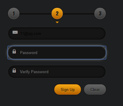
部分效果截图:
HTML代码(index.html):
<!DOCTYPE HTML>
<html lang="en-US">
<head>
	<meta http-equiv="Content-Type" content="text/html; charset=UTF-8">
	<title>CSS3分步注册表单</title>
	<link rel="stylesheet" type="text/css" href="css/base.css" media="all" />
	<style type="text/css" >
body{
background:#1e1f20;
font-size:18px;
}
.login{
width: 330px;
margin: 40px auto 0;
text-align: center;
}
.login h2{
font:italic 32px/40px "Impact";
letter-spacing:1px;
color:rgba(0,0,0,0);
background: -webkit-linear-gradient(top,#ffcf6b,#ffc54c 10%,#ffb320 40%,#c16e05);
background: -moz-linear-gradient(top,#ffcf6b,#ffc54c 10%,#ffb320 40%,#c16e05);
background: linear-gradient(top,#ffcf6b,#ffc54c 10%,#ffb320 40%,#c16e05);
-webkit-background-clip:text;
/*-webkit-text-stroke: 2px #000;*/
}
.login p{
color:#070606;
font-size:28px;
font-style:italic;
font-weight:bold;
text-shadow:1px 1px 0 rgba(255,255,255,.2),-1px -1px 0 rgba(255,255,255,.2);
}
.control-round{
position:relative;
list-style:none;
height:5px;
border:1px solid #222222;
background:#101010;
margin:50px 0 40px;
}
.control-round label{
position:absolute;
top:-18px;
font-family:"Impact";
width:36px;
color:#151515;
line-height:36px;
text-shadow:-1px -1px 1px #666,1px 1px 1px #666;
border-radius:18px;
border:1px solid #686868;
box-shadow:0 0 2px 2px rgba(0,0,0,.2);
background:-webkit-linear-gradient(top,#656565,#393939);
background:-moz-linear-gradient(top,#656565,#393939);
background:linear-gradient(top,#656565,#393939);
}
.control-round label.active{
text-shadow:0 1px 0 #f5b738;
border:1px solid #c4883b;
background:-webkit-linear-gradient(top,#f6ae1b,#b46001);
background:-moz-linear-gradient(top,#f6ae1b,#b46001);
background:linear-gradient(top,#f6ae1b,#b46001);
}
.control-round label.active:after,
	.control-round label.active:before{
position:absolute;
display:block;
content:"";
border-style:solid;
left:50%;
top:40px;
}
.control-round label.active:after{
margin:5px 0 0 -6px;
border-width:6px;
border-color:#dc8e0f transparent transparent transparent;
z-index:3;
}
.control-round label.active:before{
margin:4px 0 0 -7px;
border-width:7px;
border-color:#000 transparent transparent transparent;
z-index:2;
}
.control-round label:nth-child(1){
left:0;
}
.control-round label:nth-child(2){
left:50%;
margin-left:-18px;
}
.control-round label:nth-child(3){
right:0;
}
.control-group{
position:relative;
margin:20px 0;
}
.control-group:after{
position:absolute;
display:block;
top:10px;
left:12px;
width:25px;
color:rgba(255,255,255,.6);
text-align:center;
font-size:16px;
content: "\21";
font-family: 'icomoon';
font-style: normal;
speak: none;
font-weight: normal;
-webkit-font-smoothing: antialiased;
}
.control-group:nth-child(2):after{
content: "\22";
}
.control-group input{
padding-left:40px;
width:100%;
height:44px;
border-radius:22px;
border:1px solid #2b2b2b;
box-shadow:inset 0 0 10px rgba(0,0,0,1);
background:#151515;
-webkit-transition: border linear 0.2s, box-shadow linear 0.2s;
-moz-transition: border linear 0.2s, box-shadow linear 0.2s;
-o-transition: border linear 0.2s, box-shadow linear 0.2s;
-ms-transition: border linear 0.2s, box-shadow linear 0.2s;
transition: border linear 0.2s, box-shadow linear 0.2s;
-webkit-box-sizing: border-box;
-moz-box-sizing: border-box;
-o-box-sizing: border-box;
-ms-box-sizing: border-box;
box-sizing: border-box;
}
.control-group input:focus{
box-shadow: inset 0 1px 3px rgba(255,255,255,0.1), 0 0 8px rgba(255,255,255, 0.6);
}
.form-actions{
text-align:right;
}
.form-actions .btn{
position:relative;
padding:0 20px;
margin-left:5px;
height:35px;
line-height:35px;
color:#000;
text-shadow:0 1px 0 #7f7f7f;
border-radius:17px;
border:1px solid #4f4f4f;
box-shadow:0 0 3px #000;
background:-webkit-linear-gradient(top,#666666,#414141);
background:-moz-linear-gradient(top,#666666,#414141);
background:linear-gradient(top,#666666,#414141);
}
.form-actions .btn:hover{
background:-webkit-linear-gradient(top,#757575,#4e4e4e);
background:-moz-linear-gradient(top,#757575,#4e4e4e);
background:linear-gradient(top,#757575,#4e4e4e);
}
.form-actions .btn:active{
top:1px;
border:1px solid #111;
box-shadow:0 1px 1px #111 inset;
background:-webkit-linear-gradient(top,#4e4e4e,#4e4e4e);
background:-moz-linear-gradient(top,#4e4e4e,#4e4e4e);
background:linear-gradient(top,#4e4e4e,#4e4e4e);
}
.form-actions .btn[type=submit]{
border:1px solid #c36e0e;
text-shadow:0 1px 0 #f4a922;
background:-webkit-linear-gradient(top,#f6ab15,#b46001);
background:-moz-linear-gradient(top,#f6ab15,#b46001);
background:linear-gradient(top,#f6ab15,#b46001);
}
.form-actions .btn[type=submit]:hover{
background:-webkit-linear-gradient(top,#ffc145,#c26905);
background:-moz-linear-gradient(top,#ffc145,#c26905);
background:linear-gradient(top,#ffc145,#c26905);
}
.form-actions .btn[type=submit]:active{
border:1px solid #492700;
box-shadow:0 1px 2px #492700 inset;
background:-webkit-linear-gradient(top,#c16e05,#c16e05);
background:-moz-linear-gradient(top,#c16e05,#c16e05);
background:linear-gradient(top,#c16e05,#c16e05);
}
@font-face {
font-family: 'icomoon';
src:url('fonts/icomoon.eot');
src:url('fonts/icomoon.eot?#iefix') format('embedded-opentype'),
	url('fonts/icomoon.svg#icomoon') format('svg'),
	url('fonts/icomoon.woff') format('woff'),
	url('fonts/icomoon.ttf') format('truetype');
font-weight: normal;
font-style: normal;
}
	</style>
    <script type="text/javascript">
window.onload=function(){
	var oForm=document.getElementById('form-control');
	var aLabel=oForm.getElementsByTagName('label');
	var aInput=oForm.getElementsByTagName('input')

	for(var i=0;i<aLabel.length;i++){
		aInput[i].index=i;
		aLabel[i].onclick=function(){
			for(var i=0;i<aLabel.length;i++){
				aLabel[i].className='';
			}
			this.className='active';
		}
		aInput[i].onclick=function(){
			for(var i=0;i<aLabel.length;i++){
				aLabel[i].className='';
			}
			aLabel[this.index].className='active';
		}
	}
}
	</script>
</head>
<body>
<div class="page">
	<header id="header">
		<hgrounp class="white">
			<h1></h1>
			<h2><h2>
		</hgrounp>
	</header>
	<section class="demo">

		<div class="login" class="clearfix">
		  <h2>Sign Up Form</h2>
		  <p>with steps</p>
		  <form method="post" action="" id="form-control" >
				<div class="control-round" id="control-round">
					<label for="email" class="active">1</label>
					<label for="password">2</label>
					<label for="vpassword">3</label>
				</div>
				<div class="control-group">
					<input  type="text"  name="loginName" id="email"  placeholder="Email Address">
				</div>
				<div class="control-group">
					<input  type="text"  name="loginName" id="password" placeholder="Password">
				</div>
				<div class="control-group">
					<input  type="text"  name="loginName" id="vpassword" placeholder="Verify Password">
				</div>
				<div class="form-actions">
					<button class="btn" type="submit" >Sign Up</button>
					<button class="btn" type="button" >Clear</button>
				</div>
		  </form>
		</div>

	</section>
</div>
</body>
</html>
CSS代码(base.css):
@charset "utf-8";@import url("http://www.w3cplus.com/download/reset.css");/* ------------------------------------------------- * common * -------------------------------------------------*/
.page{text-align:left;padding-top:40px;}
.wrap_top_nav{background-color:#333;box-shadow:0 1px 3px rgba(0,0,0,0.25),0 -1px 0 rgba(0,0,0,0.1) inset;height:40px;}
#top_nav{width:1000px;margin:0 auto;position:relative;}
#top_nav a{font-size:16px;line-height:40px;float:left;margin-right:20px;color:#999;text-decoration:none;}
#top_nav a:hover{color:#fff;}
#top_nav li:nth-child(1) a{background-image:url(http://www.w3cplus.com/sites/all/themes/marvin/logo.png);background-position:0 -12px;background-repeat:no-repeat;background-size:68px 60px;padding-left:74px;color:#fff;width:74px;overflow:hidden;}
#read{position:absolute;right:0;top:0;font-family:'宋体';}
#header{text-align:center;}
#header .white{color:#fff;}
#header .blank{color:#444;}
#header h1{font-size:24px;}
#header h2{font-weight:normal;}
#ad_w3cplus{width:750px;margin:100px auto;text-align:center;}
#ad_w3cplus .grid-ad{float:left;}


 分享到QQ
分享到QQ 分享到微博
分享到微博 微信扫一扫
微信扫一扫