以下是 基于CSS3的实现的表单特效js代码 的示例演示效果:
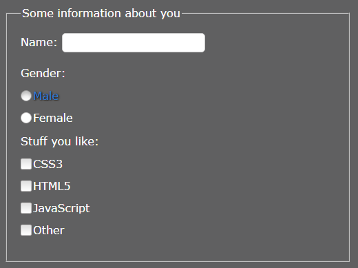
部分效果截图:
HTML代码(index.html):
<!DOCTYPE html>
<html>
<head>
<meta http-equiv="Content-Type" content="text/html; charset=utf-8" />
<title>Form replacement using CSS | The CSS Ninja</title>
<link rel="stylesheet" type="text/css" href="_styles.css" media="screen" />
</head>
<body>
	<form>
		<fieldset>
			<legend>Some information about you</legend>
			<label for="fullname">Name:</label>
			<input type="text" id="fullname" />
			<p>Gender:</p>
			<p><input type="radio" value="male" id="male" name="gender" /> <label for="male">Male</label></p>
			<p><input type="radio" value="Female" id="female" name="gender" /> <label for="female">Female</label></p>

			<p>Stuff you like:</p>
			<p><input type="checkbox" value="CSS3" id="css3" /> <label for="css3">CSS3</label></p>
			<p><input type="checkbox" value="HTML5" id="html5" /> <label for="html5">HTML5</label></p>
			<p><input type="checkbox" value="JavaScript" id="javascript" /> <label for="javascript">JavaScript</label></p>
			<p><input type="checkbox" value="Other" id="other" /> <label for="other">Other</label></p>

		</fieldset>

		<fieldset>
			<legend>What happens when I specify disabled or checked attributes?</legend>

			<p>Disabling and checking radio inputs:</p>
			<p><input type="radio" value="disabled" id="disabled" name="disabled" disabled /> <label for="disabled">This is disabled</label></p>
			<p><input type="radio" value="check" id="check" name="check" checked /> <label for="check">This is checked</label></p>

			<p>Disabling and checking checkbox inputs:</p>
			<p><input type="checkbox" value="disabled" id="disabled2" disabled /> <label for="disabled2">This is disabled</label></p>
			<p><input type="checkbox" value="check" id="check2" checked /> <label for="check2">This is checked</label></p>
			<p><input type="checkbox" value="Stop" id="disablecheck" disabled checked /> <label for="disablecheck">This is checked and disabled</label></p>
			<p><input type="checkbox" value="Other" id="other2" /> <label for="other2">Other</label></p>

		</fieldset>

		<fieldset>
			<legend>Contact info</legend>

			<label>Email:</label>
			<input type="email" />

			<p>Subscribe to newsletter:</p>
			<p><input type="radio" value="yes" id="yes" name="subscribe" /> <label for="yes">Yes</label></p>
			<p><input type="radio" value="no" id="no" name="subscribe" /> <label for="no">No</label></p>

			<p>Tick the information you would like to hear about:</p>
			<p><input type="checkbox" value="Rich" id="rich" /> <label for="rich">I would like to here about the how the CSS Ninja can make me rich</label></p>
			<p><input type="checkbox" value="Poor" id="poor" /> <label for="poor">How the CSS Ninja can make me poor</label></p>
			<p><input type="checkbox" value="Stop" id="stop" /> <label for="stop">Please make the CSS Ninja stop from trying to make me rich or poor</label></p>
			<p><input type="checkbox" value="Other" id="other3" /> <label for="other3">Other</label></p>
		</fieldset>
	</form>
</body>
</html>
CSS代码(styles.css):
/* Just some base styles not needed for example to function */
*,html{font-family:Verdana,Arial,Helvetica,sans-serif;}
body,form,ul,li,p,h1,h2,h3,h4,h5{margin:0;padding:0;}
body{background-color:#606061;color:#ffffff;}
img{border:none;}
p{font-size:1em;margin:0 0 1em 0;}
/* Custom checkbox and radio styles */
fieldset{margin:1em;padding:20px;}
fieldset p{display:block;position:relative;overflow:hidden;}
fieldset input[type=text],fieldset input[type=email]{border:1px solid #ccc;line-height:20px;padding:3px;width:200px;-moz-border-radius:5px;-webkit-border-radius:5px;border-radius:5px;}
label + p,input + p{margin-top:20px;}
p > input{padding:0;margin:0;height:16px;width:16px;float:left;position:absolute;left:0;opacity:0;}
p > label{float:left;line-height:16px;color:#fff;padding:0 0 0 18px;-moz-transition:color 1s ease;-o-transition:color 1s ease;-webkit-transition:color 1s ease;transition:color 1s ease;}
p:not(#foo) > input:hover + label,p:not(#foo) > input:focus + label,p:not(#foo) > input + label:hover,p:not(#foo) > input:focus + label{text-shadow:1px 1px 3px #000;color:#2C7AD0;}
p:not(#foo) > input + label{background:url(gr_custom-inputs.png) 0 -1px no-repeat;height:16px;}
p:not(#foo) > input[type=radio] + label{background-position:0 -161px;}
/* Checked styles */
p:not(#foo) > input[type=radio]:checked + label{background-position:0 -241px;}
p:not(#foo) > input[type=checkbox]:checked + label{background-position:0 -81px;}
p:not(#foo) > input[type=checkbox]:hover:checked + label,p:not(#foo) > input[type=checkbox]:focus:checked + label,p:not(#foo) > input[type=checkbox]:checked + label:hover,p:not(#foo) > input[type=checkbox]:focus:checked + label{background-position:0 -101px;}
p:not(#foo) > input[type=radio]:hover:checked + label,p:not(#foo) > input[type=radio]:focus:checked + label,p:not(#foo) > input[type=radio]:checked + label:hover,p:not(#foo) > input[type=radio]:focus:checked + label{background-position:0 -261px;}
/* Hover & Focus styles */
p:not(#foo) > input[type=checkbox]:hover + label,p:not(#foo) > input[type=checkbox]:focus + label,p:not(#foo) > input[type=checkbox] + label:hover{background-position:0 -21px;}
p:not(#foo) > input[type=radio]:hover + label,p:not(#foo) > input[type=radio]:focus + label,p:not(#foo) > input[type=radio] + label:hover{background-position:0 -181px;}
/* Active styles */
p:not(#foo) > input[type=checkbox]:active + label,p:not(#foo) > input[type=checkbox] + label:hover:active{background-position:0 -41px;}
p:not(#foo) > input[type=radio]:active + label,p:not(#foo) > input[type=radio] + label:hover:active{background-position:0 -201px;}
p:not(#foo) > input[type=checkbox]:active:checked + label,p:not(#foo) > input[type=checkbox]:checked + label:hover:active{background-position:0 -121px;}
p:not(#foo) > input[type=radio]:active:checked + label,p:not(#foo) > input[type=radio]:checked + label:hover:active{background-position:0 -281px;}
/* Disabled styles */
p:not(#foo) > input[type=checkbox]:disabled + label,p:not(#foo) > input[type=checkbox]:hover:disabled + label,p:not(#foo) > input[type=checkbox]:focus:disabled + label,p:not(#foo) > input[type=checkbox]:disabled + label:hover,p:not(#foo) > input[type=checkbox]:disabled + label:hover:active{background-position:0 -61px;}
p:not(#foo) > input[type=radio]:disabled + label,p:not(#foo) > input[type=radio]:hover:disabled + label,p:not(#foo) > input[type=radio]:focus:disabled + label,p:not(#foo) > input[type=radio]:disabled + label:hover,p:not(#foo) > input[type=radio]:disabled + label:hover:active{background-position:0 -221px;}
p:not(#foo) > input[type=checkbox]:disabled:checked + label,p:not(#foo) > input[type=checkbox]:hover:disabled:checked + label,p:not(#foo) > input[type=checkbox]:focus:disabled:checked + label,p:not(#foo) > input[type=checkbox]:disabled:checked + label:hover,p:not(#foo) > input[type=checkbox]:disabled:checked + label:hover:active{background-position:0 -141px;}
p:not(#foo) > input[type=radio]:disabled:checked + label,p:not(#foo) > input[type=radio]:hover:disabled:checked + label,p:not(#foo) > input[type=radio]:focus:disabled:checked + label,p:not(#foo) > input[type=radio]:disabled:checked + label:hover,p:not(#foo) > input[type=radio]:disabled:checked + label:hover:active{background-position:0 -301px;}


 分享到QQ
分享到QQ 分享到微博
分享到微博 微信扫一扫
微信扫一扫