以下是 jQ+CSS3彩色流动边框登录框js代码 的示例演示效果:
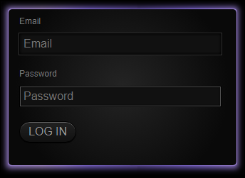
部分效果截图:
HTML代码(index.html):
<!DOCTYPE html PUBLIC "-//W3C//DTD XHTML 1.0 Transitional//EN" "http://www.w3.org/TR/xhtml1/DTD/xhtml1-transitional.dtd">
<html xmlns="http://www.w3.org/1999/xhtml">
<head>
<meta http-equiv="Content-Type" content="text/html; charset=gb2312" />
<title>jQ+CSS3彩色流动边框登录框</title>
<style type="text/css">
*{margin:0;padding:0;list-style-type:none;}
a,img{border:0;}
body{
	background: #000;
	color: #DDD;
	font-family: 'Helvetica', 'Lucida Grande', 'Arial', sans-serif;
}
.border,.rain{
	width: 320px;
}

.rain{
	 padding: 10px 12px 12px 10px;
	 -moz-box-shadow: 10px 10px 10px rgba(0,0,0,1) inset, -9px -9px 8px rgba(0,0,0,1) inset;
	 -webkit-box-shadow: 8px 8px 8px rgba(0,0,0,1) inset, -9px -9px 8px rgba(0,0,0,1) inset;
	 box-shadow: 8px 8px 8px rgba(0,0,0,1) inset, -9px -9px 8px rgba(0,0,0,1) inset;
	 margin: 100px auto;
}

.border{
	padding: 1px;
	-moz-border-radius: 5px;
	-webkit-border-radius: 5px;
	border-radius: 5px;
}

.border,
.rain,
.border.start,
.rain.start{
	background-repeat: repeat-x, repeat-x, repeat-x, repeat-x;
	background-position: 0 0, 0 0, 0 0, 0 0;

	background-image: -moz-linear-gradient(left, #09BA5E 0%, #00C7CE 15%, #3472CF 26%, #00C7CE 48%, #0CCF91 91%, #09BA5E 100%);

	background-image: -webkit-gradient(linear, left top, right top, color-stop(1%,rgba(0,0,0,.3)), color-stop(23%,rgba(0,0,0,.1)), color-stop(40%,rgba(255,231,87,.1)), color-stop(61%,rgba(255,231,87,.2)), color-stop(70%,rgba(255,231,87,.1)), color-stop(80%,rgba(0,0,0,.1)), color-stop(100%,rgba(0,0,0,.25)));

	background-color: #39f;

	filter: progid:DXImageTransform.Microsoft.gradient( startColorstr='#00BA1B', endColorstr='#00BA1B',GradientType=1 );
}


.border.end,
.rain.end{
	-moz-transition-property: background-position;
	-moz-transition-duration: 30s;
	-moz-transition-timing-function: linear;
	-webkit-transition-property: background-position;
	-webkit-transition-duration: 30s;
	-webkit-transition-timing-function: linear;
	-o-transition-property: background-position;
	-o-transition-duration: 30s;
	-o-transition-timing-function: linear;
	transition-property: background-position;
	transition-duration: 30s;
	transition-timing-function: linear;
	background-position: -5400px 0, -4600px 0, -3800px 0, -3000px 0;
}


@-webkit-keyframes colors {
	0% {background-color: #39f;}
	15% {background-color: #F246C9;}
	30% {background-color: #4453F2;}
	45% {background-color: #44F262;}
	60% {background-color: #F257D4;}
	75% {background-color: #EDF255;}
	90% {background-color: #F20006;}
	100% {background-color: #39f;}
}
.border,.rain{
	-webkit-animation-direction: normal;
	-webkit-animation-duration: 20s;
	-webkit-animation-iteration-count: infinite;
	-webkit-animation-name: colors;
	-webkit-animation-timing-function: ease;
}


.border.unfocus{
	background: #333 !important;
	 -moz-box-shadow: 0px 0px 15px rgba(255,255,255,.2);
	 -webkit-box-shadow: 0px 0px 15px rgba(255,255,255,.2);
	 box-shadow: 0px 0px 15px rgba(255,255,255,.2);
	 -webkit-animation-name: none;
}
.rain.unfocus{
	background: #000 !important;
	-webkit-animation-name: none;
}


form{
	background: #212121;
	-moz-border-radius: 5px;
	-webkit-border-radius: 5px;
	border-radius: 5px;
	height:220px;
	width: 100%;
	background: -moz-radial-gradient(50% 46% 90deg,circle closest-corner, #242424, #090909);
	background: -webkit-gradient(radial, 50% 50%, 0, 50% 50%, 150, from(#242424), to(#090909));
}
form label{
	display: block;
	padding: 10px 10px 5px 15px;
	font-size: 11px;
	color: #777;
}
form input{
	display: block;
	margin: 5px 10px 10px 15px;
	width: 85%;
	background: #111;
	-moz-box-shadow: 0px 0px 4px #000 inset;
	-webkit-box-shadow: 0px 0px 4px #000 inset;
	box-shadow: 0px 0px 4px #000 inset;
	outline: 1px solid #333;
	border: 1px solid #000;
	padding: 5px;
	color: #444;
	font-size: 16px;
}
form input:focus{
	outline: 1px solid #555;
	color: #FFF;
}
input[type="submit"]{
	color: #999;
	padding: 5px 10px;
	border: 1px solid #000;
	font-weight: lighter;
	-moz-border-radius: 15px;
	-webkit-border-radius: 15px;
	border-radius: 15px;
	background: #45484d;
	background: -moz-linear-gradient(top, #222 0%, #111 100%);
	background: -webkit-gradient(linear, left top, left bottom, color-stop(0%,#222), color-stop(100%,#111));
	filter: progid:DXImageTransform.Microsoft.gradient( startColorstr='#22222', endColorstr='#11111',GradientType=0 );
	-moz-box-shadow: 0px 1px 1px #000, 0px 1px 0px rgba(255,255,255,.3) inset;
	-webkit-box-shadow: 0px 1px 1px #000, 0px 1px 0px rgba(255,255,255,.3) inset;
	box-shadow: 0px 1px 1px #000,0px 1px 0px rgba(255,255,255,.3) inset;
	text-shadow: 0 1px 1px #000;
	outline: none;
	width:80px;
	margin-top:20px;
}
</style>

<script type="text/javascript" src="js/jquery.min.js"></script>
<script type="text/javascript">
$(function(){
	var $form_inputs =   $('form input');
	var $rainbow_and_border = $('.rain, .border');

	$form_inputs.bind('focus', function(){
		$rainbow_and_border.addClass('end').removeClass('unfocus start');
	});
	$form_inputs.bind('blur', function(){
		$rainbow_and_border.addClass('unfocus start').removeClass('end');
	});
	$form_inputs.first().delay(800).queue(function(){
		$(this).focus();
	});
});
</script>
</head>

<body>

<div class="rain">
    <div class="border start">
        <form>
            <label for="email">Email</label>
            <input name="email" type="text" placeholder="Email"/>
            <label for="pass">Password</label>
            <input name="pass" type="password" placeholder="Password"/>
            <input type="submit" value="LOG IN"/>
        </form>
    </div>
</div>
</body>
</html>


 分享到QQ
分享到QQ 分享到微博
分享到微博 微信扫一扫
微信扫一扫