以下是 纯css3实现iphone表单风格js代码 的示例演示效果:
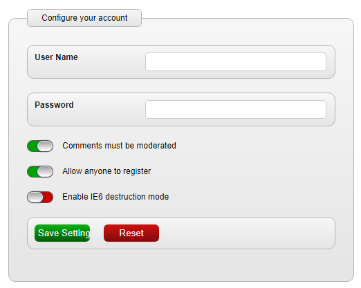
部分效果截图:
HTML代码(index.html):
<!DOCTYPE html>
<html>
<head>
<meta http-equiv="Content-Type" content="text/html; charset=utf-8" />
<title>纯css3实现iphone表单风格</title>
<style type="text/css">
html, body, h1, form, fieldset, legend, ol, li {
	margin: 0;
	padding: 0;
}
body {
	background: #ffffff;
	color: #111111;
	font-family: Helvetica;
	padding: 20px;
	font-size: 12px
}

input:not([type=checkbox]), textarea {
	width: 250px;
	padding: 5px;
	border: 1px solid #ccc;
	-moz-border-radius: 5px;
	-webkit-border-radius: 5px;
}


form {
	width: 500px;
	margin: 0 auto 0 auto;


}

form fieldset {
	padding: 26px;
	border: 1px solid #b4b4b4;
	-moz-border-radius: 10px;
	-webkit-border-radius: 10px;
}

form legend {
	padding: 5px 20px 5px 20px;
	color: #030303;
	-moz-border-radius: 6px;
	-webkit-border-radius: 6px;
	border: 1px solid #b4b4b4;
}

form ol {
	list-style: none;
	margin-bottom: 20px;
	border: 1px solid #b4b4b4;
	-moz-border-radius: 10px;
	-webkit-border-radius: 10px;
	padding: 10px;
}

form ol, form legend, form fieldset {
	background-image: -moz-linear-gradient(top, #f7f7f7, #e5e5e5); /* FF3.6 */
	background-image: -webkit-gradient(linear,left bottom,left top,color-stop(0, #e5e5e5),color-stop(1, #f7f7f7)); /* Saf4+, Chrome */
}

form ol.buttons {
	overflow: auto;
}

form ol li label {
	float: left;
	width: 160px;
	font-weight: bold;

}

/*
form ol.radio-buttons li {
	float:left;
margin-bottom:0;
width:8px;
}

form ol.radio-buttons li label {
	line-height:20px;
padding-right:20px;
width:80px;
}

form ol.radio-buttons li input {
padding:0;
width:20px;
}
*/

.settings {
	/* width: 400px; */
	list-style: none;
	position: relative;
}

.settings p {
	display: block;
	margin-bottom: 20px;
	background: -moz-linear-gradient(50% 50% 180deg,#C91A1A, #DB2E2E, #0C990C 0%);
	background: -webkit-gradient(linear, 50% 50%, 0% 50%, from(#C90202), to(#009C05), color-stop(0,#00AB00));
	border-radius: 8px;
	-moz-border-radius: 6px;
	border: 1px solid #555555;
	width: 36px;
	position: relative;
	height: 15px;
}

/*
.settings p:before {
	content: "ON";
	padding-left: 9px;
	line-height: 15px;
	color: #fff;
	font-size: 14px;
	text-shadow: #093B5C 0px -1px 1px;

}

.settings p:after {
	content: "OFF";
	padding-left: 12px;
	line-height: 15px;
	color: #fff;
	font-size: 14px;
	text-shadow: #093B5C 0px -1px 1px;
}
*/

.check {
	display: block;
	width: 20px;
	height: 13px;
	border-radius: 8px;
	-moz-border-radius: 6px;
	background: -moz-linear-gradient(19% 75% 90deg,#FFFFFF, #A1A1A1);
	background: #fff -webkit-gradient(linear, 0% 0%, 0% 100%, from(#A1A1A1), to(#FFFFFF));
	border: 1px solid #e5e5e5;
	position: absolute;
	top: 0px;
	left: 0px;
}


input[type=checkbox] {
	display: none;
}

@-webkit-keyframes labelON {
	0% {
		top: 0px;
    	left: 0px;
	}

	100% {
		top: 0px;
    	left: 14px;
	}
}

input[type=checkbox]:checked + label.check {
	top: 0px;
	left: 14px;
	-webkit-animation-name: labelON;
  	-webkit-animation-duration: .2s;
  	-webkit-animation-iteration-count: 1;
  	-webkit-animation-timing-function: ease-in;
  	-webkit-box-shadow: #244766 -1px 0px 3px;
  	-moz-box-shadow: #244766 -1px 0px 3px;
}

@-webkit-keyframes labelOFF {
	0% {
		top: 0px;
    	left: 16px;
	}

	100% {
		top: 0px;
    	left: 0px;
	}
}

input[type=checkbox] + label.check {
	top: 0px;
	left: 0px;
	-webkit-animation-name: labelOFF;
  	-webkit-animation-duration: .2s;
  	-webkit-animation-iteration-count: 1;
  	-webkit-animation-timing-function: ease-in;
  	-webkit-box-shadow: #244766 1px 0px 3px;
  	-moz-box-shadow: #244766 1px 0px 3px;
}

label.info {
	position: absolute;
	color: #000;
	top:0px;
	left: 50px;
	line-height: 15px;
	width: 200px;
}


form ol.buttons li {
	float: left;
	width: 100px;
}

input[type=submit] {
	width: 80px;
	color: #f3f3f3;
	-moz-border-radius: 6px;
	-webkit-border-radius: 6px;
	background-image: -moz-linear-gradient(top, #0cb114, #07580b); /* FF3.6 */
	background-image: -webkit-gradient(linear,left bottom,left top,color-stop(0, #07580b),color-stop(1, #0cb114)); /* Saf4+, Chrome */
	-webkit-box-shadow: #4b4b4b 0px 2px 5px;
	-moz-box-shadow: #4e4e4e 0px 2px 5px;
	box-shadow: #e3e3e3 0px 2px 5px;
	border: none;
}
input[type=reset] {
	width: 80px;
	color: #f3f3f3;
	-moz-border-radius: 6px;
	-webkit-border-radius: 6px;
	background-image: -moz-linear-gradient(top, #d01111, #7e0c0c); /* FF3.6 */
	background-image: -webkit-gradient(linear,left bottom,left top,color-stop(0, #7e0c0c),color-stop(1, #d01111)); /* Saf4+, Chrome */
	-webkit-box-shadow: #4b4b4b 0px 2px 5px;
	-moz-box-shadow: #4e4e4e 0px 2px 5px;
	box-shadow: #e3e3e3 0px 2px 5px;
	border: none;

}

input[type=file] {
	width: 80px;
}


</style>
</head>
<body>

<form id="form-1" action="" method="post">
  <fieldset>
    <legend>Configure your account</legend>
    <ol>
      <li><label for="field1">User Name</label></li>
      <li><input type="text" id="field1" name="field1" required/></li>
    </ol>
    <ol>

      <li><label for="field2">Password</label></li>
      <li><input type="password" id="field2" name="field2" /></li>
    </ol>
      <div class="settings">
          <p>
			<input type="checkbox" value="1" id="1" name="1" checked="checked"/>
			<label class="check" for="1"></label>
			<label class="info">Comments must be moderated</label>

		  </p>
		  <p>
          	<input type="checkbox" value="2" id="2" name="2" />
			<label class="check" for="2"></label>
			<label class="info">Allow anyone to register</label>
          </p>
          <p>
         	<input type="checkbox" value="3" id="3" name="3" />

			<label class="check" for="3"></label>
			<label class="info">Enable IE6 destruction mode</label>
          </p>

      </div>
    <ol class="buttons">
      <li><input type="submit" class="button" value="Save Settings" /></li>
      <li><input type="reset" class="button" value="Reset" /></li>
    </ol>
  </fieldset>

</form>
</body>
</html>


 分享到QQ
分享到QQ 分享到微博
分享到微博 微信扫一扫
微信扫一扫