以下是 纯css3实现的折角效果 的示例演示效果:
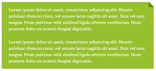
部分效果截图1:
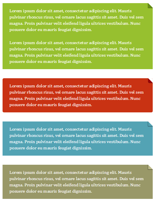
部分效果截图2:
HTML代码(index.html):
<!DOCTYPE html>
<html>
<head>
<meta http-equiv="Content-Type" content="text/html; charset=utf-8" />
<title>纯css3实现的折角效果</title>
 <link rel="stylesheet" href="default.css">
</head>
<body>
<div class="note">
    <p>Lorem ipsum dolor sit amet, consectetur adipiscing elit. Mauris pulvinar rhoncus risus, vel ornare lacus sagittis sit amet. Duis vel sem magna. Proin pulvinar velit eleifend ligula ultrices vestibulum. Nunc posuere dolor eu mauris feugiat dignissim.</p>
    <p>Lorem ipsum dolor sit amet, consectetur adipiscing elit. Mauris pulvinar rhoncus risus, vel ornare lacus sagittis sit amet. Duis vel sem magna. Proin pulvinar velit eleifend ligula ultrices vestibulum. Nunc posuere dolor eu mauris feugiat dignissim.</p>
</div>

<div class="note red rounded">
    <p>Lorem ipsum dolor sit amet, consectetur adipiscing elit. Mauris pulvinar rhoncus risus, vel ornare lacus sagittis sit amet. Duis vel sem magna. Proin pulvinar velit eleifend ligula ultrices vestibulum. Nunc posuere dolor eu mauris feugiat dignissim.</p>
</div>

<div class="note blue">
    <p>Lorem ipsum dolor sit amet, consectetur adipiscing elit. Mauris pulvinar rhoncus risus, vel ornare lacus sagittis sit amet. Duis vel sem magna. Proin pulvinar velit eleifend ligula ultrices vestibulum. Nunc posuere dolor eu mauris feugiat dignissim.</p>
</div>

<div class="note taupe">
    <p>Lorem ipsum dolor sit amet, consectetur adipiscing elit. Mauris pulvinar rhoncus risus, vel ornare lacus sagittis sit amet. Duis vel sem magna. Proin pulvinar velit eleifend ligula ultrices vestibulum. Nunc posuere dolor eu mauris feugiat dignissim.</p>
</div>
</body>
</html>
CSS代码(default.css):
/* ----------------------------------------------------------------------------------------------------------------------------== GENERAL STYLES** ---------------------------------------------------------------------------------------------------------------------------- */
html,body{padding:0;margin:0;font:1em/1.4 Cambria,Georgia,sans-serif;color:#333;background:#fff;}
header,hgroup{display:block;}
a:link,a:visited{border-bottom:1px solid #c55500;color:#c55500;text-decoration:none;}
a:visited{border-bottom:1px solid #730800;color:#730800;}
a:hover,a:focus,a:active{border:0;color:#fff;background:#c55500;}
a:visited:hover,a:visited:focus,a:visited:active{color:#fff;background:#730800;}
.container{width:540px;padding:0 0 10px;margin:0 auto 30px;}
.header{border-bottom:1px solid #ddd;}
.footer{padding:10px 0 30px;border-top:1px solid #ddd;margin-bottom:0;}
h1{margin:1em 0 0;font-size:2.5em;font-weight:normal;line-height:1.2;text-align:center;}
h2{margin:0.5em 0 1.5em;font-size:1.25em;font-weight:normal;font-style:italic;text-align:center;}
p{margin:1em 0;line-height:1.4em;}
pre{margin:1.4em 0;font-size:12px;line-height:1.4em;white-space:pre-wrap;word-wrap:break-word;}
.follow{clear:both;margin-top:2em;font-size:1.125em;}
.follow span{font-weight:bold;}
/* ----------------------------------------------------------------------------------------------------------------------------== FOLDED CORNERS** ---------------------------------------------------------------------------------------------------------------------------- */
.note{position:relative;width:480px;padding:1em 1.5em;margin:2em auto;color:#fff;background:#97C02F;overflow:hidden;}
.note:before{content:"";position:absolute;top:0;right:0;border-width:0 16px 16px 0;/* This trick side-steps a webkit bug */
 border-style:solid;border-color:#fff #fff #658E15 #658E15;/* A bit more verbose to work with .rounded too */
 background:#658E15;/* For Opera when also applying a border-radius */
 display:block;width:0;/* Only for Firefox 3.0 damage limitation */
 /* Optional:shadow */
 -webkit-box-shadow:0 1px 1px rgba(0,0,0,0.3),-1px 1px 1px rgba(0,0,0,0.2);-moz-box-shadow:0 1px 1px rgba(0,0,0,0.3),-1px 1px 1px rgba(0,0,0,0.2);box-shadow:0 1px 1px rgba(0,0,0,0.3),-1px 1px 1px rgba(0,0,0,0.2);}
.note.red{background:#C93213;}
.note.red:before{border-color:#fff #fff #97010A #97010A;background:#97010A;}
.note.blue{background:#53A3B4;}
.note.blue:before{border-color:#fff #fff transparent transparent;background:transparent;}
.note.taupe{background:#999868;}
.note.taupe:before{border-color:#fff #fff #BDBB8B #BDBB8B;background:#BDBB8B;}
/* ROUNDED CORNERS VERSION * All modern browsers can produce this effect with a single pseudo-element. * However,they all have bugs (mainly to do with border-radius) that make this a bit tricky. * As far as I can tell,this is the only cross-browser method for the moment. * Can't use this method for the simple effect because Opera 11 will only show backgrounds * through transparent borders if there is a border-radius applied. */
.note.rounded{-webkit-border-radius:5px;-moz-border-radius:5px;border-radius:5px;}
.note.rounded:before{border-width:8px;/* Triggers a 1px 'step' along the diagonal in Safari 5 (and Chrome 10) */
 border-color:#fff #fff transparent transparent;/* Avoids the 1px 'step' in webkit. Background colour shows through */
 -webkit-border-bottom-left-radius:5px;-moz-border-radius:0 0 0 5px;border-radius:0 0 0 5px;}
.note p{margin:0;}
.note p + p{margin:1.5em 0 0;}


 分享到QQ
分享到QQ 分享到微博
分享到微博 微信扫一扫
微信扫一扫