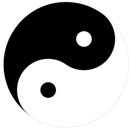
以下是 纯CSS3实现太极图形样式代码 的示例演示效果:
部分效果截图:
HTML代码(index.html):
<!DOCTYPE html>
<html>
<head>
<meta charset=utf-8>
<title>纯CSS3实现太极图形样式代码</title>
<style>
	.square{
		width:400px;height:400px;position:relative;

		transform:rotate(45deg);
		-webkit-transform:rotate(45deg);
		-moz-transform:rotate(45deg);

		animation:rotate infinite linear 5s;margin:10% auto;
		-webkit-animation:rotate infinite linear 5s;margin:10% auto;
		-moz-animation:rotate infinite linear 5s;margin:10% auto;
	}
	.rect{width:400px;height:200px;position:relative;border:1px #d2d2d2 solid;border-bottom:none;}
	.inner_circle{width:200px;height:200px;border-radius:200px;position:absolute;z-index:1;}
	.dot{width:50px;height:50px;position:absolute;left:0;right:0;top:0;bottom:0;margin:auto;border-radius:50%;}
	.rect_one{border-radius:200px 200px 0 0;background:white;}
	.rect_one_one{bottom:-100px;left:0;background:black;}
	.rect_one_two{background:white;}
	.rect_two{border-radius:0 0 200px 200px;background:black;}
	.rect_two_one{bottom:100px;right:0;background:white;}
	.rect_two_two{background:black;}
	@keyframes rotate{
		from{
		transform:rotate(0deg);
		-webkit-transform:rotate(0deg);
		}to{
		transform:rotate(360deg);
		-webkit-transform:rotate(360deg);
	}}
</style>
</head>

<body>

<div class="square">
	<div class="rect rect_one">
		<div class="inner_circle rect_one_one">
			<div class="dot rect_one_two"></div>
		</div>
	</div>
	<div class="rect rect_two">
		<div class="inner_circle rect_two_one">
			<div class="dot rect_two_two"></div>
		</div>
	</div>
</div>
</body>
</html>


 分享到QQ
分享到QQ 分享到微博
分享到微博 微信扫一扫
微信扫一扫