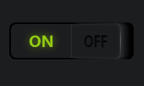
以下是 纯CSS3实现发光按钮开关切换特效 的示例演示效果:
部分效果截图:
HTML代码(index.html):
<!DOCTYPE html>
<html>
<head>
    <meta charset="gb2312">
    <title>��CSS3ʵ�ַ��ⰴť�����л���Ч</title>
    <link rel="stylesheet" href="css/style.css" media="screen" type="text/css" />
</head>
<body>
    <label class="button"><input type="checkbox"><span></span><span></span></input></label>
</body>
</html>
CSS代码(style.css):
*,*:before,*:after{-moz-box-sizing:border-box;box-sizing:border-box;}
body{background-color:#1c1d1f;}
.button{display:block;width:400px;height:120px;position:absolute;top:50%;left:50%;-webkit-transform:translate(-50%,-50%);-ms-transform:translate(-50%,-50%);transform:translate(-50%,-50%);background-color:#000000;box-shadow:0 -1px 0 rgba(255,255,255,0.2) inset;border-radius:20px;overflow:hidden;cursor:pointer;-webkit-tap-highlight-color:rgba(0,0,0,0);}
.button span{display:block;position:absolute;top:6px;width:194px;height:108px;background-color:#1c1d1f;-webkit-transition:-webkit-transform 300ms ease,box-shadow 300ms ease;transition:transform 300ms ease,box-shadow 300ms ease;}
.button span:before{position:absolute;top:50%;left:50%;-webkit-transform:translate(-50%,-50%);-ms-transform:translate(-50%,-50%);transform:translate(-50%,-50%);font-family:"Open Sans";font-weight:800;font-size:48px;-webkit-transition:text-shadow 800ms ease 100ms,color 800ms ease 100ms;transition:text-shadow 800ms ease 100ms,color 800ms ease 100ms;}
.button span:after{content:"";width:4px;height:108px;position:absolute;top:0;background:-webkit-radial-gradient(center,ellipse,rgba(255,255,255,0.5) 0%,transparent 50%);background:radial-gradient(ellipse at center,rgba(255,255,255,0.5) 0%,transparent 50%);-webkit-transition:opacity 300ms ease;transition:opacity 300ms ease;}
.button span:first-of-type{left:6px;border-top-left-radius:18px;border-bottom-left-radius:18px;-webkit-transform-style:preserve3d;transform-style:preserve3d;-webkit-transform-origin:right center;-ms-transform-origin:right center;transform-origin:right center;-webkit-transform:perspective(2000px) rotateY(40deg);transform:perspective(2000px) rotateY(40deg);box-shadow:-1px 0 1px rgba(255,255,255,0.1) inset,4px 0 8px rgba(255,255,255,0.1) inset,1px 0 0 rgba(255,255,255,0.1) inset,-10px 0 8px rgba(40,42,44,0.9),-20px 0 8px rgba(28,29,31,0.7),-30px 0 8px rgba(28,29,31,0.4);}
.button span:first-of-type:before{content:"ON";color:rgba(0,0,0,0.5);text-shadow:1px 4px 6px #1c1d1f,0 0 0 #000000,1px 4px 6px #1c1d1f;}
.button span:first-of-type:after{left:-1px;}
.button span:last-of-type{right:6px;border-top-right-radius:18px;border-bottom-right-radius:18px;-webkit-transform-origin:left center;-ms-transform-origin:left center;transform-origin:left center;box-shadow:-1px 1px 1px rgba(255,255,255,0.1) inset,2px 0 2px rgba(255,255,255,0.05) inset;}
.button span:last-of-type:before{content:"OFF";color:#ff4847;text-shadow:0 0 24px rgba(255,72,71,0.6);}
.button span:last-of-type:after{right:-1px;opacity:0;}
.button input[type="checkbox"]{display:none;}
.button input[type="checkbox"]:checked ~ span:first-of-type{-webkit-transform:none;-ms-transform:none;transform:none;box-shadow:1px 1px 1px rgba(255,255,255,0.1) inset,-2px 0 2px rgba(255,255,255,0.05) inset;}
.button input[type="checkbox"]:checked ~ span:first-of-type:before{color:#93c913;text-shadow:0 0 24px rgba(147,201,19,0.6);}
.button input[type="checkbox"]:checked ~ span:first-of-type:after{opacity:0;}
.button input[type="checkbox"]:checked ~ span:last-of-type{-webkit-transform:perspective(2000px) rotateY(-40deg);transform:perspective(2000px) rotateY(-40deg);box-shadow:1px 0 1px rgba(255,255,255,0.1) inset,-4px 0 8px rgba(255,255,255,0.1) inset,-1px 0 0 rgba(255,255,255,0.1) inset,10px 0 8px rgba(40,42,44,0.9),20px 0 8px rgba(28,29,31,0.7),30px 0 8px rgba(28,29,31,0.4);}
.button input[type="checkbox"]:checked ~ span:last-of-type:before{color:rgba(0,0,0,0.5);text-shadow:1px 4px 6px #1c1d1f,0 0 0 #000000,1px 4px 6px #1c1d1f;}
.button input[type="checkbox"]:checked ~ span:last-of-type:after{opacity:1;}


 分享到QQ
分享到QQ 分享到微博
分享到微博 微信扫一扫
微信扫一扫