以下是 纯CSS3实现动画开关按钮特效 的示例演示效果:
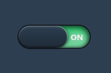
部分效果截图:
HTML代码(index.html):
<!DOCTYPE html>
<html class=''>
<head>
<meta charset='UTF-8'>
<title>纯CSS3实现动画开关按钮特效</title>
<style class="cp-pen-styles">
@import url(http://fonts.useso.com/css?family=Open+Sans:800);
*,
*:before,
*:after {
  -moz-box-sizing: border-box;
       box-sizing: border-box;
}
body {
  background-color: #2c3e50;
}
.button {
  display: block;
  position: absolute;
  width: 240px;
  height: 80px;
  top: 50%;
  left: 50%;
  -webkit-transform: translate(-50%, -50%);
      -ms-transform: translate(-50%, -50%);
          transform: translate(-50%, -50%);
  background: -webkit-linear-gradient(top, #11181f 0%, #161f29 100%);
  background: linear-gradient(to bottom, #11181f 0%, #161f29 100%);
  border-radius: 40px;
  box-shadow: 0 0 0 1px rgba(255, 255, 255, 0.1);
  cursor: pointer;
  -webkit-tap-highlight-color: rgba(0, 0, 0, 0);
}
.button span {
  position: absolute;
  display: block;
}
.button span:first-of-type {
  z-index: 100;
  top: 4px;
  right: 4px;
  width: 160px;
  height: 72px;
  background: -webkit-linear-gradient(top, #2c3e50 0%, #1e2a36 100%);
  background: linear-gradient(to bottom, #2c3e50 0%, #1e2a36 100%);
  box-shadow: 0 6px 4px rgba(255, 255, 255, 0.1) inset, 0 2px 0px rgba(255, 255, 255, 0.2) inset, 0 -6px 0px rgba(0, 0, 0, 0.2) inset, 0 -2px 0px rgba(0, 0, 0, 0.2) inset, 0 2px 2px rgba(0, 0, 0, 0.4), -4px 2px 8px rgba(0, 0, 0, 0.4), 2px 0 1px rgba(242, 201, 197, 0.5) inset;
  border-radius: 36px;
  -webkit-transition: right 400ms cubic-bezier(1, 0, 0, 1), box-shadow 400ms ease;
          transition: right 400ms cubic-bezier(1, 0, 0, 1), box-shadow 400ms ease;
}
.button span:nth-last-of-type(-n+2) {
  z-index: 10;
  top: 4px;
  width: 116px;
  height: 72px;
  -webkit-transition: opacity 800ms ease 100ms;
          transition: opacity 800ms ease 100ms;
}
.button span:nth-last-of-type(-n+2):after {
  position: absolute;
  top: 26px;
  line-height: 1;
  font-family: "Open Sans";
  font-weight: 800;
  font-size: 24px;
  color: white;
  text-shadow: 0 1px 2px rgba(0, 0, 0, 0.2), 0 0 20px #ffffff;
}
.button span:nth-of-type(2) {
  left: 4px;
  background: -webkit-linear-gradient(top, #c0392b 0%, #d65548 100%);
  background: linear-gradient(to bottom, #c0392b 0%, #d65548 100%);
  border-top-left-radius: 36px;
  border-bottom-left-radius: 36px;
  box-shadow: 4px 4px 12px 4px rgba(0, 0, 0, 0.5) inset, 0 -2px 8px rgba(0, 0, 0, 0.4) inset;
}
.button span:nth-of-type(2):after {
  content: "OFF";
  left: 18px;
}
.button span:last-of-type {
  right: 4px;
  background: -webkit-linear-gradient(top, #2ecc71 0%, #7ee2a8 100%);
  background: linear-gradient(to bottom, #2ecc71 0%, #7ee2a8 100%);
  border-top-right-radius: 36px;
  border-bottom-right-radius: 36px;
  box-shadow: -4px 4px 12px 4px rgba(0, 0, 0, 0.5) inset, 0 -2px 8px rgba(0, 0, 0, 0.4) inset;
  opacity: 0.2;
}
.button span:last-of-type:after {
  content: "ON";
  right: 22px;
}
.button input[type="checkbox"] {
  display: none;
}
.button input[type="checkbox"]:checked ~ span:first-of-type {
  right: 76px;
  box-shadow: 0 6px 4px rgba(255, 255, 255, 0.1) inset, 0 2px 0px rgba(255, 255, 255, 0.2) inset, 0 -6px 0px rgba(0, 0, 0, 0.2) inset, 0 -2px 0px rgba(0, 0, 0, 0.2) inset, 0 2px 2px rgba(0, 0, 0, 0.4), 4px 2px 8px rgba(0, 0, 0, 0.4), -2px 0 1px rgba(209, 245, 224, 0.5) inset;
}
.button input[type="checkbox"]:checked ~ span:nth-of-type(2) {
  opacity: 0.2;
}
.button input[type="checkbox"]:checked ~ span:last-of-type {
  opacity: 1;
}
</style></head><body>
<label class="button">
  <input type="checkbox">
  <span></span>
  <span></span>
  <span></span>
</label>
</body>
</html>


 分享到QQ
分享到QQ 分享到微博
分享到微博 微信扫一扫
微信扫一扫