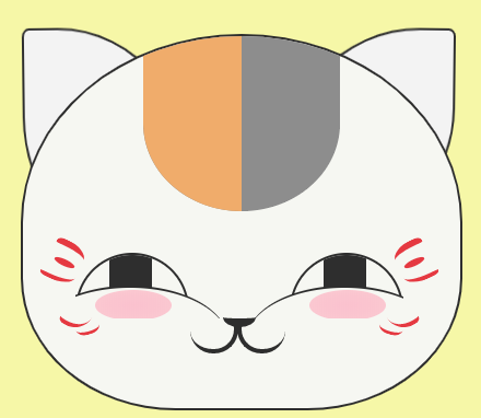
以下是 纯CSS3制作鼠标控制小猫笑脸动画 的示例演示效果:
部分效果截图:
HTML代码(index.html):
<!DOCTYPE html>
<html lang="en" xmlns="http://www.w3.org/1999/xhtml">
<head>
<meta charset="utf-8" />
<title></title>

<link type="text/css" href="maolaoshifu.css" rel="stylesheet"/>

</head>
<body>
<div class="mao_box">
	<div class="mao">
		<div class="mao_head">
			<div class="huawen">
				<div><!--头部花纹——左边橙色--></div>
			</div>
		</div>
		<div class="erduo">
			<div></div>
			<div></div>
		</div>
		<div class="yanjing">
			<div>
				<div class="yanquan">
					<div></div>
				</div>
				<div class="yanquan_hedding">

				</div>
				<div class="hong"></div>
			</div>
			<div class="yan_right">
				<div class="yanquan">
					<div></div>
				</div>
				<div class="yanquan_hedding">

				</div>
				<div class="hong"></div>
			</div>
			<div style="clear:both"></div>
		</div>
		<div class="face_huawen">
			<div class="face_huawen_huawen huawen_left">
				<div></div>
				<div></div>
				<div></div>
				<div></div>
				<div></div>

			</div>
			<div class="face_huawen_huawen huawen_right">
				<div></div>
				<div></div>
				<div></div>
				<div></div>
				<div></div>

			</div>
			<div style="clear:both"></div>
		</div>
		<div class="bizi">
			<div></div>
			<div></div>
			<div></div>
			<div></div>
		</div>
		<div class="zuiba_box">
			<div class="zuiba">
				<div></div>
				<div></div>
				<div></div>
			</div>
		</div>
	</div>
</div>
</body>
</html>
CSS代码(maolaoshifu.css):
body{margin:0px;background:#F6F7A7;}
.mao_box{position:relative;top:200px;/*width:424px;*/
}
.mao{margin:0 auto;width:400px;}
.mao_head{margin:0 auto;width:400px;height:340px;background:#F6F7F2;position:relative;border-radius:50% 50% 35% 35%;border:solid 2px #2e2e2e;overflow:hidden;z-index:10;}
.huawen{position:absolute;height:160px;width:180px;background:#8D8D8D;left:110px;border-radius:0% 0% 50% 50%;overflow:hidden;}
.huawen > div:first-child{height:160px;width:90px;background:#F0AC6B;}
/*耳朵*/
.erduo{width:374px;height:120px;position:absolute;top:-6px;left:50%;margin-left:-187px;border-radius:0% 0% 0% 0%;}
/*左耳*/
 .erduo > div:first-child{height:200px;width:160px;border:2px solid #2e2e2e;background:#f3f3f3;transform:rotate(-15deg);-ms-transform:rotate(-15deg);-moz-transform:rotate(-15deg);-webkit-transform:rotate(-15deg);-o-transform:rotate(-15deg);border-radius:4% 80% 0% 50%;position:absolute;left:-20px;top:0px;transition:transform 1s,left 1s;}
/*右耳*/
 .erduo > div:last-child{height:180px;width:160px;border:2px solid #2e2e2e;background:#f3f3f3;transform:rotate(15deg);-ms-transform:rotate(15deg);-moz-transform:rotate(15deg);-webkit-transform:rotate(15deg);-o-transform:rotate(15deg);border-radius:80% 4% 50% 0%;position:absolute;right:-20px;top:0px;transition:transform 1s,right 1s;}
/*鼠标浮动耳朵样式*/
/*左耳*/
.mao:hover .erduo > div:first-child{left:-10px;transform:rotate(0deg);-ms-transform:rotate(0deg);-moz-transform:rotate(0deg);-webkit-transform:rotate(0deg);-o-transform:rotate(0deg);border-radius:4% 80% 0% 60%;/*transition:all 1s;*/
 /*transition:transform 1s,left 1s;*/
}
.mao:hover .erduo > div:last-child{right:-10px;transform:rotate(0deg);-ms-transform:rotate(0deg);-moz-transform:rotate(0deg);-webkit-transform:rotate(0deg);-o-transform:rotate(0deg);border-radius:80% 4% 60% 0%;/*transition:transform 1s,right 1s;*/
}
/*眼睛*/
.yanjing{height:60px;width:300px;position:absolute;top:200px;z-index:20;left:50%;margin-left:-150px;overflow:hidden;}
/*左眼*/
.yanquan{height:100px;width:100px;border:2px solid #2e2e2e;border-radius:50% 50% 50% 50%;overflow:hidden;position:absolute;}
/*眼珠子 左*/
 .yanquan > div:first-child{height:100px;width:30px;background-color:#2e2e2e;margin-left:35px;transition:all 1s;/*transition-property:width;transition-duration:2s;*/
}
.mao:hover .yanquan > div:first-child{width:40px;margin-left:30px;/*transition:all 1s;*/
}
.yanquan_hedding{height:100px;width:180px;border-top:2px solid #2e2e2e;border-radius:50% 50% 50% 50%;background:#F6F7F2;margin-top:50px;margin-left:-40px;position:absolute;transition:margin-top 1s;}
.hong{position:absolute;height:28px;width:70px;background:red;top:34px;/*top:64px;*/
 left:18px;border-radius:50% 50% 50% 50%;background-image:-moz-radial-gradient( 50% 50%,rgba(253,214,240,0.8) 0%,rgba(253,224,244,0.8) 66%,rgba(253,234,247,0.8) 100%);background-image:-webkit-radial-gradient( 50% 50%,rgba(253,214,240,0.8) 0%,rgba(253,224,244,0.8) 66%,rgba(253,234,247,0.8) 100%);background-image:-ms-radial-gradient( 50% 50%,rgba(253,214,240,0.8) 0%,rgba(253,224,244,0.8) 66%,rgba(253,234,247,0.8) 100%);opacity:0.0;/*transition:opacity 0.5s ease-in 0.2s;*/
}
.yan_right{left:196px;top:0px;background:red;position:absolute;}
/*眼睛浮动属性*/
.mao:hover .yanquan_hedding{margin-top:30px;/*transition:margin-top 1s;*/
}
.mao:hover .hong{/*top:34px;*/
 opacity:0.8;transition:opacity 0.5s ease-in 0.2s;}
/*脸部花纹*/
/*左边花纹*/
.face_huawen{height:80px;width:380px;position:absolute;top:190px;z-index:20;left:50%;margin-left:-190px;}
.face_huawen_huawen > div:first-child{width:30px;height:10px;border-top:6px #E53941 solid;border-radius:30% 80% 20% 50%;transform:rotate(25deg);-ms-transform:rotate(25deg);-moz-transform:rotate(25deg);-webkit-transform:rotate(25deg);-o-transform:rotate(25deg);margin-left:20px;}
.face_huawen_huawen > div:nth-child(2){width:20px;height:6px;background-color:#E53941;border-radius:50% 50% 50% 50%;transform:rotate(25deg);-ms-transform:rotate(25deg);-moz-transform:rotate(25deg);-webkit-transform:rotate(25deg);-o-transform:rotate(25deg);margin-left:20px;}
.face_huawen_huawen > div:nth-child(3){/*margin-top:10px;*/
 width:32px;height:10px;border-bottom:4px #E53941 solid;border-radius:30% 0% 90% 30%;transform:rotate(25deg);-ms-transform:rotate(25deg);-moz-transform:rotate(25deg);-webkit-transform:rotate(25deg);-o-transform:rotate(25deg);margin-left:8px;}
.face_huawen_huawen > div:nth-child(4){margin-top:20px;width:26px;height:20px;border-bottom:4px #E53941 solid;border-radius:30% 0% 90% 30%;transform:rotate(30deg);-ms-transform:rotate(30deg);-moz-transform:rotate(30deg);-webkit-transform:rotate(30deg);-o-transform:rotate(30deg);margin-left:28px;}
.face_huawen_huawen > div:last-child{width:22px;height:10px;border-bottom:3px #E53941 solid;border-radius:0% 0% 50% 50%;transform:rotate(-15deg);-ms-transform:rotate(-15deg);-moz-transform:rotate(-15deg);-webkit-transform:rotate(-15deg);-o-transform:rotate(-15deg);margin-left:40px;margin-top:-8px;}
/*右边花纹*/
.huawen_right{float:right;transform:rotateY(180deg);-webkit-transform:rotateY(180deg);/* Safari 和 Chrome */
 -moz-transform:rotateY(180deg);/* Firefox */
 margin-top:-85px;}
/*鼻子*/
.bizi{width:30px;height:36px;position:absolute;left:50%;margin-left:-15px;top:260px;z-index:30;}
.bizi > div:first-child{width:30px;height:10px;border-bottom:8px solid #2e2e2e;border-radius:0% 0% 50% 50%;margin-top:-10px;}
.zuiba_box{width:200px;height:36px;position:absolute;overflow:hidden;left:50%;margin-left:-100px;top:260px;z-index:30;}
.zuiba{margin-left:85px;margin-top:6px;}
.zuiba > div:first-child{width:4px;height:8px;background:#2e2e2e;margin-left:13px;}
/*右半边嘴巴*/
 .zuiba > div:nth-child(2){width:50px;height:40px;border-bottom:4px solid #2e2e2e;border-left:4px solid #2e2e2e;border-radius:40% 0% 20% 50%;margin-left:13px;margin-top:-26px;position:absolute;transition:border-radius 1s;}
/*左半边嘴巴*/
 .zuiba > div:nth-child(3){width:50px;height:40px;border-bottom:4px solid #2e2e2e;border-right:4px solid #2e2e2e;border-radius:0% 40% 50% 20%;margin-left:-38px;margin-top:-26px;position:absolute;transition:border-radius 1s;}
.mao:hover .zuiba > div:nth-child(2){border-radius:50% 50% 50% 50%;width:40px;/*transition:border-radius 1s;*/
}
.mao:hover .zuiba > div:nth-child(3){width:40px;margin-left:-30px;border-radius:50% 50% 50% 50%;/*transition:border-radius 1s;*/
}
.ceshi{width:26px;height:26px;-webkit-border-radius:50% 50% 50% 0;-moz-border-radius:50% 50% 50% 0;-o-border-radius:50% 50% 50% 0;border-radius:50% 50% 50% 0;-webkit-transform:rotate(-45deg);-moz-transform:rotate(-45deg);-ms-transform:rotate(-45deg);-o-transform:rotate(-45deg);transform:rotate(-45deg);margin:1px 4px 7px;border:2px solid;}


 分享到QQ
分享到QQ 分享到微博
分享到微博 微信扫一扫
微信扫一扫