以下是 四组欢乐CSS3加载动画 的示例演示效果:
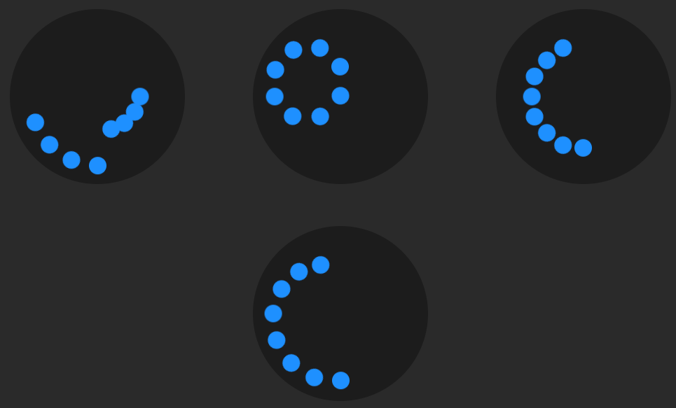
部分效果截图1:

部分效果截图2:
HTML代码(index.html):
<!DOCTYPE html>
<html>
<head>
  <meta charset="UTF-8">
  <title>四组欢乐CSS3加载动画 </title>
<style>
@keyframes move {
  from { transform: translate(0,50%); }
  to { transform: translate(0,850%); }
}

* {
  margin: 0;
  padding: 0;
}

body {
  min-width: 325px;
  height: 100vh;
  display: flex;
  flex-wrap: wrap;
  justify-content: space-around;
  align-items: center;
  align-content: flex-start;
  background: #2a2a2a;
}

figure {
  margin: 30px;
  width: 250px;
  height: 250px;
  border-radius: 50%;
  position: relative;
  background: #1c1c1c;
}

section {
  width: 10%;
  height: 100%;
  position: absolute;
  left: 45%;
}

section:nth-child(2) { transform: rotate(22.5deg);  }
section:nth-child(3) { transform: rotate(45deg);    }
section:nth-child(4) { transform: rotate(67.5deg);  }
section:nth-child(5) { transform: rotate(90deg);    }
section:nth-child(6) { transform: rotate(112.5deg); }
section:nth-child(7) { transform: rotate(135deg);   }
section:nth-child(8) { transform: rotate(157.5deg); }

figure div {
  height: 10%;
  border-radius: 50%;
  background: dodgerblue;
  animation: move 1s ease-in-out infinite alternate;
}

figure:nth-child(1) > section:nth-child(1) > div { animation-delay: -0.1875s; }
figure:nth-child(1) > section:nth-child(2) > div { animation-delay: -0.175s;  }
figure:nth-child(1) > section:nth-child(3) > div { animation-delay: -0.1625s; }
figure:nth-child(1) > section:nth-child(4) > div { animation-delay: -0.15s;   }
figure:nth-child(1) > section:nth-child(5) > div { animation-delay: -0.9375s; }
figure:nth-child(1) > section:nth-child(6) > div { animation-delay: -0.925s;  }
figure:nth-child(1) > section:nth-child(7) > div { animation-delay: -0.9125s; }
figure:nth-child(1) > section:nth-child(8) > div { animation-delay: -0.9s;    }

figure:nth-child(2) > section:nth-child(1) > div { animation-delay: -0.875s;  }
figure:nth-child(2) > section:nth-child(2) > div { animation-delay: -0.75s;   }
figure:nth-child(2) > section:nth-child(3) > div { animation-delay: -0.625s;  }
figure:nth-child(2) > section:nth-child(4) > div { animation-delay: -0.5s;    }
figure:nth-child(2) > section:nth-child(5) > div { animation-delay: -0.375s;  }
figure:nth-child(2) > section:nth-child(6) > div { animation-delay: -0.25s;   }
figure:nth-child(2) > section:nth-child(7) > div { animation-delay: -0.125s;  }

figure:nth-child(3) > section:nth-child(1) > div { animation-delay: -0.5s;    }
figure:nth-child(3) > section:nth-child(3) > div { animation-delay: -0.5s;    }
figure:nth-child(3) > section:nth-child(5) > div { animation-delay: -0.5s;    }
figure:nth-child(3) > section:nth-child(7) > div { animation-delay: -0.5s;    }

figure:nth-child(4) > section:nth-child(1) > div { animation-delay: -0.35s;   }
figure:nth-child(4) > section:nth-child(2) > div { animation-delay: -0.3s;    }
figure:nth-child(4) > section:nth-child(3) > div { animation-delay: -0.25s;   }
figure:nth-child(4) > section:nth-child(4) > div { animation-delay: -0.2s;    }
figure:nth-child(4) > section:nth-child(5) > div { animation-delay: -0.15s;   }
figure:nth-child(4) > section:nth-child(6) > div { animation-delay: -0.1s;    }
figure:nth-child(4) > section:nth-child(7) > div { animation-delay: -0.05s;   }
</style>

    <script src="js/prefixfree.min.js"></script>

</head>

<body>

  <figure>
  <section><div></div></section>
  <section><div></div></section>
  <section><div></div></section>
  <section><div></div></section>
  <section><div></div></section>
  <section><div></div></section>
  <section><div></div></section>
  <section><div></div></section>
</figure>

<figure>
  <section><div></div></section>
  <section><div></div></section>
  <section><div></div></section>
  <section><div></div></section>
  <section><div></div></section>
  <section><div></div></section>
  <section><div></div></section>
  <section><div></div></section>
</figure>

<figure>
  <section><div></div></section>
  <section><div></div></section>
  <section><div></div></section>
  <section><div></div></section>
  <section><div></div></section>
  <section><div></div></section>
  <section><div></div></section>
  <section><div></div></section>
</figure>

<figure>
  <section><div></div></section>
  <section><div></div></section>
  <section><div></div></section>
  <section><div></div></section>
  <section><div></div></section>
  <section><div></div></section>
  <section><div></div></section>
  <section><div></div></section>
</figure>
</body>
</html>
CSS代码(style.css):
@keyframes move{from{transform:translate(0,50%);}
to{transform:translate(0,850%);}
}
*{margin:0;padding:0;}
body{min-width:325px;height:100vh;display:flex;flex-wrap:wrap;justify-content:space-around;align-items:center;align-content:flex-start;background:#2a2a2a;}
figure{margin:30px;width:250px;height:250px;border-radius:50%;position:relative;background:#1c1c1c;}
section{width:10%;height:100%;position:absolute;left:45%;}
section:nth-child(2){transform:rotate(22.5deg);}
section:nth-child(3){transform:rotate(45deg);}
section:nth-child(4){transform:rotate(67.5deg);}
section:nth-child(5){transform:rotate(90deg);}
section:nth-child(6){transform:rotate(112.5deg);}
section:nth-child(7){transform:rotate(135deg);}
section:nth-child(8){transform:rotate(157.5deg);}
div{height:10%;border-radius:50%;background:dodgerblue;animation:move 1s ease-in-out infinite alternate;}
figure:nth-child(1) > section:nth-child(1) > div{animation-delay:-0.1875s;}
figure:nth-child(1) > section:nth-child(2) > div{animation-delay:-0.175s;}
figure:nth-child(1) > section:nth-child(3) > div{animation-delay:-0.1625s;}
figure:nth-child(1) > section:nth-child(4) > div{animation-delay:-0.15s;}
figure:nth-child(1) > section:nth-child(5) > div{animation-delay:-0.9375s;}
figure:nth-child(1) > section:nth-child(6) > div{animation-delay:-0.925s;}
figure:nth-child(1) > section:nth-child(7) > div{animation-delay:-0.9125s;}
figure:nth-child(1) > section:nth-child(8) > div{animation-delay:-0.9s;}
figure:nth-child(2) > section:nth-child(1) > div{animation-delay:-0.875s;}
figure:nth-child(2) > section:nth-child(2) > div{animation-delay:-0.75s;}
figure:nth-child(2) > section:nth-child(3) > div{animation-delay:-0.625s;}
figure:nth-child(2) > section:nth-child(4) > div{animation-delay:-0.5s;}
figure:nth-child(2) > section:nth-child(5) > div{animation-delay:-0.375s;}
figure:nth-child(2) > section:nth-child(6) > div{animation-delay:-0.25s;}
figure:nth-child(2) > section:nth-child(7) > div{animation-delay:-0.125s;}
figure:nth-child(3) > section:nth-child(1) > div{animation-delay:-0.5s;}
figure:nth-child(3) > section:nth-child(3) > div{animation-delay:-0.5s;}
figure:nth-child(3) > section:nth-child(5) > div{animation-delay:-0.5s;}
figure:nth-child(3) > section:nth-child(7) > div{animation-delay:-0.5s;}
figure:nth-child(4) > section:nth-child(1) > div{animation-delay:-0.35s;}
figure:nth-child(4) > section:nth-child(2) > div{animation-delay:-0.3s;}
figure:nth-child(4) > section:nth-child(3) > div{animation-delay:-0.25s;}
figure:nth-child(4) > section:nth-child(4) > div{animation-delay:-0.2s;}
figure:nth-child(4) > section:nth-child(5) > div{animation-delay:-0.15s;}
figure:nth-child(4) > section:nth-child(6) > div{animation-delay:-0.1s;}
figure:nth-child(4) > section:nth-child(7) > div{animation-delay:-0.05s;}


 分享到QQ
分享到QQ 分享到微博
分享到微博 微信扫一扫
微信扫一扫