以下是 仿Prezi幻灯片文字3D旋转特效 的示例演示效果:
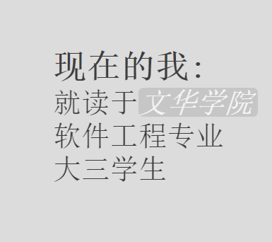
部分效果截图:
HTML代码(index.html):
<html>
<head>
<meta http-equiv="Content-Type" content="text/html; charset=gb2312" />
<title>��Prezi�õ�Ƭ����3D��ת��Ч</title>
<script type="text/javascript" src="js/jquery-1.9.1.js"></script>
<script type="text/javascript" src="js/jquery.simple-text-rotator.js"></script>
<script src="js/jquery-1.3.2.min.js"></script>
<script src="js/jquery.easing.1.3.js"></script>
<script src="js/jQueryRotate.js"></script>
<link rel="stylesheet" type="text/css" href="css/simpletextrotator.css">
<style type="text/css">
body {
margin: 0px;
padding: 0px;
overflow: scroll;
overflow-x: hidden;
overflow: scroll;
overflow-y: hidden;
background-color: #DCDCDC;
}
#bg {
width: 2000px;
height: 1000px;
position: absolute;
top: -210px;
left: -340px;
background-color: #DCDCDC;
}
.cons {
position: absolute;
font-family: '����';
cursor: pointer;
}
#con1 {
top: 460px;
left: 850px;
text-align: center;
font-size: 1px;
font-weight: normal;
opacity: 0.1;
}
#con1 span {
font-family: '������';
}
#con2 {
top: 460px;
left: 1100px;
font-size: 1px;
opacity: 0.1;
}
#con2 a {
text-decoration: none;
background-color: #BEBEBE;
border-radius: 7px;
font-style: italic;
padding-right: 7px;
color: white;
}
#con2 a:hover {
background-color: white;
color: gray;
}
#con3 {
top: 600px;
left: 1200px;
font-size: 2px;
opacity: 0.3;
-webkit-transform: rotate(90deg); /*Safari 4+,Google Chrome 1+ */
-moz-transform: rotate(90deg); /*Firefox 3.5+*/
filter: progid:DXImageTransform.Microsoft.BasicImage(rotation=2); /*ie*/
}
#con4 {
top: 600px;
left: 1230px;
font-size: 10px;
opacity: 0.4;
-webkit-transform: rotate(90deg); /*Safari 4+,Google Chrome 1+ */
-moz-transform: rotate(90deg); /*Firefox 3.5+*/
filter: progid:DXImageTransform.Microsoft.BasicImage(rotation=2); /*ie*/
}
#con5 {
top: 600px;
left: 1260px;
font-size: 15px;
opacity: 0.5;
-webkit-transform: rotate(90deg); /*Safari 4+,Google Chrome 1+ */
-moz-transform: rotate(90deg); /*Firefox 3.5+*/
filter: progid:DXImageTransform.Microsoft.BasicImage(rotation=1); /*ie*/
}
#con6 {
top: 600px;
left: 900px;
font-size: 15px;
opacity: 0.2;
-webkit-transform: rotate(315deg); /*Safari 4+,Google Chrome 1+ */
-moz-transform: rotate(315deg); /*Firefox 3.5+*/
filter: progid:DXImageTransform.Microsoft.BasicImage(rotation=2); /*ie*/
}
#con7 {
top: 600px;
left: 900px;
font-size: 1px;
opacity: 0.1;
-webkit-transform: rotate(225deg); /*Safari 4+,Google Chrome 1+ */
-moz-transform: rotate(225deg); /*Firefox 3.5+*/
filter: progid:DXImageTransform.Microsoft.BasicImage(rotation=2); /*ie*/
}
#con8 {
top: 370px;
left: 670px;
font-size: 2px;
opacity: 0.2;
-webkit-transform: rotate(225deg); /*Safari 4+,Google Chrome 1+ */
-moz-transform: rotate(225deg); /*Firefox 3.5+*/
filter: progid:DXImageTransform.Microsoft.BasicImage(rotation=2); /*ie*/
}
#con9 {
top: 320px;
left: 1070px;
font-size: 10px;
opacity: 0.3;
-webkit-transform: rotate(180deg); /*Safari 4+,Google Chrome 1+ */
-moz-transform: rotate(180deg); /*Firefox 3.5+*/
filter: progid:DXImageTransform.Microsoft.BasicImage(rotation=2); /*ie*/
}
#con10 {
top: 600px;
left: 580px;
font-size: 15px;
opacity: 0.3;
-webkit-transform: rotate(180deg); /*Safari 4+,Google Chrome 1+ */
-moz-transform: rotate(180deg); /*Firefox 3.5+*/
filter: progid:DXImageTransform.Microsoft.BasicImage(rotation=2); /*ie*/
}
#con11 {
top: 440px;
left: 580px;
font-size: 20px;
opacity: 0.3;
}
.before_image {
width: 80px;
}
.after_image {
width: 200px;
}
#con11 a {
background-color: #E8E8E8;
text-decoration: none;
border-radius: 7px;
font-style: italic;
padding-right: 6px;
color: blue;
}
#con11 a:hover {
background-color: white;
}
.name_span {
font-family: Tahoma;
font-weight: bold;
}
#address {
font-weight: bold;
}
#tip {
position: fixed;
top: 280px;
left: 0px;
width: 1322px;
height: 80px;
background-color: #6F6F6F;
opacity: 0.2;
text-align: center;
}
#tip span {
display: block;
padding-top: 12px;
font-size: 50px;
color: white;
}
#con10_span1 {
font-family: '���ź�';
}
#con10_span2 {
font-family: '���ź�';
}
#con10_span3 {
font-family: '����';
}
#double_span {
display: none;
position: absolute;
width: 120px;
height: 50px;
top: 0px;
left: 100px;
}
#qq_span {
background-color: #BEBEBE;
font-style: italic;
padding-right: 7px;
border-radius: 8px;
color: white;
}
#qq_span:hover {
background-color: white;
color: gray;
}
#web_span {
font-family: '���ź�';
}
#age_span {
color: gray;
}
.rotate {
-webkit-transition: opacity 2s ease,-webkit-transform 2s ease;
// ����ִ�е�ʱ�� -moz-transition: opacity 2s ease,-webkit-transform 2s ease;
-ms-transition: opacity 2s ease,-webkit-transform 2s ease;
-o-transition: opacity 2s ease,-webkit-transform 2s ease;
transition: opacity 2s ease,-webkit-transform 2s ease;
-webkit-transform: rotate(270deg);
// div��ת�ĽǶ� -moz-transform: rotate(270deg);
-ms-transform: rotate(270deg);
-o-transform: rotate(270deg);
transform: rotate(270deg);
}
.rotate2 {
-webkit-transition: opacity 2s ease,-webkit-transform 2s ease;
// ����ִ�е�ʱ�� -moz-transition: opacity 2s ease,-webkit-transform 2s ease;
-ms-transition: opacity 2s ease,-webkit-transform 2s ease;
-o-transition: opacity 2s ease,-webkit-transform 2s ease;
transition: opacity 2s ease,-webkit-transform 2s ease;
-webkit-transform: rotate(405deg);
// div��ת�ĽǶ� -moz-transform: rotate(405deg);
-ms-transform: rotate(405deg);
-o-transform: rotate(405deg);
transform: rotate(405deg);
}
.rotate3 {
-webkit-transition: opacity 2s ease,-webkit-transform 2s ease;
// ����ִ�е�ʱ�� -moz-transition: opacity 2s ease,-webkit-transform 2s ease;
-ms-transition: opacity 2s ease,-webkit-transform 2s ease;
-o-transition: opacity 2s ease,-webkit-transform 2s ease;
transition: opacity 2s ease,-webkit-transform 2s ease;
-webkit-transform: rotate(495deg);
// div��ת�ĽǶ� -moz-transform: rotate(495deg);
-ms-transform: rotate(495deg);
-o-transform: rotate(495deg);
transform: rotate(495deg);
}
.rotate4 {
-webkit-transition: opacity 2s ease,-webkit-transform 2s ease;
// ����ִ�е�ʱ�� -moz-transition: opacity 2s ease,-webkit-transform 2s ease;
-ms-transition: opacity 2s ease,-webkit-transform 2s ease;
-o-transition: opacity 2s ease,-webkit-transform 2s ease;
transition: opacity 2s ease,-webkit-transform 2s ease;
-webkit-transform: rotate(540deg);
// div��ת�ĽǶ� -moz-transform: rotate(540deg);
-ms-transform: rotate(540deg);
-o-transform: rotate(540deg);
transform: rotate(540deg);
}
.rotate5 {
-webkit-transition: opacity 2s ease,-webkit-transform 2s ease;
// ����ִ�е�ʱ�� -moz-transition: opacity 2s ease,-webkit-transform 2s ease;
-ms-transition: opacity 2s ease,-webkit-transform 2s ease;
-o-transition: opacity 2s ease,-webkit-transform 2s ease;
transition: opacity 2s ease,-webkit-transform 2s ease;
-webkit-transform: rotate(720deg);
// div��ת�ĽǶ� -moz-transform: rotate(720deg);
-ms-transform: rotate(720deg);
-o-transform: rotate(720deg);
transform: rotate(720deg);
}
</style>
<script type="text/javascript">
var times = 800; //����ִ�е�ʱ��
var n = 0;
var temp = 1;
function bg_click() {
if (temp == 1) {
temp = 0;
n++;
switch (n) {
case 1: {
$('#tip').animate({ opacity: '0.0' }, 400, function () {
$('#con1').animate({ top: '-=20', left: '-=140', opacity: '1.0', fontSize: '50px' }, times);
$('#con2').animate({ top: '-=20', left: '+=1200', opacity: '0.1', fontSize: '50px' }, times);
$('#con3').animate({ top: '+=600', left: '+=580', opacity: '0.1', fontSize: '80px' }, times);
$('#con4').animate({ top: '+=600', left: '+=610', opacity: '0.1', fontSize: '80px' }, times);
$('.double_span_class').animate({ fontSize: '80px' }, times);
$('#con5').animate({ top: '+=600', left: '+=640', opacity: '0.1', fontSize: '80px' }, times);
$('#con6').animate({ top: '+=700', left: '+=300', opacity: '0.1', fontSize: '80px' }, times);
$('#con7').animate({ top: '+=700', left: '+=300', opacity: '0.1', fontSize: '80px' }, times);
$('#con8').animate({ top: '-=450', left: '-=780', opacity: '0.1', fontSize: '70px' }, times);
$('#con10').animate({ top: '+=400', left: '-=800', opacity: '0.1', fontSize: '70px' }, times);
$('#con11').animate({ top: '+=100', left: '-=740', opacity: '0.1', fontSize: '65px' }, times);
$('#con9').animate({ top: '110px', left: '+=640', opacity: '0.1', fontSize: '60px' }, times, function () {
temp = 1;
});
});
break;
}
case 2: {
$('#con1').animate({ left: '-=1500', opacity: '0.1', fontSize: '50px' }, times);
$('#con2').animate({ left: '-=1500', opacity: '1.0', fontSize: '50px' }, times);
$('#con3').animate({ left: '-=1500', opacity: '0.1', fontSize: '80px' }, times);
$('#con4').animate({ left: '-=1500', opacity: '0.1', fontSize: '80px' }, times);
$('.double_span_class').animate({ fontSize: '80px' }, times);
$('#con5').animate({ left: '-=1500', opacity: '0.1', fontSize: '80px' }, times);
$('#con6').animate({ left: '-=1500', opacity: '0.1', fontSize: '80px' }, times);
$('#con7').animate({ left: '-=1500', opacity: '0.1', fontSize: '80px' }, times);
$('#con10').animate({ left: '-=1500', opacity: '0.1', fontSize: '70px' }, times);
$('#con11').animate({ left: '-=1500', opacity: '0.1', fontSize: '70px' }, times);
$('#con8').animate({ left: '-=1500', opacity: '0.1', fontSize: '70px' }, times);
$('#con9').animate({ left: '-=1080', opacity: '0.02', fontSize: '60px' }, times, function () {
$('#me_top').css({ fontWeight: 'bold' });
$('#me_top').animate({ fontSize: '55px' }, times - 200);
$('#me_one').animate({ top: '+=200', fontSize: '45px' }, times - 200);
$('#me_two').animate({ top: '+=200', fontSize: '45px' }, times - 200);
$('#me_three').animate({ top: '+=200', fontSize: '45px' }, times - 200, function () {
temp = 1;
});
});
break;
}
case 3: {
$('#con1').animate({ left: '-=0', opacity: '0.1', fontSize: '30px' }, times);
$('#con2').animate({ left: '-=0', opacity: '0.1' }, times);
$("#me_top").animate({ fontSize: '30px' }, times);
$("#me_one").animate({ fontSize: '30px' }, times);
$("#me_two").animate({ fontSize: '30px' }, times);
$("#me_three").animate({ fontSize: '30px' }, times);
$('#con3').animate({ left: '1100px', top: '800px', opacity: '1.0', fontSize: '50px' }, times);
$('#con4').animate({ left: '1150px', top: '800px', opacity: '0.03', fontSize: '75px' }, times);
$('.double_span_class').animate({ fontSize: '105px' }, times);
$('#con5').animate({ left: '1220px', top: '800px', opacity: '0.03', fontSize: '105px' }, times);
$('#con6').animate({ left: '500px', top: '780px', opacity: '0.2', fontSize: '30px' }, times);
$('#con7').animate({ left: '500px', top: '850px', opacity: '0.1', fontSize: '10px' }, times);
$('#con10').animate({ left: '-200px', top: '760px', opacity: '0.1', fontSize: '30px' }, times);
$('#con11').animate({ left: '-400px', top: '950px', opacity: '0.1', fontSize: '30px' }, times);
$('#con8').animate({ left: '0px', top: '200px', opacity: '0.1', fontSize: '30px' }, times);
$('#con9').animate({ left: '+=120', top: '+=80', opacity: '0.1', fontSize: '50px' }, times, function () {
$("#bg").addClass('rotate');
$('#con9').animate({ top: '-=200', left: '-=200' }, times);
$('#bg').animate({ left: "-730px", top: '40px' }, times - 100, function () {
temp = 1;
});
});
break;
}
case 4: {
$('#con1').animate({ left: '-=0', opacity: '0.1', fontSize: '20px' }, times);
$("#me_top").animate({ fontSize: '15px' }, times);
$("#me_one").animate({ fontSize: '15px' }, times);
$("#me_two").animate({ fontSize: '15px' }, times);
$("#me_three").animate({ fontSize: '15px' }, times);
$('#con3').animate({ left: '-=70', top: '+=0', opacity: '0.2', fontSize: '20px' }, times);
$('#con4').animate({ left: '-=70', top: '+=0', opacity: '1.0', fontSize: '50px' }, times);
$('.double_span_class').animate({ fontSize: '90px' }, times);
$('#con5').animate({ left: '-=70', top: '+=0', opacity: '0.05', fontSize: '90px' }, times, function () {
temp = 1;
});
break;
}
case 5: {
$('#con1').animate({ left: '-=0', opacity: '0.1', fontSize: '20px' }, times);
$('#con3').animate({ left: '-=70', top: '+=0', opacity: '0.1', fontSize: '3px' }, times);
$('#con4').animate({ left: '-=70', top: '+=0', opacity: '0.2', fontSize: '20px' }, times);
$('.double_span_class').animate({ fontSize: '50px' }, times);
$('#con5').animate({ left: '-=70', top: '+=0', opacity: '1.0', fontSize: '50px' }, times, function () {
$('#double_span1').html(' ');
$('#double_span').css({ display: 'block' });
$('#double_span').animate({ left: '+=120' }, 1000, function () {
temp = 1;
});
});
break;
}
case 6: {
$('#double_span').css({ display: 'none' });
$('#double_span1').html('����');
$('#con1').animate({ left: '-=0', opacity: '0.1', fontSize: '10px' }, times);
$('#con3').animate({ left: '-=0', top: '+=0', opacity: '0.05', fontSize: '1px' }, times);
$('#con4').animate({ left: '-=0', top: '+=0', opacity: '0.1', fontSize: '8px' }, times);
$('.double_span_class').animate({ fontSize: '20px' }, times);
$('#con5').animate({ left: '-=0', top: '+=0', opacity: '0.3', fontSize: '20px' }, times, function () {
$("#bg").addClass('rotate2');
$('#con1').animate({ left: '800px', top: '-290px', opacity: '0.1', fontSize: '20px' }, times);
$('#con2').animate({ left: '+=740', top: '-=970', opacity: '0.1', fontSize: '20px' }, times);
$("#me_top").animate({ fontSize: '40px' }, times);
$("#me_one").animate({ fontSize: '40px' }, times);
$("#me_two").animate({ fontSize: '40px' }, times);
$("#me_three").animate({ fontSize: '40px' }, times);
$('#con6').animate({ left: '+=350px', top: '-=800px', opacity: '1.0', fontSize: '45px' }, times);
$('#con7').animate({ left: '+=500px', top: '-=820px', opacity: '0.1', fontSize: '20px' }, times);
$('#con10').animate({ left: '+=220px', top: '-=780px', opacity: '0.05', fontSize: '40px' }, times);
$('#con11').animate({ left: '+=220px', top: '-=780px', opacity: '0.1', fontSize: '40px' }, times);
$('#con9').animate({ left: '1600px', top: '-600px', opacity: '0.1', fontSize: '20px' }, times, function () {
temp = 1;
});
});
break;
}
case 7: {
$('#con1').animate({ left: '-=500', top: '-=600', opacity: '0.1', fontSize: '80px' }, times);
$('#con2').animate({ left: '+=300', opacity: '0.1', fontSize: '80px' }, times);
$('#con3').animate({ left: '1700px', top: '300px', opacity: '0.1', fontSize: '20px' }, times);
$('#con4').animate({ left: '1700px', top: '300px', opacity: '0.1', fontSize: '45px' }, times);
$('.double_span_class').animate({ fontSize: '70px' }, times);
$('#con5').animate({ left: '1700px', top: '300px', opacity: '0.1', fontSize: '70px' }, times);
$('#con6').animate({ left: '-=160', top: '+=170', opacity: '0.03', fontSize: '70px' }, times);
$('#con7').animate({ left: '-=200', top: '+=100', opacity: '1.0', fontSize: '43px' }, times);
$('#con8').animate({ left: '300px', top: '-700px', opacity: '0.1', fontSize: '70px' }, times);
$('#con10').animate({ left: '-=340', top: '+=90', opacity: '0.1', fontSize: '50px' }, times);
$('#con11').animate({ left: '-=150', top: '-=600', opacity: '0.1', fontSize: '50px' }, times);
$('#con9').animate({ left: '1700px', top: '-900px', opacity: '0.1', fontSize: '70px' }, times, function () {
$("#bg").addClass('rotate3');
$('#bg').animate({ top: '-=600', left: '+=220' }, times - 300);
$('#con1').animate({ top: '-590px', left: '-140px' }, times - 300);
$('#con8').animate({ top: '-960px', left: '-860px' }, times - 300, function () { //1190 1100
$('#php_web').animate({ fontSize: '60px' }, 3000, function () {
$('#php_web').css({ fontStyle: 'italic', color: 'gray' });
temp = 1;
});
});
});
break;
}
case 8: {
$('#bg').animate({ top: '+=500', left: '-=1900' }, times);
$('#con9').animate({ top: '-=100', left: '-=300', opacity: '0.1', fontSize: '15px' }, times);
$('#con2').animate({ top: '+=350', left: '-=300', opacity: '0.1', fontSize: '20px' }, times);
$('#con6').animate({ top: '+=160', left: '-=200', opacity: '0.1', fontSize: '20px' }, times);
$('#con7').animate({ opacity: '0.1' }, times);
$('#con1').animate({ top: '+=240', left: '+=600', fontSize: '15px' }, times);
$('#con8').animate({ fontSize: '45px', opacity: '1.0' }, times, function () {
$('#title_span').css({ color: 'black', fontStyle: 'bold', fontFamily: '���ź�' });
$('#basket').css({ color: 'red', fontStyle: 'italic' });
$('#roll').css({ color: 'blue', fontStyle: 'italic' });
$('#sing').css({ color: 'yellow', fontStyle: 'italic' });
$('#movie').css({ color: 'orange', fontStyle: 'italic' });
$('#like_span').css({ color: 'black', fontStyle: 'bold', fontFamily: '����' });
temp = 1;
});
break;
}
case 9: {
$("#bg").addClass('rotate4');
$('#con8').animate({ top: '+=300', left: '+=785', fontSize: '28px', opacity: '0.04' }, times);
$('#con6').animate({ top: '-=200', left: '+=550' }, times);
$('#bg').animate({ top: '-=1530', left: '+=1400' }, times - 300, function () {
$('#bg').animate({ top: '-=50', left: '+=1300' }, times - 400);
$('#con9').animate({ opacity: '1.0', fontSize: '45px' }, times, function () {
temp = 1;
});
});
break;
}
case 10: {
$('#bg').animate({ top: '+=1000', left: '-=1450' }, times);
$('#con10').animate({ opacity: '1.0', fontSize: '45px' }, times, function () {
temp = 1;
});
break;
}
case 11: {
$('#thank_img').addClass('after_image');
$('#con10').css({ opacity: '0.05' });
$('#con11').animate({ opacity: '1.0' }, times);
$("#bg").addClass('rotate5');
$('#bg').animate({ top: '+=1200', left: '+=1900' }, times);
break;
}
default: {
break;
}
}
}
}
</script>
</head>
<body scroll="no" style="overflow-x:hidden;" onclick="bg_click()">
<div id="bg">
<div id="tip"><span>�����ҳ ����ҵļ��</span></div>
<div id="con1" class="cons"><span>Hello World!!!</span><br /><span>Welcome to </span><span class="name_span">����</span><span>'s OwnWeb</span></div>
<div id="con2" class="cons"><span id="me_top">���ڵ���:</span><br /><span id="me_one">�Ͷ���<a href="http://www.hustwenhua.net/">�Ļ�ѧԺ</a></span><br /><span id="me_two">�������רҵ</span><br /><span id="me_three">����ѧ�� </span></div>
<div id="con3" class="cons">����<span id="age_span">22</span>�����</div>
<div id="con4" class="cons"><span>������һ����</span></div>
<div id="con5" class="cons"><span class="double_span_class">ʵ�ڲ��� </span><span id="double_span1" class="double_span_class">����</span> <span id="double_span" class="double_span_class">����</span></div>
<div id="con6" class="cons"><span>���ں���ʡ������ </span><span id="address">�����</span>:)</div>
<div id="con7" class="cons"><span>����Ҫѧϰ���о�</span><span id="php_web"> PHP Web </span><span>����</span></div>
<div id="con8" class="cons"><span id="title_span">ҵ��ʱ��</span><br /><span id="basket">���� </span><span id="roll">�ֻ� </span><span id="sing">���� </span><span id="movie">����Ӱ</span><br /><span id="like_span">�����ҵ��</span></div>
<div id="con9" class="cons">�����Ҳ��<span id="web_span">Web����Գ</span><br /><span>���Լ��� </span><span id="qq_span">QQ:123456</span><br /><span>�ڴ������ļ�������</span></div>
<div id="con10" class="cons"><span id="con10_span1">���ڵ�Ŭ�� </span><span id="con10_span2">ֻΪ�˽������Ҹ� </span><span id="con10_span3">Ը���һ��Ŭ��</span></div>
</div>
</body>
</html>
CSS代码(simpletextrotator.css):
.rotating{display:inline-block;-webkit-transform-style:preserve-3d;-moz-transform-style:preserve-3d;-ms-transform-style:preserve-3d;-o-transform-style:preserve-3d;transform-style:preserve-3d;-webkit-transform:rotateX(0) rotateY(0) rotateZ(0);-moz-transform:rotateX(0) rotateY(0) rotateZ(0);-ms-transform:rotateX(0) rotateY(0) rotateZ(0);-o-transform:rotateX(0) rotateY(0) rotateZ(0);transform:rotateX(0) rotateY(0) rotateZ(0);-webkit-transition:2.2s;/*修改源码 0.5 -> 1.2 */
 -moz-transition:2.2s;-ms-transition:2.2s;-o-transition:2.2s;transition:2.2s;-webkit-transform-origin-x:50%;}
.rotating.flip{position:relative;}
.rotating .front,.rotating .back{left:0;top:0;-webkit-backface-visibility:hidden;-moz-backface-visibility:hidden;-ms-backface-visibility:hidden;-o-backface-visibility:hidden;backface-visibility:hidden;}
.rotating .front{position:absolute;display:inline-block;-webkit-transform:translate3d(0,0,1px);-moz-transform:translate3d(0,0,1px);-ms-transform:translate3d(0,0,1px);-o-transform:translate3d(0,0,1px);transform:translate3d(0,0,1px);}
.rotating.flip .front{z-index:1;}
.rotating .back{display:block;opacity:0;}
.rotating.spin{/*修改源码 360 -> 180 0->1 */
 -webkit-transform:rotate(180deg) scale(1);-moz-transform:rotate(180deg) scale(1);-ms-transform:rotate(180deg) scale(1);-o-transform:rotate(180deg) scale(1);transform:rotate(180deg) scale(1);}
.rotating.flip .back{z-index:2;display:block;opacity:1;-webkit-transform:rotateY(180deg) translate3d(0,0,0);-moz-transform:rotateY(180deg) translate3d(0,0,0);-ms-transform:rotateY(180deg) translate3d(0,0,0);-o-transform:rotateY(180deg) translate3d(0,0,0);transform:rotateY(180deg) translate3d(0,0,0);}
.rotating.flip.up .back{-webkit-transform:rotateX(180deg) translate3d(0,0,0);-moz-transform:rotateX(180deg) translate3d(0,0,0);-ms-transform:rotateX(180deg) translate3d(0,0,0);-o-transform:rotateX(180deg) translate3d(0,0,0);transform:rotateX(180deg) translate3d(0,0,0);}
.rotating.flip.cube .front{-webkit-transform:translate3d(0,0,100px) scale(0.9,0.9);-moz-transform:translate3d(0,0,100px) scale(0.85,0.85);-ms-transform:translate3d(0,0,100px) scale(0.85,0.85);-o-transform:translate3d(0,0,100px) scale(0.85,0.85);transform:translate3d(0,0,100px) scale(0.85,0.85);}
.rotating.flip.cube .back{-webkit-transform:rotateY(180deg) translate3d(0,0,100px) scale(0.9,0.9);-moz-transform:rotateY(180deg) translate3d(0,0,100px) scale(0.85,0.85);-ms-transform:rotateY(180deg) translate3d(0,0,100px) scale(0.85,0.85);-o-transform:rotateY(180deg) translate3d(0,0,100px) scale(0.85,0.85);transform:rotateY(180deg) translate3d(0,0,100px) scale(0.85,0.85);}
.rotating.flip.cube.up .back{-webkit-transform:rotateX(180deg) translate3d(0,0,100px) scale(0.9,0.9);-moz-transform:rotateX(180deg) translate3d(0,0,100px) scale(0.85,0.85);-ms-transform:rotateX(180deg) translate3d(0,0,100px) scale(0.85,0.85);-o-transform:rotateX(180deg) translate3d(0,0,100px) scale(0.85,0.85);transform:rotateX(180deg) translate3d(0,0,100px) scale(0.85,0.85);}


 分享到QQ
分享到QQ 分享到微博
分享到微博 微信扫一扫
微信扫一扫