以下是 三维动态滑块jquery特效 的示例演示效果:
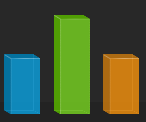
部分效果截图1:
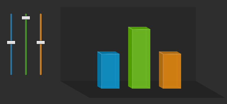
部分效果截图2:
HTML代码(index.html):
<!DOCTYPE html PUBLIC "-//W3C//DTD XHTML 1.0 Strict//EN" "http://www.w3.org/TR/xhtml1/DTD/xhtml1-strict.dtd">
<html xmlns="http://www.w3.org/1999/xhtml">
<head>
<meta http-equiv="Content-Type" content="text/html; charset=utf-8" />
<title>Sc.Chinaz.Com</title>

<link rel="stylesheet" type="text/css" href="styles.css" />

<script type="text/javascript" src="jquery-1.7.2.min.js"></script>
<script type="text/javascript" src="jquery-ui.min.js"></script>
<script type="text/javascript" src="sliders.js"></script>
</head>

<body>
<h1>Sc.Chinaz.Com</h1>


<div class="main">

    <!-- The sliders -->

    <div class="colorful-slider blue">
    <div class="slider-handle"></div>
    </div>

    <div class="colorful-slider green">
    <div class="slider-handle"></div>
    </div>

    <div class="colorful-slider orange">
    <div class="slider-handle"></div>
    </div>


    <div class="cube-area">

        <!-- The colorful bars -->

        <div class="cuboid blue">
        <div class="cu-top"></div>
        <div class="cu-mid"></div>
        <div class="cu-bottom"></div>
        </div>

        <div class="cuboid green">
        <div class="cu-top"></div>
        <div class="cu-mid"></div>
        <div class="cu-bottom"></div>
        </div>

        <div class="cuboid orange">
        <div class="cu-top"></div>
        <div class="cu-mid"></div>
        <div class="cu-bottom"></div>
        </div>

        <!-- The perspective div is CSS3 transformed -->

        <div class="perspective">
        </div>
    </div>

    <!-- Old school float clearing -->
    <div class="clear"></div>
</div>
</body>
</html>
JS代码(sliders.js):
$(document).ready(function(){
	/* The code here is executed on page load */
/* Converting the slide handles to draggables,constrained by their parent slider divs:*/
$('.slider-handle').draggable({
	containment:'parent',axis:'y',drag:function(e,ui){
	/* The drag function is called on every drag movement,no matter how minute */
if(!this.par){
	/* Initializing the variables only on the first drag move for performance */
this.par = $(this).parent();
	this.parHeight = this.par.height();
	this.height = $(this).height();
	this.color = $.trim(this.par.attr('class').replace('colorful-slider',''));
}
var ratio = 1-(ui.position.top+this.height)/this.parHeight;
	resizeBar(this.color,ratio);
}
}
);
}
);
	function resizeBar(color,ratio){
	$('.cu-mid','.cuboid.'+color).height(200*ratio)}
CSS代码(styles.css):
*{margin:0;padding:0;}
body{/* Setting default text color,background and a font stack */
color:#eee;font-size:0.825em;background:#2f2e2f;font-family:Arial,Helvetica,sans-serif;}
/* Styling the sliders */
.colorful-slider{width:6px;height:200px;border:1px solid #242424;position:relative;float:left;margin:20px 20px 0;-moz-border-radius:12px;-webkit-border-radius:12px;border-radius:12px;}
/* Three sider colors:*/
.colorful-slider.orange{background:url("img/slider_orange_bg.png") repeat-y;}
.colorful-slider.green{background:url("img/slider_green_bg.png") repeat-y;}
.colorful-slider.blue{background:url("img/slider_blue_bg.png") repeat-y;}
.slider-handle{position:absolute;left:-11px;width:28px;height:12px;background:url("img/slider_handle.png") no-repeat;cursor:n-resize;top:44%;}
.cube-area{width:400px;height:200px;background-color:#282828;float:left;margin:0 0 0 40px;padding:20px;position:relative;}
.cuboid{/* The three resizable bar divs */
width:72px;position:absolute;margin:20px;padding:12px 0 9px;float:left;bottom:-45px;z-index:10;}
.cu-top{/* The top section of the bars */
position:absolute;width:100%;top:0;left:0;height:12px;background-repeat:no-repeat;}
.cu-mid{/* The mid section,it is freely resizable */
background-repeat:repeat-y;height:100px;width:72px;}
.cu-bottom{/* The bottom part */
position:absolute;width:100%;height:9px;bottom:0;left:0;background-repeat:no-repeat;}
/* Three color themes for the bars */
.cuboid.blue{left:100px;}
.cuboid.blue .cu-top{background-image:url("img/cuboid_blue_top.png");}
.cuboid.blue .cu-mid{background-image:url("img/cuboid_blue_mid.png");}
.cuboid.blue .cu-bottom{background-image:url("img/cuboid_blue_bottom.png");}
.cuboid.green{left:200px;}
.cuboid.green .cu-top{background-image:url("img/cuboid_green_top.png");}
.cuboid.green .cu-mid{background-image:url("img/cuboid_green_mid.png");}
.cuboid.green .cu-bottom{background-image:url("img/cuboid_green_bottom.png");}
.cuboid.orange{left:300px;}
.cuboid.orange .cu-top{background-image:url("img/cuboid_orange_top.png");}
.cuboid.orange .cu-mid{background-image:url("img/cuboid_orange_mid.png");}
.cuboid.orange .cu-bottom{background-image:url("img/cuboid_orange_bottom.png");}
.perspective{/* The perspective DIV */
background-color:#232323;position:absolute;z-index:1;left:0;bottom:-55px;height:55px;width:100%;/* Applying CSS3 transformations */
-moz-transform:skewX(60deg) translate(47px);-webkit-transform:skewX(60deg) translate(47px);transform:skewX(60deg) translate(47px);}
/* The styles below are only necessary for the styling of the demo page:*/
.main{margin:100px auto;width:640px;}
h1{background-color:#292929;border-bottom:1px solid #222222;font-size:20px;font-weight:normal;margin-bottom:15px;padding:15px;text-align:center;}
h2{font-size:12px;font-weight:normal;padding-right:40px;position:relative;right:0;text-align:right;text-transform:uppercase;top:-48px;}
a,a:visited{color:#0196e3;text-decoration:none;outline:none;}
a:hover{text-decoration:underline;}
.clear{clear:both;}
h1,h2,p.tutInfo{font-family:"Myriad Pro",Arial,Helvetica,sans-serif;}


 分享到QQ
分享到QQ 分享到微博
分享到微博 微信扫一扫
微信扫一扫