以下是 JS+CSS3实现时间日期特效 的示例演示效果:
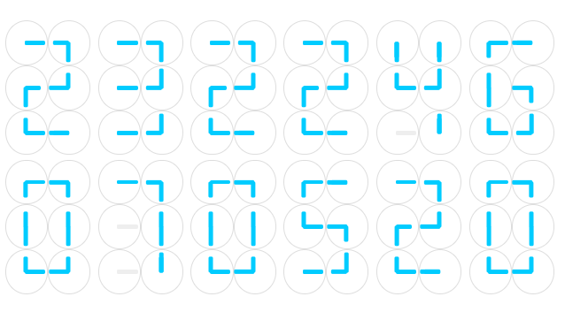
部分效果截图:
HTML代码(index.html):
<!DOCTYPE html>
<html lang='en' xml:lang='en' xmlns='http://www.w3.org/1999/xhtml'>
<head>
<meta http-equiv="Content-Type" content="text/html; charset=gb2312" />
<title>JS+CSS3ʵ��ʱ��������Ч</title>
<link rel="stylesheet" type="text/css" href="css/zzsc.css" />
</head>
<body>
<div id="clockclock" ></div>
<script src="js/zzsc.js" type="text/javascript"></script>
</body>
</html>
JS代码(zzsc.js):
var digitsArray = [ [2,0,2,4,6,2,6,2,6,0,6,4],//0 [9,9,4,2,9,9,6,2,9,9,6,6],//1 [0,0,4,2,0,2,6,4,6,0,4,4],//2 [0,0,4,2,0,0,4,6,0,0,4,6],//3 [2,2,2,2,6,0,4,6,9,9,6,6],//4 [2,0,4,4,6,0,2,4,0,0,4,6],//5 [2,0,4,4,6,2,2,4,6,0,4,6],//6 [0,0,4,2,9,9,6,2,9,9,6,6],//7 [0,2,4,2,6,0,6,4,0,6,4,6],//8 [0,2,4,2,6,0,6,2,0,0,6,4]];
	//9var clockContainer = document.getElementById("clockclock");
	function resizeContainer(){
	clockContainer.style.width = document.body.clientWidth+"px";
	clockContainer.style.height = Math.floor(document.body.clientWidth*0.5)+"px";
	clockContainer.style.marginTop = Math.floor(-0.25*document.body.clientWidth)+"px";
}
window.onresize = resizeContainer;
	resizeContainer();
	function Clock(){
	this.node = document.createElement("div");
	this.node.setAttribute("class","clock");
	this.setNeedle = function(n,pos){
	if(pos==9){
	this.needles[n].setAttribute("style","background-color:#eee;
	");
}
else{
	var angle = pos*45+"deg";
	this.needles[n].setAttribute("style","-webkit-transform:rotate("+angle+");
	-moz-transform:rotate("+angle+");
	transform:rotate("+angle+")");
}
}
;
	this.needles=[];
	for(var n=0;
	n<2;
	n++) //2 needles per clock{
	var needle = document.createElement("div");
	needle.setAttribute("class","needle "+(n===0?"short":"long"));
	this.needles.push(needle);
	this.node.appendChild(needle);
	this.setNeedle(n,9);
}
}
function Block(){
	this.digits = [];
	this.set = function(n){
	var u=n%10,d=(n-u)/10;
	for(var c=0;
	c<6;
	c++){
	this.clocks[c].setNeedle(0,digitsArray[d][2*c]);
	this.clocks[c].setNeedle(1,digitsArray[d][2*c+1]);
	this.clocks[6+c].setNeedle(0,digitsArray[u][2*c]);
	this.clocks[6+c].setNeedle(1,digitsArray[u][2*c+1]);
}
}
;
	this.clocks = [];
	for(var d=0;
	d<2;
	d++) //2 digits per block{
	var digit = document.createElement("div");
	digit.setAttribute("class","block");
	this.digits.push(digit);
	for(var c=0;
	c<6;
	c++){
	var clock = new Clock();
	this.clocks.push(clock);
	digit.appendChild(clock.node);
}
clockContainer.appendChild(digit);
}
}
function ClockClock(){
	this.hourBlock = new Block();
	this.minuteBlock = new Block();
	this.secondBlock = new Block();
	this.dayBlock = new Block();
	this.monthBlock = new Block();
	this.yearBlock = new Block();
	this.update = function(){
	var time = new Date();
	this.hourBlock.set(time.getHours());
	this.minuteBlock.set(time.getMinutes());
	this.secondBlock.set(time.getSeconds());
	this.dayBlock.set(time.getDate());
	this.monthBlock.set(time.getMonth()+1);
	this.yearBlock.set(time.getFullYear()%100);
}
;
}
var clockclock = new ClockClock();
	clockclock.update();
	setInterval(function(){
	clockclock.update();
}
,1000);
CSS代码(zzsc.css):
.needle{position:absolute;top:50%;left:50%;background-color:#0cf;height:10%;margin:-5% 0 0 -5%;transform-origin:5% center;-moz-transform-origin:5% center;-webkit-transform-origin:5% center;-o-transform-origin:5% center;transition-duration:1s;-webkit-transition-duration:1s;-moz-transition-duration:1s;-o-transition-duration:1s;border-radius:5px;-moz-border-radius:5px;-webkit-border-radius:5px;-o-border-radius:5px;}
.long{width:50%;}
.short{width:40%;}
.clock{float:left;position:relative;height:31%;width:44%;border:1px solid #ddd;-moz-border-radius:50%;-webkit-border-radius:50%;-o-border-radius:50%;border-radius:50%;background-color:#fff;}
.block{position:relative;float:left;height:50%;width:16.6%;}
#clockclock{position:absolute;top:50%;}


 分享到QQ
分享到QQ 分享到微博
分享到微博 微信扫一扫
微信扫一扫