以下是 JS+CSS3点击按钮3D翻转动画 的示例演示效果:
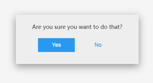
部分效果截图:
HTML代码(index.html):
<!doctype html>
<html lang="zh">
<head>
    <meta charset="UTF-8">
    <meta http-equiv="X-UA-Compatible" content="IE=edge,chrome=1">
    <meta name="viewport" content="width=device-width, initial-scale=1.0">
    <title>JS+CSS3点击按钮3D翻转动画 </title>
    <link href="css/style.css" rel="stylesheet" type="text/css" />
</head>
<body>
<div class="btn">
	<div class="btn-back">
		<p>
			Are you sure you want to do that?</p>
		<button class="yes">
			Yes</button>
		<button class="no">
			No</button>
	</div>
	<div class="btn-front">
		Delete</div>
</div>

<script src="js/script.js"></script>
</body>
</html>
JS代码(script.js):
window.onload = function(){
	var btn = document.querySelector( '.btn' );
	var btnFront = btn.querySelector( '.btn-front' ),btnYes = btn.querySelector( '.btn-back .yes' ),btnNo = btn.querySelector( '.btn-back .no' );
	btnFront.addEventListener( 'click',function( event ){
	var mx = event.clientX - btn.offsetLeft,my = event.clientY - btn.offsetTop;
	var w = btn.offsetWidth,h = btn.offsetHeight;
	var directions = [{
	id:'top',x:w/2,y:0}
,{
	id:'right',x:w,y:h/2}
,{
	id:'bottom',x:w/2,y:h}
,{
	id:'left',x:0,y:h/2}
];
	directions.sort( function( a,b ){
	return distance( mx,my,a.x,a.y ) - distance( mx,my,b.x,b.y );
}
);
	btn.setAttribute( 'data-direction',directions.shift().id );
	btn.classList.add( 'is-open' );
}
);
	btnYes.addEventListener( 'click',function( event ){
	btn.classList.remove( 'is-open' );
}
);
	btnNo.addEventListener( 'click',function( event ){
	btn.classList.remove( 'is-open' );
}
);
	function distance( x1,y1,x2,y2 ){
	var dx = x1-x2;
	var dy = y1-y2;
	return Math.sqrt( dx*dx + dy*dy );
}
}
;
CSS代码(style.css):
@import url(http://fonts.useso.com/css?family=Roboto:400,700);html,body{width:100%;height:100%;margin:0;-webkit-user-select:none;-moz-user-select:none;-ms-user-select:none;user-select:none;}
body{display:-webkit-flex;display:-ms-flexbox;display:flex;font-family:Roboto,"Helvetica Neue",sans-serif;font-size:18px;-webkit-perspective:1000px;perspective:1000px;background-color:#f5f5f5;-webkit-flex-direction:column;-ms-flex-direction:column;flex-direction:column;-webkit-justify-content:center;-ms-flex-pack:center;justify-content:center;-webkit-align-items:center;-ms-flex-align:center;align-items:center;}
.description{margin-top:50px;text-align:center;color:#999;transition:opacity 0.3s ease;}
.description a{color:#4A9DF6;text-decoration:none;}
.btn.is-open ~ .description{opacity:0;}
.btn{display:block;position:relative;width:200px;height:80px;transition:width 0.8s cubic-bezier(0.23,1,0.32,1),height 0.8s cubic-bezier(0.23,1,0.32,1),-webkit-transform 0.8s cubic-bezier(0.175,0.885,0.32,1.275);transition:width 0.8s cubic-bezier(0.23,1,0.32,1),height 0.8s cubic-bezier(0.23,1,0.32,1),transform 0.8s cubic-bezier(0.175,0.885,0.32,1.275);-webkit-transform-style:preserve-3d;transform-style:preserve-3d;-webkit-transform-origin:50% 50%;-ms-transform-origin:50% 50%;transform-origin:50% 50%;text-align:center;}
.btn-front{position:absolute;display:block;width:100%;height:100%;line-height:80px;background-color:#F44336;color:#fff;cursor:pointer;-webkit-backface-visibility:hidden;backface-visibility:hidden;-webkit-tap-highlight-color:rgba(0,0,0,0);transition:background 0.15s ease,line-height 0.8s cubic-bezier(0.23,1,0.32,1);}
.btn-front:hover{background-color:#f77066;}
.btn.is-open .btn-front{pointer-events:none;line-height:160px;}
.btn-back{position:absolute;width:100%;height:100%;background-color:#eee;color:#222;-webkit-transform:translateZ(-1px) rotateX(180deg);transform:translateZ(-1px) rotateX(180deg);overflow:hidden;transition:box-shadow 0.8s ease;}
.btn-back p{margin-top:27px;margin-bottom:25px;}
.btn-back button{padding:12px 20px;width:30%;margin:0 5px;background-color:transparent;border:0;border-radius:2px;font-size:1em;cursor:pointer;-webkit-appearance:none;-webkit-tap-highlight-color:rgba(0,0,0,0);transition:background 0.15s ease;}
.btn-back button:focus{outline:0;}
.btn-back button.yes{background-color:#2196F3;color:#fff;}
.btn-back button.yes:hover{background-color:#51aef6;}
.btn-back button.no{color:#2196F3;}
.btn-back button.no:hover{background-color:#ddd;}
.btn.is-open .btn-back{box-shadow:0 8px 25px rgba(0,0,0,0.4);}
.btn[data-direction="left"] .btn-back,.btn[data-direction="right"] .btn-back{-webkit-transform:translateZ(-1px) rotateY(180deg);transform:translateZ(-1px) rotateY(180deg);}
.btn.is-open{width:400px;height:160px;}
.btn[data-direction="top"].is-open{-webkit-transform:rotateX(180deg);transform:rotateX(180deg);}
.btn[data-direction="right"].is-open{-webkit-transform:rotateY(180deg);transform:rotateY(180deg);}
.btn[data-direction="bottom"].is-open{-webkit-transform:rotateX(-180deg);transform:rotateX(-180deg);}
.btn[data-direction="left"].is-open{-webkit-transform:rotateY(-180deg);transform:rotateY(-180deg);}


 分享到QQ
分享到QQ 分享到微博
分享到微博 微信扫一扫
微信扫一扫