以下是 jQuery鼠标经过变化过渡效果 的示例演示效果:
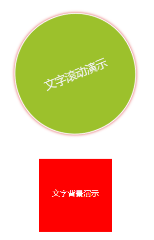
部分效果截图:
HTML代码(index.html):
<!DOCTYPE HTML PUBLIC "-//W3C//DTD HTML 4.01 Transitional//EN" "http://www.w3.org/TR/html4/loose.dtd">
<html>
 <head>
<title>jQuery鼠标经过变化过渡效果</title>
<meta http-equiv="Content-Type" content="text/html; charset=utf-8"/>

<link rel="stylesheet" type="text/css" href="css/style.css"/>

</head>

<body>

<div class="dd"><p> 文字滚动演示 </p></div>

<div class="m"><p> 文字背景演示 </p></div>

<script type="text/javascript" src="js/jquery-1.4.2.min.js"></script>
<script type="text/javascript" src="js/main4444.js"></script>

</body>
</html>
JS代码(main.js):
 $(function(){
	$(".dd").hover(function(){
	$(".dd").stop().animate({
	width:'250px',height:'250px',fontSize:'23px',}
);
	$(".dd").css("border-radius","125px") $(".dd").addClass("dd2");
}
,function(){
	$(".dd").stop().animate({
	width:'170px',height:'170px',fontSize:'15px',borderRadius:'87',}
);
	$(".dd").removeClass("dd2");
}
);
	$(".m").hover(function(){
	$(".m1").animate({
	opacity:'0'}
,1100,function(){
	$(".m2").animate({
	opacity:'0'}
,1100,function(){
	$(".m3").animate({
	opacity:'0'}
,1100);
}
);
}
);
}
,function(){
	$(".m1").stop().animate({
	opacity:'1',}
,0);
	$(".m2").stop().animate({
	opacity:'1',}
,0);
	$(".m3").stop().animate({
	opacity:'1',}
,0);
}
);
}
);
CSS代码(style.css):
/* CSS Document */
*{margin:0px;padding:0px;}
li{list-style-type:none;}
img{border:0px;vertical-align:middle;}
a{text-decoration:none;outline:none;blr:expression(this.onFocus=this.blur());}
.clear{clear:both;}
.dd{transition:all 1.5s;-moz-transition:all 1.5s;-webkit-transition:all 1.5s;margin:100px auto 50px;background:rgb(220,220,220);width:170px;height:100px;padding-top:70px;border:2px solid rgb(201,201,201);border-radius:87px;box-shadow:0px 0px 6px rgb(190,190,190);font-size:15px;}
.dd p{width:100%;text-align:center;}
.dd:hover{-webkit-transform:rotateZ(360deg);-moz-transform:rotateZ(360deg);transform:rotateZ(360deg);background:rgb(152,191,33);width:250px;height:140px;padding-top:110px;border-color:rgb(255,255,255);box-shadow:0px 0px 6px rgb(223,60,60);color:rgb(255,255,255);border-radius:125px;font-size:23px;}
.m{background:rgb(255,0,0);width:150px;height:150px;margin:50px auto;}
.m p{color:white;padding-top:60px;width:100%;text-align:center;}
.m:hover{background:rgb(7,57,219);animation:m 7s;-moz-animation:m 7s;-webkit-animation:m 7s;}
@keyframes m{0%{background:rgb(255,0,0);}
33%{background:rgb(230,230,12);}
66%{background:rgb(7,219,52);}
100%{background:rgb(7,57,219);}
}
@-moz-keyframes m /* Firefox */
{0%{background:rgb(255,0,0);}
33%{background:rgb(230,230,12);}
66%{background:rgb(7,219,52);}
100%{background:rgb(7,57,219);}
}
@-webkit-keyframes m /* Safari and Chrome */
{0%{background:rgb(255,0,0);}
33%{background:rgb(230,230,12);}
66%{background:rgb(7,219,52);}
100%{background:rgb(7,57,219);}
}


 分享到QQ
分享到QQ 分享到微博
分享到微博 微信扫一扫
微信扫一扫