以下是 jquery白天到夜间特效 的示例演示效果:
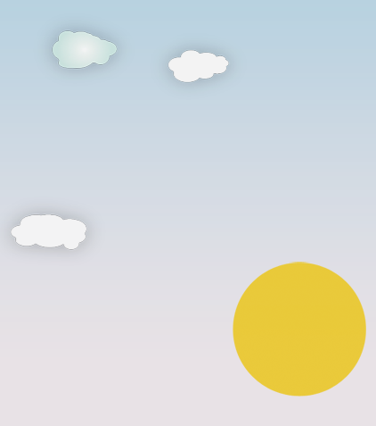
部分效果截图:
HTML代码(index.html):
<!DOCTYPE html PUBLIC "-//W3C//DTD XHTML 1.0 Strict//EN" "http://www.w3.org/TR/xhtml1/DTD/xhtml1-strict.dtd">
<html>
    <head>
        <title>Day and Night Scenery Animation with jQuery</title>
        <meta http-equiv="Content-Type" content="text/html; charset=UTF-8"/>
        <meta name="description" content="Day and Night: Creating a Scenery Animation with jQuery and CSS" />
        <meta name="keywords" content="jquery, css, animation, scenery, tutorial" />
        <link rel="stylesheet" type="text/css" href="css/style.css" media="screen"/>
    </head>
    <body>
        <div id="sky"></div>
        <div id="sun_yellow"></div>
        <div id="sun_red"></div>
        <div id="clouds"></div>
        <div id="ground"></div>
        <div id="night"></div>
        <div id="stars"></div>
        <div id="sstar"></div>
        <div id="moon"></div>
        <div id="title"></div>
        <div>
            <a id="back" href="#"></a>
        </div>
        <script type="text/javascript" src="jquery-1.3.2.js"></script>
        <script type="text/javascript" src="jquery.color.js"></script>
        <script type="text/javascript">
            $(function() {
                $('#sun_yellow').animate({'top':'96%','opacity':0.4}, 12000,function(){
                    $('#stars').animate({'opacity':1}, 5000,function(){
                        $('#moon').animate({'top':'30%','opacity':1}, 5000, function(){
                            $('#sstar').animate({'opacity':1}, 300);
                            $('#sstar').animate({
                                'backgroundPosition':'0px 0px','top':'15%', 'opacity':0
                            }, 500,function(){
                                $('#title').animate({'opacity':1}, 1000);
                                $('#back').animate({'opacity':1}, 3000);
                            });
                        });
                    });
                });
                $('#sun_red').animate({'top':'96%','opacity':0.8}, 12000);
                $('#sky').animate({'backgroundColor':'#4F0030'}, 18000);
                $('#clouds').animate({'backgroundPosition':'1000px 0px','opacity':0}, 30000);
                $('#night').animate({'opacity':0.8}, 20000);
            });
        </script>
    </body>
</html>
CSS代码(style.css):
body{overflow:hidden;}
#clouds,#sky,#night,#stars{position:absolute;top:0px;left:0px;right:0px;bottom:0px;width:100%;}
#sky{background:#fff url(../images/sky.png) repeat-x top left;z-index:1;}
#sun_yellow{position:absolute;left:45%;top:50%;width:150px;height:152px;background:transparent url(../images/sun.png) no-repeat center center;z-index:2;}
#sun_red{position:absolute;left:45%;top:50%;width:150px;height:152px;background:transparent url(../images/sun2.png) no-repeat center center;z-index:2;opacity:0;filter:progid:DXImageTransform.Microsoft.Alpha(opacity=0);}
#clouds{background:transparent url(../images/clouds.png) repeat-x top left;z-index:3;}
#ground{position:absolute;left:0px;right:0px;bottom:0px;width:100%;height:232px;background:transparent url(../images/ground.png) repeat-x bottom center;z-index:3;}
#night{background-color:#000;z-index:4;opacity:0;filter:progid:DXImageTransform.Microsoft.Alpha(opacity=0);}
#stars{bottom:200px;background:transparent url(../images/stars.png) repeat bottom center;z-index:5;opacity:0;filter:progid:DXImageTransform.Microsoft.Alpha(opacity=0);}
#sstar{position:absolute;left:40%;top:10%;width:126px;height:80px;background:transparent url(../images/shootingstar.png) no-repeat 80px -200px;z-index:5;opacity:0;filter:progid:DXImageTransform.Microsoft.Alpha(opacity=0);}
#moon{position:absolute;left:45%;top:60%;width:168px;height:168px;background:transparent url(../images/moon.png) no-repeat center center;z-index:6;opacity:0;filter:progid:DXImageTransform.Microsoft.Alpha(opacity=0);}
/* Just for the showcase*/
#title{position:absolute;left:0px;top:0px;width:500px;height:300px;background:transparent url(../title.png) no-repeat center center;z-index:6;opacity:0;filter:progid:DXImageTransform.Microsoft.Alpha(opacity=0);}
#back{position:absolute;right:0px;bottom:0px;width:176px;height:50px;background:transparent url(../back.png) no-repeat center center;z-index:6;outline:none;cursor:pointer;opacity:0;filter:progid:DXImageTransform.Microsoft.Alpha(opacity=0);}


 分享到QQ
分享到QQ 分享到微博
分享到微博 微信扫一扫
微信扫一扫