以下是 jQuery灯泡照射阴影效果 的示例演示效果:
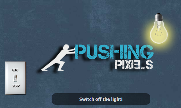
部分效果截图:
HTML代码(index.html):
<!DOCTYPE html>
<html>
<head>
<meta http-equiv="Content-Type" content="text/html; charset=utf-8" />
<title>jQuery灯泡照射阴影效果</title>
<link type="text/css" rel="stylesheet" href="css/style.css" media="all" />
		<script type="text/javascript" src="js/jquery.min.js"></script>
		<script type="text/javascript" src="js/jquery-ui.min.js"></script>
		<script type="text/javascript" src="js/script.js"></script>
	</head>
	<body>
		<div id="switch"></div>
		<div id="light-bulb" class="off"><div id="light-bulb2"></div></div>
		<div id="logo"></div>
		<div id="logosh"></div>
		<div id="infobox"><p>Please activate JavaScript!</p></div>
</body>
</html>
JS代码(script.js):
$(function(){
	var shadowOffset=1.08;
	// shadow offsetvar lightswitch=$("#switch");
	// the light switchvar lightbulb=$("#light-bulb");
	// outer light bulbvar lightbulb2=$("#light-bulb2");
	// inner light bulbvar lightCenterX=parseInt(lightbulb.width()/2);
	// center of light - X-axisvar lightCenterY=parseInt(lightbulb.height()/2);
	// center of light - Y-axisvar logo=$("#logo");
	// logo containervar lightAlogo=$("#light-bulb,#logo");
	// light and logo containersvar logoCenterX=parseInt(logo.width()/2);
	// center of logo - X-axisvar logoCenterY=parseInt(logo.height()/2);
	// center of logo - Y-axisvar logoshadow=$("#logosh");
	// shadow containervar logoShdwCenterX=parseInt(logoshadow.width()/2);
	// center of shadow - X-axisvar logoShdwCenterY=parseInt(logoshadow.height()/2);
	// center of shadow - Y-axisvar statustext=$("#infobox p");
	// info-box text containervar defaulttxt="Drag the light-bulb or the logo!";
	// info-box default textvar ontxt="Let there be light!";
	// info-box text for hovering switch while state is "off"var offtxt="Switch off the light!";
	// info-box text for hovering switch while state is "on"statustext.text(defaulttxt);
	// set info-box text to default textmoveShadow();
	// start our main function// making the light and the logo draggablelightAlogo.draggable({
	drag:function(event,ui){
	statustext.text("dragging " + $(this).attr("id"));
	// change the statustext do "dragging + element id" statemoveShadow();
	// our main function which will move the shadow}
,stop:function(event,ui){
	statustext.text(defaulttxt);
	// switching to default text when stoped draging}
}
);
	// asinging the things,which should happen,when clicking the light switchlightswitch.click(function(){
	if(lightbulb.hasClass("off")){
	// when the light bulb has the class "off" do following:lightbulb.removeClass("off");
	// first remove the class "off"lightswitch.css("backgroundPosition","0 0");
	// change the background position of the CSS spritelogoshadow.stop().fadeTo(750,setOpacity(shadowDistance));
	// showing the shadow of the logo with a fading animationlightbulb2.stop().fadeTo(750,1);
	// fade in the inner light bulb container (light is turned on!)statustext.text(offtxt);
	// changing the status text to the "off text"}
else{
	// else do following:lightbulb.addClass("off");
	// adding the class "off"lightswitch.css("backgroundPosition","-80px 0");
	// move the background position of the switch back to original positionlogoshadow.stop().fadeTo(750,0);
	// fade out the logo shadowlightbulb2.stop().fadeTo(750,0);
	// fade out the turned on light (no more lights now)statustext.text(ontxt);
	// changing the status text to the "on text"}
}
);
	// changing the infotext when hovering the switchlightswitch.hover(function(){
	if(lightbulb.hasClass("off")){
	statustext.text(ontxt);
	// when lightbulb has the class "off" show this text}
else{
	statustext.text(offtxt);
	// otherwise show this text}
}
,function(){
	statustext.text(defaulttxt);
	// hovering out will show the default text again}
);
	// calculating the shadow opacity according to the light bulb distancefunction setOpacity(getDistance){
	if(lightbulb.hasClass("off")){
	return 0;
	// if the lightbulb has the class "off",opacity = 0 (no shadow)}
else{
	return (1.2 - getDistance /1000);
	// otherwise we calculate a suitable shadow opacity with this formular}
}
// the main function - our shadow moverfunction moveShadow(){
	// save the current X position of the light bulblightX=parseInt(lightbulb.offset().left) + lightCenterX;
	// save the current Y position of the light bulblightY=parseInt(lightbulb.offset().top) + lightCenterY;
	// save the current X position of the logologoX=parseInt(logo.offset().left) + logoCenterX;
	// save the current Y position of the logologoY=parseInt(logo.offset().top) + logoCenterY;
	// save the value how far the logo is away from the light bulb on the X-axisdistanceX=logoX - lightX;
	// save the value how far the logo is away from the light bulb on the Y-axisdistanceY=logoY - lightY;
	// calculating and saving the value of the square root of those two distance valuesdistance=Math.sqrt(Math.pow(distanceX,2) + Math.pow(distanceY,2));
	// calculating and saving the shadow distance with the offset we defined in our variablesshadowDistance=distance * shadowOffset;
	// preparing the CSS value to put into the "left" attribute of the shadow containershadowPosLeft=(distanceX / distance * shadowDistance + lightX - logoShdwCenterX) + "px";
	// preparing the CSS value to put into the "top" attribute of the shadow containershadowPosTop=(distanceY / distance * shadowDistance + lightY - logoShdwCenterY) + "px";
	// finaly using the results of all above calculations to position our shadow and set the opacitylogoshadow.css({
	"left":shadowPosLeft,"top":shadowPosTop,"opacity":setOpacity(shadowDistance)}
);
}
}
);
CSS代码(style.css):
body{background:#3B4D61 url(../img/bg.jpg) repeat 0 0;}
#infobox{position:absolute;width:300px;bottom:20px;left:50%;margin-left:-150px;padding:0 20px;background:rgba(0,0,0,0.5);-moz-border-radius:15px;-webkit-border-radius:15px;z-index:999;}
#infobox p{display:block;color:#D1D8DF;font:bold 15px/10px Tahoma,Helvetica,Arial,Sans-Serif;text-align:center;}
#switch{position:absolute;bottom:50px;left:50px;width:80px;height:120px;background:url(../img/light-switch.png) -80px 0 no-repeat;cursor:pointer;z-index:100;}
#light-bulb{position:absolute;top:20%;left:70%;width:150px;height:150px;background:url(../img/lightbulb.png) -150px 0 no-repeat;cursor:move;z-index:800;}
#light-bulb2{width:150px;height:150px;display:none;background:url(../img/lightbulb.png) 0 0 no-repeat;}
#logo{position:absolute;top:40%;left:20%;width:450px;height:150px;background:url(../img/logo.png) 0 0 no-repeat;cursor:move;z-index:700;}
#logosh{position:absolute;width:450px;height:150px;display:none;background:url(../img/logo.png) 0 -150px no-repeat;z-index:600;}


 分享到QQ
分享到QQ 分享到微博
分享到微博 微信扫一扫
微信扫一扫