以下是 jquery密码强度百分比 的示例演示效果:
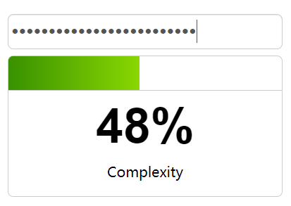
部分效果截图:
HTML代码(index.html):
<!DOCTYPE html>
<html>
<head>
<meta charset="utf-8">
<meta name="viewport" content="width=device-width, initial-scale=1">
<script src='js/jquery-1.7.2.min.js'></script>
<title>jquery</title>
</head>
<body>
<h2></h2>
<br/>
<script src='js/jquery.complexify.js'></script>
<div id="demo">
<input type="password" id="password" placeholder="Password">
<div id="progressbar"><div id="progress"></div></div>
<div id="status">
<div id="complexity">0%</div>
<div id="complexityLabel">Complexity</div>
</div>
</div>
<br/>
<br/>
<script type="text/javascript">
$(function () {
$("#password").complexify({}, function (valid, complexity) {
if (!valid) {
$('#progress').css({'width':complexity + '%'}).removeClass('progressbarValid').addClass('progressbarInvalid');
} else {
$('#progress').css({'width':complexity + '%'}).removeClass('progressbarInvalid').addClass('progressbarValid');
}
$('#complexity').html(Math.round(complexity) + '%');
});
});
</script>
<style type="text/css">
#demo {
width:380px;
margin-right:auto;
margin-left:auto;
}

#progressbar {
width:388px;
height:48px;
display:block;
border-left:1px solid #ccc;
border-right:1px solid #ccc;
border-top:1px solid #ccc;
border-top-right-radius: 8px;
border-top-left-radius: 8px;
overflow:hidden;
background-color: white;
}

#progress {
display:block;
height:100px;
width:0%;
}

.progressbarValid {
background-color:green;
background-image: -o-linear-gradient(-90deg, #8AD702 0%, #389100 100%);
background-image: -moz-linear-gradient(-90deg, #8AD702 0%, #389100 100%);
background-image: -webkit-linear-gradient(-90deg, #8AD702 0%, #389100 100%);
background-image: -ms-linear-gradient(-90deg, #8AD702 0%, #389100 100%);
background-image: linear-gradient(-90deg, #8AD702 0%, #389100 100%);
}

.progressbarInvalid {
background-color:red;
background-image: -o-linear-gradient(-90deg, #F94046 0%, #92080B 100%);
background-image: -moz-linear-gradient(-90deg, #F94046 0%, #92080B 100%);
background-image: -webkit-linear-gradient(-90deg, #F94046 0%, #92080B 100%);
background-image: -ms-linear-gradient(-90deg, #F94046 0%, #92080B 100%);
background-image: linear-gradient(-90deg, #F94046 0%, #92080B 100%);
}

#status {
height:150px;
width:388px;
border:1px solid #ccc;
border-bottom-right-radius: 8px;
border-bottom-left-radius: 8px;
background-color: white;
}

#password {
width:100%;
height:40px;
font-size:30px;
line-height:40px;
border-radius: 8px;
padding: 4px;

box-shadow: inset 0 1px 1px rgba(0, 0, 0, 0.075);
-webkit-box-shadow: inset 0 1px 1px rgba(0, 0, 0, 0.075);
margin-bottom: 9px;
color: #555555;
border: 1px solid #cccccc;
font-family: "Helvetica Neue", Helvetica, Arial, sans-serif;
-webkit-text-security: disc;
-webkit-appearance: textfield;
outline: none;
}

#complexityLabel {
width:100%;
text-align:center;
margin-top:10px;
font-size:20px;
line-height:30px;
}

#complexity {
width:100%;
text-align:center;
font-family:"Helvetica Neue", "Helvetica", Arial, sans-serif;
font-weight:bold;
font-size:70px;
line-height:80px;
margin-top:10px;
}

</style>
</body>
</html>


 分享到QQ
分享到QQ 分享到微博
分享到微博 微信扫一扫
微信扫一扫