以下是 jQuery可拖拽3D万花筒旋转特效 的示例演示效果:
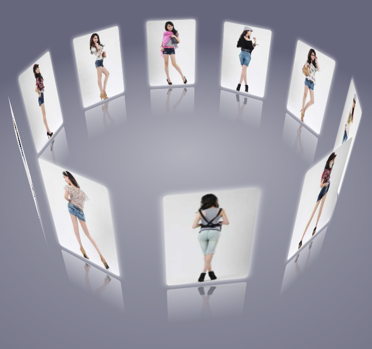
部分效果截图:
HTML代码(index.html):
<!DOCTYPE html>
<html lang="zh">
<head>
<meta charset="UTF-8">
<meta http-equiv="X-UA-Compatible" content="IE=edge,chrome=1">
<meta name="viewport" content="width=device-width, initial-scale=1.0">
<title>jQuery可拖拽3D万花筒旋转特效</title>

<style type="text/css">
	*{margin:0;padding: 0;}
	.pic{
		width: 120px;
		height: 180px;
		margin: 150px auto 0;
		position: relative;
		/*transform 旋转元素*/
		transform-style:preserve-3d;
		transform:perspective(800px) rotateX(-10deg) rotateY(0deg);
	}
	body{background-color: #66677c;overflow:hidden;}

	.pic img{
		position: absolute;
		width: 100%;
		height: 100%;
		border-radius: 5px;
		box-shadow: 0px 0px 10px #fff;
		/*倒影的设置*/
		-webkit-box-reflect:below 10px -webkit-linear-gradient(top,rgba(0,0,0,0) 50%,rgba(0,0,0,.5) 100%);
	}
	.pic p{
		width: 1200px;
		height: 1200px;
		background: -webkit-radial-gradient(center center,600px 600px,rgba(255,255,255,.5),rgba(0,0,0,0));
		position: absolute;
		top:100%;left:50%;
		margin-top: -600px;
		margin-left: -600px;
		border-radius:600px;
		transform:rotateX(90deg);
	}
</style>

</head>
<body>

<div class="pic">
	<img src="img/1.jpg"/>
	<img src="img/2.jpg" />
	<img src="img/3.jpg"/>
	<img src="img/4.jpg"/>
	<img src="img/5.jpg"/>
	<img src="img/6.jpg"/>
	<img src="img/7.jpg"/>
	<img src="img/8.jpg"/>
	<img src="img/9.jpg"/>
	<img src="img/10.jpg"/>
	<p></p>
</div>

<script src="js/jquery-1.11.0.min.js" type="text/javascript"></script>
<script type="text/javascript">
	$(function(){

var imgL=$(".pic img").size();
var deg=360/imgL;
var roY=0,roX=-10;
 var xN=0,yN=0;
 var play=null;

$(".pic img").each(function(i){
	$(this).css({
		<!--translateZ 定义2d旋转沿着z轴-->
		"transform":"rotateY("+i*deg+"deg) translateZ(300px)"	});
		<!--防止图片被拖拽-->
		$(this).attr('ondragstart','return false');
	});

	$(document).mousedown(function(ev){
	var x_=ev.clientX;
	var y_=ev.clientY;
	clearInterval(play);
		console.log('我按下了');
		$(this).bind('mousemove',function(ev){
			/*获取当前鼠标的坐标*/
			var x=ev.clientX;
			var y=ev.clientY;
			/*两次坐标之间的距离*/
			  xN=x-x_;
			  yN=y-y_;

			 roY+=xN*0.2;
			roX-=yN*0.1;
			console.log('移动');
			//$('body').append('<div style="width:5px;height:5px;position:absolute;top:'+y+'px;left:'+x+'px;background-color:red"></div>');

			$('.pic').css({
				 transform:'perspective(800px) rotateX('+roX+'deg) rotateY('+roY+'deg)'
			});
			/*之前的鼠标坐标*/
		 x_=ev.clientX;
		 y_=ev.clientY;

		});
	}).mouseup(function(){
		  $(this).unbind('mousemove');
		  var play=setInterval(function(){

		   xN*=0.95;
		   yN*=0.95
		   if(Math.abs(xN)<1 && Math.abs(yN)<1){
			  clearInterval(play);
		   }
			roY+=xN*0.2;
			roX-=yN*0.1;
			$('.pic').css({
				 transform:'perspective(800px) rotateX('+roX+'deg) rotateY('+roY+'deg)'
			});

		  },30);

	});

});
</script>
</body>
</html>
CSS代码(htmleaf-demo.css):
@font-face{font-family:'icomoon';src:url('../fonts/icomoon.eot?rretjt');src:url('../fonts/icomoon.eot?#iefixrretjt') format('embedded-opentype'),url('../fonts/icomoon.woff?rretjt') format('woff'),url('../fonts/icomoon.ttf?rretjt') format('truetype'),url('../fonts/icomoon.svg?rretjt#icomoon') format('svg');font-weight:normal;font-style:normal;}
[class^="icon-"],[class*=" icon-"]{font-family:'icomoon';speak:none;font-style:normal;font-weight:normal;font-variant:normal;text-transform:none;line-height:1;/* Better Font Rendering =========== */
-webkit-font-smoothing:antialiased;-moz-osx-font-smoothing:grayscale;}
body,html{font-size:100%;padding:0;margin:0;}
/* Reset */
*,*:after,*:before{-webkit-box-sizing:border-box;-moz-box-sizing:border-box;box-sizing:border-box;}
/* Clearfix hack by Nicolas Gallagher:http://nicolasgallagher.com/micro-clearfix-hack/ */
.clearfix:before,.clearfix:after{content:" ";display:table;}
.clearfix:after{clear:both;}
body{background:#494A5F;color:#D5D6E2;font-weight:500;font-size:1.05em;font-family:"Microsoft YaHei","Segoe UI","Lucida Grande",Helvetica,Arial,sans-serif;}
a{color:rgba(255,255,255,0.6);outline:none;text-decoration:none;-webkit-transition:0.2s;transition:0.2s;}
a:hover,a:focus{color:#74777b;text-decoration:none;}
.htmleaf-container{margin:0 auto;}
.bgcolor-1{background:#f0efee;}
.bgcolor-2{background:#f9f9f9;}
.bgcolor-3{background:#e8e8e8;}
/*light grey*/
.bgcolor-4{background:#2f3238;color:#fff;}
/*Dark grey*/
.bgcolor-5{background:#df6659;color:#521e18;}
/*pink1*/
.bgcolor-6{background:#2fa8ec;}
/*sky blue*/
.bgcolor-7{background:#d0d6d6;}
/*White tea*/
.bgcolor-8{background:#3d4444;color:#fff;}
/*Dark grey2*/
.bgcolor-9{background:#ef3f52;color:#fff;}
/*pink2*/
.bgcolor-10{background:#64448f;color:#fff;}
/*Violet*/
.bgcolor-11{background:#3755ad;color:#fff;}
/*dark blue*/
.bgcolor-12{background:#3498DB;color:#fff;}
/*light blue*/
.bgcolor-20{background:#494A5F;color:#D5D6E2;}
/* Header */
.htmleaf-header{padding:1em 190px 1em;letter-spacing:-1px;text-align:center;background:#66677c;}
.htmleaf-header h1{color:#D5D6E2;font-weight:600;font-size:2em;line-height:1;margin-bottom:0;}
.htmleaf-header h1 span{display:block;font-size:60%;font-weight:400;padding:0.8em 0 0.5em 0;color:#c3c8cd;}
/*nav*/
.htmleaf-demo a{color:#fff;text-decoration:none;}
.htmleaf-demo{width:100%;padding-bottom:1.2em;}
.htmleaf-demo a{display:inline-block;margin:0.5em;padding:0.6em 1em;border:3px solid #fff;font-weight:700;}
.htmleaf-demo a:hover{opacity:0.6;}
.htmleaf-demo a.current{background:#1d7db1;color:#fff;}
/* Top Navigation Style */
.htmleaf-links{position:relative;display:inline-block;white-space:nowrap;font-size:1.5em;text-align:center;}
.htmleaf-links::after{position:absolute;top:0;left:50%;margin-left:-1px;width:2px;height:100%;background:#dbdbdb;content:'';-webkit-transform:rotate3d(0,0,1,22.5deg);transform:rotate3d(0,0,1,22.5deg);}
.htmleaf-icon{display:inline-block;margin:0.5em;padding:0em 0;width:1.5em;text-decoration:none;}
.htmleaf-icon span{display:none;}
.htmleaf-icon:before{margin:0 5px;text-transform:none;font-weight:normal;font-style:normal;font-variant:normal;font-family:'icomoon';line-height:1;speak:none;-webkit-font-smoothing:antialiased;}
/* footer */
.htmleaf-footer{width:100%;padding-top:10px;}
.htmleaf-small{font-size:0.8em;}
.center{text-align:center;}
/****/
.related{color:#fff;background:#494A5F;text-align:center;font-size:1.25em;padding:0.5em 0;overflow:hidden;}
.related > a{vertical-align:top;width:calc(100% - 20px);max-width:340px;display:inline-block;text-align:center;margin:20px 10px;padding:25px;font-family:"Microsoft YaHei","宋体","Segoe UI","Lucida Grande",Helvetica,Arial,sans-serif,FreeSans,Arimo;}
.related a{display:inline-block;text-align:left;margin:20px auto;padding:10px 20px;opacity:0.8;-webkit-transition:opacity 0.3s;transition:opacity 0.3s;-webkit-backface-visibility:hidden;}
.related a:hover,.related a:active{opacity:1;}
.related a img{max-width:100%;opacity:0.8;border-radius:4px;}
.related a:hover img,.related a:active img{opacity:1;}
.related h3{font-family:"Microsoft YaHei",sans-serif;font-size:1.2em}
.related a h3{font-size:0.85em;font-weight:300;margin-top:0.15em;color:#fff;}
/* icomoon */
.icon-htmleaf-home-outline:before{content:"\e5000";}
.icon-htmleaf-arrow-forward-outline:before{content:"\e5001";}
@media screen and (max-width:1024px){.htmleaf-header{padding:2em 10% 2em;}
.htmleaf-header h1{font-size:1.4em;}
.htmleaf-links{font-size:1.4em}
}
@media screen and (max-width:960px){.htmleaf-header{padding:2em 10% 2em;}
.htmleaf-header h1{font-size:1.2em;}
.htmleaf-links{font-size:1.2em}
.related h3{font-size:1em;}
.related a h3{font-size:0.8em;}
}
@media screen and (max-width:766px){.htmleaf-header h1{font-size:1.3em;}
.htmleaf-links{font-size:1.3em}
}
@media screen and (max-width:640px){.htmleaf-header{padding:2em 10% 2em;}
.htmleaf-header h1{font-size:1em;}
.htmleaf-links{font-size:1em}
.related h3{font-size:0.8em;}
.related a h3{font-size:0.6em;}
}


 分享到QQ
分享到QQ 分享到微博
分享到微博 微信扫一扫
微信扫一扫