以下是 CSS3+jQuery仿IOS股市无缝滚动 的示例演示效果:
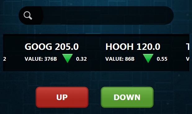
部分效果截图:
HTML代码(index.html):
<!DOCTYPE html PUBLIC "-//W3C//DTD XHTML 1.0 Transitional//EN" "http://www.w3.org/TR/xhtml1/DTD/xhtml1-transitional.dtd">
<html xmlns="http://www.w3.org/1999/xhtml">
<head>
    <meta http-equiv="Content-Type" content="text/html; charset=gb2312" />
    <link rel="stylesheet" href="rolling.css" type="text/css" />
    <title>stock</title>
</head>
<body>
    <div id="search">
        <img src="images/magnifier.png" />
        <input type="text" />
    </div>
    <div id="demoLeft">
        <div class="indemo">
            <div id="demo1" class="demo">
                <div class="block">
                    <div class="info">APPL 405.0</div>
                    <div class="subinfo">VALUE: 176B</div>
                    <div class="pointer up">0.12</div>
                    <div class="clear"></div>
                </div>

                <div class="block">
                    <div class="info">GOOG 205.0</div>
                    <div class="subinfo">VALUE: 376B</div>
                    <div class="pointer down">0.32</div>
                    <div class="clear"></div>
                </div>
                <div class="block">
                    <div class="info">HOOH 120.0</div>
                    <div class="subinfo">VALUE: 86B</div>
                    <div class="pointer down">0.55</div>
                    <div class="clear"></div>
                </div>

                <div class="block">
                    <div class="info">TNT 405.0</div>
                    <div class="subinfo">VALUE: 276B</div>
                    <div class="pointer up">0.34</div>
                    <div class="clear"></div>
                </div>

            </div>
            <div id="demo2" class="demo"></div>
        </div>
    </div>
    <div class="buttonSet">
        <div class="button red">UP</div>
        <div class="button green">DOWN</div>
    </div>
</body>
</html>
<script type="text/javascript" src="rolling.js"></script>
JS代码(rolling.js):
var speed=40var tabLeft=document.getElementById("demoLeft");
	var tab1=document.getElementById("demo1");
	var tab2=document.getElementById("demo2");
	tab2.innerHTML=tab1.innerHTML;
	function Marquee1(){
	if(tabLeft.scrollLeft>=tab2.offsetWidth)tabLeft.scrollLeft-=tab1.offsetWidthelse{
	tabLeft.scrollLeft+=4;
}
}
var MyMar=setInterval(Marquee1,speed);
	tabLeft.onmouseover=function(){
	clearInterval(MyMar)}
;
	tabLeft.onmouseout=function(){
	MyMar=setInterval(Marquee1,speed)}
;
CSS代码(rolling.css):
*{margin:0;padding:0;}
body{background:url(images/metal.jpg) top center;}
.clear{clear:both;}
#search{background:#000;background:rgba(0,0,0,0.7);width:500px;height:60px;margin:30px auto;margin-top:50px;border-radius:100px;overflow:hidden;}
#search img{float:left;width:100px;height:100px;margin:-20px;}
#search input{background:none;border:none;float:left;width:80%;height:40px;margin:10px auto;line-height:40px;color:#FFF;font:24px Tahoma,Geneva,sans-serif;outline:none;}
#demoLeft{overflow:hidden;width:600px;height:120px;margin:20px auto 0;box-shadow:inset 0 4px 4px 2px #000;}
#demoLeft .indemo{background:rgba(0,0,0,0.7);background:url(images/opacity_70.png);float:left;width:500%;}
.demo{float:left;}
.block{float:left;width:200px;height:100px;margin:20px 30px;color:#FFF;text-shadow:2px 4px 2px #000;cursor:pointer;}
.info{float:left;width:200px;height:40px;font:bold 28px "���ź�";line-height:40px;}
.subinfo{float:left;width:120px;height:40px;font:bold 16px "���ź�";line-height:40px;}
.pointer{float:left;width:80px;height:40px;text-align:right;font:bold 16px "���ź�";line-height:40px;}
.up{background:url(images/up.png) no-repeat;}
.down{background:url(images/down.png) no-repeat;}
.buttonSet{width:430px;height:120px;margin:30px auto 0;}
.button{float:left;margin:20px;width:170px;height:68px;border:none;outline:none;cursor:pointer;color:#FFF;font:bold 24px Verdana,Geneva,sans-serif;text-align:center;line-height:68px;}
.red{background:url(images/1.png) no-repeat;}
.green{background:url(images/2.png) no-repeat;}
.red:active{background-position:0 -68px;line-height:70px;}
.green:active{background-position:0 -68px;line-height:70px;}
.calendar{width:450px;height:78px;margin:0 auto;}
.card{background:url(images/BackgroundHistoryNum@2x.png);float:left;width:52px;height:78px;font:bold 40px Arial,Helvetica,sans-serif;line-height:78px;color:#062F41;text-align:center;text-shadow:2px 2px 2px #FFF;}
.card:hover{}


 分享到QQ
分享到QQ 分享到微博
分享到微博 微信扫一扫
微信扫一扫