以下是 jQuery+css3实现信封效果 的示例演示效果:
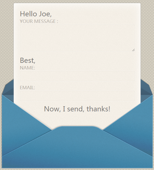
部分效果截图:
HTML代码(index.html):
<!DOCTYPE html>
<html>
<head>
    <meta http-equiv="Content-Type" content="text/html; charset=utf-8">
    <title>jQuery+css3实现信封效果</title>
    <script src="js/jquery-1.3.2.min.js"></script>
    <!--[if IE]><script>
        $(document).ready(function() {

    $("#form_wrap").addClass('hide');

    })

    </script><![endif]-->

    <style>
        body, div, h1, h2, form, fieldset, input, textarea, footer, p {
            margin: 0;
            padding: 0;
            border: 0;
            outline: none;
        }


        @font-face {
            font-family: 'YanoneKaffeesatzRegular';
            src: url('yanonekaffeesatz-regular-webfont.eot');
            src: url('yanonekaffeesatz-regular-webfont.eot?#iefix') format('embedded-opentype'), url('yanonekaffeesatz-regular-webfont.woff') format('woff'), url('yanonekaffeesatz-regular-webfont.ttf') format('truetype'), url('yanonekaffeesatz-regular-webfont.svg#YanoneKaffeesatzRegular') format('svg');
            font-weight: normal;
            font-style: normal;
        }

        body {
            background: #ccc url('images/bg_out.png');
            color: #7c7873;
            font-family: 'YanoneKaffeesatzRegular';
        }

        p {
            text-shadow: 0 1px 0 #fff;
            font-size: 24px;
        }

        #wrap {
            width: 530px;
            margin: 20px auto 0;
            height: 1000px;
        }

        h1 {
            margin-bottom: 20px;
            text-align: center;
            font-size: 48px;
            text-shadow: 0 1px 0 #ede8d9;
        }


        #form_wrap {
            overflow: hidden;
            height: 446px;
            position: relative;
            top: 0px;
            -webkit-transition: all 1s ease-in-out .3s;
            -moz-transition: all 1s ease-in-out .3s;
            -o-transition: all 1s ease-in-out .3s;
            transition: all 1s ease-in-out .3s;
        }

            #form_wrap:before {
                content: "";
                position: absolute;
                bottom: 128px;
                left: 0px;
                background: url('images/before.png');
                width: 530px;
                height: 316px;
            }

            #form_wrap:after {
                content: "";
                position: absolute;
                bottom: 0px;
                left: 0;
                background: url('images/after.png');
                width: 530px;
                height: 260px;
            }

            #form_wrap.hide:after, #form_wrap.hide:before {
                display: none;
            }

            #form_wrap:hover {
                height: 776px;
                top: -200px;
            }


        form {
            background: #f7f2ec url('images/letter_bg.png');
            position: relative;
            top: 200px;
            overflow: hidden;
            height: 200px;
            width: 400px;
            margin: 0px auto;
            padding: 20px;
            border: 1px solid #fff;
            border-radius: 3px;
            -moz-border-radius: 3px;
            -webkit-border-radius: 3px;
            box-shadow: 0px 0px 3px #9d9d9d, inset 0px 0px 27px #fff;
            -moz-box-shadow: 0px 0px 3px #9d9d9d, inset 0px 0px 14px #fff;
            -webkit-box-shadow: 0px 0px 3px #9d9d9d, inset 0px 0px 27px #fff;
            -webkit-transition: all 1s ease-in-out .3s;
            -moz-transition: all 1s ease-in-out .3s;
            -o-transition: all 1s ease-in-out .3s;
            transition: all 1s ease-in-out .3s;
        }


        #form_wrap:hover form {
            height: 530px;
        }

        label {
            margin: 11px 20px 0 0;
            font-size: 16px;
            color: #b3aba1;
            text-transform: uppercase;
            text-shadow: 0px 1px 0px #fff;
        }

        input[type=text], textarea {
            font: 14px normal normal uppercase helvetica, arial, serif;
            color: #7c7873;
            background: none;
            width: 380px;
            height: 36px;
            padding: 0px 10px;
            margin: 0 0 10px 0;
            border: 1px solid #f8f5f1;
            -moz-border-radius: 5px;
            -webkit-border-radius: 5px;
            border-radius: 5px;
            -moz-box-shadow: inset 0px 0px 1px #726959;
            -webkit-box-shadow: inset 0px 0px 1px #b3a895;
            box-shadow: inset 0px 0px 1px #b3a895;
        }

        textarea {
            height: 80px;
            padding-top: 14px;
        }

            textarea:focus, input[type=text]:focus {
                background: rgba(255,255,255,.35);
            }

        #form_wrap input[type=submit] {
            position: relative;
            font-family: 'YanoneKaffeesatzRegular';
            font-size: 24px;
            color: #7c7873;
            text-shadow: 0 1px 0 #fff;
            width: 100%;
            text-align: center;
            opacity: 0;
            background: none;
            cursor: pointer;
            -moz-border-radius: 3px;
            -webkit-border-radius: 3px;
            border-radius: 3px;
            -webkit-transition: opacity .6s ease-in-out 0s;
            -moz-transition: opacity .6s ease-in-out 0s;
            -o-transition: opacity .6s ease-in-out 0s;
            transition: opacity .6s ease-in-out 0s;
        }

        #form_wrap:hover input[type=submit] {
            z-index: 1;
            opacity: 1;
            -webkit-transition: opacity .5s ease-in-out 1.3s;
            -moz-transition: opacity .5s ease-in-out 1.3s;
            -o-transition: opacity .5s ease-in-out 1.3s;
            transition: opacity .5s ease-in-out 1.3s;
        }

        #form_wrap:hover input:hover[type=submit] {
            color: #435c70;
        }
    </style>
</head>
<body>
    <div id="wrap">
        <div id='form_wrap'>
            <form>
                <p>Hello Joe,</p>
                <label for="email">Your Message : </label>
                <textarea name="message" value="Your Message" id="message"></textarea>
                <p>Best,</p>
                <label for="name">Name: </label>
                <input type="text" name="name" value="" id="name" />
                <label for="email">Email: </label>
                <input type="text" name="email" value="" id="email" />
                <input type="submit" name="submit" value="Now, I send, thanks!" />
            </form>
        </div>
    </div>
</body>
</html>


 分享到QQ
分享到QQ 分享到微博
分享到微博 微信扫一扫
微信扫一扫