以下是 jquery+css3实现yoyo球效果 的示例演示效果:
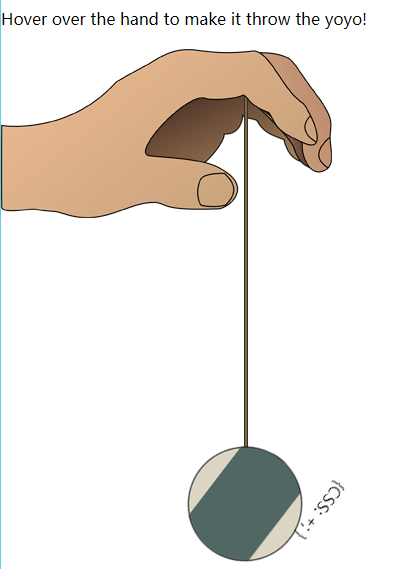
部分效果截图:
HTML代码(index.html):
<!DOCTYPE html>
<html>
<head>
    <meta http-equiv="Content-Type" content="text/html; charset=utf-8" />
    <title>jquery+css3实现yoyo球效果</title>
    <link rel="stylesheet" type="text/css" href="css/style.css" />
    <script type='text/javascript' src='js/jquery.min.js?ver=1.4.2'></script>
    <script type='text/javascript' src='js/jquery.easing-1.3.pack.js'></script>
    <script type="text/javascript">
        $(document).ready(function () {

            $("#container").hover(function () {
                $("#yoyo").addClass("rotate");
                $("#string").stop().animate({ height: '400px' }, { duration: 1000, easing: 'easeOutBack' });
                $("#yoyo").stop().animate({ top: '400px' }, { duration: 1000, easing: 'easeOutBack' });
            }, function () {
                $("#yoyo").removeClass("rotate");
                $("#string").stop().animate({ height: '20px' }, { duration: 600, easing: 'easeInOutExpo' });
                $("#yoyo").stop().animate({ top: "47px" }, { duration: 600, easing: 'easeInOutExpo' });
            });
            $("#yoyo a").hover(function () {
                $("#yoyo").toggleClass("rotate");
            });
        });
    </script>
</head>
<body>
    <div id="content">
        <h2>Yoyo with jQuery and CSS3</h2>
        <p>Hover over the hand  to make it throw the yoyo!</p>
        <div id="container">
            <div id="hand-back"></div>
            <div id="hand-front"></div>
            <div id="string"></div>
            <div id="yoyo">{CSS: +; }</div>
        </div>
    </div>
</body>
</html>
JS代码(jquery.backgroundPosition.js):
/** * @author Alexander Farkas * v. 1.02 */
(function($){
	$.extend($.fx.step,{
	backgroundPosition:function(fx){
	if (fx.state === 0 && typeof fx.end == 'string'){
	var start = $.curCSS(fx.elem,'backgroundPosition');
	start = toArray(start);
	fx.start = [start[0],start[2]];
	var end = toArray(fx.end);
	fx.end = [end[0],end[2]];
	fx.unit = [end[1],end[3]];
}
var nowPosX = [];
	nowPosX[0] = ((fx.end[0] - fx.start[0]) * fx.pos) + fx.start[0] + fx.unit[0];
	nowPosX[1] = ((fx.end[1] - fx.start[1]) * fx.pos) + fx.start[1] + fx.unit[1];
	fx.elem.style.backgroundPosition = nowPosX[0]+' '+nowPosX[1];
	function toArray(strg){
	strg = strg.replace(/left|top/g,'0px');
	strg = strg.replace(/right|bottom/g,'100%');
	strg = strg.replace(/([0-9\.]+)(\s|\)|$)/g,"$1px$2");
	var res = strg.match(/(-?[0-9\.]+)(px|\%|em|pt)\s(-?[0-9\.]+)(px|\%|em|pt)/);
	return [parseFloat(res[1],10),res[2],parseFloat(res[3],10),res[4]];
}
}
}
);
}
)(jQuery);
CSS代码(resets.css):
/*****Reset*****/
body,div,dl,dt,dd,ul,ol,li,h1,h2,h3,h4,h5,h6,pre,form,fieldset,input,textarea,p,blockquote,th,td{margin:0;padding:0}
table{border-collapse:collapse;border-spacing:0}
fieldset,img{border:0}
address,caption,cite,code,dfn,em,strong,th,var{font-style:normal;font-weight:normal}
ol,ul{list-style:none}
caption,th{text-align:left}
h1,h2,h3,h4,h5,h6{font-size:100%;font-weight:normal}
q:before,q:after{content:''}
abbr,acronym{border:0}
/* remember to define focus styles! */
:focus{outline:0}
/* remember to highlight inserts somehow! */
ins{text-decoration:none}
del{text-decoration:line-through}
a{color:#15adff;text-decoration:none;}
a:hover{text-decoration:underline;}
CSS代码(style.css):
@charset "utf-8";/* http://css-plus.com by Jamy Golden */
/*Imports*/
@import url("resets.css");/*Always Used*/
#page-wrap{margin:0 auto;position:relative;min-width:991px;max-width:1024px;}
.clear{clear:both;}
h2{color:#000;font:30px Arial,Helvetica,sans-serif;margin:20px 0 40px 0;}
p{color:#000;}
/*Basic Elements*/
#content{width:960px;position:absolute;top:0;left:0;}
/*Demo*/
#container{height:550px;width:331px;position:relative;}
#hand-front{background:url(../images/hand-front.png) no-repeat left top;height:169px;width:331px;position:absolute;left:0;top:20px;z-index:400;}
#hand-back{background:url(../images/hand-back.png) no-repeat left top;height:99px;width:190px;position:absolute;left:128px;top:43px;z-index:100;}
#string{background:#79694c;border:1px solid #3b2f1d;height:20px;width:2px;position:absolute;top:47px;left:243px;z-index:200;}
#yoyo{background:url(../images/yoyo.png) no-repeat center center;height:150px;width:150px;position:absolute;left:169px;top:47px;z-index:300;}
#yoyo a{color:white;display:block;font-size:20px;font-weight:bold;line-height:150px;margin-left:27px;}
#yoyo a:hover{text-decoration:none;text-shadow:0 0 15px #000;}
.rotate{-webkit-animation-duration:0.8s;-webkit-animation-iteration-count:infinite;-webkit-animation-name:yoyo;-webkit-animation-timing-function:linear;}
@-webkit-keyframes yoyo{from{-webkit-transform:scale(1) rotate(0deg);}
to{-webkit-transform:scale(1) rotate(360deg);}
}


 分享到QQ
分享到QQ 分享到微博
分享到微博 微信扫一扫
微信扫一扫