以下是 jQuery+CSS3实现ToolTip效果 的示例演示效果:
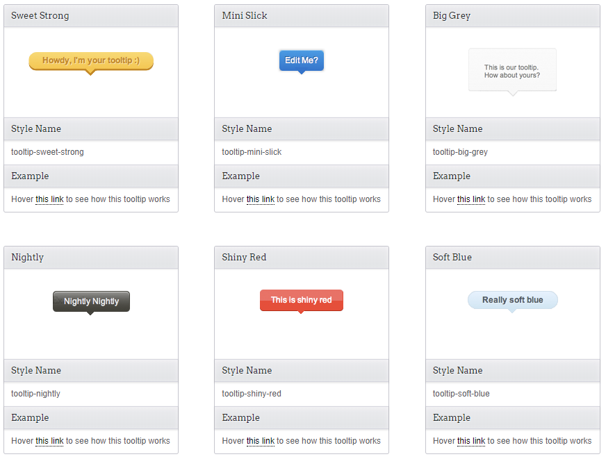
部分效果截图:
HTML代码(index.html):
<!DOCTYPE html>
<html>
<head>
	<meta charset="gb2312">
	<title>jQuery+CSS3ʵ��ToolTipЧ��</title>
	<link rel="stylesheet" href="css/demo.css">
	<link rel="stylesheet" href="css/sweet-tooltip.css">
</head>
<body>
	<div id="container">
		<div class="item-tooltip">
			<div class="item">
				<span class="top-title">Sweet Strong </span>
				<div class="image-item"><img src="images/sweet-strong.png" /></div>
			</div>
			<div class="item-information">
				<span class="title">Style Name </span>
				<span class="information-content">
					tooltip-sweet-strong
				</span>
				<span class="title">Example </span>
				<span class="information-content">
					Hover <a href="#" class="sweet-tooltip" data-style-tooltip="tooltip-sweet-strong" data-text-tooltip="Howdy, I'm your tooltip :) ">this link</a> to see how this tooltip works
				</span>
			</div>
		</div>

		<div class="item-tooltip">
			<div class="item">
				<span class="top-title">Mini Slick </span>
				<div class="image-item"><img src="images/mini-slick.png" /></div>
			</div>
			<div class="item-information">
				<span class="title">Style Name </span>
				<span class="information-content">
					tooltip-mini-slick
				</span>
				<span class="title">Example </span>
				<span class="information-content">
					Hover <a href="#" class="sweet-tooltip" data-style-tooltip="tooltip-mini-slick" data-text-tooltip="Edit Me? ">this link</a> to see how this tooltip works
				</span>
			</div>
		</div>

		<div class="item-tooltip">
			<div class="item">
				<span class="top-title">Big Grey </span>
				<div class="image-item"><img src="images/big-grey.png" /></div>
			</div>
			<div class="item-information">
				<span class="title">Style Name </span>
				<span class="information-content">
					tooltip-big-grey
				</span>
				<span class="title">Example </span>
				<span class="information-content">
					Hover <a href="#" class="sweet-tooltip" data-style-tooltip="tooltip-big-grey" data-text-tooltip="This is our tooltip. <br/> How about yours? ">this link</a> to see how this tooltip works
				</span>
			</div>
		</div>

		<div class="item-tooltip">
			<div class="item">
				<span class="top-title">Nightly </span>
				<div class="image-item"><img src="images/nightly.png" /></div>
			</div>
			<div class="item-information">
				<span class="title">Style Name </span>
				<span class="information-content">
					tooltip-nightly
				</span>
				<span class="title">Example </span>
				<span class="information-content">
					Hover <a href="#" class="sweet-tooltip" data-style-tooltip="tooltip-nightly" data-text-tooltip="Nightly Nightly">this link</a> to see how this tooltip works
				</span>
			</div>
		</div>

		<div class="item-tooltip">
			<div class="item">
				<span class="top-title">Shiny Red </span>
				<div class="image-item"><img src="images/shiny-red.png" /></div>
			</div>
			<div class="item-information">
				<span class="title">Style Name </span>
				<span class="information-content">
					tooltip-shiny-red
				</span>
				<span class="title">Example </span>
				<span class="information-content">
					Hover <a href="#" class="sweet-tooltip" data-style-tooltip="tooltip-shiny-red" data-text-tooltip="This is shiny red">this link</a> to see how this tooltip works
				</span>
			</div>
		</div>

		<div class="item-tooltip">
			<div class="item">
				<span class="top-title">Soft Blue </span>
				<div class="image-item"><img src="images/soft-blue.png" /></div>
			</div>
			<div class="item-information">
				<span class="title">Style Name </span>
				<span class="information-content">
					tooltip-soft-blue
				</span>
				<span class="title">Example </span>
				<span class="information-content">
					Hover <a href="#" class="sweet-tooltip" data-style-tooltip="tooltip-soft-blue" data-text-tooltip="Really soft blue">this link</a> to see how this tooltip works
				</span>
			</div>
		</div>

		<div class="item-tooltip">
			<div class="item">
				<span class="top-title">Big Yellow </span>
				<div class="image-item"><img src="images/big-yellow.png" /></div>
			</div>
			<div class="item-information">
				<span class="title">Style Name </span>
				<span class="information-content">
					tooltip-big-yellow
				</span>
				<span class="title">Example </span>
				<span class="information-content">
					Hover <a href="#" class="sweet-tooltip" data-style-tooltip="tooltip-big-yellow" data-text-tooltip="This is big yellow">this link</a> to see how this tooltip works
				</span>
			</div>
		</div>
	</div>
	<script type="text/javascript" src="js/jquery.min.js"></script>
	<script type="text/javascript" src="js/sweet-tooltip.js"></script>
</body>
</html>
JS代码(sweet-tooltip.js):
/* * Sweet Tooltip * * by Hidayat Sagita * http://www.webstuffshare.com * Licensed Under GPL version 2 license. * */
$(document).ready(function(){
	$('.sweet-tooltip').bind('mouseover',function(){
	tooltip= $(this);
	tooltipText= tooltip.attr('data-text-tooltip');
	tooltipClassName= tooltip.attr('data-style-tooltip');
	tooltipClass= '.' + tooltipClassName;
	if(tooltip.hasClass('showed-tooltip')) return false;
	tooltip.addClass('showed-tooltip') .after('<div class="'+tooltipClassName+'">'+tooltipText+'</div>');
	tooltipPosTop= tooltip.position().top - $(tooltipClass).outerHeight() - 10;
	tooltipPosLeft = tooltip.position().left;
	tooltipPosLeft = tooltipPosLeft - (($(tooltipClass).outerWidth()/2) - tooltip.outerWidth()/2);
	$(tooltipClass).css({
	'left':tooltipPosLeft,'top':tooltipPosTop}
).animate({
	'opacity':'1','marginTop':'0'}
,500);
}
).bind('mouseout',function(){
	$(tooltipClass).animate({
	'opacity':'0','marginTop':'-10px'}
,500,function(){
	$(this).remove();
	tooltip.removeClass('showed-tooltip');
}
);
}
);
}
);
CSS代码(demo.css):
@import url(http://fonts.googleapis.com/css?family=Arvo|Lobster);body{font-family:Arial;color:#292d2f;background:url('images/background.png');text-align:center;text-shadow:1px 1px 1px rgba(255,255,255,0.7);font-size:12px;}
h2{display:block;margin:1.5em 0;font-size:30px;font-family:Lobster;text-shadow:3px 3px 0px rgba(0,0,0,0.05),1px 1px 0px #fff;color:#41474a;font-weight:normal;}
a,a:visited{color:#000;border-bottom:1px dotted #000;text-decoration:none;}
a:hover{border:none;}
#container{display:block;width:910px;margin:5em auto;text-align:left;vertical-align:top;}
.item-tooltip{vertical-align:top;display:inline-block;width:250px;min-height:270px;border-radius:3px;border:1px solid #c6c6ce;margin:0 4em 4em 0;text-align:center;}
.item{display:block;min-height:100px;text-align:left;}
.image-item{height:70px;padding:30px 0;vertical-align:middle;text-align:center;}
.item-information{vertical-align:top;text-align:left;}
.information-content{display:block;margin:.2em 0;padding:8px 10px;color:#596165;}
.title,.top-title{font-size:13px;font-weight:normal;margin:0;font-family:Arvo;display:block;padding:8px 10px;width:230px;background-image:-webkit-gradient(linear,left top,left bottom,from(#ebebee),to(#e2e4e6));background-image:-webkit-linear-gradient(top,#ebebee,#e2e4e6);background-image:-moz-linear-gradient(top,#ebebee,#e2e4e6);background-image:-ms-linear-gradient(top,#ebebee,#e2e4e6);background-image:-o-linear-gradient(top,#ebebee,#e2e4e6);background-image:linear-gradient(to bottom,#ebebee,#e2e4e6);box-shadow:inset rgba(255,254,255,.5) 0 0.1em 7px,rgba(0,0,0,0.1) 0px 1px 2px;border-top:1px solid #d5d5de;border-bottom:1px solid #d5d5de;}
.top-title{border-top-right-radius:3px;border-top-left-radius:3px;border-top:none;background-image:-webkit-gradient(linear,left top,left bottom,from(#ebebee),to(#e2e4e6));}


 分享到QQ
分享到QQ 分享到微博
分享到微博 微信扫一扫
微信扫一扫