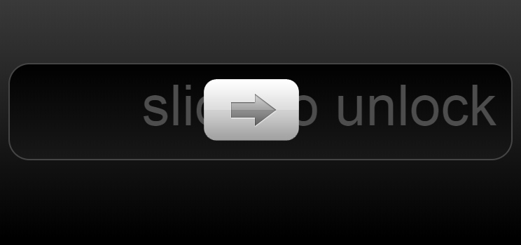
以下是 iphone滑动解锁jQ特效 的示例演示效果:
部分效果截图:
HTML代码(index.html):
<!DOCTYPE html>
<html>
<head>
	<meta http-equiv="Content-Type" content="text/html; charset=UTF-8">
	<title>Slide To Unlock</title>
	<link rel='stylesheet' href='css/style.css'>
	<script src='js/jquery.min.js'></script>
	<script src='js/jquery-ui.min.js'></script>
	<script src='js/slidetounlock.js'></script>
</head>

<body>

	<div id="page-wrap">

		<div id="well">

			<h2><strong id="slider"></strong> <span>slide to unlock</span></h2>

		</div>

	</div>

 <style type="text/css" style="display: none !important;">
	* {
		margin: 0;
		padding: 0;
	}
	body {
		overflow-x: hidden;
	}
	.bsa_it_ad {
		padding: 8px 4px 8px 12px !important;
		position: relative;
		border: 0 !important;
		background: #D6D5D5 !important;
		border-top: 0 !important;
		box-shadow: 2px 2px 2px rgba(0, 0, 0, 0.1);
		font: 11px "Lucida Grande", Sans-Serif !important;
	}
	.bsa_it_ad:before, .bsa_it_ad:after {
		content: "";
		position: absolute;
		top: 0;
		left: 6px;
		width: 100%;
		height: 100%;
		background: #989898;
		border-bottom: 6px solid #989898;
		z-index: -1;
		box-shadow: 2px 2px 2px rgba(0, 0, 0, 0.1);
	}
	.bsa_it_ad:before {
		top: 0;
		left: 12px;
		z-index: -2;
		background: #6C6666;
		border-bottom: 12px solid #6C6666;
	}

	.bsa_it_ad a {
	  margin: 0 !important;
		padding: 0 !important;
	}
	.bsa_it_ad a img {
	  border: 0 !important;
		position: static !important;
	}
	.bsa_it_ad a:hover img {
		margin: 0 !important;
	}
	.bsa_it_ad a:hover {
	  background: none !important;
	}
	.bsa_it_i {
		margin: 0 15px 0 0 !important;
	}
	.bsa_it_t {
		font-size: 14px !important;
		margin: 12px 0 0 0 !important;
	}
	.bsa_it_d {
		padding-right: 10px;
	}
	.bsa_it_p{
		display: none !important;
	}
	#demo-bar-ad {
		width: 416px;
		position: absolute;
		right: 0;
		top: -20px;
		font: 11px "Lucida Grande", Sans-Serif !important;
	}
	#bsap_aplink {
		position: absolute;
		color: #999;
		text-decoration: none;
		bottom: 8px !important;
		right: 8px !important;
		padding: 0 !important;
	}
	.bsa_it_p a:hover {
		background:none !important;
	}
	#demo-top-bar {
		text-align: left;
		background: #e18728;
		position: relative;
		zoom: 1;
		width: 100% !important;
		z-index: 6000;
		box-shadow: 0 0 10px black;
		padding: 20px 0 15px;
	}
	#demo-bar-inside {
		width: 960px;
		margin: 0 auto;
		position: relative;
	}
	#demo-top-bar:before, #demo-top-bar:after {
		content: "";
		position: absolute;
		top: 0;
		left: 6px;
		width: 100%;
		height: 100%;
		background: #e18728;
		border-bottom: 6px solid #8F5314;
		z-index: -1;
		box-shadow: 2px 2px 2px rgba(0, 0, 0, 0.1);
	}
	#demo-top-bar:before {
		top: 0;
		left: 12px;
		background: #6C6666;
		border-bottom: 12px solid #62390E;
	}

	#demo-bar-buttons {
		display: inline-block;
		width: 236px;
		text-align: center;
		vertical-align: top;
		font-size: 0;
	}
	#demo-bar-buttons a {
		font-size: 12px;
		color: white;
		display: block;
		margin: 2px 0;
		text-decoration: none;
		font: 14px "Lucida Grande", Sans-Serif !important;
	}
	#demo-bar-buttons a:hover,
	#demo-bar-buttons a:focus {
		color: #333;
	}

	#demo-bar-badge {
		display: inline-block;
		width: 302px;
		padding: 0 !important;
		margin: 0 !important;
		background-color: transparent !important;
	}
	#demo-bar-badge a {
		display: block;
		width: 100%;
		height: 38px;
		border-radius: 0;
		bottom: auto;
		margin: 0;
		background: url(/images/examples-logo.png) no-repeat;
		background-size: 100%;
		overflow: hidden;
		text-indent: -9999px;
	}
	#demo-bar-badge:before, #demo-bar-badge:after {
		display: none !important;
	}
</style>
</body>
</html>
JS代码(slidetounlock.js):
$(function(){
	$("#slider").draggable({
	axis:'x',containment:'parent',drag:function(event,ui){
	if (ui.position.left > 550){
	$("#well").fadeOut();
}
else{
	// Apparently Safari isn't allowing partial opacity on text with background clip? Not sure.// $("h2 span").css("opacity",100 - (ui.position.left / 5))}
}
,stop:function(event,ui){
	if (ui.position.left < 551){
	$(this).animate({
	left:0}
)}
}
}
);
	// The following credit:http://www.evanblack.com/blog/touch-slide-to-unlock/$('#slider')[0].addEventListener('touchmove',function(event){
	event.preventDefault();
	var el = event.target;
	var touch = event.touches[0];
	curX = touch.pageX - this.offsetLeft - 73;
	if(curX <= 0) return;
	if(curX > 550){
	$('#well').fadeOut();
}
el.style.webkitTransform = 'translateX(' + curX + 'px)';
}
,false);
	$('#slider')[0].addEventListener('touchend',function(event){
	this.style.webkitTransition = '-webkit-transform 0.3s ease-in';
	this.addEventListener( 'webkitTransitionEnd',function( event ){
	this.style.webkitTransition = 'none';
}
,false );
	this.style.webkitTransform = 'translateX(0px)';
}
,false);
}
);
CSS代码(style.css):
/* CSS-Tricks Example by Chris Coyier http://css-tricks.com*/
*{margin:0;padding:0;}
html{background:black;}
body{font:14px Georgia,serif;background-image:-webkit-gradient(linear,left top,left bottom,color-stop(0,#3b3b3b),color-stop(1,#000000));background-repeat:no-repeat;min-height:350px;}
#page-wrap{width:720px;margin:0 auto;padding-top:100px;}
#well{padding:14px 20px 20px 20px;-webkit-border-radius:30px;-moz-border-radius:30px;border-radius:30px;background:-moz-linear-gradient(top,#010101,#181818);background:-webkit-gradient(linear,left top,left bottom,color-stop(0,#010101),color-stop(1,#181818));border:2px solid #454545;overflow:hidden;-webkit-user-select:none;}
#well h2{background:-moz-linear-gradient(left,#4d4d4d,0.4,#4d4d4d,0.5,white,0.6,#4d4d4d,#4d4d4d);background:-webkit-gradient(linear,left top,right top,color-stop(0,#4d4d4d),color-stop(0.4,#4d4d4d),color-stop(0.5,white),color-stop(0.6,#4d4d4d),color-stop(1,#4d4d4d));-moz-background-clip:text;-webkit-background-clip:text;-moz-text-fill-color:transparent;-webkit-text-fill-color:transparent;-webkit-animation:slidetounlock 5s infinite;font-size:80px;font-family:"HelveticaNeue-Light","Helvetica Neue Light","Helvetica Neue",Helvetica,Arial,"Lucida Grande",sans-serif;font-weight:300;padding:0;width:200%;-webkit-text-size-adjust:none;}
#slider{background:url(arrow.png) no-repeat;width:146px;height:98px;display:inline-block;vertical-align:middle;line-height:1;}
@-webkit-keyframes slidetounlock{0%{background-position:-720px 0;}
100%{background-position:720px 0;}
}


 分享到QQ
分享到QQ 分享到微博
分享到微博 微信扫一扫
微信扫一扫