以下是 CSS3 input输入框蓝光特效 的示例演示效果:
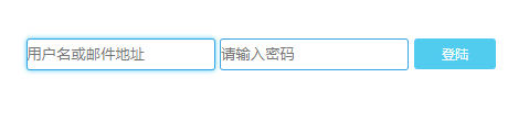
部分效果截图:
HTML代码(index.html):
<!DOCTYPE html PUBLIC "-//W3C//DTD XHTML 1.0 Transitional//EN" "http://www.w3.org/TR/xhtml1/DTD/xhtml1-transitional.dtd">
<html xmlns="http://www.w3.org/1999/xhtml">
<head>
<meta http-equiv="Content-Type" content="text/html; charset=gb2312" />
<title>CSS3 input�����������Ч</title>
<style type="text/css">
input{
transition:all 0.30s ease-in-out;
-webkit-transition: all 0.30s ease-in-out;
-moz-transition: all 0.30s ease-in-out;
border:#35a5e5 1px solid;
border-radius:3px;
outline:none;
}
input:focus{
box-shadow:0 0 5px rgba(81, 203, 238, 1);
-webkit-box-shadow:0 0 5px rgba(81, 203, 238, 1);
-moz-box-shadow:0 0 5px rgba(81, 203, 238, 1);
}
a{
text-decoration:none;
background:rgba(81, 203, 238, 1);
color:white;padding: 6px 25px 6px 25px;
font:12px '���ź�';
border-radius:3px;
-webkit-transition:all linear 0.30s;
-moz-transition:all linear 0.30s;
transition:all linear 0.30s;
}
a:hover{background:rgba(39, 154, 187, 1);}
</style>
</head>
<body>
<div style="width:520px;height:34px;margin:40px auto 0 auto;">
<input type="text" placeholder="�û������ʼ���ַ" style="height:25px"/>
<input type="password" placeholder="����������" style="height:25px"/>
<a href="#">��½</a>
</div>
</body>
</html>


 分享到QQ
分享到QQ 分享到微博
分享到微博 微信扫一扫
微信扫一扫