以下是 css3邮票样式效果 的示例演示效果:
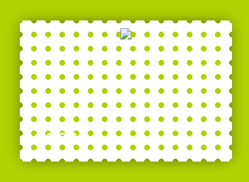
部分效果截图:
HTML代码(index.html):
<!DOCTYPE HTML>
<html lang="en-US">
<head>
<meta http-equiv="Content-Type" content="text/html; charset=gb2312">
    <title>css3��Ʊ��ʽЧ��</title>
    <link href="css/menu.css" rel="stylesheet" type="text/css" />
    </head>
    <body>
<style>
/*Basic reset*/
* {margin: 0; padding: 0;}

body {
	background: #B1d202;
	padding: 100px;
	text-align: center;
}

.stamp {
	width: 280px;
	height: 180px;
	display: inline-block;
	padding: 10px;
	background: white;
	position: relative;

	/*The stamp cutout will be created using crisp radial gradients*/
	background: radial-gradient(
		transparent 0px,
		transparent 4px,
		white 4px,
		white
	);
	/*reducing the gradient size*/
	background-size: 20px 20px;
	/*Offset to move the holes to the edge*/
	background-position: -10px -10px;
}
.stamp:after {
	content: '';
	position: absolute;
	/*We can shrink the pseudo element here to hide the shadow edges*/
	left: 5px; top: 5px; right: 5px; bottom: 5px;
	/*Shadow - doesn't look good because of the stamp cutout. We can still move this into another pseudo element behind the .stamp main element*/
	box-shadow: 0 0 20px 1px rgba(0, 0, 0, 0.5);
	/*pushing it back*/
	z-index: -1;
}
/*Some text*/
.stamp:before {
	content: 'CSS3';
	position: absolute;
	bottom: 0; left: 0;
	font: bold 24px arial;
	color: white;
	opacity: 0.75;
	line-height: 100%;
	padding: 20px;
}
		</style>

<div class="stamp"><img src="http://thecodeplayer.com/uploads/media/css3logo.png" /></div>
<script src="js/prefixfree-1.0.7.js" type="text/javascript" type="text/javascript"></script>
</body>
</html>


 分享到QQ
分享到QQ 分享到微博
分享到微博 微信扫一扫
微信扫一扫