以下是 css3社会分享按钮 的示例演示效果:
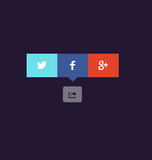
部分效果截图:
HTML代码(index.html):
<!DOCTYPE html PUBLIC "-//W3C//DTD XHTML 1.0 Transitional//EN" "http://www.w3.org/TR/xhtml1/DTD/xhtml1-transitional.dtd">
<html xmlns="http://www.w3.org/1999/xhtml">
<head>
<meta http-equiv="Content-Type" content="text/html; charset=utf-8" />
<title>css3社会分享按钮</title>
<link href="css/zzsc.css" type="text/css"  rel="stylesheet"/>
</head>

<body>
<div id="content">
  <input type="checkbox" class="checkbox" id="share" checked>
  <label for="share" class="label entypo-export"></label>
  <div class="social">
    <ul>
      <li class="entypo-twitter"></li>
      <li class="entypo-facebook"></li>
      <li class="entypo-gplus"></li>
    </ul>
  </div>
</div>
</body>
</html>
JS代码(zzsc.js):
$(document).ready(function(){
	$('.menu a').hover(function(){
	$(this).stop().animate({
	opacity:1}
,200);
}
,function(){
	$(this).stop().animate({
	opacity:0.3}
,200);
}
);
}
);
CSS代码(zzsc.css):
@import url(http://weloveiconfonts.com/api/?family=entypo);/* entypo */
[class*="entypo-"]:before{font-family:'entypo',sans-serif;}
html{margin:0;padding:50px 0;background:#231733;}
#content{text-align:center;position:absolute;left:0;right:0;margin:auto;padding:120px 0 10px 0;width:200px;height:20px;}
input[type="checkbox"]{display:none;}
.checkbox:checked + .label{background:#7B7484;color:#231733;}
.checkbox:checked ~ .social{opacity:1;-webkit-transform:scale(1) translateY(-90px);-moz-transform:scale(1) translateY(-90px);-o-transform:scale(1) translateY(-90px);transform:scale(1) translateY(-90px);-webkit-transition:.5s;-moz-transition:.5s;-o-transition:.5s;transition:.5s;}
.label{font-size:16px;cursor:pointer;margin:0;padding:5px 10px;border-radius:10%;color:#7B7484;}
.social{transform-origin:50% 0%;-webkit-transform:scale(0) translateY(-190px);-moz-transform:scale(0) translateY(-190px);-o-transform:scale(0) translateY(-190px);transform:scale(0) translateY(-190px);opacity:0;}
ul{position:relative;left:0;right:0;margin:auto;color:#fff;height:46px;width:180px;background:#3B5998;padding:0;list-style:none;}
ul li{font-size:20px;cursor:pointer;width:60px;margin:0;padding:12px 0;text-align:center;float:left;display:block;height:22px;}
ul li:hover{color:rgba(0,0,0,.5);}
ul:after{content:'';display:block;position:absolute;left:0;right:0;margin:35px auto;height:0;width:0;border-left:20px solid transparent;border-right:20px solid transparent;border-top:20px solid #3B5998;}
li[class*="twitter"]{background:#6CDFEA;padding:12px 0;}
li[class*="gplus"]{background:#E34429;padding:12px 0;}


 分享到QQ
分享到QQ 分享到微博
分享到微博 微信扫一扫
微信扫一扫