以下是 CSS3用户登录框样式代码 的示例演示效果:
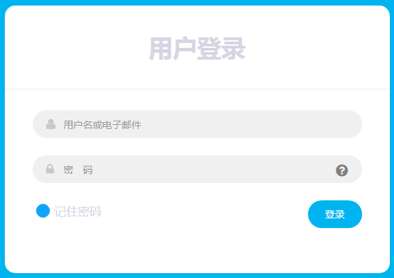
部分效果截图:
HTML代码(index.html):
<!DOCTYPE html>
<html lang="zh">
<head>
<meta charset="UTF-8">
<meta http-equiv="X-UA-Compatible" content="IE=edge,chrome=1">
<meta name="viewport" content="width=device-width, initial-scale=1.0">
<title>CSS3用户登录框样式代码</title>
<link rel="stylesheet" href="css/font-awesome.min.css">
<link rel="stylesheet" href="css/bootstrap.min.css">
<link rel="stylesheet" type="text/css" href="css/demo.css">
<style type="text/css">
	.form-horizontal{
		background: #fff;
		padding-bottom: 40px;
		border-radius: 15px;
		text-align: center;
	}
	.form-horizontal .heading{
		display: block;
		font-size: 35px;
		font-weight: 700;
		padding: 35px 0;
		border-bottom: 1px solid #f0f0f0;
		margin-bottom: 30px;
	}
	.form-horizontal .form-group{
		padding: 0 40px;
		margin: 0 0 25px 0;
		position: relative;
	}
	.form-horizontal .form-control{
		background: #f0f0f0;
		border: none;
		border-radius: 20px;
		box-shadow: none;
		padding: 0 20px 0 45px;
		height: 40px;
		transition: all 0.3s ease 0s;
	}
	.form-horizontal .form-control:focus{
		background: #e0e0e0;
		box-shadow: none;
		outline: 0 none;
	}
	.form-horizontal .form-group i{
		position: absolute;
		top: 12px;
		left: 60px;
		font-size: 17px;
		color: #c8c8c8;
		transition : all 0.5s ease 0s;
	}
	.form-horizontal .form-control:focus + i{
		color: #00b4ef;
	}
	.form-horizontal .fa-question-circle{
		display: inline-block;
		position: absolute;
		top: 12px;
		right: 60px;
		font-size: 20px;
		color: #808080;
		transition: all 0.5s ease 0s;
	}
	.form-horizontal .fa-question-circle:hover{
		color: #000;
	}
	.form-horizontal .main-checkbox{
		float: left;
		width: 20px;
		height: 20px;
		background: #11a3fc;
		border-radius: 50%;
		position: relative;
		margin: 5px 0 0 5px;
		border: 1px solid #11a3fc;
	}
	.form-horizontal .main-checkbox label{
		width: 20px;
		height: 20px;
		position: absolute;
		top: 0;
		left: 0;
		cursor: pointer;
	}
	.form-horizontal .main-checkbox label:after{
		content: "";
		width: 10px;
		height: 5px;
		position: absolute;
		top: 5px;
		left: 4px;
		border: 3px solid #fff;
		border-top: none;
		border-right: none;
		background: transparent;
		opacity: 0;
		-webkit-transform: rotate(-45deg);
		transform: rotate(-45deg);
	}
	.form-horizontal .main-checkbox input[type=checkbox]{
		visibility: hidden;
	}
	.form-horizontal .main-checkbox input[type=checkbox]:checked + label:after{
		opacity: 1;
	}
	.form-horizontal .text{
		float: left;
		margin-left: 7px;
		line-height: 20px;
		padding-top: 5px;
		text-transform: capitalize;
	}
	.form-horizontal .btn{
		float: right;
		font-size: 14px;
		color: #fff;
		background: #00b4ef;
		border-radius: 30px;
		padding: 10px 25px;
		border: none;
		text-transform: capitalize;
		transition: all 0.5s ease 0s;
	}
	@media only screen and (max-width: 479px){
		.form-horizontal .form-group{
			padding: 0 25px;
		}
		.form-horizontal .form-group i{
			left: 45px;
		}
		.form-horizontal .btn{
			padding: 10px 20px;
		}
	}
</style>

</head>
<body>

<div class="demo" style="padding: 20px 0;">
	<div class="container">
		<div class="row">
			<div class="col-md-offset-3 col-md-6">
				<form class="form-horizontal">
					<span class="heading">用户登录</span>
					<div class="form-group">
						<input type="email" class="form-control" id="inputEmail3" placeholder="用户名或电子邮件">
						<i class="fa fa-user"></i>
					</div>
					<div class="form-group help">
						<input type="password" class="form-control" id="inputPassword3" placeholder="密 码">
						<i class="fa fa-lock"></i>
						<a href="#" class="fa fa-question-circle"></a>
					</div>
					<div class="form-group">
						<div class="main-checkbox">
							<input type="checkbox" value="None" id="checkbox1" name="check">
							<label for="checkbox1"></label>
						</div>
						<span class="text">记住密码</span>
						<button type="submit" class="btn btn-default">登录</button>
					</div>
				</form>
			</div>
		</div>
	</div>
</div>
</body>
</html>
CSS代码(demo.css):
body,html{font-size:100%;padding:0;margin:0;}
/* Reset */
*,*:after,*:before{-webkit-box-sizing:border-box;-moz-box-sizing:border-box;box-sizing:border-box;}
/* Clearfix hack by Nicolas Gallagher:http://nicolasgallagher.com/micro-clearfix-hack/ */
.clearfix:before,.clearfix:after{content:" ";display:table;}
.clearfix:after{clear:both;}
body{background:#00b4ef;color:#D5D6E2;font-weight:500;font-size:1.05em;font-family:"Microsoft YaHei","Segoe UI","Lucida Grande",Helvetica,Arial,sans-serif;}
a{color:rgba(255,255,255,0.6);outline:none;text-decoration:none;-webkit-transition:0.2s;transition:0.2s;}
a:hover,a:focus{color:#74777b;text-decoration:none;}


 分享到QQ
分享到QQ 分享到微博
分享到微博 微信扫一扫
微信扫一扫