以下是 jQuery表单设计器自由拖拽特效js代码 的示例演示效果:
部分效果截图:
HTML代码(index.html):
<!DOCTYPE HTML>
<html>
<head>
<title>jQuery表单设计器自由拖拽特效</title>
<meta http-equiv="Content-Type" content="text/html; charset=utf-8" />
<meta name="viewport" content="width=device-width, initial-scale=1.0">
<meta http-equiv="X-UA-Compatible" content="IE=edge,chrome=1">
<meta name="author" content="leipi.org">
<link href="Public/css/bootstrap/css/bootstrap.css?2024" rel="stylesheet" type="text/css" />
<!--[if lte IE 6]>
<link rel="stylesheet" type="text/css" href="Public/css/bootstrap/css/bootstrap-ie6.css?2024">
<![endif]-->
<!--[if lte IE 7]>
<link rel="stylesheet" type="text/css" href="Public/css/bootstrap/css/ie.css?2024">
<![endif]-->
<link href="Public/css/site.css?2024" rel="stylesheet" type="text/css" />
<style>
#components{
min-height: 600px;
}
#target{
min-height: 200px;
border: 1px solid #ccc;
padding: 5px;
}
#target .component{
border: 1px solid #fff;
}
#temp{
width: 500px;
background: white;
border: 1px dotted #ccc;
border-radius: 10px;
}
.popover-content form {
margin: 0 auto;
width: 213px;
}
.popover-content form .btn{
margin-right: 10px
}
#source{
min-height: 500px;
}
</style>
<!--link href="Public/css/bootstrap/css/bootstrap-responsive.min.css" rel="stylesheet"-->
</head>
<body>
<!-- Docs page layout -->
<div class="bs-header" id="content">
<div class="container">
<h1><img src="Public/js/formbuild/images/leipi_formbuild.png" width="64"/>拖拽式表单设计器</h1>
</div>
</div>
<div class="container">
<div class="row clearfix">
<div class="span6">
<div class="clearfix">
<h2>我的表单</h2>
<hr>
<div id="build">
<form id="target" class="form-horizontal">
<fieldset>
<div id="legend" class="component" rel="popover" title="编辑属性" trigger="manual"
data-content="
<form class='form'>
<div class='controls'>
<label class='control-label'>表单名称</label> <input type='text' id='orgvalue' placeholder='请输入表单名称'>
<hr/>
<button class='btn btn-info' type='button'>确定</button><button class='btn btn-danger' type='button'>取消</button>
</div>
</form>"
>
<input type="hidden" name="form_name" value="" class="leipiplugins" leipiplugins="form_name"/>
<legend class="leipiplugins-orgvalue">点击填写表单名</legend>
</div>
</fieldset>
</form>
</div>
</div>
</div>
<div class="span6">
<h2>拖拽下面的控件到左侧</h2>
<hr>
<div class="tabbable">
<ul class="nav nav-tabs" id="navtab">
<li class="active"><a href="#1" data-toggle="tab">常用控件</a></li>
<li class><a href="#2" data-toggle="tab">定制控件</a></li>
<li class><a id="sourcetab" href="#5" data-toggle="tab">源代码</a></li>
</ul>
<form class="form-horizontal" id="components">
<fieldset>
<div class="tab-content">
<div class="tab-pane active" id="1">
<!-- Text start -->
<div class="control-group component" rel="popover" title="文本框控件" trigger="manual"
data-content="
<form class='form'>
<div class='controls'>
<label class='control-label'>控件名称</label> <input type='text' id='orgname' placeholder='必填项'>
<label class='control-label'>默认值</label> <input type='text' id='orgvalue' placeholder='默认值'>
<hr/>
<button class='btn btn-info' type='button'>确定</button><button class='btn btn-danger' type='button'>取消</button>
</div>
</form>"
>
<!-- Text -->
<label class="control-label leipiplugins-orgname">文本框</label>
<div class="controls">
<input name="leipiNewField" type="text" placeholder="默认值" title="文本框" value="" class="leipiplugins" leipiplugins="text"/>
</div>
</div>
<!-- Text end -->
<!-- Textarea start -->
<div class="control-group component" rel="popover" title="多行文本控件" trigger="manual"
data-content="
<form class='form'>
<div class='controls'>
<label class='control-label'>控件名称</label> <input type='text' id='orgname' placeholder='必填项'>
<label class='control-label'>默认值</label> <input type='text' id='orgvalue' placeholder='默认值'>
<hr/>
<button class='btn btn-info' type='button'>确定</button><button class='btn btn-danger' type='button'>取消</button>
</div>
</form>"
>
<!-- Textarea -->
<label class="control-label leipiplugins-orgname">多行文本</label>
<div class="controls">
<div class="textarea">
<textarea title="多行文本" name="leipiNewField" class="leipiplugins" leipiplugins="textarea"/> </textarea>
</div>
</div>
</div>
<!-- Textarea end -->
<!-- Select start -->
<div class="control-group component" rel="popover" title="下拉控件" trigger="manual"
data-content="
<form class='form'>
<div class='controls'>
<label class='control-label'>控件名称</label> <input type='text' id='orgname' placeholder='必填项'>
<label class='control-label'>下拉选项</label>
<textarea style='min-height: 200px' id='orgvalue'></textarea>
<p class='help-block'>一行一个选项</p>
<hr/>
<button class='btn btn-info' type='button'>确定</button><button class='btn btn-danger' type='button'>取消</button>
</div>
</form>"
>
<!-- Select -->
<label class="control-label leipiplugins-orgname">下拉菜单</label>
<div class="controls">
<select name="leipiNewField" title="下拉菜单" class="leipiplugins" leipiplugins="select">
<option>选项一</option>
<option>选项二</option>
<option>选项三</option>
</select>
</div>
</div>
<!-- Select end -->
<!-- Select start -->
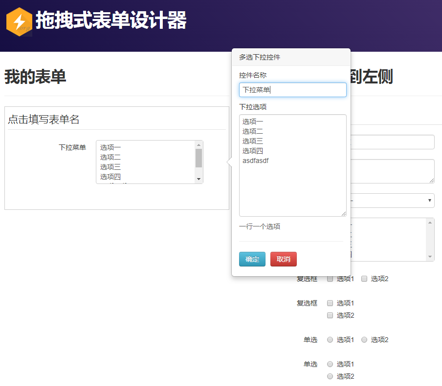
<div class="control-group component" rel="popover" title="多选下拉控件" trigger="manual"
data-content="
<form class='form'>
<div class='controls'>
<label class='control-label'>控件名称</label> <input type='text' id='orgname' placeholder='必填项'>
<label class='control-label'>下拉选项</label>
<textarea style='min-height: 200px' id='orgvalue'></textarea>
<p class='help-block'>一行一个选项</p>
<hr/>
<button class='btn btn-info' type='button'>确定</button><button class='btn btn-danger' type='button'>取消</button>
</div>
</form>"
>
<!-- Select -->
<label class="control-label leipiplugins-orgname">下拉菜单</label>
<div class="controls">
<select multiple="multiple" name="leipiNewField" title="下拉菜单" class="leipiplugins" leipiplugins="select">
<option>选项一</option>
<option>选项二</option>
<option>选项三</option>
<option>选项四</option>
</select>
</div>
</div>
<!-- Select end -->
<!-- Multiple Checkboxes start -->
<div class="control-group component" rel="popover" title="复选控件" trigger="manual"
data-content="
<form class='form'>
<div class='controls'>
<label class='control-label'>控件名称</label> <input type='text' id='orgname' placeholder='必填项'>
<label class='control-label'>复选框</label>
<textarea style='min-height: 200px' id='orgvalue'></textarea>
<p class='help-block'>一行一个选项</p>
<hr/>
<button class='btn btn-info' type='button'>确定</button><button class='btn btn-danger' type='button'>取消</button>
</div>
</form>"
>
<label class="control-label leipiplugins-orgname">复选框</label>
<div class="controls leipiplugins-orgvalue">
<!-- Multiple Checkboxes -->
<label class="checkbox inline">
<input type="checkbox" name="leipiNewField" title="复选框" value="选项1" class="leipiplugins" leipiplugins="checkbox" orginline="inline">
选项1
</label>
<label class="checkbox inline">
<input type="checkbox" name="leipiNewField" title="复选框" value="选项2" class="leipiplugins" leipiplugins="checkbox" orginline="inline">
选项2
</label>
</div>
</div>
<div class="control-group component" rel="popover" title="复选控件" trigger="manual"
data-content="
<form class='form'>
<div class='controls'>
<label class='control-label'>控件名称</label> <input type='text' id='orgname' placeholder='必填项'>
<label class='control-label'>复选框</label>
<textarea style='min-height: 200px' id='orgvalue'></textarea>
<p class='help-block'>一行一个选项</p>
<hr/>
<button class='btn btn-info' type='button'>确定</button><button class='btn btn-danger' type='button'>取消</button>
</div>
</form>"
>
<label class="control-label leipiplugins-orgname">复选框</label>
<div class="controls leipiplugins-orgvalue">
<!-- Multiple Checkboxes -->
<label class="checkbox">
<input type="checkbox" name="leipiNewField" title="复选框" value="选项1" class="leipiplugins" leipiplugins="checkbox">
选项1
</label>
<label class="checkbox">
<input type="checkbox" name="leipiNewField" title="复选框" value="选项2" class="leipiplugins" leipiplugins="checkbox">
选项2
</label>
</div>
</div>
<!-- Multiple Checkboxes end -->
<!-- Multiple radios start -->
<div class="control-group component" rel="popover" title="单选控件" trigger="manual"
data-content="
<form class='form'>
<div class='controls'>
<label class='control-label'>控件名称</label> <input type='text' id='orgname' placeholder='必填项'>
<label class='control-label'>单选框</label>
<textarea style='min-height: 200px' id='orgvalue'></textarea>
<p class='help-block'>一行一个选项</p>
<hr/>
<button class='btn btn-info' type='button'>确定</button><button class='btn btn-danger' type='button'>取消</button>
</div>
</form>"
>
<label class="control-label leipiplugins-orgname">单选</label>
<div class="controls leipiplugins-orgvalue">
<!-- Multiple Checkboxes -->
<label class="radio inline">
<input type="radio" name="leipiNewField" title="单选框" value="选项1" class="leipiplugins" leipiplugins="radio" orginline="inline">
选项1
</label>
<label class="radio inline">
<input type="radio" name="leipiNewField" title="单选框" value="选项2" class="leipiplugins" leipiplugins="radio" orginline="inline">
选项2
</label>
</div>
</div>
<div class="control-group component" rel="popover" title="单选控件" trigger="manual"
data-content="
<form class='form'>
<div class='controls'>
<label class='control-label'>控件名称</label> <input type='text' id='orgname' placeholder='必填项'>
<label class='control-label'>单选框</label>
<textarea style='min-height: 200px' id='orgvalue'></textarea>
<p class='help-block'>一行一个选项</p>
<hr/>
<button class='btn btn-info' type='button'>确定</button><button class='btn btn-danger' type='button'>取消</button>
</div>
</form>"
>
<label class="control-label leipiplugins-orgname">单选</label>
<div class="controls leipiplugins-orgvalue">
<!-- Multiple Checkboxes -->
<label class="radio">
<input type="radio" name="leipiNewField" title="单选框" value="选项1" class="leipiplugins" leipiplugins="radio">
选项1
</label>
<label class="radio">
<input type="radio" name="leipiNewField" title="单选框" value="选项2" class="leipiplugins" leipiplugins="radio">
选项2
</label>
</div>
</div>
<!-- Multiple radios end -->
</div>
<div class="tab-pane" id="2">
<div class="control-group component" rel="popover" title="文件上传" trigger="manual"
data-content="
<form class='form'>
<div class='controls'>
<label class='control-label'>控件名称</label> <input type='text' id='orgname' placeholder='必填项'>
<hr/>
<button class='btn btn-info' type='button'>确定</button><button class='btn btn-danger' type='button'>取消</button>
</div>
</form>"
>
<label class="control-label leipiplugins-orgname">文件上传</label>
<!-- File Upload -->
<div>
<input type="file" name="leipiNewField" title="文件上传" class="leipiplugins" leipiplugins="uploadfile">
</div>
</div>
</div>
<div class="tab-pane" id="5">
<textarea id="source" class="span6"></textarea>
</div>
</fieldset>
</form>
</div><!--tab-content-->
</div><!---tabbable-->
</div> <!-- row -->
</div> <!-- /container -->
<script type="text/javascript" charset="utf-8" src="Public/js/jquery-1.7.2.min.js"></script>
<script type="text/javascript" src="Public/js/formbuild/bootstrap/js/bootstrap.min.js"></script>
<script type="text/javascript" charset="utf-8" src="Public/js/formbuild/leipi.form.build.core.js"></script>
<script type="text/javascript" charset="utf-8" src="Public/js/formbuild/leipi.form.build.plugins.js"></script>
</body>
</html>
CSS代码(doc.css):
/*! * Copyright 2013 Twitter,Inc. * * Licensed under the Creative Commons Attribution 3.0 Unported License. For * details,see http://creativecommons.org/licenses/by/3.0/. */
/* * Carbon ads * * Single display ad that shows on all pages (except homepage) in page headers. * The hella `!important` is required for any pre-set property. */
.carbonad{width:auto !important;margin:50px -30px -40px !important;padding:20px !important;overflow:hidden;/* clearfix */
 height:auto !important;font-size:13px !important;line-height:16px !important;text-align:left;background:#463265 !important;border:0 !important;box-shadow:inset 0 3px 5px rgba(0,0,0,.075);}
.carbonad-img{margin:0 !important;}
.carbonad-text,.carbonad-tag{float:none !important;display:block !important;width:auto !important;height:auto !important;margin-left:145px !important;font-family:"Helvetica Neue",Helvetica,Arial,sans-serif !important;}
.carbonad-text{padding-top:0 !important;}
.carbonad-tag{color:#cdbfe3 !important;text-align:left !important;}
.carbonad-text a,.carbonad-tag a{color:#fff !important;}
.carbonad #azcarbon > img{display:none;/* hide what I assume are tracking images */
}
@media (min-width:768px){.carbonad{margin:0 !important;border-radius:4px;box-shadow:inset 0 3px 5px rgba(0,0,0,.075),0 1px 0 rgba(255,255,255,.1);}
}
@media (min-width:992px){.carbonad{position:absolute;top:20px;right:15px;/* 15px instead of 0 since box-sizing */
 padding:15px !important;width:330px !important;}
}
/* Homepage variations */
.bs-docs-home .carbonad{margin:0 -15px 40px !important;}
@media (min-width:480px){.bs-docs-home .carbonad{width:330px !important;margin:0 auto 40px !important;border-radius:4px;}
}
@media (min-width:768px){.bs-docs-home .carbonad{float:left;width:330px !important;margin:0 0 30px !important;}
.bs-docs-home .bs-social,.bs-docs-home .bs-masthead-links{margin-left:350px;}
.bs-docs-home .bs-social{margin-bottom:10px;}
.bs-docs-home .bs-masthead-links{margin-top:10px;}
}
@media (min-width:992px){.bs-docs-home .carbonad{position:static;}
}
@media (min-width:1170px){.bs-docs-home .carbonad{margin-top:-25px !important;}
}
/* * Callout for 2.3.2 docs * * Only appears below page headers (not on the homepage). The homepage gets its * own link with the masthead links. */
.bs-old-docs{padding:15px 20px;color:#777;background-color:#fafafa;border-top:1px solid #fff;border-bottom:1px solid #e5e5e5;}
.bs-old-docs strong{color:#555;}
/* * Side navigation * * Scrollspy and affixed enhanced navigation to highlight sections and secondary * sections of docs content. */
/* By default it's not affixed in mobile views,so undo that */
.bs-sidebar.affix{position:static;}
/* First level of nav */
.bs-sidenav{margin-top:30px;margin-bottom:30px;padding-top:10px;padding-bottom:10px;text-shadow:0 1px 0 #fff;background-color:#f7f5fa;border-radius:5px;}
/* All levels of nav */
.bs-sidebar .nav > li > a{display:block;color:#716b7a;padding:5px 20px;}
.bs-sidebar .nav > li > a:hover,.bs-sidebar .nav > li > a:focus{text-decoration:none;background-color:#e5e3e9;border-right:1px solid #dbd8e0;}
.bs-sidebar .nav > .active > a,.bs-sidebar .nav > .active:hover > a,.bs-sidebar .nav > .active:focus > a{font-weight:bold;color:#563d7c;background-color:transparent;border-right:1px solid #563d7c;}
/* Nav:second level (shown on .active) */
.bs-sidebar .nav .nav{display:none;/* Hide by default,but at >768px,show it */
 margin-bottom:8px;}
.bs-sidebar .nav .nav > li > a{padding-top:3px;padding-bottom:3px;padding-left:30px;font-size:90%;}
/* Show and affix the side nav when space allows it */
@media (min-width:992px){.bs-sidebar .nav > .active > ul{display:block;}
/* Widen the fixed sidebar */
 .bs-sidebar.affix,.bs-sidebar.affix-bottom{width:213px;}
.bs-sidebar.affix{position:fixed;/* Undo the static from mobile first approach */
 top:80px;}
.bs-sidebar.affix-bottom{position:absolute;/* Undo the static from mobile first approach */
}
.bs-sidebar.affix-bottom .bs-sidenav,.bs-sidebar.affix .bs-sidenav{margin-top:0;margin-bottom:0;}
}
@media (min-width:1200px){/* Widen the fixed sidebar again */
 .bs-sidebar.affix-bottom,.bs-sidebar.affix{width:263px;}
}
/* * Docs sections * * Content blocks for each component or feature. */
/* Space things out */
.bs-docs-section + .bs-docs-section{padding-top:40px;}
/* Janky fix for preventing navbar from overlapping */
h1[id]{padding-top:80px;margin-top:-45px;}
/* * Callouts * * Not quite alerts,but custom and helpful notes for folks reading the docs. * Requires a base and modifier class. */
/* Common styles for all types */
.bs-callout{margin:20px 0;padding:20px;border-left:3px solid #eee;}
.bs-callout h4{margin-top:0;margin-bottom:5px;}
.bs-callout p:last-child{margin-bottom:0;}
/* Variations */
.bs-callout-danger{background-color:#fdf7f7;border-color:#eed3d7;}
.bs-callout-danger h4{color:#b94a48;}
.bs-callout-warning{background-color:#faf8f0;border-color:#faebcc;}
.bs-callout-warning h4{color:#8a6d3b;}
.bs-callout-info{background-color:#f4f8fa;border-color:#bce8f1;}
.bs-callout-info h4{color:#34789a;}
/* * Team members * * Avatars,names,and usernames for core team. */
.bs-team .team-member{color:#555;line-height:32px;}
.bs-team .team-member:hover{color:#333;text-decoration:none;}
.bs-team .github-btn{float:right;margin-top:6px;width:120px;height:20px;}
.bs-team img{float:left;width:32px;margin-right:10px;border-radius:4px;}
/* * Grid examples * * Highlight the grid columns within the docs so folks can see their padding,* alignment,sizing,etc. */
.show-grid{margin-bottom:15px;}
.show-grid [class^="col-"]{padding-top:10px;padding-bottom:10px;background-color:#eee;border:1px solid #ddd;background-color:rgba(86,61,124,.15);border:1px solid rgba(86,61,124,.2);}
/* * Examples * * Isolated sections of example content for each component or feature. Usually * followed by a code snippet. */
.bs-example{position:relative;padding:45px 15px 15px;margin:0 -15px 15px;background-color:#fafafa;box-shadow:inset 0 3px 6px rgba(0,0,0,.05);border-color:#e5e5e5 #eee #eee;border-style:solid;border-width:1px 0;}
/* Echo out a label for the example */
.bs-example:after{content:"Example";position:absolute;top:15px;left:15px;font-size:12px;font-weight:bold;color:#bbb;text-transform:uppercase;letter-spacing:1px;}
/* Tweak display of the code snippets when following an example */
.bs-example + .highlight{margin:-15px -15px 15px;border-radius:0;border-width:0 0 1px;}
/* Make the examples and snippets not full-width */
@media (min-width:768px){.bs-example{margin-left:0;margin-right:0;background-color:#fff;border-width:1px;border-color:#ddd;border-radius:4px 4px 0 0;box-shadow:none;}
.bs-example + .highlight{margin-top:-16px;margin-left:0;margin-right:0;border-width:1px;border-bottom-left-radius:4px;border-bottom-right-radius:4px;}
}
/* Undo width of container */
.bs-example .container{width:auto;}
/* Tweak content of examples for optimum awesome */
.bs-example > p:last-child,.bs-example > ul:last-child,.bs-example > ol:last-child,.bs-example > blockquote:last-child,.bs-example > .form-control:last-child,.bs-example > .table:last-child,.bs-example > .navbar:last-child,.bs-example > .jumbotron:last-child,.bs-example > .alert:last-child,.bs-example > .panel:last-child,.bs-example > .list-group:last-child,.bs-example > .well:last-child,.bs-example > .progress:last-child,.bs-example > .table-responsive:last-child > .table{margin-bottom:0;}
.bs-example > p > .close{float:none;}
/* Typography */
.bs-example-type .table .info{color:#999;vertical-align:middle;}
.bs-example-type .table td{padding:15px 0;border-color:#eee;}
.bs-example-type .table tr:first-child td{border-top:0;}
.bs-example-type h1,.bs-example-type h2,.bs-example-type h3,.bs-example-type h4,.bs-example-type h5,.bs-example-type h6{margin:0;}
/* Images */
.bs-example > .img-circle,.bs-example > .img-rounded,.bs-example > .img-thumbnail{margin:5px;}
/* Tables */
.bs-example > .table-responsive > .table{background-color:#fff;}
/* Buttons */
.bs-example > .btn,.bs-example > .btn-group{margin-top:5px;margin-bottom:5px;}
.bs-example > .btn-toolbar + .btn-toolbar{margin-top:10px;}
/* Forms */
.bs-example-control-sizing select,.bs-example-control-sizing input[type="text"] + input[type="text"]{margin-top:10px;}
.bs-example-form .input-group{margin-bottom:10px;}
.bs-example > textarea.form-control{resize:vertical;}
/* List groups */
.bs-example > .list-group{max-width:400px;}
/* Navbars */
.bs-example .navbar:last-child{margin-bottom:0;}
.bs-navbar-top-example,.bs-navbar-bottom-example{z-index:1;padding:0;overflow:hidden;/* cut the drop shadows off */
}
.bs-navbar-top-example .navbar-header,.bs-navbar-bottom-example .navbar-header{margin-left:0;}
.bs-navbar-top-example .navbar-fixed-top,.bs-navbar-bottom-example .navbar-fixed-bottom{position:relative;margin-left:0;margin-right:0;}
.bs-navbar-top-example{padding-bottom:45px;}
.bs-navbar-top-example:after{top:auto;bottom:15px;}
.bs-navbar-top-example .navbar-fixed-top{top:-1px;}
.bs-navbar-bottom-example{padding-top:45px;}
.bs-navbar-bottom-example .navbar-fixed-bottom{bottom:-1px;}
.bs-navbar-bottom-example .navbar{margin-bottom:0;}
@media (min-width:768px){.bs-navbar-top-example .navbar-fixed-top,.bs-navbar-bottom-example .navbar-fixed-bottom{position:absolute;}
.bs-navbar-top-example{border-radius:0 0 4px 4px;}
.bs-navbar-bottom-example{border-radius:4px 4px 0 0;}
}
/* Pagination */
.bs-example .pagination{margin-top:10px;margin-bottom:10px;}
/* Pager */
.bs-example > .pager{margin-top:0;}
/* Example modals */
.bs-example-modal{background-color:#f5f5f5;}
.bs-example-modal .modal{position:relative;top:auto;right:auto;left:auto;bottom:auto;z-index:1;display:block;}
.bs-example-modal .modal-dialog{left:auto;margin-left:auto;margin-right:auto;}
/* Example dropdowns */
.bs-example > .dropdown > .dropdown-menu{position:static;display:block;margin-bottom:5px;}
/* Example tabbable tabs */
.bs-example-tabs .nav-tabs{margin-bottom:15px;}
/* Tooltips */
.bs-example-tooltips{text-align:center;}
.bs-example-tooltips > .btn{margin-top:5px;margin-bottom:5px;}
/* Popovers */
.bs-example-popover{padding-bottom:24px;background-color:#f9f9f9;}
.bs-example-popover .popover{position:relative;display:block;float:left;width:260px;margin:20px;}
/* Scrollspy demo on fixed height div */
.scrollspy-example{position:relative;height:200px;margin-top:10px;overflow:auto;}
/* * Code snippets * * Generated via Pygments and Jekyll,these are snippets of HTML,CSS,and JS. */
.highlight{display:none;/* hidden by default,until >480px */
 padding:9px 14px;margin-bottom:14px;background-color:#f7f7f9;border:1px solid #e1e1e8;border-radius:4px;}
.highlight pre{padding:0;margin-top:0;margin-bottom:0;background-color:transparent;border:0;white-space:nowrap;}
.highlight pre code{font-size:inherit;color:#333;/* Effectively the base text color */
}
.highlight pre .lineno{display:inline-block;width:22px;padding-right:5px;margin-right:10px;text-align:right;color:#bebec5;}
/* Show code snippets when we have the space */
@media (min-width:481px){.highlight{display:block;}
}
/* * Responsive tests * * Generate a set of tests to show the responsive utilities in action. */
/* Responsive (scrollable) doc tables */
.table-responsive .highlight pre{white-space:normal;}
/* Utility classes table */
.bs-table th small,.responsive-utilities th small{display:block;font-weight:normal;color:#999;}
.responsive-utilities tbody th{font-weight:normal;}
.responsive-utilities td{text-align:center;}
.responsive-utilities td.is-visible{color:#468847;background-color:#dff0d8 !important;}
.responsive-utilities td.is-hidden{color:#ccc;background-color:#f9f9f9 !important;}
/* Responsive tests */
.responsive-utilities-test{margin-top:5px;}
.responsive-utilities-test .col-xs-6{margin-bottom:10px;}
.responsive-utilities-test span{padding:15px 10px;font-size:14px;font-weight:bold;line-height:1.1;text-align:center;border-radius:4px;}
.visible-on .col-xs-6 .hidden-xs,.visible-on .col-xs-6 .hidden-sm,.visible-on .col-xs-6 .hidden-md,.visible-on .col-xs-6 .hidden-lg,.hidden-on .col-xs-6 .hidden-xs,.hidden-on .col-xs-6 .hidden-sm,.hidden-on .col-xs-6 .hidden-md,.hidden-on .col-xs-6 .hidden-lg{color:#999;border:1px solid #ddd;}
.visible-on .col-xs-6 .visible-xs,.visible-on .col-xs-6 .visible-sm,.visible-on .col-xs-6 .visible-md,.visible-on .col-xs-6 .visible-lg,.hidden-on .col-xs-6 .visible-xs,.hidden-on .col-xs-6 .visible-sm,.hidden-on .col-xs-6 .visible-md,.hidden-on .col-xs-6 .visible-lg{color:#468847;background-color:#dff0d8;border:1px solid #d6e9c6;}
/* * Glyphicons * * Special styles for displaying the icons and their classes in the docs. */
.bs-glyphicons{padding-left:0;padding-bottom:1px;margin-bottom:20px;list-style:none;overflow:hidden;}
.bs-glyphicons li{float:left;width:25%;height:115px;padding:10px;margin:0 -1px -1px 0;font-size:12px;line-height:1.4;text-align:center;border:1px solid #ddd;}
.bs-glyphicons .glyphicon{margin-top:5px;margin-bottom:10px;font-size:24px;}
.bs-glyphicons .glyphicon-class{display:block;text-align:center;word-wrap:break-word;/* Help out IE10+ with class names */
}
.bs-glyphicons li:hover{background-color:rgba(86,61,124,.1);}
@media (min-width:768px){.bs-glyphicons li{width:12.5%;}
}
/* * Customizer * * Since this is so form control heavy,we have quite a few styles to customize * the display of inputs,headings,and more. Also included are all the download * buttons and actions. */
.bs-customizer .toggle{float:right;margin-top:85px;/* On account of ghetto navbar fix */
}
/* Headings and form contrls */
.bs-customizer label{margin-top:10px;font-weight:500;color:#555;}
.bs-customizer h2{margin-top:0;margin-bottom:5px;padding-top:30px;}
.bs-customizer h3{margin-bottom:0;}
.bs-customizer h4{margin-top:15px;margin-bottom:0;}
.bs-customizer .bs-callout h4{margin-top:0;/* lame,but due to specificity we have to duplicate */
 margin-bottom:5px;}
.bs-customizer input[type="text"]{font-family:Menlo,Monaco,Consolas,"Courier New",monospace;background-color:#fafafa;}
.bs-customizer .help-block{font-size:12px;margin-bottom:5px;}
/* For the variables,use regular weight */
#less-section label{font-weight:normal;}
/* Downloads */
.bs-customize-download .btn-outline{padding:20px;}
/* Error handling */
.bs-customizer-alert{position:fixed;top:51px;left:0;right:0;z-index:1030;padding:15px 0;color:#fff;background-color:#d9534f;box-shadow:inset 0 1px 0 rgba(255,255,255,.25);border-bottom:1px solid #b94441;}
.bs-customizer-alert .close{margin-top:-4px;font-size:24px;}
.bs-customizer-alert p{margin-bottom:0;}
.bs-customizer-alert .glyphicon{margin-right:5px;}
.bs-customizer-alert pre{margin:10px 0 0;color:#fff;background-color:#a83c3a;border-color:#973634;box-shadow:inset 0 2px 4px rgba(0,0,0,.05),0 1px 0 rgba(255,255,255,.1);}
/* * Miscellaneous * * Odds and ends for optimum docs display. */
 /* About page */
 .bs-about{font-size:16px;}
/* Examples gallery:space out content better */
.bs-examples h4{margin-bottom:5px;}
.bs-examples p{margin-bottom:20px;}
/* Pseudo:focus state for showing how it looks in the docs */
#focusedInput{border-color:rgba(82,168,236,.8);outline:0;outline:thin dotted \9;/* IE6-9 */
 -moz-box-shadow:0 0 8px rgba(82,168,236,.6);box-shadow:0 0 8px rgba(82,168,236,.6);}
/* Better spacing on download options in getting started */
.bs-docs-dl-options h4{margin-top:15px;margin-bottom:5px;}
CSS代码(site.css):
/** * Main navigation */
.bs-docs-nav{text-shadow:0 -1px 0 rgba(0,0,0,.15);/* background-color:#563d7c;*/
 border-color:#463265;box-shadow:0 1px 0 rgba(255,255,255,.1);}
.bs-docs-nav .navbar-collapse{border-color:#463265;}
.bs-docs-nav .navbar-brand{color:#fff;}
.bs-docs-nav .navbar-nav > li > a{color:#cdbfe3;}
.bs-docs-nav .navbar-nav > li > a:hover{color:#fff;}
.bs-docs-nav .navbar-nav > .active > a,.bs-docs-nav .navbar-nav > .active > a:hover{color:#fff;background:none;}
.bs-docs-nav .navbar-toggle{border-color:#563d7c;}
.bs-docs-nav .navbar-toggle:hover{background-color:#463265;border-color:#463265;}
/* Page headers */
.bs-header{padding:40px 15px 20px;/* side padding builds on .container 15px,so 30px */
 margin:20px 0;font-size:16px;text-align:left;text-shadow:0 1px 0 rgba(0,0,0,.15);background-color:#000;color:#fff;;background-repeat:repeat-x;background-image:-webkit-linear-gradient(45deg,#020031,#563d7c);background-image:-moz-linear-gradient(45deg,#020031,#563d7c);background-image:linear-gradient(45deg,#020031,#563d7c)}
.bs-header p{font-weight:300;line-height:1.5;}
/* * Footer * * Separated section of content at the bottom of all pages,save the homepage. */
.bs-footer{padding-top:40px;padding-bottom:30px;margin-top:40px;color:#777;text-align:left;border-top:1px solid #e5e5e5;background-color:#f5f5f5}
.footer-links{margin:10px 0;padding-left:0;}
.footer-links li{display:inline;padding:0 2px;}
.footer-links li:first-child{padding-left:0;}


 分享到QQ
分享到QQ 分享到微博
分享到微博 微信扫一扫
微信扫一扫