以下是 jQuery响应式表格插件basictable js代码 的示例演示效果:
部分效果截图:
HTML代码(index.html):
<!doctype html>
<html lang="zh">
<head>
<meta charset="UTF-8">
<meta http-equiv="X-UA-Compatible" content="IE=edge,chrome=1">
<meta name="viewport" content="width=device-width, initial-scale=1.0 maximum-scale=1.0, user-scalable=no"/>
<title>jQuery响应式表格插件basictable</title>
<link rel="stylesheet" type="text/css" href="css/zzsc-demo.css">
<link rel="stylesheet" type="text/css" href="css/style.css" />
<link rel="stylesheet" type="text/css" href="css/basictable.css" />
</head>
<body>
<div class="zzsc-container">
<div id="page">
<h1>基本表格Demo</h1>
<h2>基本实现</h2>
<p>基本实现使用默认参数设置。表格的响应式效果发生在宽度小于等于568像素的时候。</p>
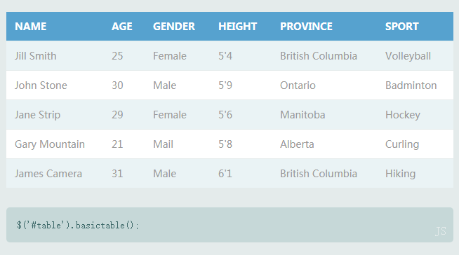
<table id="table">
<thead>
<tr>
<th>Name</th>
<th>Age</th>
<th>Gender</th>
<th>Height</th>
<th>Province</th>
<th>Sport</th>
</tr>
</thead>
<tbody>
<tr>
<td>Jill Smith</td>
<td>25</td>
<td>Female</td>
<td>5'4</td>
<td>British Columbia</td>
<td>Volleyball</td>
</tr>
<tr>
<td>John Stone</td>
<td>30</td>
<td>Male</td>
<td>5'9</td>
<td>Ontario</td>
<td>Badminton</td>
</tr>
<tr>
<td>Jane Strip</td>
<td>29</td>
<td>Female</td>
<td>5'6</td>
<td>Manitoba</td>
<td>Hockey</td>
</tr>
<tr>
<td>Gary Mountain</td>
<td>21</td>
<td>Mail</td>
<td>5'8</td>
<td>Alberta</td>
<td>Curling</td>
</tr>
<tr>
<td>James Camera</td>
<td>31</td>
<td>Male</td>
<td>6'1</td>
<td>British Columbia</td>
<td>Hiking</td>
</tr>
</tbody>
</table>
<code class="js">
$('#table').basictable();
</code>
<h2>修改Breakpoint</h2>
<p>你可以手动修改每个表格的breakpoint。下面的例子将表格的breakpoint设置为768像素,以适应典型的平板电脑和portrait模式。</p>
<table id="table-breakpoint">
<thead>
<tr>
<th>Name</th>
<th>Age</th>
<th>Gender</th>
<th>Height</th>
<th>Province</th>
<th>Sport</th>
</tr>
</thead>
<tbody>
<tr>
<td>Jill Smith</td>
<td>25</td>
<td>Female</td>
<td>5'4</td>
<td>British Columbia</td>
<td>Volleyball</td>
</tr>
<tr>
<td>John Stone</td>
<td>30</td>
<td>Male</td>
<td>5'9</td>
<td>Ontario</td>
<td>Badminton</td>
</tr>
<tr>
<td>Jane Strip</td>
<td>29</td>
<td>Female</td>
<td>5'6</td>
<td>Manitoba</td>
<td>Hockey</td>
</tr>
<tr>
<td>Gary Mountain</td>
<td>21</td>
<td>Mail</td>
<td>5'8</td>
<td>Alberta</td>
<td>Curling</td>
</tr>
<tr>
<td>James Camera</td>
<td>31</td>
<td>Male</td>
<td>6'1</td>
<td>British Columbia</td>
<td>Hiking</td>
</tr>
</tbody>
</table>
<code class="js">
$('#table-breakpoint').basictable({<br />
breakpoint: 768,<br />
});
</code>
<h2>Force Responsive Off</h2>
<p>The script will not force the table to be responsive. The table will only go into responsive mode when the table is actually larger than its parent container. In this demo the parent of table is the div with id page.</p>
<table id="table-force-off">
<thead>
<tr>
<th>Name</th>
<th>Age</th>
<th>Gender</th>
<th>Height</th>
<th>Province</th>
<th>Sport</th>
</tr>
</thead>
<tbody>
<tr>
<td>Jill Smith</td>
<td>25</td>
<td>Female</td>
<td>5'4</td>
<td>British Columbia</td>
<td>Volleyball</td>
</tr>
<tr>
<td>John Stone</td>
<td>30</td>
<td>Male</td>
<td>5'9</td>
<td>Ontario</td>
<td>Badminton</td>
</tr>
<tr>
<td>Jane Strip</td>
<td>29</td>
<td>Female</td>
<td>5'6</td>
<td>Manitoba</td>
<td>Hockey</td>
</tr>
<tr>
<td>Gary Mountain</td>
<td>21</td>
<td>Mail</td>
<td>5'8</td>
<td>Alberta</td>
<td>Curling</td>
</tr>
<tr>
<td>James Camera</td>
<td>31</td>
<td>Male</td>
<td>6'1</td>
<td>British Columbia</td>
<td>Hiking</td>
</tr>
</tbody>
</table>
<code class="js">
$('#table-force-off').basictable({<br />
forceResponsive: false,<br />
});
</code>
<h2>最大高度</h2>
<p>Some tables could get very long in responsive. You could set a max-height in mobile where scrolling within the table would happen. Turn on tableWrapper to get a container around the table that toggles an active class. You could also just create your own wrapper and match the breakpoint to do this.</p>
<table id="table-max-height" class="max-height">
<thead>
<tr>
<th>Name</th>
<th>Age</th>
<th>Gender</th>
<th>Height</th>
<th>Province</th>
<th>Sport</th>
</tr>
</thead>
<tbody>
<tr>
<td>Jill Smith</td>
<td>25</td>
<td>Female</td>
<td>5'4</td>
<td>British Columbia</td>
<td>Volleyball</td>
</tr>
<tr>
<td>John Stone</td>
<td>30</td>
<td>Male</td>
<td>5'9</td>
<td>Ontario</td>
<td>Badminton</td>
</tr>
<tr>
<td>Jane Strip</td>
<td>29</td>
<td>Female</td>
<td>5'6</td>
<td>Manitoba</td>
<td>Hockey</td>
</tr>
<tr>
<td>Gary Mountain</td>
<td>21</td>
<td>Mail</td>
<td>5'8</td>
<td>Alberta</td>
<td>Curling</td>
</tr>
<tr>
<td>James Camera</td>
<td>31</td>
<td>Male</td>
<td>6'1</td>
<td>British Columbia</td>
<td>Hiking</td>
</tr>
</tbody>
</table>
<code class="js">
$('#table-max-height').basictable({<br />
tableWrapper: true<br />
});
</code>
<h2>CSS Controls</h2>
<h3>Use Media Query Over JS Resize</h3>
<p>If you don't want to use the js bind on resize you can use css to control the breakpoint itself. Using basic table to setup the structure itself and copying basictable.css styles into your own media query.</p>
<table id="table-no-resize">
<thead>
<tr>
<th>Name</th>
<th>Age</th>
<th>Gender</th>
<th>Height</th>
<th>Province</th>
<th>Sport</th>
</tr>
</thead>
<tbody>
<tr>
<td>Jill Smith</td>
<td>25</td>
<td>Female</td>
<td>5'4</td>
<td>British Columbia</td>
<td>Volleyball</td>
</tr>
<tr>
<td>John Stone</td>
<td>30</td>
<td>Male</td>
<td>5'9</td>
<td>Ontario</td>
<td>Badminton</td>
</tr>
<tr>
<td>Jane Strip</td>
<td>29</td>
<td>Female</td>
<td>5'6</td>
<td>Manitoba</td>
<td>Hockey</td>
</tr>
<tr>
<td>Gary Mountain</td>
<td>21</td>
<td>Mail</td>
<td>5'8</td>
<td>Alberta</td>
<td>Curling</td>
</tr>
<tr>
<td>James Camera</td>
<td>31</td>
<td>Male</td>
<td>6'1</td>
<td>British Columbia</td>
<td>Hiking</td>
</tr>
</tbody>
</table>
<code class="css">
@media only screen and (max-width: 568px) {<br />
#table-no-resize thead {<br />
display: none;<br />
}<br /><br />
#table-no-resize tbody td {<br />
border: none !important;<br />
display: block;<br />
vertical-align: top;<br />
}<br /><br />
#table-no-resize tbody td:before {<br />
content: attr(data-th) ": ";<br />
display: inline-block;<br />
font-weight: bold;<br />
width: 6.5em;<br />
}<br /><br />
#table-no-resize tbody td.bt-hide {<br />
display: none;<br />
}<br />
}
</code>
<code class="js">
$('#table-no-resize').basictable({<br />
noResize: true,<br />
});
</code>
<h3>Two Axis Styling</h3>
<p>Two axis could be styled differently. This does not need to be done through the library itself. The example code will show how to target the first column in desktop and first row in responsive mode.</p>
<table id="table-two-axis" class="two-axis">
<thead>
<tr>
<th>Name</th>
<th>Age</th>
<th>Gender</th>
<th>Height</th>
<th>Province</th>
<th>Sport</th>
</tr>
</thead>
<tbody>
<tr>
<td>Jill Smith</td>
<td>25</td>
<td>Female</td>
<td>5'4</td>
<td>British Columbia</td>
<td>Volleyball</td>
</tr>
<tr>
<td>John Stone</td>
<td>30</td>
<td>Male</td>
<td>5'9</td>
<td>Ontario</td>
<td>Badminton</td>
</tr>
<tr>
<td>Jane Strip</td>
<td>29</td>
<td>Female</td>
<td>5'6</td>
<td>Manitoba</td>
<td>Hockey</td>
</tr>
<tr>
<td>Gary Mountain</td>
<td>21</td>
<td>Mail</td>
<td>5'8</td>
<td>Alberta</td>
<td>Curling</td>
</tr>
<tr>
<td>James Camera</td>
<td>31</td>
<td>Male</td>
<td>6'1</td>
<td>British Columbia</td>
<td>Hiking</td>
</tr>
</tbody>
</table>
<code class="css">
table.two-axis tr td:first-of-type {<br />
background: #dff1f7;<br />
}<br /><br />
@media only screen and (max-width: 568px) {<br />
table.two-axis tr td:first-of-type,<br />
table.two-axis tr:nth-of-type(2n+2) td:first-of-type,<br />
table.two-axis tr td:first-of-type:before
{<br />
background: #dff1f7;<br />
color: #ffffff;<br />
}<br /><br />
table.two-axis tr td:first-of-type {<br />
border-bottom: 1px solid #e4ebeb;<br />
}<br />
}
</code>
</div>
</div>
<script src="js/jquery-2.1.1.min.js" type="text/javascript"></script>
<script type="text/javascript" src="js/jquery.basictable.min.js"></script>
<script type="text/javascript">
$(document).ready(function() {
$('#table').basictable();
$('#table-breakpoint').basictable({
breakpoint: 768
});
$('#table-swap-axis').basictable({
swapAxis: true
});
$('#table-force-off').basictable({
forceResponsive: true
});
$('#table-no-resize').basictable({
noResize: true
});
$('#table-two-axis').basictable();
$('#table-max-height').basictable({
tableWrapper: true
});
});
</script>
</body>
</html>JS代码(jquery.basictable.min.js):
/* * jQuery Basic Table * Author:Jerry Low */
(function(e){
e.fn.basictable=function(t){
var n=function(t,n){
var i=[];
n.tableWrap&&t.wrap('<div class="bt-wrapper"></div>');
var s="";
t.find("thead tr th").length?s="thead th":t.find("tbody tr th").length?s="tbody tr th":t.find("th").length?s="tr:first th":s="tr:first td",e.each(t.find(s),function(){
var t=e(this),n=parseInt(t.attr("colspan"),10)||1,r=t.closest("tr").index();
i[r]||(i[r]=[]);
for(var s=0;
s<n;
s++)i[r].push(t)}
),e.each(t.find("tbody tr"),function(){
r(e(this),i,n)}
),e.each(t.find("tfoot tr"),function(){
r(e(this),i,n)}
)}
,r=function(t,n,r){
t.children().each(function(){
var t=e(this);
if(t.html()!==""&&t.html()!=="
"||!!r.showEmptyCells){
var i=t.index(),s="";
for(var o=0;
o<n.length;
o++){
o!=0&&(s+=":");
var u=n[o][i];
s+=u.text()}
t.attr("data-th",s),r.contentWrap&&!t.children().hasClass("bt-content")&&t.wrapInner('<span class="bt-content" />')}
else t.addClass("bt-hide")}
)}
,i=function(t){
e.each(t.find("td"),function(){
var t=e(this),n=t.children(".bt-content").html();
t.html(n)}
)}
,s=function(t,n){
n.forceResponsive?e(window).width()<=n.breakpoint?o(t,n):u(t,n):t.removeClass("bt").outerWidth()>t.parent().width()?o(t,n):u(t,n)}
,o=function(e,t){
e.addClass("bt"),t.tableWrap&&e.parent(".bt-wrapper").addClass("active")}
,u=function(e,t){
e.removeClass("bt"),t.tableWrap&&e.parent(".bt-wrapper").removeClass("active")}
,a=function(e,t){
e.find("td").removeAttr("data-th"),t.tableWrap&&e.unwrap(),t.contentWrap&&i(e),e.removeData("basictable")}
,f=function(e){
e.data("basictable")&&s(e,e.data("basictable"))}
;
this.each(function(){
var r=e(this);
if(r.length===0||r.data("basictable"))return r.data("basictable")&&(t=="destroy"?a(r,r.data("basictable")):t==="start"?o(r,r.data("basictable")):t==="stop"?u(r,r.data("basictable")):s(r,r.data("basictable"))),!1;
var i=e.extend({
}
,e.fn.basictable.defaults,t),l={
breakpoint:i.breakpoint,contentWrap:i.contentWrap,forceResponsive:i.forceResponsive,noResize:i.noResize,tableWrap:i.tableWrap,showEmptyCells:i.showEmptyCells}
;
r.data("basictable",l),n(r,r.data("basictable")),l.noResize||(s(r,r.data("basictable")),e(window).bind("resize.basictable",function(){
f(r)}
))}
)}
,e.fn.basictable.defaults={
breakpoint:568,contentWrap:!0,forceResponsive:!0,noResize:!1,tableWrap:!1,showEmptyCells:!1}
}
)(jQuery);
CSS代码(style.css):
/* * Basic Table Demo CSS. */
/*@import url(http://fonts.googleapis.com/css?family=Lato:400,700|Montserrat:400,700);*/
*{margin:0;padding:0;}
body{background:#e4ebeb;color:#636363;/*font-family:'Lato',sans-serif;*/
 line-height:1.5;}
#page{padding:50px 100px;}
@media only screen and (max-width:568px){#page{padding:50px 30px;}
}
h1,h2,h3,h4,h5{line-height:1.2;/*font-family:'Montserrat',sans-serif;*/
 font-weight:normal;}
h1{color:#5b8e8d;font-size:3rem;font-weight:700;letter-spacing:-0.01em;margin-bottom:0.75em;text-transform:uppercase;}
@media only screen and (max-width:568px){h1{font-size:2.25rem;}
}
h2{color:#82bcba;font-size:1.75rem;margin-bottom:0.75em;margin-top:2em;}
h3{color:#82bcba;font-size:1.25rem;margin-bottom:0.75em;margin-top:2em;}
a,a:visited,a:active{color:#5b8e8d;text-decoration:none;}
a:hover{color:#53bcba;}
p{font-size:1.125rem;word-break:break-word;}
p.credits{font-size:.8125rem;margin-top:6em;}
@media only screen and (max-width:568px){.phone-block{display:block;}
.phone-hide{display:none;}
}
code{background:#c6d8d8;border-radius:5px;color:#3d6969;display:block;margin:2em 0;padding:15px;position:relative;}
code:after{bottom:5px;color:#e4ebeb;/*font-family:'Lato',sans-serif;*/
 font-size:1rem;position:absolute;right:10px;text-transform:uppercase;}
code.css:after{content:'css';}
code.js:after{content:'js';}
table{background:white;border-collapse:collapse;margin:1.25em 0 0;width:100%;}
table tr,table th,table td{border:none;border-bottom:1px solid #e4ebeb;/*font-family:'Lato',sans-serif;*/
 font-size:.875rem;}
table th,table td{padding:10px 12px;text-align:left;}
table th{background:#56a2cf;color:#ffffff;text-transform:uppercase;}
table tr td{background:#eaf3f5;color:#999999;}
table tr:nth-of-type(2n+2) td{background:#ffffff;}
table.bt tfoot th,table.bt tfoot td,table.bt tbody td{font-size:.8125rem;padding:0;}
table.bt tfoot th:before,table.bt tfoot td:before,table.bt tbody td:before{background:#56a2cf;color:white;margin-right:10px;padding:2px 10px;}
table.bt tfoot th .bt-content,table.bt tfoot td .bt-content,table.bt tbody td .bt-content{display:inline-block;padding:2px 5px;}
table.bt tfoot th:first-of-type:before,table.bt tfoot th:first-of-type .bt-content,table.bt tfoot td:first-of-type:before,table.bt tfoot td:first-of-type .bt-content,table.bt tbody td:first-of-type:before,table.bt tbody td:first-of-type .bt-content{padding-top:10px;}
table.bt tfoot th:last-of-type:before,table.bt tfoot th:last-of-type .bt-content,table.bt tfoot td:last-of-type:before,table.bt tfoot td:last-of-type .bt-content,table.bt tbody td:last-of-type:before,table.bt tbody td:last-of-type .bt-content{padding-bottom:10px;}
/* * Example 4:* Media query over js resize */
@media only screen and (max-width:568px){#table-no-resize thead{display:none;}
#table-no-resize tbody td{border:none !important;display:block;font-size:.8125rem;padding:0;vertical-align:top;}
#table-no-resize tbody td:before{background:#56a2cf;content:attr(data-th) ":";color:white;display:inline-block;font-weight:bold;margin-right:10px;padding:2px 10px;width:6.5em;}
#table-no-resize tbody td .bt-content{display:inline-block;padding:2px 5px;}
#table-no-resize tbody td:first-of-type:before,#table-no-resize tbody td:first-of-type .bt-content{padding-top:10px;}
#table-no-resize tbody td:last-of-type:before,#table-no-resize tbody td:last-of-type .bt-content{padding-bottom:10px;}
}
/* * Example 5:* Two axis styling */
table.two-axis tr td:first-of-type{background:#cadde1;}
@media only screen and (max-width:568px){table.two-axis tr td:first-of-type,table.two-axis tr:nth-of-type(2n+2) td:first-of-type,table.two-axis tr td:first-of-type:before{background:#3584b3;color:#ffffff;}
table.two-axis tr td:first-of-type{border-bottom:1px solid #e4ebeb;}
table.two-axis tr td:first-of-type:before{padding-bottom:10px;}
}
/* * Example 6:* Max height */
.bt-wrapper.active{margin-top:1.5em;}
.bt-wrapper.active table{margin:0;}
table{width:100%;}
.table{margin:30px 0;border-collapse:collapse;border-spacing:0;empty-cells:show;border:1px solid #e0e0e0;}
.table caption{color:#333;font-style:italic;font-size:85%;line-height:1;padding:1em 0;text-align:center;}
.table td,.table th{border-left:1px solid #e0e0e0;border-width:0 0 0 1px;font-size:inherit;margin:0;overflow:visible;padding:0.5em 1em;font-weight:normal;}
.table td:first-child,.table th:first-child{border-left-width:0;}
.table thead,.table tfoot{background-color:#f05050;color:#fff;text-align:left;vertical-align:bottom;}
.table thead td,.table tfoot td,.table thead th,.table tfoot th{border-color:#fff;}
.table td{background-color:transparent;}
.table_striped tr:nth-child(2n-1) td{background-color:#ececec;}
.table_bordered td{border-bottom:1px solid #e0e0e0;}
.table_bordered tbody > tr:last-child > td,.table_bordered thead > tr:last-child > td{border-bottom-width:0;}
.table_horizontal td,.table_horizontal th{border-width:0 0 1px 0;border-bottom:1px solid #e0e0e0;}
.table_horizontal tbody > tr:last-child > td,.table_horizontal thead > tr:last-child > td{border-bottom-width:0;}
CSS代码(zzsc-demo.css):
@import url(http://fonts.useso.com/css?family=Raleway:200,500,700,800);@font-face{font-family:'icomoon';src:url('../fonts/icomoon.eot?rretjt');src:url('../fonts/icomoon.eot?#iefixrretjt') format('embedded-opentype'),url('../fonts/icomoon.woff?rretjt') format('woff'),url('../fonts/icomoon.ttf?rretjt') format('truetype'),url('../fonts/icomoon.svg?rretjt#icomoon') format('svg');font-weight:normal;font-style:normal;}
[class^="icon-"],[class*=" icon-"]{font-family:'icomoon';speak:none;font-style:normal;font-weight:normal;font-variant:normal;text-transform:none;line-height:1;/* Better Font Rendering =========== */
-webkit-font-smoothing:antialiased;-moz-osx-font-smoothing:grayscale;}
body,html{font-size:100%;padding:0;margin:0;}
/* Reset */
*,*:after,*:before{-webkit-box-sizing:border-box;-moz-box-sizing:border-box;box-sizing:border-box;}
/* Clearfix hack by Nicolas Gallagher:http://nicolasgallagher.com/micro-clearfix-hack/ */
.clearfix:before,.clearfix:after{content:" ";display:table;}
.clearfix:after{clear:both;}
body{background:#494A5F;color:#D5D6E2;font-weight:500;font-size:1.05em;font-family:"Microsoft YaHei","宋体","Segoe UI","Lucida Grande",Helvetica,Arial,sans-serif,FreeSans,Arimo;}
a{color:#2fa0ec;text-decoration:none;outline:none;}
a:hover,a:focus{color:#74777b;}
.zzsc-container{margin:0 auto;overflow:hidden;}
.bgcolor-1{background:#f0efee;}
.bgcolor-2{background:#f9f9f9;}
.bgcolor-3{background:#e8e8e8;}
/*light grey*/
.bgcolor-4{background:#2f3238;color:#fff;}
/*Dark grey*/
.bgcolor-5{background:#df6659;color:#521e18;}
/*pink1*/
.bgcolor-6{background:#2fa8ec;}
/*sky blue*/
.bgcolor-7{background:#d0d6d6;}
/*White tea*/
.bgcolor-8{background:#3d4444;color:#fff;}
/*Dark grey2*/
.bgcolor-9{background:#ef3f52;color:#fff;}
/*pink2*/
.bgcolor-10{background:#64448f;color:#fff;}
/*Violet*/
.bgcolor-11{background:#3755ad;color:#fff;}
/*dark blue*/
.bgcolor-12{background:#3498DB;color:#fff;}
/*light blue*/
.bgcolor-20{background:#494A5F;color:#D5D6E2;}
/* Header */
.zzsc-header{padding:1em 190px 1em;letter-spacing:-1px;text-align:center;background:#66677c;}
.zzsc-header h1{color:#D5D6E2;font-weight:600;font-size:2em;line-height:1;margin-bottom:0;font-family:"Microsoft YaHei","宋体","Segoe UI","Lucida Grande",Helvetica,Arial,sans-serif,FreeSans,Arimo;}
.zzsc-header h1 span{font-family:"Microsoft YaHei","宋体","Segoe UI","Lucida Grande",Helvetica,Arial,sans-serif,FreeSans,Arimo;display:block;font-size:60%;font-weight:400;padding:0.8em 0 0.5em 0;color:#c3c8cd;}
/*nav*/
.zzsc-demo a{color:#fff;text-decoration:none;}
.zzsc-demo{width:100%;padding-bottom:1.2em;}
.zzsc-demo a{display:inline-block;margin:0.5em;padding:0.6em 1em;border:3px solid #fff;font-weight:700;}
.zzsc-demo a:hover{opacity:0.6;}
.zzsc-demo a.current{background:#1d7db1;color:#fff;}
/* Top Navigation Style */
.zzsc-links{position:relative;display:inline-block;white-space:nowrap;font-size:1.5em;text-align:center;}
.zzsc-links::after{position:absolute;top:0;left:50%;margin-left:-1px;width:2px;height:100%;background:#dbdbdb;content:'';-webkit-transform:rotate3d(0,0,1,22.5deg);transform:rotate3d(0,0,1,22.5deg);}
.zzsc-icon{display:inline-block;margin:0.5em;padding:0em 0;width:1.5em;text-decoration:none;}
.zzsc-icon span{display:none;}
.zzsc-icon:before{margin:0 5px;text-transform:none;font-weight:normal;font-style:normal;font-variant:normal;font-family:'icomoon';line-height:1;speak:none;-webkit-font-smoothing:antialiased;}
/* footer */
.zzsc-footer{width:100%;padding-top:10px;}
.zzsc-small{font-size:0.8em;}
.center{text-align:center;}
/****/
.related{color:#fff;background:#494A5F;text-align:center;font-size:1.25em;padding:0.5em 0;overflow:hidden;}
.related > a{vertical-align:top;width:calc(100% - 20px);max-width:340px;display:inline-block;text-align:center;margin:20px 10px;padding:25px;font-family:"Microsoft YaHei","宋体","Segoe UI","Lucida Grande",Helvetica,Arial,sans-serif,FreeSans,Arimo;}
.related a{display:inline-block;text-align:left;margin:20px auto;padding:10px 20px;opacity:0.8;-webkit-transition:opacity 0.3s;transition:opacity 0.3s;-webkit-backface-visibility:hidden;}
.related a:hover,.related a:active{opacity:1;}
.related a img{max-width:100%;opacity:0.8;border-radius:4px;}
.related a:hover img,.related a:active img{opacity:1;}
.related h3{font-family:"Microsoft YaHei",sans-serif;}
.related a h3{font-weight:300;margin-top:0.15em;color:#fff;}
/* icomoon */
.icon-zzsc-home-outline:before{content:"\e5000";}
.icon-zzsc-arrow-forward-outline:before{content:"\e5001";}
@media screen and (max-width:50em){.zzsc-header{padding:3em 10% 4em;}
.zzsc-header h1{font-size:2em;}
}
@media screen and (max-width:40em){.zzsc-header h1{font-size:1.5em;}
}
@media screen and (max-width:30em){.zzsc-header h1{font-size:1.2em;}
}


 分享到QQ
分享到QQ 分享到微博
分享到微博 微信扫一扫
微信扫一扫