以下是 jquery叠加效果自动滚动切换特效 的示例演示效果:
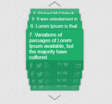
部分效果截图:
HTML代码(index.html):
<!DOCTYPE html PUBLIC "-//W3C//DTD XHTML 1.0 Transitional//EN" "http://www.w3.org/TR/xhtml1/DTD/xhtml1-transitional.dtd">
<html xmlns="http://www.w3.org/1999/xhtml">
<head>
<meta http-equiv="Content-Type" content="text/html; charset=utf-8" />
<title>jquery叠加效果自动滚动切换特效</title>
<link rel="stylesheet" type="text/css" href="css/funnyNewsTicker.css">
<script src="js/jQuery.js"></script>
<!--<link href='http://fonts.useso.com/css?family=Open+Sans:400,600,300&subset=latin-ext' rel='stylesheet' type='text/css'>-->
<style>
	body{background:url(img/bgnoise_lg.png); margin:0; padding:0; font-family:'Open Sans',Roboto,Arial,Verdana; font-size:15px; font-weight:400;}
	.container{width:60%; height:auto; margin:0 auto; margin-top:20px;}
	.fnt-container-header h1{font-weight:300; font-size:48px; text-align:center;}
	.fnt-container-header h2{font-size:30px; text-align:center;}

</style></head>
<body>

	<div class="container">


        <div style="width:50%; margin:0 auto; box-sizing:border-box;">

            <div class="funnyNewsTicker fnt-radius fnt-shadow fnt-easing" id="funnyNewsTicker2">
                <ul>
                    <li>
                        <div class="fnt-content" data-link="#">1. Lorem Ipsum is simply dummy text of the printing and typesetting industry.</div>
                    </li>
                    <li>
                        <div class="fnt-content" data-link="#">2. When an unknown printer took a galley of type and scrambled it to make a type specimen book. It has survived not only five centuries</div>
                    </li>
                    <li>
                        <div class="fnt-content" data-link="#">3. There are many variations of passages of Lorem Ipsum available, but the majority have suffered alteration</div>
                    </li>
                    <li>
                        <div class="fnt-content" data-link="#">4. Richard McClintock, a Latin professor at Hampden-Sydney College in Virginia</div>
                    </li>
                    <li>
                        <div class="fnt-content" data-link="#">5. It was popularised in the 1960s with the release of Letraset sheets containing Lorem Ipsum passages</div>
                    </li>
                    <li>
                        <div class="fnt-content" data-link="#">6. Lorem Ipsum is that it has a more-or-less normal distribution</div>
                    </li>
                    <li>
                        <div class="fnt-content" data-link="#">7. Variations of passages of Lorem Ipsum available, but the majority have suffered</div>
                    </li>
                    <li>
                        <div class="fnt-content" data-link="#">8. Test content lorem Ipsum is that it has a more-or-less normal distribution</div>
                    </li>
                    <li>
                        <div class="fnt-content" data-link="#">9. Lorem Ipsum is that it has a more-or-less normal distribution example content </div>
                    </li>
                    <li>
                        <div class="fnt-content" data-link="#">10. Lorem Ipsum is that it has a more-or-less normal distribution</div>
                    </li>
                </ul>
            </div>
        </div>
        <br><br>
        <div style="width:50%; margin:0 auto; box-sizing:border-box;">

            <div class="funnyNewsTicker fnt-radius fnt-shadow fnt-easing" id="funnyNewsTicker3">
                <ul>
                    <li>
                        <div class="fnt-content" data-link="#">1. Lorem Ipsum is simply dummy text of the printing and typesetting industry.</div>
                    </li>
                    <li>
                        <div class="fnt-content" data-link="#">2. When an unknown printer took a galley of type and scrambled it to make a type specimen book. It has survived not only five centuries</div>
                    </li>
                    <li>
                        <div class="fnt-content" data-link="#">3. There are many variations of passages of Lorem Ipsum available, but the majority have suffered alteration <a href="#">http://envato.com</a></div>
                    </li>
                    <li>
                        <div class="fnt-content" data-link="#">4. Richard McClintock, a Latin professor at Hampden-Sydney College in Virginia</div>
                    </li>
                    <li>
                        <div class="fnt-content" data-link="#">5. It was popularised in the 1960s with the release of Letraset sheets containing Lorem Ipsum passages</div>
                    </li>
                    <li>
                        <div class="fnt-content" data-link="#">6. Lorem Ipsum is that it has a more-or-less normal distribution</div>
                    </li>
                    <li>
                        <div class="fnt-content" data-link="#">7. Variations of passages of Lorem Ipsum available, but the majority have suffered</div>
                    </li>
                    <li>
                        <div class="fnt-content" data-link="#">8. Test content lorem Ipsum is that it has a more-or-less normal distribution</div>
                    </li>
                    <li>
                        <div class="fnt-content" data-link="#">9. Lorem Ipsum is that it has a more-or-less normal distribution example content </div>
                    </li>
                    <li>
                        <div class="fnt-content" data-link="#">10. Lorem Ipsum is that it has a more-or-less normal distribution</div>
                    </li>
                </ul>
            </div>
        </div>
    </div>
<script>
	$(document).ready(function(){
		$("#funnyNewsTicker1").funnyNewsTicker({feed:"#/",width:"70%"});
		$("#funnyNewsTicker2").funnyNewsTicker({width:"80%",timer:1000,titlecolor:"#FFF",itembgcolor:"#1faf6d",infobgcolor:"#1a935c",buttonstyle:"white",bordercolor:"#1a935c"});
		$("#funnyNewsTicker3").funnyNewsTicker({width:"40%",itemheight:250,infobarvisible:false,pagenavi:false,timer:500,itembgcolor:"#af1f63",bordercolor:"#af1f63",titlecolor:"#FFF"});
	});
</script>
</body>
</html>
CSS代码(funnyNewsTicker.css):
.funnyNewsTicker{width:100%;overflow:hidden;height:440px;position:relative;padding:0 5px;box-sizing:border-box;margin:0 auto;}
.funnyNewsTicker>ul{padding:0;margin:0;list-style-type:none;position:relative;}
.funnyNewsTicker>ul>li{display:none;width:100%;height:100px;background:#FFF;position:absolute;overflow:hidden}
.funnyNewsTicker>ul>li>.fnt-content{position:absolute;top:0;bottom:30px;left:0;right:0;box-sizing:border-box;padding:5%;overflow:hidden;}
.funnyNewsTicker>ul>li>.fnt-content a{text-decoration:none;}
.funnyNewsTicker>ul>li>.fnt-content a:hover{text-decoration:underline;}
.funnyNewsTicker>ul>li>.fnt-info{position:absolute;bottom:0;left:0;right:0;height:20px;padding:5px;border-top:solid 1px #DDD;}
.funnyNewsTicker>ul>li>.fnt-info a{display:inline-block;width:20px;height:20px;background:#0F0;opacity:0.2;cursor:pointer;}
.funnyNewsTicker>ul>li>.fnt-info a:hover{opacity:1;}
.funnyNewsTicker>ul>li>.fnt-info a.fnt-facebook-black{background:url(../img/fnt-buttons-black.png) 0 0 no-repeat;float:left;margin-right:5px;}
.funnyNewsTicker>ul>li>.fnt-info a.fnt-twitter-black{background:url(../img/fnt-buttons-black.png) -20px 0 no-repeat;float:left;margin-right:5px;}
.funnyNewsTicker>ul>li>.fnt-info a.fnt-google-black{background:url(../img/fnt-buttons-black.png) -40px 0 no-repeat;float:left;}
.funnyNewsTicker>ul>li>.fnt-info a.fnt-link-black{background:url(../img/fnt-buttons-black.png) -60px 0 no-repeat;float:right;}
.funnyNewsTicker>ul>li>.fnt-info a.fnt-facebook-white{background:url(../img/fnt-buttons-white.png) 0 0 no-repeat;float:left;margin-right:5px;}
.funnyNewsTicker>ul>li>.fnt-info a.fnt-twitter-white{background:url(../img/fnt-buttons-white.png) -20px 0 no-repeat;float:left;margin-right:5px;}
.funnyNewsTicker>ul>li>.fnt-info a.fnt-google-white{background:url(../img/fnt-buttons-white.png) -40px 0 no-repeat;float:left;}
.funnyNewsTicker>ul>li>.fnt-info a.fnt-link-white{background:url(../img/fnt-buttons-white.png) -60px 0 no-repeat;float:right;}
.funnyNewsTicker>ul>li>.fnt-info span{position:absolute;left:80px;right:30px;text-align:center;opacity:0.4;z-index:0;font-size:13px;cursor:default;}
.funnyNewsTicker>div{width:50px;height:30px;cursor:pointer;position:absolute;opacity:0.3;}
.funnyNewsTicker>div:hover{opacity:1;}
.funnyNewsTicker>div.fnt-top-arrow{top:0;background:url(../img/fnt-arrows-black.png) top no-repeat;}
.funnyNewsTicker>div.fnt-bottom-arrow{bottom:0;background:url(../img/fnt-arrows-black.png) bottom no-repeat;}
.funnyNewsTicker .fnt-top0{-ms-transform:scale(0.80);-webkit-transform:scale(0.85);transform:scale(0.85);opacity:0.85;top:0;z-index:1;display:block;}
.funnyNewsTicker .fnt-top1{-ms-transform:scale(0.87);-webkit-transform:scale(0.9);transform:scale(0.9);opacity:0.9;top:20px;z-index:2;display:block;}
.funnyNewsTicker .fnt-top2{-ms-transform:scale(0.95);-webkit-transform:scale(0.95);transform:scale(0.95);opacity:0.95;top:45px;z-index:3;display:block;}
.funnyNewsTicker .fnt-active{-ms-transform:scale(1);-webkit-transform:scale(1);transform:scale(1);opacity:1;top:75px;z-index:10;display:block;}
.funnyNewsTicker .fnt-bottom2{-ms-transform:scale(0.95);-webkit-transform:scale(0.95);transform:scale(0.95);opacity:0.95;top:105px;z-index:6;display:block;}
.funnyNewsTicker .fnt-bottom1{-ms-transform:scale(0.87);-webkit-transform:scale(0.90);transform:scale(0.90);opacity:0.9;top:130px;z-index:5;display:block;}
.funnyNewsTicker .fnt-bottom0{-ms-transform:scale(0.80);-webkit-transform:scale(0.85);transform:scale(0.85);opacity:0.85;top:150px;z-index:4;display:block;}
.fnt-easing2{transition:.25s linear;-moz-transition:.25s linear;-webkit-transition:.25s linear;}
.fnt-easing li{transition:.5s ease-out;-moz-transition:.5s ease-out;-webkit-transition:.5s ease-out;}
.fnt-radius li{-webkit-border-radius:3px;-moz-border-radius:3px;border-radius:3px;}
.fnt-radius2 li{-webkit-border-radius:10px;-moz-border-radius:10px;border-radius:10px;}
.fnt-shadow li{-webkit-box-shadow:0px 0px 10px 0px rgba(100,100,100,0.3);-moz-box-shadow:0px 0px 10px 0px rgba(100,100,100,0.3);box-shadow:0px 0px 10px 0px rgba(100,100,100,0.3);}
.fnt-shadow-big{-webkit-box-shadow:0px 0px 10px 0px rgba(0,0,0,0.5) !important;-moz-box-shadow:0px 0px 10px 0px rgba(0,0,0,0.5) !important;box-shadow:0px 0px 10px 0px rgba(0,0,0,0.5) !important;}


 分享到QQ
分享到QQ 分享到微博
分享到微博 微信扫一扫
微信扫一扫