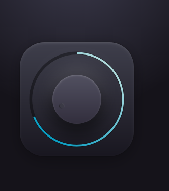
以下是 HTML5+CSS3音量调节旋转按钮源码 的示例演示效果:
部分效果截图:
HTML代码(index.html):
<!DOCTYPE html>
<html>
<head>
<meta charset="UTF-8">
<title>HTML5+CSS3音量调节旋转按钮</title>
<meta name="viewport" content="width=device-width, initial-scale=1">
<link rel="stylesheet" href="css/style.css" media="screen" type="text/css" />
</head>

<body>
<div id="icon" class="icon">
<svg
   class="outline"
   viewBox="0 0 216 216"
   preserveAspectRatio="xMidYMid meet"
   xmlns="http://www.w3.org/2000/svg">
<defs>
  <linearGradient x1="16.291%" y1="13.917%" x2="88.893%" y2="80.425%" id="a">
	  <stop stop-color="#B0DBDD" offset="0%"/>
	  <stop stop-color="#0AA3C9" offset="100%"/>
  </linearGradient>
</defs>
<g fill="none" fill-rule="evenodd">
  <path d="M10 108c0-54.124 43.876-98 98-98s98 43.876 98 98-43.876 98-98 98-98-43.876-98-98z" stroke="rgba(0,0,0,.4)" stroke-width="6"/>

  <path id="path" class="path" d="M10 108c0-54.124 43.876-98 98-98s98 43.876 98 98-43.876 98-98 98-98-43.876-98-98z" stroke="url(#a)" stroke-width="4"/>
</g>
</svg>
<div class="wheel">
<div id="indicator" class="indicator"></div>
</div>
</div>

<script src='js/jquery.js'></script>
<script src='js/TweenLite.min.js'></script>
<script src='js/Draggable.min.js'></script>
<script src='js/CSSPlugin.min.js'></script>
<script src="js/index.js"></script>
</body>
</html>
JS代码(index.js):
var path = $('#path');
	Draggable.create("#indicator",{
	type:"rotation",throwProps:true,maxRotation:360,onDrag:function(){
	var i = this.rotation;
	path.css('stroke-dashoffset',620*(1-i/360));
}
,}
);
CSS代码(style.css):
.icon > *{position:absolute;bottom:0;top:0;left:0;right:0;margin:auto;}
html,body{height:100%;background:-webkit-radial-gradient(50% 0,circle,#3c3b4d 0%,#15131a 50%);background:radial-gradient(circle at 50% 0,#3c3b4d 0%,#15131a 50%);}
body{display:-webkit-flex;display:-ms-flexbox;display:flex;-webkit-flex-direction:column;-ms-flex-direction:column;flex-direction:column;-webkit-align-items:center;-ms-flex-align:center;align-items:center;-webkit-justify-content:center;-ms-flex-pack:center;justify-content:center;}
h4{color:#3C3B4D;font-family:"Helvetica Neue",sans-serif;font-weight:200;}
.icon{width:14em;height:14em;border-radius:3em;position:relative;-webkit-flex-shrink:0;-ms-flex-negative:0;flex-shrink:0;box-shadow:0 0.5em 2em rgba(0,0,0,0.3),inset 0 0.2em 0.4em -0.2em rgba(255,255,255,0.2),0 0 0.2em rgba(0,0,0,0.4);background:-webkit-linear-gradient(top,#3F3F4C,#191720);background:linear-gradient(to bottom,#3F3F4C,#191720);}
.wheel{width:6em;height:6em;border-radius:50%;box-shadow:inset 0 0.1em 0.2em rgba(255,255,255,0.2),0 1em 2em 0.4em rgba(0,0,0,0.5),0 -1em 2em 0.1em rgba(255,255,255,0.1);background:-webkit-linear-gradient(top,#525161,#322E3D);background:linear-gradient(to bottom,#525161,#322E3D);}
.wheel .indicator{width:100%;height:100%;}
.wheel .indicator:after{content:'';display:block;position:absolute;background:#3B3A46;border-radius:50%;width:.65em;height:.65em;top:.6em;left:0;right:0;margin:auto;box-shadow:0 1px 1px -1px rgba(255,255,255,0.4),inset 0 1px 1px rgba(0,0,0,0.4);}
.outline{width:12.5em;height:12.5em;-webkit-transform:translateZ(0) rotateZ(90deg);transform:translateZ(0) rotateZ(90deg);}
.path{stroke-dasharray:620;stroke-dashoffset:620;}
@-webkit-keyframes path{40%{stroke-dashoffset:100;}
100%{stroke-dashoffset:620;}
}
@keyframes path{40%{stroke-dashoffset:100;}
100%{stroke-dashoffset:620;}
}
@-webkit-keyframes rotate{40%{-webkit-transform:rotateZ(320deg);transform:rotateZ(320deg);}
100%{-webkit-transform:rotateZ(0);transform:rotateZ(0);}
}
@keyframes rotate{40%{-webkit-transform:rotateZ(320deg);transform:rotateZ(320deg);}
100%{-webkit-transform:rotateZ(0);transform:rotateZ(0);}
}
.path{-webkit-animation:path 2s;animation:path 2s;}
.indicator{-webkit-animation:rotate 2s;animation:rotate 2s;}


 分享到QQ
分享到QQ 分享到微博
分享到微博 微信扫一扫
微信扫一扫