以下是 HTML5+CSS3悬浮按钮彩球效果特效代码 的示例演示效果:
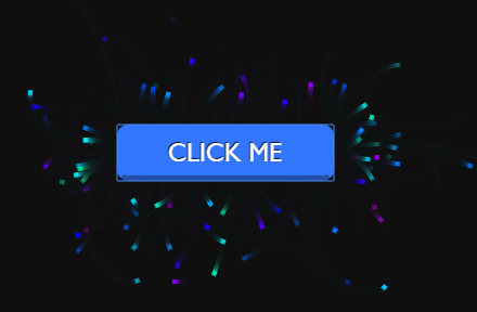
部分效果截图:
HTML代码(index.html):
<!DOCTYPE html>
<html>
<head>
    <meta charset="UTF-8">
    <title>HTML5+CSS3悬浮按钮彩球效果</title>
    <style>
        body {
            margin: 0;
            overflow: hidden;
        }

        #myCanvas {
            display: block;
        }

        #button {
            font-family: "Gill Sans", "Gill Sans MT", Calibri, sans-serif;
            position: absolute;
            font-size: 1.5em;
            text-transform: uppercase;
            padding: 7px 20px;
            left: 50%;
            width: 200px;
            margin-left: -100px;
            top: 50%;
            border-radius: 10px;
            color: white;
            text-shadow: -1px -1px 1px rgba(0,0,0,0.8);
            border: 5px solid transparent;
            border-bottom-color: rgba(0,0,0,0.35);
            background: hsla(260, 100%, 50%, 1);
            cursor: pointer;
            animation: pulse 1s infinite alternate;
            transition: background 0.4s, border 0.2s, margin 0.2s;
        }

        #button:hover {
            background: hsla(220, 100%, 60%, 1);
            margin-top: -1px;
            animation: none;
        }

        #button:active {
            border-bottom-width: 0;
            margin-top: 5px;
        }

        @keyframes pulse {
            0% {
                margin-top: 0px;
            }

            100% {
                margin-top: 6px;
            }
        }
    </style>

    <script src="js/prefixfree.min.js"></script>

</head>

<body>
    <button id="button">click me</button>
    <canvas id="myCanvas" width="500" height="500"></canvas>
    <script src="js/index.js"></script>
</body>
</html>
JS代码(index.js):
window.requestAnimFrame = (function (){
	return window.requestAnimationFrame ||window.webkitRequestAnimationFrame ||window.mozRequestAnimationFrame ||window.oRequestAnimationFrame ||window.msRequestAnimationFrame ||function (callback){
	window.setTimeout(callback,1000 / 60);
}
;
}
)();
	Math.randMinMax = function(min,max,round){
	var val = min + (Math.random() * (max - min));
	if( round ) val = Math.round( val );
	return val;
}
;
	Math.TO_RAD = Math.PI/180;
	Math.getAngle = function( x1,y1,x2,y2 ){
	vardx = x1 - x2,dy = y1 - y2;
	return Math.atan2(dy,dx);
}
;
	Math.getDistance = function( x1,y1,x2,y2 ){
	varxs = x2 - x1,ys = y2 - y1;
	xs *= xs;
	ys *= ys;
	return Math.sqrt( xs + ys );
}
;
	varFX ={
}
;
	(function(){
	varcanvas = document.getElementById('myCanvas'),ctx = canvas.getContext('2d'),lastUpdate = new Date(),mouseUpdate = new Date(),lastMouse = [],width,height;
	FX.particles = [];
	setFullscreen();
	document.getElementById('button').addEventListener('mousedown',buttonEffect);
	function buttonEffect(){
	var button = document.getElementById('button'),height = button.offsetHeight,left = button.offsetLeft,top = button.offsetTop,width = button.offsetWidth,x,y,degree;
	for(var i=0;
	i<40;
	i=i+1){
	if( Math.random() < 0.5 ){
	y = Math.randMinMax(top,top+height);
	if( Math.random() < 0.5 ){
	x = left;
	degree = Math.randMinMax(-45,45);
}
else{
	x = left + width;
	degree = Math.randMinMax(135,225);
}
}
else{
	x = Math.randMinMax(left,left+width);
	if( Math.random() < 0.5 ){
	y = top;
	degree = Math.randMinMax(45,135);
}
else{
	y = top + height;
	degree = Math.randMinMax(-135,-45);
}
}
createParticle({
	x:x,y:y,degree:degree,speed:Math.randMinMax(100,150),vs:Math.randMinMax(-4,-1)}
);
}
}
window.setTimeout(buttonEffect,100);
	loop();
	window.addEventListener('resize',setFullscreen );
	function createParticle( args ){
	var options ={
	x:width/2,y:height/2,color:'hsla('+ Math.randMinMax(160,290) +',100%,50%,'+(Math.random().toFixed(2))+')',degree:Math.randMinMax(0,360),speed:Math.randMinMax(300,350),vd:Math.randMinMax(-90,90),vs:Math.randMinMax(-8,-5)}
;
	for (key in args){
	options[key] = args[key];
}
FX.particles.push( options );
}
function loop(){
	varthisUpdate = new Date(),delta = (lastUpdate - thisUpdate) / 1000,amount = FX.particles.length,size = 2,i = 0,p;
	ctx.fillStyle = 'rgba(15,15,15,0.25)';
	ctx.fillRect(0,0,width,height);
	ctx.globalCompositeStyle = 'lighter';
	for(;
	i<amount;
	i=i+1){
	p = FX.particles[ i ];
	p.degree += (p.vd * delta);
	p.speed += (p.vs);
	// * delta);
	if( p.speed < 0 ) continue;
	p.x += Math.cos(p.degree * Math.TO_RAD) * (p.speed * delta);
	p.y += Math.sin(p.degree * Math.TO_RAD) * (p.speed * delta);
	ctx.save();
	ctx.translate( p.x,p.y );
	ctx.rotate( p.degree * Math.TO_RAD );
	ctx.fillStyle = p.color;
	ctx.fillRect( -size,-size,size*2,size*2 );
	ctx.restore();
}
lastUpdate = thisUpdate;
	requestAnimFrame( loop );
}
function setFullscreen(){
	width = canvas.width = window.innerWidth;
	height = canvas.height = window.innerHeight;
}
;
}
)();
CSS代码(style.css):
body{margin:0;overflow:hidden;}
#myCanvas{display:block;}
#button{font-family:"Gill Sans","Gill Sans MT",Calibri,sans-serif;position:absolute;font-size:1.5em;text-transform:uppercase;padding:7px 20px;left:50%;width:200px;margin-left:-100px;top:50%;border-radius:10px;color:white;text-shadow:-1px -1px 1px rgba(0,0,0,0.8);border:5px solid transparent;border-bottom-color:rgba(0,0,0,0.35);background:hsla(260,100%,50%,1);cursor:pointer;animation:pulse 1s infinite alternate;transition:background 0.4s,border 0.2s,margin 0.2s;}
#button:hover{background:hsla(220,100%,60%,1);margin-top:-1px;animation:none;}
#button:active{border-bottom-width:0;margin-top:5px;}
@keyframes pulse{0%{margin-top:0px;}
100%{margin-top:6px;}
}


 分享到QQ
分享到QQ 分享到微博
分享到微博 微信扫一扫
微信扫一扫