以下是 7款HTML5 Canvas全屏背景动画特效 的示例演示效果:
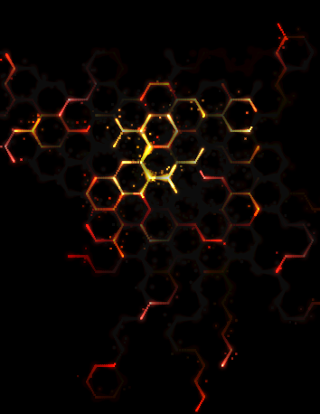
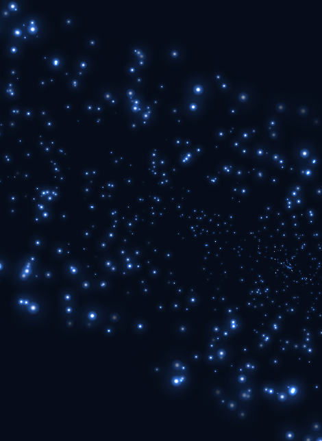
部分效果截图1:
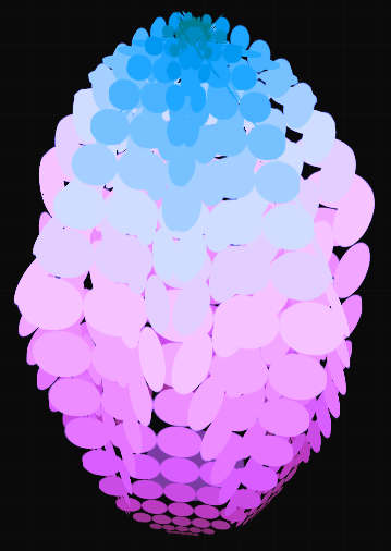
部分效果截图2:
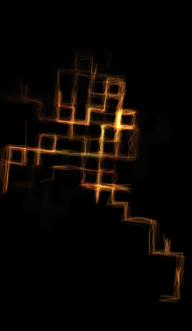
部分效果截图3:
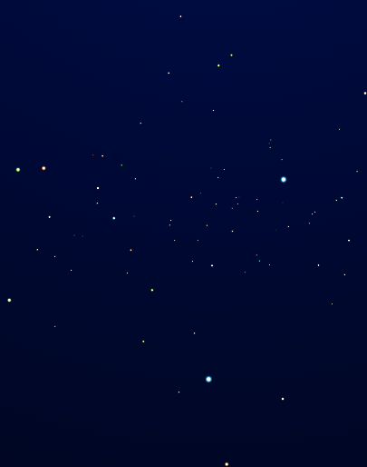
部分效果截图4:
部分效果截图5:
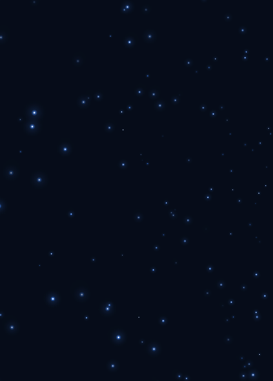
部分效果截图6:
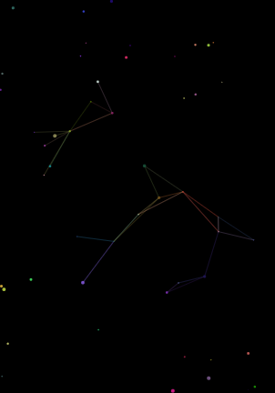
部分效果截图7:
HTML代码(index.html):
<!DOCTYPE html>
<html >
<head>
<meta charset="gb2312">
<meta name="google" value="notranslate">
<meta name="robots" content="noindex">
<title>7��HTML5 Canvasȫ������������Ч</title>
<style>
canvas { position: absolute; top: 0; left: 0; }

/* Demo Buttons Style */
.codrops-demos {
	font-size: 0.8em;
	text-align:center;
	position:absolute;
	z-index:99;
	width:96%;
}

.codrops-demos a {
	display: inline-block;
	margin: 0.35em 0.1em;
	padding: 0.5em 1.2em;
	outline: none;
	text-decoration: none;
	text-transform: uppercase;
	letter-spacing: 1px;
	font-weight: 700;
	border-radius: 2px;
	font-size: 110%;
	border: 2px solid transparent;
	color:#fff;
}

.codrops-demos a:hover,
.codrops-demos a.current-demo {
	border-color: #383a3c;
}
</style>
</head>

<body>

<nav class="codrops-demos">
	<a class="current-demo" href="index.html">Demo 1</a>
	<a href="index2.html">Demo 2</a>
	<a href="index3.html">Demo 3</a>
	<a href="index4.html">Demo 4</a>
	<a href="index5.html">Demo 5</a>
	<a href="index6.html">Demo 6</a>
	<a href="index7.html">Demo 7</a>
</nav>

<canvas id="c"></canvas>

<script type="text/javascript">
var w = c.width = window.innerWidth,
h = c.height = window.innerHeight,
ctx = c.getContext('2d'),
opts = {
	len: 20,
	count: 50,
	baseTime: 10,
	addedTime: 10,
	dieChance: .05,
	spawnChance: 1,
	sparkChance: .1,
	sparkDist: 10,
	sparkSize: 2,
	color: 'hsl(hue,100%,light%)',
	baseLight: 50,
	addedLight: 10,
	shadowToTimePropMult: 6,
	baseLightInputMultiplier: .01,
	addedLightInputMultiplier: .02,
	cx: w / 2,
	cy: h / 2,
	repaintAlpha: .04,
	hueChange: .1
},
tick = 0,
lines = [],
dieX = w / 2 / opts.len,
dieY = h / 2 / opts.len,
baseRad = Math.PI * 2 / 6;
ctx.fillStyle = 'black';
ctx.fillRect(0, 0, w, h);
function loop() {
	window.requestAnimationFrame(loop); ++tick;
	ctx.globalCompositeOperation = 'source-over';
	ctx.shadowBlur = 0;
	ctx.fillStyle = 'rgba(0,0,0,alp)'.replace('alp', opts.repaintAlpha);
	ctx.fillRect(0, 0, w, h);
	ctx.globalCompositeOperation = 'lighter';
	if (lines.length < opts.count && Math.random() < opts.spawnChance) lines.push(new Line);
	lines.map(function(line) {
		line.step()
	})
}
function Line() {
	this.reset()
}
Line.prototype.reset = function() {
	this.x = 0;
	this.y = 0;
	this.addedX = 0;
	this.addedY = 0;
	this.rad = 0;
	this.lightInputMultiplier = opts.baseLightInputMultiplier + opts.addedLightInputMultiplier * Math.random();
	this.color = opts.color.replace('hue', tick * opts.hueChange);
	this.cumulativeTime = 0;
	this.beginPhase()
}
Line.prototype.beginPhase = function() {
	this.x += this.addedX;
	this.y += this.addedY;
	this.time = 0;
	this.targetTime = (opts.baseTime + opts.addedTime * Math.random()) | 0;
	this.rad += baseRad * (Math.random() < .5 ? 1 : -1);
	this.addedX = Math.cos(this.rad);
	this.addedY = Math.sin(this.rad);
	if (Math.random() < opts.dieChance || this.x > dieX || this.x < -dieX || this.y > dieY || this.y < -dieY) this.reset()
}
Line.prototype.step = function() {++this.time; ++this.cumulativeTime;
	if (this.time >= this.targetTime) this.beginPhase();
	var prop = this.time / this.targetTime,
	wave = Math.sin(prop * Math.PI / 2),
	x = this.addedX * wave,
	y = this.addedY * wave;
	ctx.shadowBlur = prop * opts.shadowToTimePropMult;
	ctx.fillStyle = ctx.shadowColor = this.color.replace('light', opts.baseLight + opts.addedLight * Math.sin(this.cumulativeTime * this.lightInputMultiplier));
	ctx.fillRect(opts.cx + (this.x + x) * opts.len, opts.cy + (this.y + y) * opts.len, 2, 2);
	if (Math.random() < opts.sparkChance) ctx.fillRect(opts.cx + (this.x + x) * opts.len + Math.random() * opts.sparkDist * (Math.random() < .5 ? 1 : -1) - opts.sparkSize / 2, opts.cy + (this.y + y) * opts.len + Math.random() * opts.sparkDist * (Math.random() < .5 ? 1 : -1) - opts.sparkSize / 2, opts.sparkSize, opts.sparkSize)
}
loop();
window.addEventListener('resize',
function() {
	w = c.width = window.innerWidth;
	h = c.height = window.innerHeight;
	ctx.fillStyle = 'black';
	ctx.fillRect(0, 0, w, h);
	opts.cx = w / 2;
	opts.cy = h / 2;
	dieX = w / 2 / opts.len;
	dieY = h / 2 / opts.len
});
</script>
</body>
</html>
HTML代码(index2.html):
<!DOCTYPE html>
<html >
<head>
<meta charset="UTF-8">
<meta name="google" value="notranslate">
<title>code2</title>
<style>
HTML, BODY { height: 100%; overflow: hidden; }
BODY { background: #0a0a0a; background-image: -webkit-linear-gradient(#0f0f0f 1px, transparent 1px), -webkit-linear-gradient(left, #0f0f0f 1px, transparent 1px); background-image: linear-gradient(#0f0f0f 1px, transparent 1px), linear-gradient(to right, #0f0f0f 1px, transparent 1px); background-size: 3.33333vmin 3.33333vmin; }
.range { /* display: none; */
position: absolute; zind: 2px; }
.wrapper { position: absolute; top: 0; right: 0; bottom: 0; left: 0; margin: auto; width: 10vmin; height: 10vmin; font-size: 10vmin; -webkit-transform: rotateX(-45deg); transform: rotateX(-45deg); -webkit-transform-style: preserve-3d; transform-style: preserve-3d; }
.flower { width: 10vmin; height: 10vmin; -webkit-animation: rotate-flower 10s linear infinite; animation: rotate-flower 10s linear infinite; -webkit-transform-style: preserve-3d; transform-style: preserve-3d; }
.flower:before { content: ''; display: block; position: absolute; width: 95%; height: 95%; top: 0; right: 0; bottom: 0; left: 0; margin: auto; background: #226600; border-radius: 50%; -webkit-transform: rotateX(90deg); transform: rotateX(90deg); -webkit-animation: rotate-hue 5s infinite; animation: rotate-hue 5s infinite; }
.petal { position: absolute; z-index: 20; bottom: 80%; left: -10vmin; -webkit-transform-style: preserve-3d; transform-style: preserve-3d; -webkit-transform-origin: bottom; transform-origin: bottom; }
.box { width: 30vmin; -webkit-transform-style: preserve-3d; transform-style: preserve-3d; -webkit-transform-origin: bottom; transform-origin: bottom; -webkit-animation: rotate-box 12s infinite; animation: rotate-box 12s infinite; }
.shape { width: 0.5em; height: 0.5em; margin: auto; background: currentColor; box-shadow: 0.5em 0 0 0, 1em 0 0 0, -1em 0 0 0, -0.5em 0 0 0; border-radius: 50%; -webkit-animation: rotate-hue 5s infinite; animation: rotate-hue 5s infinite; }
 @-webkit-keyframes rotate-box {
 0% {
 -webkit-transform: rotateX(3.5deg);
 transform: rotateX(3.5deg);
}
 15% {
 -webkit-transform: rotateX(3.5deg);
 transform: rotateX(3.5deg);
}
 50% {
 -webkit-transform: rotateX(-7deg);
 transform: rotateX(-7deg);
}
 80% {
 -webkit-transform: rotateX(-7deg);
 transform: rotateX(-7deg);
}
 100% {
 -webkit-transform: rotateX(3.5deg);
 transform: rotateX(3.5deg);
}
}
 @keyframes rotate-box {
 0% {
 -webkit-transform: rotateX(3.5deg);
 transform: rotateX(3.5deg);
}
 15% {
 -webkit-transform: rotateX(3.5deg);
 transform: rotateX(3.5deg);
}
 50% {
 -webkit-transform: rotateX(-7deg);
 transform: rotateX(-7deg);
}
 80% {
 -webkit-transform: rotateX(-7deg);
 transform: rotateX(-7deg);
}
 100% {
 -webkit-transform: rotateX(3.5deg);
 transform: rotateX(3.5deg);
}
}
@-webkit-keyframes rotate-flower {
 100% {
 -webkit-transform: rotateY(360deg);
 transform: rotateY(360deg);
}
}
@keyframes rotate-flower {
 100% {
 -webkit-transform: rotateY(360deg);
 transform: rotateY(360deg);
}
}
@-webkit-keyframes rotate-hue {
 100% {
 -webkit-filter: hue-rotate(360deg);
 filter: hue-rotate(360deg);
}
}
@keyframes rotate-hue {
 100% {
 -webkit-filter: hue-rotate(360deg);
 filter: hue-rotate(360deg);
}
}

/* Demo Buttons Style */
.codrops-demos {
	font-size: 0.8em;
	text-align:center;
	position:absolute;
	z-index:99;
	width:96%;
}

.codrops-demos a {
	display: inline-block;
	margin: 0.35em 0.1em;
	padding: 0.5em 1.2em;
	outline: none;
	text-decoration: none;
	text-transform: uppercase;
	letter-spacing: 1px;
	font-weight: 700;
	border-radius: 2px;
	font-size: 110%;
	border: 2px solid transparent;
	color:#fff;
}

.codrops-demos a:hover,
.codrops-demos a.current-demo {
	border-color: #383a3c;
}
</style>
</head>

<body>

<nav class="codrops-demos">
	<a href="index.html">Demo 1</a>
	<a class="current-demo" href="index2.html">Demo 2</a>
	<a href="index3.html">Demo 3</a>
	<a href="index4.html">Demo 4</a>
	<a href="index5.html">Demo 5</a>
	<a href="index6.html">Demo 6</a>
	<a href="index7.html">Demo 7</a>
</nav>

<div class="wrapper">
  <div class="flower"></div>
</div>
<script>
 console.clear();

var doc = document;
var flower = doc.querySelector('.flower');
var range = doc.querySelector('.range');

var petalPartMarkup = '<div class="box"> \
                    <div class="shape"></div> \
                </div>';

var maxParts = 20;
var maxPetalsDef = 6;
var maxPetals = maxPetalsDef;

var partsFontStepDef = 25 / maxParts;
var partsFontStep = partsFontStepDef;
var huetStep = 150 / maxParts;

createFlower();

function createFlower() {

	var angle = 360 / maxPetals;

	for (var i = 0; i < maxPetals; i++) {
		var petal = createPetal();
		var currAngle = angle * i + 'deg';
		var transform = 'transform: rotateY(' + currAngle + ') rotateX(-30deg) translateZ(9vmin)';

		petal.setAttribute('style', transform);

		flower.appendChild(petal);
	}
}

function createPetal() {

	var box = createBox(null, 0);

	var petal = doc.createElement('div');
	petal.classList.add('petal');

	for (var i = 1; i <= maxParts; i++) {
		newBox = createBox(box, i);
		box = newBox;
	}

	petal.appendChild(box);

	return petal;
}

function createBox(box, pos) {

	var fontSize = partsFontStep * (maxParts - pos) + 'vmin';
	var half = maxParts / 2;

	var bright = '50';

	if (pos < half + 1) {
		fontSize = partsFontStep * pos + 'vmin';
	} else {
		bright = 10 + 40 / half * (maxParts - pos);
	}

	var color = 'hsl(' + huetStep * pos + ', 100%, ' + bright + '%)';

	// 1. Add shape
	var newShape = doc.createElement('div');
	newShape.classList.add('shape');

	// 2. Create wrapper .box
	var newBox = doc.createElement('div');
	newBox.classList.add('box');

	var boxStyle = ['color: ' + color, 'font-size: ' + fontSize].join(';');
	newBox.setAttribute('style', boxStyle);

	// 3. Add old box to new box
	if (box) {
		newBox.appendChild(box);
	}

	// 4. Add shape to new box
	newBox.appendChild(newShape);

	return newBox;
}

function out(content) {
	console.log(content);
}
</script>
</body>
</html>
HTML代码(index3.html):
<!doctype html>
<html>
<head>
<meta charset="utf-8">
<title>code3</title>
<style>
body {
	background: #000;
	overflow: hidden;
}

canvas {
	display: block;
}

/* Demo Buttons Style */
.codrops-demos {
	font-size: 0.8em;
	text-align:center;
	position:absolute;
	z-index:99;
	width:96%;
}

.codrops-demos a {
	display: inline-block;
	margin: 0.35em 0.1em;
	padding: 0.5em 1.2em;
	outline: none;
	text-decoration: none;
	text-transform: uppercase;
	letter-spacing: 1px;
	font-weight: 700;
	border-radius: 2px;
	font-size: 110%;
	border: 2px solid transparent;
	color:#fff;
}

.codrops-demos a:hover,
.codrops-demos a.current-demo {
	border-color: #383a3c;
}
</style>
</head>

<body>

<nav class="codrops-demos">
	<a href="index.html">Demo 1</a>
	<a href="index2.html">Demo 2</a>
	<a class="current-demo" href="index3.html">Demo 3</a>
	<a href="index4.html">Demo 4</a>
	<a href="index5.html">Demo 5</a>
	<a href="index6.html">Demo 6</a>
	<a href="index7.html">Demo 7</a>
</nav>

<canvas id="canvas"></canvas>
<script>
var canvas,
	ctx,
	width,
	height,
	size,
	lines,
	tick;

function line() {
	this.path = [];
	this.speed = rand(10, 20);
	this.count = randInt(10, 30);
	this.x = width / 2, +1;
	this.y = height / 2 + 1;
	this.target = {
		x: width / 2,
		y: height / 2
	};
	this.dist = 0;
	this.angle = 0;
	this.hue = tick / 5;
	this.life = 1;
	this.updateAngle();
	this.updateDist();
}

line.prototype.step = function(i) {
	this.x += Math.cos(this.angle) * this.speed;
	this.y += Math.sin(this.angle) * this.speed;

	this.updateDist();

	if (this.dist < this.speed) {
		this.x = this.target.x;
		this.y = this.target.y;
		this.changeTarget();
	}

	this.path.push({
		x: this.x,
		y: this.y
	});
	if (this.path.length > this.count) {
		this.path.shift();
	}

	this.life -= 0.001;

	if (this.life <= 0) {
		this.path = null;
		lines.splice(i, 1);
	}
};

line.prototype.updateDist = function() {
	var dx = this.target.x - this.x,
		dy = this.target.y - this.y;
	this.dist = Math.sqrt(dx * dx + dy * dy);
}

line.prototype.updateAngle = function() {
	var dx = this.target.x - this.x,
		dy = this.target.y - this.y;
	this.angle = Math.atan2(dy, dx);
}

line.prototype.changeTarget = function() {
	var randStart = randInt(0, 3);
	switch (randStart) {
		case 0: // up
			this.target.y = this.y - size;
			break;
		case 1: // right
			this.target.x = this.x + size;
			break;
		case 2: // down
			this.target.y = this.y + size;
			break;
		case 3: // left
			this.target.x = this.x - size;
	}
	this.updateAngle();
};

line.prototype.draw = function(i) {
	ctx.beginPath();
	var rando = rand(0, 10);
	for (var j = 0, length = this.path.length; j < length; j++) {
		ctx[(j === 0) ? 'moveTo' : 'lineTo'](this.path[j].x + rand(-rando, rando), this.path[j].y + rand(-rando, rando));
	}
	ctx.strokeStyle = 'hsla(' + rand(this.hue, this.hue + 30) + ', 80%, 55%, ' + (this.life / 3) + ')';
	ctx.lineWidth = rand(0.1, 2);
	ctx.stroke();
};

function rand(min, max) {
	return Math.random() * (max - min) + min;
}

function randInt(min, max) {
	return Math.floor(min + Math.random() * (max - min + 1));
};

function init() {
	canvas = document.getElementById('canvas');
	ctx = canvas.getContext('2d');
	size = 30;
	lines = [];
	reset();
	loop();
}

function reset() {
	width = Math.ceil(window.innerWidth / 2) * 2;
	height = Math.ceil(window.innerHeight / 2) * 2;
	tick = 0;

	lines.length = 0;
	canvas.width = width;
	canvas.height = height;
}

function create() {
	if (tick % 10 === 0) {
		lines.push(new line());
	}
}

function step() {
	var i = lines.length;
	while (i--) {
		lines[i].step(i);
	}
}

function clear() {
	ctx.globalCompositeOperation = 'destination-out';
	ctx.fillStyle = 'hsla(0, 0%, 0%, 0.1';
	ctx.fillRect(0, 0, width, height);
	ctx.globalCompositeOperation = 'lighter';
}

function draw() {
	ctx.save();
	ctx.translate(width / 2, height / 2);
	ctx.rotate(tick * 0.001);
	var scale = 0.8 + Math.cos(tick * 0.02) * 0.2;
	ctx.scale(scale, scale);
	ctx.translate(-width / 2, -height / 2);
	var i = lines.length;
	while (i--) {
		lines[i].draw(i);
	}
	ctx.restore();
}

function loop() {
	requestAnimationFrame(loop);
	create();
	step();
	clear();
	draw();
	tick++;
}

function onresize() {
	reset();
}

window.addEventListener('resize', onresize);

init();
</script>
</body>
</html>
HTML代码(index4.html):
<!doctype html>
<html>
<head>
<meta charset="utf-8">
<title>code7</title>
<style>
html {
  height: 100%;
  background-image: -webkit-radial-gradient(ellipse farthest-corner at center top, #000d4d 0%, #000105 100%);
  background-image: radial-gradient(ellipse farthest-corner at center top, #000d4d 0%, #000105 100%);
  cursor: move;
}

body {
  width: 100%;
  margin: 0;
  overflow: hidden;
}

/* Demo Buttons Style */
.codrops-demos {
	font-size: 0.8em;
	text-align:center;
	position:absolute;
	z-index:99;
	width:96%;
}

.codrops-demos a {
	display: inline-block;
	margin: 0.35em 0.1em;
	padding: 0.5em 1.2em;
	outline: none;
	text-decoration: none;
	text-transform: uppercase;
	letter-spacing: 1px;
	font-weight: 700;
	border-radius: 2px;
	font-size: 110%;
	border: 2px solid transparent;
	color:#fff;
}

.codrops-demos a:hover,
.codrops-demos a.current-demo {
	border-color: #383a3c;
}
</style>
</head>

<body>


<nav class="codrops-demos">
	<a href="index.html">Demo 1</a>
	<a href="index2.html">Demo 2</a>
	<a href="index3.html">Demo 3</a>
	<a class="current-demo" href="index4.html">Demo 4</a>
	<a href="index5.html">Demo 5</a>
	<a href="index6.html">Demo 6</a>
	<a href="index7.html">Demo 7</a>
</nav>

<canvas id="canv"></canvas>
<script>
var num = 200;
var w = window.innerWidth;
var h = window.innerHeight;
var max = 100;
var _x = 0;
var _y = 0;
var _z = 150;
var dtr = function(d) {
  return d * Math.PI / 180;
};

var rnd = function() {
  return Math.sin(Math.floor(Math.random() * 360) * Math.PI / 180);
};
var dist = function(p1, p2, p3) {
  return Math.sqrt(Math.pow(p2.x - p1.x, 2) + Math.pow(p2.y - p1.y, 2) + Math.pow(p2.z - p1.z, 2));
};

var cam = {
  obj: {
    x: _x,
    y: _y,
    z: _z
  },
  dest: {
    x: 0,
    y: 0,
    z: 1
  },
  dist: {
    x: 0,
    y: 0,
    z: 200
  },
  ang: {
    cplane: 0,
    splane: 0,
    ctheta: 0,
    stheta: 0
  },
  zoom: 1,
  disp: {
    x: w / 2,
    y: h / 2,
    z: 0
  },
  upd: function() {
    cam.dist.x = cam.dest.x - cam.obj.x;
    cam.dist.y = cam.dest.y - cam.obj.y;
    cam.dist.z = cam.dest.z - cam.obj.z;
    cam.ang.cplane = -cam.dist.z / Math.sqrt(cam.dist.x * cam.dist.x + cam.dist.z * cam.dist.z);
    cam.ang.splane = cam.dist.x / Math.sqrt(cam.dist.x * cam.dist.x + cam.dist.z * cam.dist.z);
    cam.ang.ctheta = Math.sqrt(cam.dist.x * cam.dist.x + cam.dist.z * cam.dist.z) / Math.sqrt(cam.dist.x * cam.dist.x + cam.dist.y * cam.dist.y + cam.dist.z * cam.dist.z);
    cam.ang.stheta = -cam.dist.y / Math.sqrt(cam.dist.x * cam.dist.x + cam.dist.y * cam.dist.y + cam.dist.z * cam.dist.z);
  }
};

var trans = {
  parts: {
    sz: function(p, sz) {
      return {
        x: p.x * sz.x,
        y: p.y * sz.y,
        z: p.z * sz.z
      };
    },
    rot: {
      x: function(p, rot) {
        return {
          x: p.x,
          y: p.y * Math.cos(dtr(rot.x)) - p.z * Math.sin(dtr(rot.x)),
          z: p.y * Math.sin(dtr(rot.x)) + p.z * Math.cos(dtr(rot.x))
        };
      },
      y: function(p, rot) {
        return {
          x: p.x * Math.cos(dtr(rot.y)) + p.z * Math.sin(dtr(rot.y)),
          y: p.y,
          z: -p.x * Math.sin(dtr(rot.y)) + p.z * Math.cos(dtr(rot.y))
        };
      },
      z: function(p, rot) {
        return {
          x: p.x * Math.cos(dtr(rot.z)) - p.y * Math.sin(dtr(rot.z)),
          y: p.x * Math.sin(dtr(rot.z)) + p.y * Math.cos(dtr(rot.z)),
          z: p.z
        };
      }
    },
    pos: function(p, pos) {
      return {
        x: p.x + pos.x,
        y: p.y + pos.y,
        z: p.z + pos.z
      };
    }
  },
  pov: {
    plane: function(p) {
      return {
        x: p.x * cam.ang.cplane + p.z * cam.ang.splane,
        y: p.y,
        z: p.x * -cam.ang.splane + p.z * cam.ang.cplane
      };
    },
    theta: function(p) {
      return {
        x: p.x,
        y: p.y * cam.ang.ctheta - p.z * cam.ang.stheta,
        z: p.y * cam.ang.stheta + p.z * cam.ang.ctheta
      };
    },
    set: function(p) {
      return {
        x: p.x - cam.obj.x,
        y: p.y - cam.obj.y,
        z: p.z - cam.obj.z
      };
    }
  },
  persp: function(p) {
    return {
      x: p.x * cam.dist.z / p.z * cam.zoom,
      y: p.y * cam.dist.z / p.z * cam.zoom,
      z: p.z * cam.zoom,
      p: cam.dist.z / p.z
    };
  },
  disp: function(p, disp) {
    return {
      x: p.x + disp.x,
      y: -p.y + disp.y,
      z: p.z + disp.z,
      p: p.p
    };
  },
  steps: function(_obj_, sz, rot, pos, disp) {
    var _args = trans.parts.sz(_obj_, sz);
    _args = trans.parts.rot.x(_args, rot);
    _args = trans.parts.rot.y(_args, rot);
    _args = trans.parts.rot.z(_args, rot);
    _args = trans.parts.pos(_args, pos);
    _args = trans.pov.plane(_args);
    _args = trans.pov.theta(_args);
    _args = trans.pov.set(_args);
    _args = trans.persp(_args);
    _args = trans.disp(_args, disp);
    return _args;
  }
};

(function() {
  "use strict";
  var threeD = function(param) {
    this.transIn = {};
    this.transOut = {};
    this.transIn.vtx = (param.vtx);
    this.transIn.sz = (param.sz);
    this.transIn.rot = (param.rot);
    this.transIn.pos = (param.pos);
  };

  threeD.prototype.vupd = function() {
    this.transOut = trans.steps(

      this.transIn.vtx,
      this.transIn.sz,
      this.transIn.rot,
      this.transIn.pos,
      cam.disp
    );
  };

  var Build = function() {
    this.vel = 0.04;
    this.lim = 360;
    this.diff = 200;
    this.initPos = 100;
    this.toX = _x;
    this.toY = _y;
    this.go();
  };

  Build.prototype.go = function() {
    this.canvas = document.getElementById("canv");
    this.canvas.width = window.innerWidth;
    this.canvas.height = window.innerHeight;
    this.$ = canv.getContext("2d");
    this.$.globalCompositeOperation = 'source-over';
    this.varr = [];
    this.dist = [];
    this.calc = [];

    for (var i = 0, len = num; i < len; i++) {
      this.add();
    }

    this.rotObj = {
      x: 0,
      y: 0,
      z: 0
    };
    this.objSz = {
      x: w / 5,
      y: h / 5,
      z: w / 5
    };
  };

  Build.prototype.add = function() {
    this.varr.push(new threeD({
      vtx: {
        x: rnd(),
        y: rnd(),
        z: rnd()
      },
      sz: {
        x: 0,
        y: 0,
        z: 0
      },
      rot: {
        x: 20,
        y: -20,
        z: 0
      },
      pos: {
        x: this.diff * Math.sin(360 * Math.random() * Math.PI / 180),
        y: this.diff * Math.sin(360 * Math.random() * Math.PI / 180),
        z: this.diff * Math.sin(360 * Math.random() * Math.PI / 180)
      }
    }));
    this.calc.push({
      x: 360 * Math.random(),
      y: 360 * Math.random(),
      z: 360 * Math.random()
    });
  };

  Build.prototype.upd = function() {
    cam.obj.x += (this.toX - cam.obj.x) * 0.05;
    cam.obj.y += (this.toY - cam.obj.y) * 0.05;
  };

  Build.prototype.draw = function() {
    this.$.clearRect(0, 0, this.canvas.width, this.canvas.height);
    cam.upd();
    this.rotObj.x += 0.1;
    this.rotObj.y += 0.1;
    this.rotObj.z += 0.1;

    for (var i = 0; i < this.varr.length; i++) {
      for (var val in this.calc[i]) {
        if (this.calc[i].hasOwnProperty(val)) {
          this.calc[i][val] += this.vel;
          if (this.calc[i][val] > this.lim) this.calc[i][val] = 0;
        }
      }

      this.varr[i].transIn.pos = {
        x: this.diff * Math.cos(this.calc[i].x * Math.PI / 180),
        y: this.diff * Math.sin(this.calc[i].y * Math.PI / 180),
        z: this.diff * Math.sin(this.calc[i].z * Math.PI / 180)
      };
      this.varr[i].transIn.rot = this.rotObj;
      this.varr[i].transIn.sz = this.objSz;
      this.varr[i].vupd();
      if (this.varr[i].transOut.p < 0) continue;
      var g = this.$.createRadialGradient(this.varr[i].transOut.x, this.varr[i].transOut.y, this.varr[i].transOut.p, this.varr[i].transOut.x, this.varr[i].transOut.y, this.varr[i].transOut.p * 2);
      this.$.globalCompositeOperation = 'lighter';
      g.addColorStop(0, 'hsla(255, 255%, 255%, 1)');
      g.addColorStop(.5, 'hsla(' + (i + 2) + ',85%, 40%,1)');
      g.addColorStop(1, 'hsla(' + (i) + ',85%, 40%,.5)');
      this.$.fillStyle = g;
      this.$.beginPath();
      this.$.arc(this.varr[i].transOut.x, this.varr[i].transOut.y, this.varr[i].transOut.p * 2, 0, Math.PI * 2, false);
      this.$.fill();
      this.$.closePath();
    }
  };
  Build.prototype.anim = function() {
    window.requestAnimationFrame = (function() {
      return window.requestAnimationFrame ||
        function(callback, element) {
          window.setTimeout(callback, 1000 / 60);
        };
    })();
    var anim = function() {
      this.upd();
      this.draw();
      window.requestAnimationFrame(anim);
    }.bind(this);
    window.requestAnimationFrame(anim);
  };

  Build.prototype.run = function() {
    this.anim();

    window.addEventListener('mousemove', function(e) {
      this.toX = (e.clientX - this.canvas.width / 2) * -0.8;
      this.toY = (e.clientY - this.canvas.height / 2) * 0.8;
    }.bind(this));
    window.addEventListener('touchmove', function(e) {
      e.preventDefault();
      this.toX = (e.touches[0].clientX - this.canvas.width / 2) * -0.8;
      this.toY = (e.touches[0].clientY - this.canvas.height / 2) * 0.8;
    }.bind(this));
    window.addEventListener('mousedown', function(e) {
      for (var i = 0; i < 100; i++) {
        this.add();
      }
    }.bind(this));
    window.addEventListener('touchstart', function(e) {
      e.preventDefault();
      for (var i = 0; i < 100; i++) {
        this.add();
      }
    }.bind(this));
  };
  var app = new Build();
  app.run();
})();
window.addEventListener('resize', function() {
  canvas.width = w = window.innerWidth;
  canvas.height = h = window.innerHeight;
}, false);
</script>
</body>
</html>
HTML代码(index5.html):
<!doctype html>
<html>
<head>
<meta charset="utf-8">
<title>code5</title>
<style>
body {
  background: #060e1b;
  overflow: hidden;
}

canvas {
  //opacity: 0.5;
}

/* Demo Buttons Style */
.codrops-demos {
	font-size: 0.8em;
	text-align:center;
	position:absolute;
	z-index:99;
	width:96%;
}

.codrops-demos a {
	display: inline-block;
	margin: 0.35em 0.1em;
	padding: 0.5em 1.2em;
	outline: none;
	text-decoration: none;
	text-transform: uppercase;
	letter-spacing: 1px;
	font-weight: 700;
	border-radius: 2px;
	font-size: 110%;
	border: 2px solid transparent;
	color:#fff;
}

.codrops-demos a:hover,
.codrops-demos a.current-demo {
	border-color: #383a3c;
}
</style>
</head>

<body>

<nav class="codrops-demos">
	<a href="index.html">Demo 1</a>
	<a href="index2.html">Demo 2</a>
	<a href="index3.html">Demo 3</a>
	<a href="index4.html">Demo 4</a>
	<a class="current-demo" href="index5.html">Demo 5</a>
	<a href="index6.html">Demo 6</a>
	<a href="index7.html">Demo 7</a>
</nav>

<canvas id="canvas"></canvas>
<script>
"use strict";

var canvas = document.getElementById('canvas'),
  ctx = canvas.getContext('2d'),
  w = canvas.width = window.innerWidth,
  h = canvas.height = window.innerHeight,

  hue = 217,
  stars = [],
  count = 0,
  maxStars = 1200;

var canvas2 = document.createElement('canvas'),
  ctx2 = canvas2.getContext('2d');
canvas2.width = 100;
canvas2.height = 100;
var half = canvas2.width / 2,
  gradient2 = ctx2.createRadialGradient(half, half, 0, half, half, half);
gradient2.addColorStop(0.025, '#fff');
gradient2.addColorStop(0.1, 'hsl(' + hue + ', 61%, 33%)');
gradient2.addColorStop(0.25, 'hsl(' + hue + ', 64%, 6%)');
gradient2.addColorStop(1, 'transparent');

ctx2.fillStyle = gradient2;
ctx2.beginPath();
ctx2.arc(half, half, half, 0, Math.PI * 2);
ctx2.fill();

// End cache

function random(min, max) {
  if (arguments.length < 2) {
    max = min;
    min = 0;
  }

  if (min > max) {
    var hold = max;
    max = min;
    min = hold;
  }

  return Math.floor(Math.random() * (max - min + 1)) + min;
}

function maxOrbit(x, y) {
  var max = Math.max(x, y),
    diameter = Math.round(Math.sqrt(max * max + max * max));
  return diameter / 2;
}

var Star = function() {

  this.orbitRadius = random(maxOrbit(w, h));
  this.radius = random(60, this.orbitRadius) / 12;
  this.orbitX = w / 2;
  this.orbitY = h / 2;
  this.timePassed = random(0, maxStars);
  this.speed = random(this.orbitRadius) / 900000;
  this.alpha = random(2, 10) / 10;

  count++;
  stars[count] = this;
}

Star.prototype.draw = function() {
  var x = Math.sin(this.timePassed) * this.orbitRadius + this.orbitX,
    y = Math.cos(this.timePassed) * this.orbitRadius + this.orbitY,
    twinkle = random(10);

  if (twinkle === 1 && this.alpha > 0) {
    this.alpha -= 0.05;
  } else if (twinkle === 2 && this.alpha < 1) {
    this.alpha += 0.05;
  }

  ctx.globalAlpha = this.alpha;
  ctx.drawImage(canvas2, x - this.radius / 2, y - this.radius / 2, this.radius, this.radius);
  this.timePassed += this.speed;
}

for (var i = 0; i < maxStars; i++) {
  new Star();
}

function animation() {
  ctx.globalCompositeOperation = 'source-over';
  ctx.globalAlpha = 0.8;
  ctx.fillStyle = 'hsla(' + hue + ', 64%, 6%, 1)';
  ctx.fillRect(0, 0, w, h)

  ctx.globalCompositeOperation = 'lighter';
  for (var i = 1, l = stars.length; i < l; i++) {
    stars[i].draw();
  };

  window.requestAnimationFrame(animation);
}

animation();
</script>
</body>
</html>
HTML代码(index6.html):
<!doctype html>
<html>
<head>
<meta charset="utf-8">
<title>code4</title>
<script src="js/jquery.min.js"></script>
<style>
html, body { background: #000; margin: 0; padding:0;}
canvas { width: 100%; height: 100%; position: absolute; }

/* Demo Buttons Style */
.codrops-demos {
	font-size: 0.8em;
	text-align:center;
	position:absolute;
	z-index:99;
	width:96%;
}

.codrops-demos a {
	display: inline-block;
	margin: 0.35em 0.1em;
	padding: 0.5em 1.2em;
	outline: none;
	text-decoration: none;
	text-transform: uppercase;
	letter-spacing: 1px;
	font-weight: 700;
	border-radius: 2px;
	font-size: 110%;
	border: 2px solid transparent;
	color:#fff;
}

.codrops-demos a:hover,
.codrops-demos a.current-demo {
	border-color: #383a3c;
}
</style>
</head>

<body>

<nav class="codrops-demos">
	<a href="index.html">Demo 1</a>
	<a href="index2.html">Demo 2</a>
	<a href="index3.html">Demo 3</a>
	<a href="index4.html">Demo 4</a>
	<a href="index5.html">Demo 5</a>
	<a class="current-demo" href="index6.html">Demo 6</a>
	<a href="index7.html">Demo 7</a>
</nav>

<canvas></canvas>
<script>
$(function(){
  var canvas = document.querySelector('canvas'),
      ctx = canvas.getContext('2d')
  canvas.width = window.innerWidth;
  canvas.height = window.innerHeight;
  ctx.lineWidth = .3;
  ctx.strokeStyle = (new Color(150)).style;

  var mousePosition = {
    x: 30 * canvas.width / 100,
    y: 30 * canvas.height / 100
  };

  var dots = {
    nb: 750,
    distance: 50,
    d_radius: 100,
    array: []
  };

  function colorValue(min) {
    return Math.floor(Math.random() * 255 + min);
  }

  function createColorStyle(r,g,b) {
    return 'rgba(' + r + ',' + g + ',' + b + ', 0.8)';
  }

  function mixComponents(comp1, weight1, comp2, weight2) {
    return (comp1 * weight1 + comp2 * weight2) / (weight1 + weight2);
  }

  function averageColorStyles(dot1, dot2) {
    var color1 = dot1.color,
        color2 = dot2.color;

    var r = mixComponents(color1.r, dot1.radius, color2.r, dot2.radius),
        g = mixComponents(color1.g, dot1.radius, color2.g, dot2.radius),
        b = mixComponents(color1.b, dot1.radius, color2.b, dot2.radius);
    return createColorStyle(Math.floor(r), Math.floor(g), Math.floor(b));
  }

  function Color(min) {
    min = min || 0;
    this.r = colorValue(min);
    this.g = colorValue(min);
    this.b = colorValue(min);
    this.style = createColorStyle(this.r, this.g, this.b);
  }

  function Dot(){
    this.x = Math.random() * canvas.width;
    this.y = Math.random() * canvas.height;

    this.vx = -.5 + Math.random();
    this.vy = -.5 + Math.random();

    this.radius = Math.random() * 2;

    this.color = new Color();
    console.log(this);
  }

  Dot.prototype = {
    draw: function(){
      ctx.beginPath();
      ctx.fillStyle = this.color.style;
      ctx.arc(this.x, this.y, this.radius, 0, Math.PI * 2, false);
      ctx.fill();
    }
  };

  function createDots(){
    for(i = 0; i < dots.nb; i++){
      dots.array.push(new Dot());
    }
  }

  function moveDots() {
    for(i = 0; i < dots.nb; i++){

      var dot = dots.array[i];

      if(dot.y < 0 || dot.y > canvas.height){
        dot.vx = dot.vx;
        dot.vy = - dot.vy;
      }
      else if(dot.x < 0 || dot.x > canvas.width){
        dot.vx = - dot.vx;
        dot.vy = dot.vy;
      }
      dot.x += dot.vx;
      dot.y += dot.vy;
    }
  }

  function connectDots() {
    for(i = 0; i < dots.nb; i++){
      for(j = 0; j < dots.nb; j++){
        i_dot = dots.array[i];
        j_dot = dots.array[j];

        if((i_dot.x - j_dot.x) < dots.distance && (i_dot.y - j_dot.y) < dots.distance && (i_dot.x - j_dot.x) > - dots.distance && (i_dot.y - j_dot.y) > - dots.distance){
          if((i_dot.x - mousePosition.x) < dots.d_radius && (i_dot.y - mousePosition.y) < dots.d_radius && (i_dot.x - mousePosition.x) > - dots.d_radius && (i_dot.y - mousePosition.y) > - dots.d_radius){
            ctx.beginPath();
            ctx.strokeStyle = averageColorStyles(i_dot, j_dot);
            ctx.moveTo(i_dot.x, i_dot.y);
            ctx.lineTo(j_dot.x, j_dot.y);
            ctx.stroke();
            ctx.closePath();
          }
        }
      }
    }
  }

  function drawDots() {
    for(i = 0; i < dots.nb; i++){
      var dot = dots.array[i];
      dot.draw();
    }
  }

  function animateDots() {
    ctx.clearRect(0, 0, canvas.width, canvas.height);
    moveDots();
    connectDots();
    drawDots();

    requestAnimationFrame(animateDots);
  }

  $('canvas').on('mousemove', function(e){
    mousePosition.x = e.pageX;
    mousePosition.y = e.pageY;
  });

  $('canvas').on('mouseleave', function(e){
    mousePosition.x = canvas.width / 2;
    mousePosition.y = canvas.height / 2;
  });

  createDots();
  requestAnimationFrame(animateDots);
});
</script>
</body>
</html>
HTML代码(index7.html):
<!doctype html>
<html>
<head>
<meta charset="utf-8">
<title>code5</title>
<style>
body {
  background: #060e1b;
  overflow: hidden;
}

canvas {
  //opacity: 0.5;
}

/* Demo Buttons Style */
.codrops-demos {
	font-size: 0.8em;
	text-align:center;
	position:absolute;
	z-index:99;
	width:96%;
}

.codrops-demos a {
	display: inline-block;
	margin: 0.35em 0.1em;
	padding: 0.5em 1.2em;
	outline: none;
	text-decoration: none;
	text-transform: uppercase;
	letter-spacing: 1px;
	font-weight: 700;
	border-radius: 2px;
	font-size: 110%;
	border: 2px solid transparent;
	color:#fff;
}

.codrops-demos a:hover,
.codrops-demos a.current-demo {
	border-color: #383a3c;
}
</style>
</head>

<body>

<nav class="codrops-demos">
	<a href="index.html">Demo 1</a>
	<a href="index2.html">Demo 2</a>
	<a href="index3.html">Demo 3</a>
	<a href="index4.html">Demo 4</a>
	<a href="index5.html">Demo 5</a>
	<a href="index6.html">Demo 6</a>
	<a class="current-demo" href="index7.html">Demo 7</a>
</nav>

<canvas id="canvas"></canvas>
<script>
"use strict";

var canvas = document.getElementById('canvas'),
  ctx = canvas.getContext('2d'),
  w = canvas.width = window.innerWidth,
  h = canvas.height = window.innerHeight,

  hue = 217,
  stars = [],
  count = 0,
  maxStars = 1400;

// Thanks @jackrugile for the performance tip! http://codepen.io/jackrugile/pen/BjBGoM
// Cache gradient
var canvas2 = document.createElement('canvas'),
    ctx2 = canvas2.getContext('2d');
    canvas2.width = 100;
    canvas2.height = 100;
var half = canvas2.width/2,
    gradient2 = ctx2.createRadialGradient(half, half, 0, half, half, half);
    gradient2.addColorStop(0.025, '#fff');
    gradient2.addColorStop(0.1, 'hsl(' + hue + ', 61%, 33%)');
    gradient2.addColorStop(0.25, 'hsl(' + hue + ', 64%, 6%)');
    gradient2.addColorStop(1, 'transparent');

    ctx2.fillStyle = gradient2;
    ctx2.beginPath();
    ctx2.arc(half, half, half, 0, Math.PI * 2);
    ctx2.fill();

// End cache

function random(min, max) {
  if (arguments.length < 2) {
    max = min;
    min = 0;
  }

  if (min > max) {
    var hold = max;
    max = min;
    min = hold;
  }

  return Math.floor(Math.random() * (max - min + 1)) + min;
}

var Star = function() {

  this.orbitRadius = random(w / 2 - 50);
  this.radius = random(100, this.orbitRadius) / 10;
  this.orbitX = w / 2;
  this.orbitY = h / 2;
  this.timePassed = random(0, maxStars);
  this.speed = random(this.orbitRadius) / 900000;
  this.alpha = random(2, 10) / 10;

  count++;
  stars[count] = this;
}

Star.prototype.draw = function() {
  var x = Math.sin(this.timePassed + 1) * this.orbitRadius + this.orbitX,
      y = Math.cos(this.timePassed) * this.orbitRadius/2 + this.orbitY,
      twinkle = random(10);

  if (twinkle === 1 && this.alpha > 0) {
    this.alpha -= 0.05;
  } else if (twinkle === 2 && this.alpha < 1) {
    this.alpha += 0.05;
  }

  ctx.globalAlpha = this.alpha;
    ctx.drawImage(canvas2, x - this.radius / 2, y - this.radius / 2, this.radius, this.radius);
  this.timePassed += this.speed;
}

for (var i = 0; i < maxStars; i++) {
  new Star();
}

function animation() {
    ctx.globalCompositeOperation = 'source-over';
    ctx.globalAlpha = 0.8;
    ctx.fillStyle = 'hsla(' + hue + ', 64%, 6%, 1)';
    ctx.fillRect(0, 0, w, h)

  ctx.globalCompositeOperation = 'lighter';
  for (var i = 1, l = stars.length; i < l; i++) {
    stars[i].draw();
  };

  window.requestAnimationFrame(animation);
}

animation();
</script>
</body>
</html>


 分享到QQ
分享到QQ 分享到微博
分享到微博 微信扫一扫
微信扫一扫