以下是 HTML5 3D骨牌图片特效js代码 的示例演示效果:
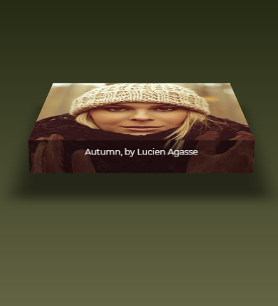
部分效果截图:
HTML代码(index.html):
<!DOCTYPE html>
<html>

<head>

  <meta charset="UTF-8">

  <title>HTML5 3D骨牌图片特效</title>

    <style>
@import url(http://fonts.googleapis.com/css?family=Montserrat);
* {
  margin: 0; padding: 0;
  box-sizing: border-box;
}
html { height: 600px; min-height: 150%; }
body {
  min-height: 100%;
  background: linear-gradient( hsl(80,51%,8%), #E0D7A3);
}
div {
  perspective: 1000px;
  width: 33%;
  margin: 0 auto;
  margin-top: 3rem;
}
figure {
  margin: 0;
  width: 100%;
  height: 29.5vw;
  background: url("winter-hat.jpg");
	background-size: 100%;
	transform-origin: center bottom;
	transform-style: preserve-3d;
	transition: 1s transform;
 }
figure figcaption {
  width: 100%;
  background: linear-gradient(rgba(0, 0, 0, 0.4), rgba(0, 0, 0, 0.4)),
		url("winter-hat.jpg");
	background-size: 100%; height: 50px;
	background-repeat: no-repeat;
  background-position: bottom;
  color: #fff;
	position: relative; top: 29.5vw;
	transform-origin: center top;
	transform: rotateX(-89.9deg);
	font-size: 1.2vw;
  font-family: Montserrat, Arial, sans-serif;
  text-align: center;
	line-height: 3;
}
figure:before {
  content: '';
  position: absolute; top: 0; left: 0;
  width: 100%; height: 100%;
	box-shadow: 0 0 100px 50px rgba(0, 0, 0, 0.1), inset 0 0 250px 250px rgba(0, 0, 0, 0.1);
	transition: 1s;
	transform: rotateX(95deg) translateZ(-80px) scale(0.75);
	transform-origin: inherit;
}
div:hover figure {
  transform: rotateX(75deg) translateZ(5vw);
}
div:hover figure:before {
	box-shadow: 0 0 25px 25px rgba(0, 0, 0, 0.5), inset 0 0 250px 250px rgba(0, 0, 0, 0.5);
	transform: rotateX(-5deg) translateZ(-80px) scale(1);
	}

@media screen and (max-width: 800px) {
  div { width: 50%; }
  figure { height: 45vw; }
  figure figcaption {
    top: 45vw;
    font-size: 2vw;
  }
}

@media screen and (max-width: 500px) {
  div {
    width: 80%;
    margin-top: 1rem;
  }
  figure {
    height: 70vw;
  }
  figure figcaption {
    top: 70vw;
    font-size: 3vw;
  }
}
</style>

  <script src="js/prefixfree.min.js"></script>

</head>

<body>

  <div onclick="">
  <figure>
    <figcaption>Autumn, by Lucien Agasse</figcaption>
  </figure>
</div>
</body>
</html>
CSS代码(style.css):
@import url(http://fonts.googleapis.com/css?family=Montserrat);*{margin:0;padding:0;box-sizing:border-box;}
html{height:600px;min-height:150%;}
body{min-height:100%;background:linear-gradient( hsl(80,51%,8%),#E0D7A3);}
div{perspective:1000px;width:33%;margin:0 auto;margin-top:3rem;}
figure{margin:0;width:100%;height:29.5vw;background:url("https://s3-us-west-2.amazonaws.com/s.cdpn.io/4273/winter-hat.jpg");background-size:100%;transform-origin:center bottom;transform-style:preserve-3d;transition:1s transform;}
figure figcaption{width:100%;background:linear-gradient(rgba(0,0,0,0.4),rgba(0,0,0,0.4)),url("https://s3-us-west-2.amazonaws.com/s.cdpn.io/4273/winter-hat.jpg");background-size:100%;height:50px;background-repeat:no-repeat;background-position:bottom;color:#fff;position:relative;top:29.5vw;transform-origin:center top;transform:rotateX(-89.9deg);font-size:1.2vw;font-family:Montserrat,Arial,sans-serif;text-align:center;line-height:3;}
figure:before{content:'';position:absolute;top:0;left:0;width:100%;height:100%;box-shadow:0 0 100px 50px rgba(0,0,0,0.1),inset 0 0 250px 250px rgba(0,0,0,0.1);transition:1s;transform:rotateX(95deg) translateZ(-80px) scale(0.75);transform-origin:inherit;}
div:hover figure{transform:rotateX(75deg) translateZ(5vw);}
div:hover figure:before{box-shadow:0 0 25px 25px rgba(0,0,0,0.5),inset 0 0 250px 250px rgba(0,0,0,0.5);transform:rotateX(-5deg) translateZ(-80px) scale(1);}
@media screen and (max-width:800px){div{width:50%;}
figure{height:45vw;}
figure figcaption{top:45vw;font-size:2vw;}
}
@media screen and (max-width:500px){div{width:80%;margin-top:1rem;}
figure{height:70vw;}
figure figcaption{top:70vw;font-size:3vw;}
}


 分享到QQ
分享到QQ 分享到微博
分享到微博 微信扫一扫
微信扫一扫