以下是 可任意翻转HTML5立方体特效代码 的示例演示效果:
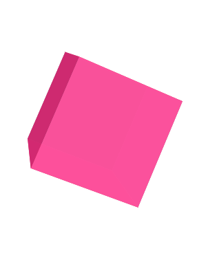
部分效果截图:
HTML代码(index.html):
<!DOCTYPE html>
<html>
<head>
    <meta charset="UTF-8">
    <title>可任意翻转HTML5立方体</title>
    <link rel="stylesheet" href="css/style.css" media="screen" type="text/css" />
</head>

<body>
    <div class="cube">
        <div class="cube-face cube-face-front"></div>
        <div class="cube-face cube-face-left"></div>
        <div class="cube-face cube-face-back"></div>
        <div class="cube-face cube-face-right"></div>
        <div class="cube-face cube-face-top"></div>
        <div class="cube-face cube-face-bottom"></div>
    </div>
</body>
</html>
CSS代码(style.css):
body{-webkit-perspective:600px;}
.cube{width:150px;height:150px;position:relative;top:100px;left:50%;margin-left:-75px;-webkit-transform-style:preserve-3d;-webkit-transform:rotateY(0deg) translateZ(-200px);-webkit-animation-name:rotationMainContainer;-webkit-animation-duration:5s;-webkit-animation-timing-function:linear;-webkit-animation-iteration-count:infinite;-webkit-animation-play-state:running;}
.cube-face{width:150px;height:150px;position:absolute;opacity:.95;background:#ff033e;-webkit-transform-origin:50% 50%;-webkit-animation-duration:5s;-webkit-animation-timing-function:linear;-webkit-animation-iteration-count:infinite;-webkit-animation-play-state:running;}
.cube-face-front{-webkit-transform:translateZ(75px);-webkit-animation-name:bgCAFace;}
.cube-face-left{-webkit-transform:rotateY(90deg) translateZ(75px);-webkit-animation-name:bgCALeft;}
.cube-face-back{-webkit-transform:translateZ(-75px);-webkit-animation-name:bgCABack;}
.cube-face-right{-webkit-transform:rotateY(90deg) translateZ(-75px);-webkit-animation-name:bgCARight;}
.cube-face-top{-webkit-transform:rotateX(90deg) translateZ(-75px);-webkit-animation-name:bgCATopBottom;}
.cube-face-bottom{-webkit-transform:rotateX(90deg) translateZ(75px);-webkit-animation-name:bgCATopBottom;}
@-webkit-keyframes rotationMainContainer{0%{-webkit-transform:rotateX(0deg) rotateY(0deg) rotateZ(0deg);}
100%{-webkit-transform:rotateX(360deg) rotateY(360deg) rotateZ(360deg)}
}
@-webkit-keyframes bgCAFace{0%{background:#7F1041;}
25%{background:#FF6DAD;}
50%{background:#FF2182;}
100%{background:#7F3756;}
}
@-webkit-keyframes bgCALeft{0%{background:#7F3756;}
25%{background:#7F1041;}
50%{background:#FF6DAD;}
100%{background:#FF2182;}
}
@-webkit-keyframes bgCABack{0%{background:#FF2182;}
25%{background:#7F3756;}
50%{background:#7F1041;}
100%{background:#FF6DAD;}
}
@-webkit-keyframes bgCARight{0%{background:#FF6DAD;}
25%{background:#FF2182;}
50%{background:#7F3756;}
100%{background:#7F1041;}
}
@-webkit-keyframes bgCATopBottom{0%{background:#7F0E2D;}
25%{background:#FF6891;}
50%{background:#FF1C5A;}
100%{background:#7F3449;}
}


 分享到QQ
分享到QQ 分享到微博
分享到微博 微信扫一扫
微信扫一扫