以下是 HTML5发光Loading动画 的示例演示效果:
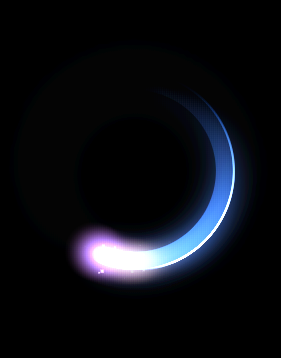
部分效果截图:
HTML代码(index.html):
<!DOCTYPE html>
<html>

<head>
    <meta charset="UTF-8">
    <title>HTML5发光Loading动画</title>
    <style>
              body {
                  background: #000;
              }

              img {
                  display: block;
                  margin: 0 auto;
              }

              canvas {
                  display: block;
                  margin: 0 auto;
                  /* uncomment to test overlay */
                  /*
        position: absolute;
        left: 0;
        opacity: .5;
        top: 0;
        */
              }
    </style>
    <script src="js/prefixfree.min.js"></script>
</head>
<body>
    <canvas id="c"></canvas>
    <script src='js/jquery.js'></script>
    <script src="js/index.js"></script>

</body>
</html>
JS代码(index.js):
/* super inefficient right now,could be improved */
var c = document.getElementById('c'),ctx = c.getContext('2d'),cw = c.width = 400,ch = c.height = 300,rand = function(a,b){
	return ~~((Math.random()*(b-a+1))+a);
}
,dToR = function(degrees){
	return degrees * (Math.PI / 180);
}
,circle ={
	x:(cw / 2) + 5,y:(ch / 2) + 22,radius:90,speed:2,rotation:0,angleStart:270,angleEnd:90,hue:220,thickness:18,blur:25}
,particles = [],particleMax = 100,updateCircle = function(){
	if(circle.rotation < 360){
	circle.rotation += circle.speed;
}
else{
	circle.rotation = 0;
}
}
,renderCircle = function(){
	ctx.save();
	ctx.translate(circle.x,circle.y);
	ctx.rotate(dToR(circle.rotation));
	ctx.beginPath();
	ctx.arc(0,0,circle.radius,dToR(circle.angleStart),dToR(circle.angleEnd),true);
	ctx.lineWidth = circle.thickness;
	ctx.strokeStyle = gradient1;
	ctx.stroke();
	ctx.restore();
}
,renderCircleBorder = function(){
	ctx.save();
	ctx.translate(circle.x,circle.y);
	ctx.rotate(dToR(circle.rotation));
	ctx.beginPath();
	ctx.arc(0,0,circle.radius + (circle.thickness/2),dToR(circle.angleStart),dToR(circle.angleEnd),true);
	ctx.lineWidth = 2;
	ctx.strokeStyle = gradient2;
	ctx.stroke();
	ctx.restore();
}
,renderCircleFlare = function(){
	ctx.save();
	ctx.translate(circle.x,circle.y);
	ctx.rotate(dToR(circle.rotation+185));
	ctx.scale(1,1);
	ctx.beginPath();
	ctx.arc(0,circle.radius,30,0,Math.PI *2,false);
	ctx.closePath();
	var gradient3 = ctx.createRadialGradient(0,circle.radius,0,0,circle.radius,30);
	gradient3.addColorStop(0,'hsla(330,50%,50%,.35)');
	gradient3.addColorStop(1,'hsla(330,50%,50%,0)');
	ctx.fillStyle = gradient3;
	ctx.fill();
	ctx.restore();
}
,renderCircleFlare2 = function(){
	ctx.save();
	ctx.translate(circle.x,circle.y);
	ctx.rotate(dToR(circle.rotation+165));
	ctx.scale(1.5,1);
	ctx.beginPath();
	ctx.arc(0,circle.radius,25,0,Math.PI *2,false);
	ctx.closePath();
	var gradient4 = ctx.createRadialGradient(0,circle.radius,0,0,circle.radius,25);
	gradient4.addColorStop(0,'hsla(30,100%,50%,.2)');
	gradient4.addColorStop(1,'hsla(30,100%,50%,0)');
	ctx.fillStyle = gradient4;
	ctx.fill();
	ctx.restore();
}
,createParticles = function(){
	if(particles.length < particleMax){
	particles.push({
	x:(circle.x + circle.radius * Math.cos(dToR(circle.rotation-85))) + (rand(0,circle.thickness*2) - circle.thickness),y:(circle.y + circle.radius * Math.sin(dToR(circle.rotation-85))) + (rand(0,circle.thickness*2) - circle.thickness),vx:(rand(0,100)-50)/1000,vy:(rand(0,100)-50)/1000,radius:rand(1,6)/2,alpha:rand(10,20)/100}
);
}
}
,updateParticles = function(){
	var i = particles.length;
	while(i--){
	var p = particles[i];
	p.vx += (rand(0,100)-50)/750;
	p.vy += (rand(0,100)-50)/750;
	p.x += p.vx;
	p.y += p.vy;
	p.alpha -= .01;
	if(p.alpha < .02){
	particles.splice(i,1)}
}
}
,renderParticles = function(){
	var i = particles.length;
	while(i--){
	var p = particles[i];
	ctx.beginPath();
	ctx.fillRect(p.x,p.y,p.radius,p.radius);
	ctx.closePath();
	ctx.fillStyle = 'hsla(0,0%,100%,'+p.alpha+')';
}
}
,clear = function(){
	ctx.globalCompositeOperation = 'destination-out';
	ctx.fillStyle = 'rgba(0,0,0,.1)';
	ctx.fillRect(0,0,cw,ch);
	ctx.globalCompositeOperation = 'lighter';
}
loop = function(){
	clear();
	updateCircle();
	renderCircle();
	renderCircleBorder();
	renderCircleFlare();
	renderCircleFlare2();
	createParticles();
	updateParticles();
	renderParticles();
}
/* Append Canvas */
//document.body.appendChild(c);
	/* Set Constant Properties */
ctx.shadowBlur = circle.blur;
	ctx.shadowColor = 'hsla('+circle.hue+',80%,60%,1)';
	ctx.lineCap = 'round'var gradient1 = ctx.createLinearGradient(0,-circle.radius,0,circle.radius);
	gradient1.addColorStop(0,'hsla('+circle.hue+',60%,50%,.25)');
	gradient1.addColorStop(1,'hsla('+circle.hue+',60%,50%,0)');
	var gradient2 = ctx.createLinearGradient(0,-circle.radius,0,circle.radius);
	gradient2.addColorStop(0,'hsla('+circle.hue+',100%,50%,0)');
	gradient2.addColorStop(.1,'hsla('+circle.hue+',100%,100%,.7)');
	gradient2.addColorStop(1,'hsla('+circle.hue+',100%,50%,0)');
	/* Loop It,Loop It Good */
setInterval(loop,16);
CSS代码(style.css):
body{background:#000;}
img{display:block;float:left;margin:0 1px 0 0;}
canvas{background:#131c35 linear-gradient(#192853,#131c35);display:block;float:left;/* uncomment to test overlay */
 /* position:absolute;left:0;opacity:.5;top:0;*/
}


 分享到QQ
分享到QQ 分享到微博
分享到微博 微信扫一扫
微信扫一扫