以下是 html5视差滚动标题固定显示代码 的示例演示效果:
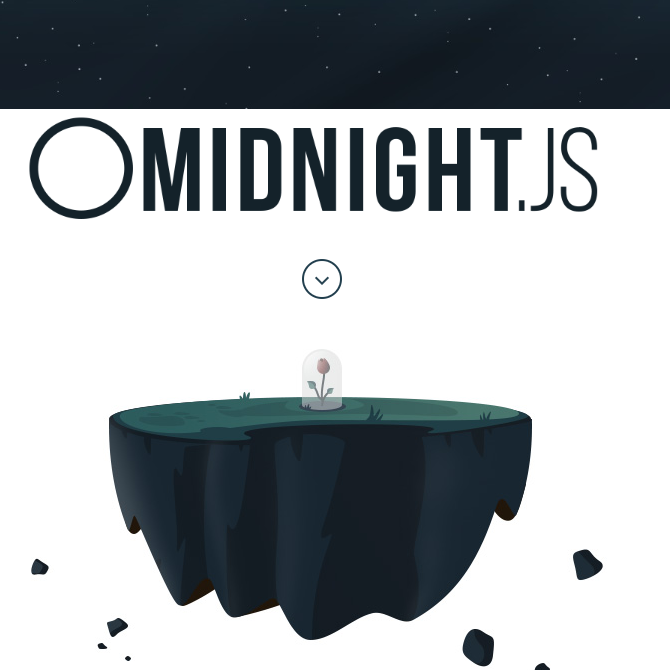
部分效果截图:
HTML代码(index.html):
<!DOCTYPE html>
<html>
<head>
<meta charset="gb2312" />
<title>html5�Ӳ��������̶���ʾ���� </title>
<meta name="viewport" content="width=device-width, initial-scale=1, maximum-scale=1, user-scalable=no, minimal-ui" />
<meta name="X-UA-Compatible" content="IE=edge" />
<meta name="apple-mobile-web-app-capable" content="yes" />
<link rel="stylesheet" href="assets/css/normalize.css" />
<link rel="stylesheet" href="assets/css/animate.css" />
<link rel="stylesheet" href="assets/css/styles.css" />
</head>
<body>
<!-- Our super awesome changing header! -->
<nav class="fixed">
<div class="midnightHeader default">
<div class="logo-holder">
<a class="logo"><span class="screenreader"></span></a>
</div>
</div>
</nav>
<div class="first-background" data-midnight="white">
<!-- Hi! -->
</div>
<header data-midnight="black">
<div class="container">
<div class="scroll-prompt wow fadeInUp"></div>
<figure id="space-island">
<img class="wow fadeInUp" src="assets/css/images/space-island.jpg" />
</figure>
</div>
</header>
<section class="step step-one" data-midnight="blue">
<div class="container">
<div class="instructions wow fadeInLeft">
<h2>The Header</h2>
<p>Create your fixed nav (or header) as you typically would.</p>
<p>You can use whatever markup suits you, just make sure the header works well with <em>position:fixed</em>.</p>
</div>
<pre class="line-numbers wow fadeInRight"><code class="language-markup"><!-- Your Fixed Nav -->
<nav class="fixed">
<a class="logo">Logo</a>
</nav></code></pre>
</div>
</section>
<section class="step step-two" data-midnight="light">
<div class="container">
<div class="instructions wow fadeInLeft">
<h2>The Sections</h2>
<p>After that, take any sections of your page that need a different nav and add <em>data-midnight="your-class"</em> to it, where <em>.your-class</em> is the class you are going to use to style that header.</p>
<p>If you don't use the property or just leave it blank, the <em>.default</em> class will be used for that section.</p>
</div>
<pre class="line-numbers wow fadeInRight"><code class="language-markup"><section data-midnight="white">
<h1>Use a white nav here</h1>
</section>
<div data-midnight="blue">
<h1>And a blue nav here</h1>
</div>
<footer>
<h1>This will just use the default header</h1>
</footer></code></pre>
</div>
</section>
<section class="step step-three" data-midnight="dark">
<div class="container">
<div class="instructions wow fadeInLeft">
<h2>Styling your headers</h2>
<p>You can style it in your css using the class <em>.midnightHeader.your-class</em>.</p>
<p>Use whatever CSS or markup you like for each one. They will be switched automatically when necessary.</p>
</div>
<pre class="line-numbers wow fadeInRight"><code class="language-css">.midnightHeader.default {
background: none;
color: black;
}
.midnightHeader.white {
background: white;
color: black;
}
.midnightHeader.blue {
background: blue;
color: white;
}</code></pre>
</div>
</section>
<section class="step step-four" data-midnight="lighter">
<div class="container">
<div class="instructions wow fadeInLeft">
<h2>The jQuery Plugin</h2>
<p>To make everything work, just load midnight (and jQuery) and initialize it. We take care of the rest.</p>
</div>
<pre class="line-numbers wow fadeInRight"><code class="language-markup"><script src="midnight.jquery.js"></script>
<script>
// Start midnight
$(document).ready(function(){
// Change this to the correct selector.
$('nav.fixed').midnight();
});
</script></code></pre>
</div>
</section>
<section class="step step-five full-height" data-midnight="white">
<div class="container">
<div class="instructions wow fadeInLeft">
<h2>Further customization</h2>
<p>Want to use custom markup for each header?</p>
<p>You just need to add a div with the class <em>.midnightHeader.default</em> inside your header, as well as any other custom headers you want.</p>
<p>For instance the "butterflies" section will use the .midnightHeader.butterflies header, and any other ones will just use the markup from .midnightHeader.default.</p>
</div>
<pre class="line-numbers wow fadeInRight"><code class="language-markup"><nav class="fixed">
<!-- Your standard header -->
<div class="midnightHeader default">
<a class="logo">Logo</a>
</div>
<!-- A header with butterflies -->
<div class="midnightHeader butterflies">
<a class="logo">Logo</a>
<span class="a-butterfly"></span>
<span class="another-butterfly"></span>
</div>
</nav></code></pre>
</div>
</section>
<footer class="footer" data-midnight="full">
<div class="illustration-city">
</div>
</footer>
<script src="assets/js/jquery-1.11.1.min.js"></script>
<script src="assets/js/sscr.min.js"></script>
<script src="assets/js/prism.js"></script>
<script src="assets/js/wow.min.js"></script>
<script src="assets/js/viewport-units-buggyfill.js"></script>
<script src="midnight.jquery.js"></script>
<script>
$(document).ready(function(){
// vh fix for iOS7 (Not that it works well on that anyway)
viewportUnitsBuggyfill.init();
$(window).resize(function(){
viewportUnitsBuggyfill.refresh();
});
// Start Midnight!
$('nav.fixed').midnight();
// Start wow.js
new WOW().init();
// The island disappears when the logo moves on top of it
var $island = $('#space-island');
var islandTop = $island.offset().top;
var windowHeight = $(window).height();
$(window).resize(function(){
islandTop = $island.offset().top;
windowHeight = $(window).height();
});
$(document).scroll(function(){
var scrollTop = window.pageYOffset || document.documentElement.scrollTop;
var minScrollTop = islandTop - windowHeight * 0.4;
var maxScrollTop = islandTop;
// Opacity goes from 1.0 at the bottom 2/3 of the screen to 0.4 at the top
if( scrollTop <= islandTop*2 ) {
var targetOpacity = 1.0;
var minOpacity = 0.4;
if( scrollTop > minScrollTop && scrollTop < maxScrollTop ) {
targetOpacity = ((maxScrollTop - scrollTop) / (maxScrollTop - minScrollTop)) * (1.0 - minOpacity) + minOpacity;
}
else if( scrollTop > maxScrollTop ) {
targetOpacity = minOpacity;
}
else if( scrollTop < minScrollTop ) {
targetOpacity = 1.0;
}
$island.css('opacity', targetOpacity);
}
});
$('.scroll-prompt').click(function(event){
event.preventDefault();
$('html, body').animate({
scrollTop: $("section.step-one").offset().top - $('nav').height() * 0.5
}, 1000, 'swing');
});
$(window).trigger('resize');
});
</script>
</body>
</html>


 分享到QQ
分享到QQ 分享到微博
分享到微博 微信扫一扫
微信扫一扫