以下是 jQuery提示框插件tinyTips js代码 的示例演示效果:
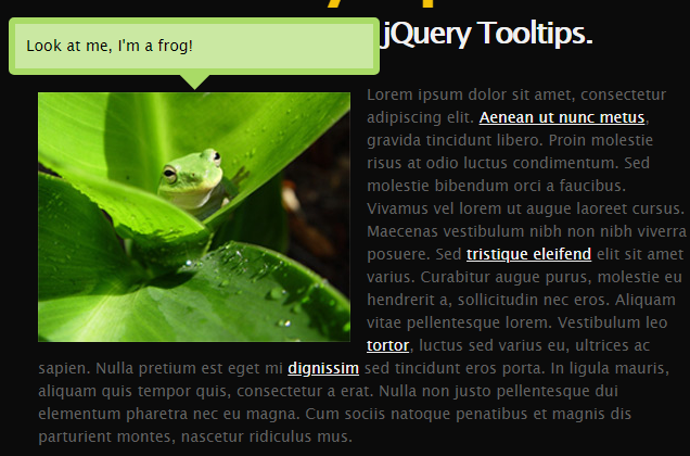
部分效果截图:
HTML代码(index.html):
<!DOCTYPE html>
<html>
<head>
<meta http-equiv="Content-Type" content="text/html; charset=utf-8" />
<title>jQuery提示框插件tinyTips</title>
<link rel="stylesheet" type="text/css" media="screen" href="styles/tinyTips.css" />
		<script type="text/javascript" src="js/jquery-1.7.2.min.js"></script>
		<script type="text/javascript" src="js/jquery.tinyTips.js"></script>
		<script type="text/javascript">
		$(document).ready(function() {
			$('a.tTip').tinyTips('light', 'title');
			$('a.imgTip').tinyTips('yellow', '<img src="images/demo-image.jpg" /><br />You can even put images or any other markup in the tooltips.');
			$('img.tTip').tinyTips('green', 'title');
			$('h1.tagline').tinyTips('blue', 'tinyTips are totally awesome!');
		});
		</script>
	</head>
<body>
	<div id="demo_wrapper">
		<h1 class="massive">tinyTips</h1>
		<h1 class="tagline">Super-lightweight jQuery Tooltips.</h1>
		<p><img class="tTip" src="images/demo-image.jpg" title="Look at me, I'm a frog!" />Lorem ipsum dolor sit amet, consectetur adipiscing elit.
		<a class="tTip" href="#" title="This tooltip is using the title of this anchor tag.">Aenean ut nunc metus</a>, gravida tincidunt libero.
		Proin molestie risus at odio luctus condimentum. Sed molestie bibendum orci a faucibus. Vivamus vel lorem ut augue laoreet cursus.
		Maecenas vestibulum nibh non nibh viverra posuere. Sed <a class="tTip" href="#" title="This one is also using the title.">tristique eleifend</a> elit sit amet varius.
		Curabitur augue purus, molestie eu hendrerit a, sollicitudin nec eros. Aliquam vitae pellentesque lorem. Vestibulum leo <a class="imgTip" href="#">tortor</a>,
		luctus sed varius eu, ultrices ac sapien. Nulla pretium est eget mi
		<a class="tTip" href="#" title="How about a really long one so we can test out positioning so it doesn't overlap the element the tooltip is for.
		Lorem ipsum dolor sit amet, consectetur adipiscing elit. Vestibulum eget purus a orci consequat congue. Lorem ipsum dolor sit amet, consectetur adipiscing elit.
		Suspendisse porttitor scelerisque leo, ut elementum nisi fermentum ac. Etiam mauris tellus, ornare sit amet venenatis at, vehicula vitae purus.
		Cum sociis natoque penatibus et magnis dis parturient montes, nascetur ridiculus mus.">dignissim</a> sed
		tincidunt eros porta. In ligula mauris, aliquam quis tempor quis, consectetur a erat. Nulla non justo
		pellentesque dui elementum pharetra nec eu magna. Cum sociis natoque penatibus et magnis dis parturient montes, nascetur ridiculus mus.</p>
	</div>
</body>
</html>
JS代码(jquery.tinyTips.js):
/***********************************************************/
/* tinyTips Plugin */
/* Version:1.1 */
/* Mike Merritt */
/* Updated:Mar 2nd,2010 */
/***********************************************************/
(function($){
$.fn.tinyTips = function (tipColor,supCont){
if (tipColor === 'null'){
tipColor = 'light';
}
var tipName = tipColor + 'Tip';
/* User settings**********************************/
// Enter the markup for your tooltips here. The wrapping div must have a class of tinyTip and// it must have a div with the class "content" somewhere inside of it.var tipFrame = '<div class="' + tipName + '"><div class="content"></div><div class="bottom">
</div></div>';
// Speed of the animations in milliseconds - 1000 = 1 second.var animSpeed = 300;
/***************************************************************************************************/
/* End of user settings - Do not edit below this line unless you are trying to edit functionality. */
/***************************************************************************************************/
// Global tinyTip variables;
var tinyTip;
var tText;
// When we hover over the element that we want the tooltip applied to$(this).hover(function(){
// Inject the markup for the tooltip into the page and// set the tooltip global to the current markup and then hide it.$('body').append(tipFrame);
var divTip = 'div.'+tipName;
tinyTip = $(divTip);
tinyTip.hide();
// Grab the content for the tooltip from the title attribute (or the supplied content) and// inject it into the markup for the current tooltip. NOTE:title attribute is used unless// other content is supplied instead.if (supCont === 'title'){
var tipCont = $(this).attr('title');
}
else if (supCont !== 'title'){
var tipCont = supCont;
}
$(divTip + ' .content').html(tipCont);
tText = $(this).attr('title');
$(this).attr('title','');
// Offsets so that the tooltip is centered over the element it is being applied to but// raise it up above the element so it isn't covering it.var yOffset = tinyTip.height() + 2;
var xOffset = (tinyTip.width() / 2) - ($(this).width() / 2);
// Grab the coordinates for the element with the tooltip and make a new copy// so that we can keep the original un-touched.var pos = $(this).offset();
var nPos = pos;
// Add the offsets to the tooltip positionnPos.top = pos.top - yOffset;
nPos.left = pos.left - xOffset;
// Make sure that the tooltip has absolute positioning and a high z-index,// then place it at the correct spot and fade it in.tinyTip.css('position','absolute').css('z-index','1000');
tinyTip.css(nPos).fadeIn(animSpeed);
}
,function(){
$(this).attr('title',tText);
// Fade the tooltip out once the mouse moves away and then remove it from the DOM.tinyTip.fadeOut(animSpeed,function(){
$(this).remove();
}
);
}
);
}
}
)(jQuery);
CSS代码(tinyTips.css):
@charset "utf-8";html{font-family:"Lucida Sans Unicode";font-size:14px;line-height:21px;color:#f1f1f1;background:#0b0b0b;}
body{}
p{color:#616161;}
a{color:#f1f1f1;}
img.tTip{margin:8px 15px 8px 0px;float:left;}
h1{text-align:center;line-height:15px;padding:0px 0px 20px 0px;letter-spacing:-2px;}
h1.massive{font-size:72px;line-height:10px;padding:0px;letter-spacing:-6px;color:#f4c20a;}
#demo_wrapper{width:600px;margin:30px auto 0px auto;}
.lightTip{}
.lightTip .content{width:310px;padding:10px;border:6px solid #e2e2e2;-moz-border-radius:5px;-webkit-border-radius:5px;background:#ffffff;color:#020202;}
.lightTip .bottom{height:14px;background:url(../images/notch-white.png) top center no-repeat;}
.yellowTip{}
.yellowTip .content{width:310px;padding:10px;border:6px solid #f9e98e;-moz-border-radius:5px;-webkit-border-radius:5px;background:#fbf7aa;color:#020202;}
.yellowTip .bottom{height:14px;background:url(../images/notch-yellow.png) top center no-repeat;}
.orangeTip{}
.orangeTip .content{width:310px;padding:10px;border:6px solid #f9cd8e;-moz-border-radius:5px;-webkit-border-radius:5px;background:#fbe3aa;color:#020202;}
.orangeTip .bottom{height:14px;background:url(../images/notch-orange.png) top center no-repeat;}
.redTip{}
.redTip .content{width:310px;padding:10px;border:6px solid #ce6f6f;-moz-border-radius:5px;-webkit-border-radius:5px;background:#f79992;color:#020202;}
.redTip .bottom{height:14px;background:url(../images/notch-red.png) top center no-repeat;}
.greenTip{}
.greenTip .content{width:310px;padding:10px;border:6px solid #a9db66;-moz-border-radius:5px;-webkit-border-radius:5px;background:#cae8a2;color:#020202;}
.greenTip .bottom{height:14px;background:url(../images/notch-green.png) top center no-repeat;}
.blueTip{}
.blueTip .content{width:310px;padding:10px;border:6px solid #36a4d9;-moz-border-radius:5px;-webkit-border-radius:5px;background:#90d8f0;color:#020202;}
.blueTip .bottom{height:14px;background:url(../images/notch-blue.png) top center no-repeat;}
.purpleTip{}
.purpleTip .content{width:310px;padding:10px;border:6px solid #8671de;-moz-border-radius:5px;-webkit-border-radius:5px;background:#a290f0;color:#020202;}
.purpleTip .bottom{height:14px;background:url(../images/notch-purple.png) top center no-repeat;}
.darkTip{}
.darkTip .content{width:310px;padding:10px;border:6px solid #303030;-moz-border-radius:5px;-webkit-border-radius:5px;background:#505050;color:#f8f8f8;}
.darkTip .bottom{height:14px;background:url(../images/notch-dark.png) top center no-repeat;}


 分享到QQ
分享到QQ 分享到微博
分享到微博 微信扫一扫
微信扫一扫