以下是 jQuery点击弹出+1放大效果js代码 的示例演示效果:
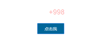
部分效果截图:
HTML代码(index.html):
<!doctype html>
<html lang="en">
<head>
    <meta charset="UTF-8">
    <title>jQuery点击弹出+1放大效果</title>
    <style type="text/css">
        body {margin:0; padding:0;font:12px/1.5 arial; color:#3E3E3E;}
        p {margin-bottom:80px;}
        #btn {width:90px;height:36px;border:none;background-color:#069;color:#fff;font-size:14px;font-family:Microsoft YaHei;cursor:pointer;}
    </style>
</head>
<body>

<p> </p>
<p> </p>
<p> </p>

<p style="text-align:center;"><button id="btn">点击我</button></p>
<p> </p>
<p> </p>

<script src="js/jquery-1.10.2.min.js" type="text/javascript"></script>
<script>
    ;(function($) {
        $.extend({
            tipsBox: function(options) {
                options = $.extend({
                    obj: null,  //jq对象,要在那个html标签上显示
                    str: "+1",  //字符串,要显示的内容;也可以传一段html,如: "<b style='font-family:Microsoft YaHei;'>+1</b>"
                    startSize: "12px",  //动画开始的文字大小
                    endSize: "30px",    //动画结束的文字大小
                    interval: 600,  //动画时间间隔
                    color: "red",    //文字颜色
                    callback: function() {}    //回调函数
                }, options);
                $("body").append("<span class='num'>"+ options.str +"</span>");
                var box = $(".num");
                var left = options.obj.offset().left + options.obj.width() / 2;
                var top = options.obj.offset().top - options.obj.height();
                box.css({
                    "position": "absolute",
                    "left": left + "px",
                    "top": top + "px",
                    "z-index": 9999,
                    "font-size": options.startSize,
                    "line-height": options.endSize,
                    "color": options.color
                });
                box.animate({
                    "font-size": options.endSize,
                    "opacity": "0",
                    "top": top - parseInt(options.endSize) + "px"
                }, options.interval , function() {
                    box.remove();
                    options.callback();
                });
            }
        });
    })(jQuery);
</script>

<script>
	$(function() {
		$("#btn").click(function() {
			$.tipsBox({
				obj: $(this),
				str: "+998",
                callback: function() {
                    //alert(5);
                }
			});
		});
	});
</script>
</body>
</html>
CSS代码(zzsc.css):
/** OPTION ONE:My favorite. Uncomment the next sections to look at other variations and feel free to make your own! There are lots of concepts to explore with this setup **/
/* I like this one best when the body is around width:440px}
*/
html,body{height:100%;background:#704D50;margin:0;padding:0;overflow:hidden;}
.container{position:relative;height:0;padding-bottom:100%;}
.circle{background:#FAE7C5;position:absolute;height:50%;width:50%;border-radius:50%;border:20px solid #704D50;top:50%;left:50%;margin-top:calc(-25% - 20px);margin-left:calc(-25% - 20px);animation:spinscale 4s linear infinite;}
.circle > .circle{width:90%;height:90%;top:40%;left:40%;}
@keyframes spinscale{0%{transform:scale(.8) rotate(0deg);}
100%{transform:scale(.8) rotate(360deg);}
}
/** OPTION TWO:TAIL */
/* This one is best when the body is at least 630pxhtml,body{height:100%;background:#704D50;margin:0;padding:0;overflow:hidden;}
.container{position:relative;height:0;padding-bottom:100%;}
.circle{background:#FAE7C5;position:absolute;height:50%;width:50%;border-radius:50%;border:20px solid #704D50;top:50%;left:50%;margin-top:calc(-25% - 20px);margin-left:calc(-25% - 20px);transform:translate(50% 50%);}
.circle > .circle{width:90%;height:90%;top:40%;left:40%;animation:spinscale 4s ease-in-out infinite;}
@keyframes spinscale{0%,100%{transform:translate(-50%) scale(.7) rotate(-10deg);}
33%{transform:translate(-50%) scale(.7) rotate(30deg);}
66%{transform:translate(-50%) scale(.7) rotate(-60deg);}
}
**/
/** OPTION THREE:Circle to movements **/
/* This one is best when the body is at least 630pxhtml,body{height:100%;background:#704D50;margin:0;padding:0;overflow:hidden;}
.container{position:relative;height:0;padding-bottom:100%;}
body .circle{transform:rotate(90deg);left:50%;top:30%;}
.circle{background:#FAE7C5;position:absolute;height:10%;width:10%;border-radius:50%;border:20px solid #704D50;top:100%;left:31%;margin-top:calc(-25% - 20px);margin-left:calc(-25% - 20px);}
.circle > .circle{width:100%;height:100%;top:0%;left:0%;transform:translate(100%,100%) rotate(-30deg) scale(1);animation:spinscale 4s ease-in-out infinite;}
@keyframes spinscale{33%{transform:scale(.8) rotate(-60deg);}
}
**/


 分享到QQ
分享到QQ 分享到微博
分享到微博 微信扫一扫
微信扫一扫