以下是 jQuery选中文本高亮页面淡出js代码 的示例演示效果:
部分效果截图:
HTML代码(index.html):
<!doctype html>
<html lang="en">
<head>
<meta charset="utf-8">
<title>Fokus - Emphasized text-highlighting using JavaScript</title>
<meta name="viewport" content="width=800, user-scalable=no">
<link href='http://fonts.googleapis.com/css?family=Lato:400,700,400italic,700italic' rel='stylesheet' type='text/css'>
<link rel="stylesheet" href="css/demo.css">
<link rel="icon" type="image/png" href="favicon.ico">
</head>
<body>
<div class="intro">
<div class="sharing">
</div>
</div>
<div class="demo">
<article class='projects single' id='rvl-io'>
<h2>rvl.io</h2>
<a class="image-link" href="#" title="Visit rvl.io">
<img alt="rvl.io" height="305" src="images/rvl-io.jpg" width="320">
</a>
<p>
As reveal.js
has grown more popular there has been a lot of requests for an online editor and rvl.io
is the answer. rvl.io is a service for authoring, storing and presenting slide decks without having to touch the underlying HTML of reveal.js. It was created by myself (frontend) and @h__r__j
(backend).
</p>
</article>
<article class='experiments single' id='linjer'>
<h2>Linjer</h2>
<a class="image-link" href="#" title="View demo">
<img alt="Meny" height="226" src="images/linjer.jpg" width="320">
</a>
<p>
An interactive experiment based on the visuals originally created for Radar.
</p>
</article>
<article class='experiments single' id='avgrund'>
<h2>Avgrund</h2>
<a class="image-link" href="#" title="View demo">
<img alt="Meny" height="219" src="images/avgrund.png" width="320">
</a>
<p>
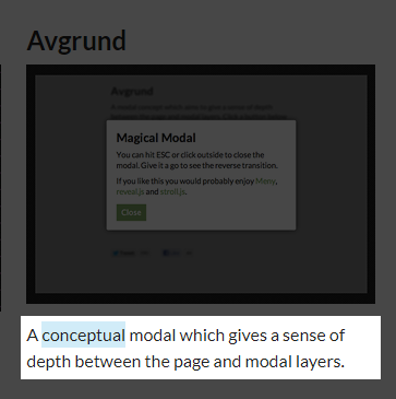
A conceptual modal which gives a sense of depth between the page and modal layers.
</p>
</article>
<article class='experiments single' id='meny'>
<h2>Meny</h2>
<a class="image-link" href="#" title="View demo">
<img alt="Meny" height="299" src="images/meny.png" width="320">
</a>
<p>
An experimental CSS 3D fold-in menu. Works in any browser that supports CSS 3D transforms, that includes Mobile Safari so get your iPhone ready!
</p>
</article>
<article class='experiments single' id='radar'>
<h2>Radar</h2>
<a class="image-link" href="#" title="View demo">
<img alt="Radar" height="260" src="images/radar.jpg" width="320">
</a>
<p>
An audio-visual experiment that uses Audiolet
to synthesize sound in real-time. The visuals are rendered on
<code><canvas></code>.
</p>
</article>
<article class='projects double' data-showin='experiments' id='sinuous-ios'>
<h2>Sinuous for iPhone & iPad</h2>
<a class="image-link" href="#" title="Open in the App Store">
<img alt="Sinuous" height="300" src="images/sinuous-ios.png" width="695">
</a>
<div class="two-columns">
<p>
Almost two years after releasing the
web version
Sinuous has finally made its way to the App Store! The gameplay is very much alike the web but it ties into Game Center so that you can compete with friends. Oh, and keep and eye our for the new 'vortex'-boost!
</p>
<p>
The game is still powered by JavaScript and rendered on HTML canvas. It relies on native code for audio and Game Center integration but that bit was easy thanks to the ever so lovely
PhoneGap. I'm very happy with how well the controls translated to touch and I hope you will be too.
</p>
<p>
This runs as smooth as butter on the iPad but the framerate is a bit shaky on the iPhone 4. I will be releasing an update soon to address that as well as some other improvements.
Try it out!
</p>
</div>
</article>
<article class='experiments single' id='forkit-js'>
<h2>forkit.js</h2>
<a class="image-link" href="#" title="View demo">
<img alt="forkit.js" height="260" src="images/forkit-js.png" width="320">
</a>
<p>
An experimental animated ribbon which lets you drag down a curtain of additional content. A fun twist on the "Fork me on GitHub" banner! Created with JavaScript-controlled CSS3 transforms.
</p>
</article>
<article class='experiments single' id='scroll-effects'>
<h2>CSS3 Scroll Effects</h2>
<a class="image-link" href="#" title="Launch">
<img alt="CSS3 Scroll Effects" height="383" src="images/scroll-effects.png" width="320">
</a>
<p>
Decided it was time for some CSS tinkering again and ended up creating this set of CSS3 scrolling styles. Not intended for any practical use but the visuals are surprisingly impactful.
</p>
<p>
This works by applying a
<code>future</code>/<code>past</code>
class to list items outside of the viewport as you scroll. Based on this class a variety of transforms are transitioned to via CSS.
</p>
<p>
Thanks
Paul Irish
for improving the JavaScript performance!
</p>
</article>
<article class='thoughts double' id='2011'>
<h2>Recap 2011</h2>
<div class="two-columns">
<p>
It's that time of the year again! In late 2010, having spent five great years working at
Fi, I was determined to change up my professional life. After interviewing with
Qwiki
and accepting the position of Lead Interactive Developer it was decided; I was moving to San Francisco! It took a good few months of hard work to sort out all of the practicalities but it was definitely worth it now that I'm here.
</p>
<p>
Fortunately I've still been able to keep this site updated and worked on a variety of projects and experiments throughout the year.
</p>
<p>
The first project to see the light of day was
Sketch, a drawing tool that mimics the style of old cartoons. It was refreshing to build something that allows others to be creative. Now �C almost a year later �C over 78,000 sketches have been saved.
</p>
<p>
Sketch was followed by a short freelance project which involved building an interactive and animated logo for a Canadian media production company called Meru. Try it out on their site;
</p>
<p>
Next I stumbled into the land of CSS3 3D transforms and ended up trying them out on two projects;
Holobox
and CSS3 3D Slideshow (later renamed
reveal.js). A few weeks ago, in mid December, I resumed my CSS 3D pursuits by creating a
rolling effect
for links and building a
Christmas tree
out of form elements.
</p>
<p>
Being far from tired of working with
<code><canvas></code>
I also created a new game called
Coil, it's similar in design to
Sinuous
but adds a touch of WebGL and perhaps an element of stress to the gameplay. Shortly thereafter I worked on a tool called
Textify.it
which allows you to recreate images using thousands of letters of text. Using Phonegap, I was able to easily port
Textify.it to iOS.
</p>
<p>
It's been really encouraging to see that there's still a lot of activity on
even though it's been out since 2010 �C meaning ancient, in internet-time. In the past year it saw more than 2,000,000 visits.
</p>
<p>
Now the new year is approaching and with it new adventures. 2012 will start with relocating to NYC and opening up Qwiki's new office. Can't wait to see where it goes from there!
</p>
</div>
</article>
</div>
<script src="js/fokus.min.js"></script>
</body>
</html>JS代码(fokus.min.js):
/*! * Fokus 0.4 * http://lab.hakim.se/fokus * MIT licensed * * Copyright (C) 2012 Hakim El Hattab,http://hakim.se */
(function(){
	var f=5;
	var q=0.75;
	var v,u,s=0,n,b={
	left:0,top:0,right:0,bottom:0}
,h={
	left:0,top:0,right:0,bottom:0}
;
	function c(){
	if(k()&&!window.__fokused){
	window.__fokused=true;
	v=document.createElement("canvas");
	u=v.getContext("2d");
	v.style.position="fixed";
	v.style.left=0;
	v.style.top=0;
	v.style.zIndex=2147483647;
	v.style.pointerEvents="none";
	document.addEventListener("mousedown",l,false);
	document.addEventListener("keyup",d,false);
	window.addEventListener("resize",e,false);
	e();
}
}
function k(){
	return !!("addEventListener" in document&&"pointerEvents" in document.body.style);
}
function r(){
	var w=t();
	u.clearRect(0,0,v.width,v.height);
	u.fillStyle="rgba( 0,0,0,"+s+" )";
	u.fillRect(0,0,v.width,v.height);
	if(w){
	if(s<0.1){
	h=b;
}
else{
	h.left+=(b.left-h.left)*0.15;
	h.top+=(b.top-h.top)*0.15;
	h.right+=(b.right-h.right)*0.15;
	h.bottom+=(b.bottom-h.bottom)*0.15;
}
}
u.clearRect(h.left-window.scrollX-f,h.top-window.scrollY-f,(h.right-h.left)+(f*2),(h.bottom-h.top)+(f*2));
	if(w){
	s+=(q-s)*0.08;
}
else{
	s=Math.max((s*0.85)-0.02,0);
}
cancelAnimationFrame(n);
	if(w||s>0){
	if(!v.parentNode){
	document.body.appendChild(v);
}
n=requestAnimationFrame(r);
}
else{
	document.body.removeChild(v);
}
}
function p(){
	b={
	left:Number.MAX_VALUE,top:Number.MAX_VALUE,right:0,bottom:0}
;
	var z=m();
	for(var B=0,E=z.length;
	B<E;
	B++){
	var A=z[B];
	if(A.nodeName==="#text"&&A.nodeValue.trim()){
	A=A.parentNode;
}
var D=a(A);
	var G=D.x,F=D.y,H=A.offsetWidth,C=A.offsetHeight;
	if(A&&typeof G==="number"&&typeof H==="number"&&(H>0||C>0)&&!A.nodeName.match(/^br$/gi)){
	b.left=Math.min(b.left,G);
	b.top=Math.min(b.top,F);
	b.right=Math.max(b.right,G+H);
	b.bottom=Math.max(b.bottom,F+C);
}
}
if(t()){
	r();
}
}
function t(){
	return b.left<b.right&&b.top<b.bottom;
}
function l(w){
	if(w.which!==3){
	document.addEventListener("mousemove",o,false);
	document.addEventListener("mouseup",i,false);
	p();
}
}
function o(w){
	p();
}
function i(w){
	document.removeEventListener("mousemove",o,false);
	document.removeEventListener("mouseup",i,false);
	setTimeout(p,1);
}
function d(w){
	p();
}
function e(w){
	v.width=window.innerWidth;
	v.height=window.innerHeight;
}
function m(){
	if(window.getSelection){
	var w=window.getSelection();
	if(!w.isCollapsed){
	return j(w.getRangeAt(0));
}
}
return[];
}
function j(x){
	var y=x.startContainer;
	var w=x.endContainer;
	if(y==w){
	if(y.nodeName==="#text"){
	return[y.parentNode];
}
return[y];
}
var z=[];
	while(y&&y!=w){
	z.push(y=g(y));
}
y=x.startContainer;
	while(y&&y!=x.commonAncestorContainer){
	z.unshift(y);
	y=y.parentNode;
}
return z;
}
function g(w){
	if(w.hasChildNodes()){
	return w.firstChild;
}
else{
	while(w&&!w.nextSibling){
	w=w.parentNode;
}
if(!w){
	return null;
}
return w.nextSibling;
}
}
function a(z){
	var w=0,A=0;
	if(z.offsetParent){
	do{
	w+=z.offsetLeft;
	A+=z.offsetTop;
}
while(z=z.offsetParent);
}
return{
	x:w,y:A}
;
}
(function(){
	var y=0;
	var z=["ms","moz","webkit","o"];
	for(var w=0;
	w<z.length&&!window.requestAnimationFrame;
	++w){
	window.requestAnimationFrame=window[z[w]+"RequestAnimationFrame"];
	window.cancelAnimationFrame=window[z[w]+"CancelAnimationFrame"]||window[z[w]+"CancelRequestAnimationFrame"];
}
if(!window.requestAnimationFrame){
	window.requestAnimationFrame=function(D,A){
	var x=new Date().getTime();
	var B=Math.max(0,16-(x-y));
	var C=window.setTimeout(function(){
	D(x+B);
}
,B);
	y=x+B;
	return C;
}
;
}
if(!window.cancelAnimationFrame){
	window.cancelAnimationFrame=function(x){
	clearTimeout(x);
}
;
}
}
());
	c();
}
)();
CSS代码(demo.css):
/** * Styles for the Fokus demo page. * * @author Hakim El Hattab | http://hakim.se */
*{margin:0;padding:0;}
::selection{background:#d1edf8;}
html,body{height:100%;}
body{background:#eee;font-family:'Lato',Helvetica,sans-serif;font-size:16px;color:#222;}
a{color:#c2575b;text-decoration:none;-webkit-transition:0.15s color ease;-moz-transition:0.15s color ease;-ms-transition:0.15s color ease;-o-transition:0.15s color ease;transition:0.15s color ease;}
a:hover{color:#f76f76;}
h1,h2{font-size:24px;}
.intro{display:inline-block;background:#eee;padding:40px 60px;overflow-y:auto;-webkit-box-sizing:border-box;-moz-box-sizing:border-box;box-sizing:border-box;}
.intro h1{position:relative;}
.intro h1:after{content:'';position:absolute;display:inline-block;width:48px;height:48px;top:-9px;margin-left:7px;background-image:url( 'fokus48.png' );background-repeat:no-repeat;}
.intro>article{width:400px;}
.intro p{margin:10px 0 10px 0;font-size:16px;line-height:1.5em;}
.intro small{display:block;margin-top:10px;padding-top:10px;color:#333;font-size:0.85em;border-top:1px dashed #ccc;-webkit-text-size-adjust:none;}
.intro .sharing{margin-top:20px;}
.demo{border-top:1px solid #ccc;padding:40px 60px;background:#fff;}
.demo>article{display:inline-block;max-width:320px;vertical-align:top;margin:0 20px 20px 0;line-height:1.5em;}
.demo>article.double{max-width:640px;}
.demo>article img{max-width:100%;margin-bottom:10px;}
.demo>article h2{margin-bottom:10px;}
.demo>article .image-link{display:block;}


 分享到QQ
分享到QQ 分享到微博
分享到微博 微信扫一扫
微信扫一扫