以下是 jQuery粘性滚动导航栏特效代码 的示例演示效果:
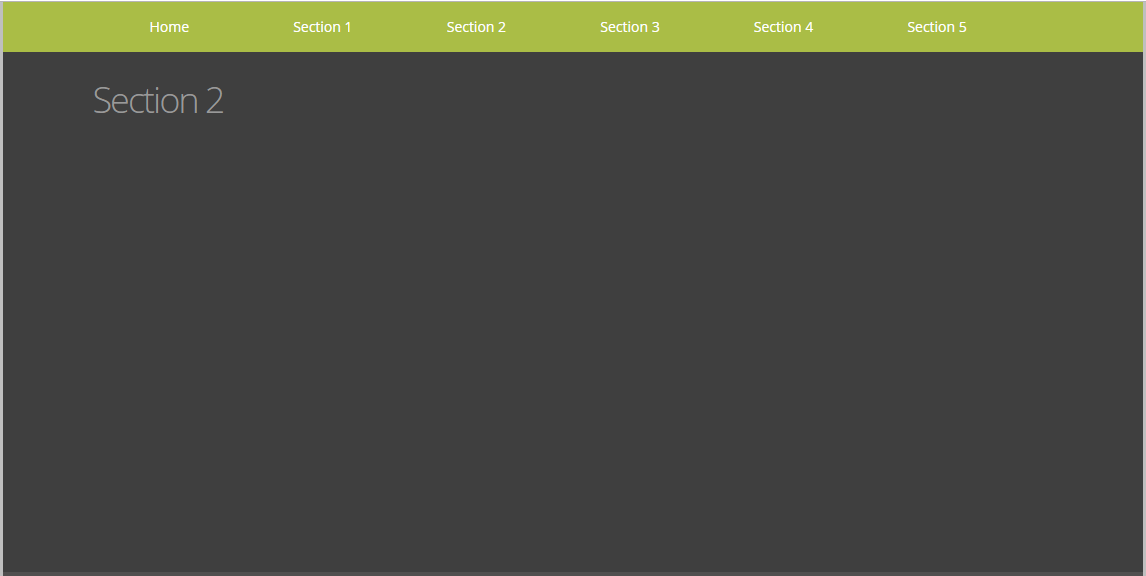
部分效果截图:
HTML代码(index.html):
<!DOCTYPE html>
<html>
<head>
<title>jQuery粘性滚动导航栏</title>
<meta name="viewport" content="width=device-width, initial-scale=1.0, maximum-scale=1, minimum-scale=1 user-scalable=no">
<link href="http://fonts.googleapis.com/css?family=Open+Sans:300,400,700" rel="stylesheet" type="text/css">
<link href="css/demo.css" rel="stylesheet" type="text/css">
<script type="text/javascript" src="js/jquery.min.js"></script>
<script type="text/javascript" src="js/jquery.smint.js"></script>
<script type="text/javascript">
$(document).ready( function() {
    $('.subMenu').smint({
    	'scrollSpeed' : 1000
    });
});
</script>
</head>
<body onload="setTimeout(function() { window.scrollTo(0, 1) }, 100);">
<div class="wrap">
	<div class="subMenu">
		<div class="inner">
			<a href="#" id="sTop" class="subNavBtn">Home</a>
			<a href="#" id="s1" class="subNavBtn">Section 1</a>
			<a href="#" id="s2" class="subNavBtn">Section 2</a>
			<a href="#" id="s3" class="subNavBtn">Section 3</a>
			<a href="#" id="s4" class="subNavBtn">Section 4</a>
			<a href="#" id="s5" class="subNavBtn end">Section 5</a> </div>
	</div>
	<div class="section sTop">
		<div class="inner">
		</div>
		<br class="clear">
	</div>
	<div class="section s1">
		<div class="inner">
			<h1>Section 1</h1>
		</div>
	</div>
	<div class="section s2">
		<div class="inner">
			<h1>Section 2</h1>
		</div>
	</div>
	<div class="section s3">
		<div class="inner">
			<h1>Section 3</h1>
		</div>
	</div>
	<div class="section s4">
		<div class="inner">
			<h1>Section 4</h1>
		</div>
	</div>
	<div class="section s5">
		<div class="inner">
			<h1>Section 5</h1>
		</div>
	</div>
</div>
</body>
</html>
JS代码(jquery.smint.js):
/*SMINT V1.0 by Robert McCrackenSMINT is my first dabble into jQuery plugins!http://www.outyear.co.uk/smint/If you like Smint,or have suggestions on how it could be improved,send me a tweet @rabmyself*/
(function(){
	$.fn.smint = function( options ){
	// adding a class to users div$(this).addClass('smint')var settings = $.extend({
	'scrollSpeed ':500}
,options);
	return $('.smint a').each( function(){
	if ( settings.scrollSpeed ){
	var scrollSpeed = settings.scrollSpeed}
///////////////////////////////////// get initial top offset for the menuvar stickyTop = $('.smint').offset().top;
	// check position and make sticky if neededvar stickyMenu = function(){
	// current distance topvar scrollTop = $(window).scrollTop();
	// if we scroll more than the navigation,change its position to fixed and add class 'fxd',otherwise change it back to absolute and remove the classif (scrollTop > stickyTop){
	$('.smint').css({
	'position':'fixed','top':0}
).addClass('fxd');
}
else{
	$('.smint').css({
	'position':'absolute','top':stickyTop}
).removeClass('fxd');
}
}
;
	// run functionstickyMenu();
	// run function every time you scroll$(window).scroll(function(){
	stickyMenu();
}
);
	///////////////////////////////////////$(this).on('click',function(e){
	// gets the height of the users div. This is used for off-setting the scroll so th emenu doesnt overlap any content in the div they jst scrolled tovar selectorHeight = $('.smint').height();
	// stops empty hrefs making the page jump when clickede.preventDefault();
	// get id pf the button you just clickedvar id = $(this).attr('id');
	// gets the distance from top of the div class that matches your button id minus the height of the nav menu. This means the nav wont initially overlap the content.var goTo = $('div.'+ id).offset().top -selectorHeight;
	// Scroll the page to the desired position!$("html,body").animate({
	scrollTop:goTo}
,scrollSpeed);
}
);
}
);
}
}
)();
CSS代码(demo.css):
*{margin:0;padding:0;outline:0;}
body{font-family:Helvetica,Arial,Verdana,sans-serif;color:#999;font-size:12px;background:#bfbfbf;}
h1,h2{font-family:'Open Sans',sans-serif;font-weight:300;margin:0 0 15px 0;}
h1{font-size:36px;letter-spacing:-2px;line-height:100%;}
h1.title{font-size:46px;font-weight:700;color:#6a6a6a;}
h2{font-size:24px;}
p{margin:0 0 15px 0;}
.menuBtn{background:center center no-repeat transparent;background:#000;display:block;width:40px;height:40px;position:absolute;top:0;left:10px;}
.clear{clear:both;}
.wrap{/*background:url(../images/bg.png) top left repeat-x;*/
width:100%;max-width:1140px;min-width:960px;z-index:10;position:relative;margin:0 auto;padding:0;}
.section{width:100%;max-width:1140px;min-width:960px;z-index:10;position:relative;margin:0 auto;padding:0 0 20px 0;}
.inner{width:960px;margin:0 auto;position:relative;min-height:50px;padding:30px 0;font-size:18px;font-family:'Open Sans',sans-serif;font-weight:300;padding:30px 0;}
/* This is the selector i used for my menu,it needs to be set as position:absolute;*/
.subMenu{position:absolute;top:462px;height:50px;z-index:1000;width:100%;max-width:1140px;min-width:960px;background:#aabd46;}
.subMenu .inner{padding:0;font-weight:400;}
.subNavBtn{display:block;height:35px;width:12%;float:left;margin:0px 0px 0 0;text-decoration:none;font-size:14px;padding:15px 2% 0 2%;text-align:center;color:#fff;}
.end{margin:0;}
/* SECTIONS */
.sTop{min-height:630px;background:#e5e5e5;color:#3d3d3d;}
.s1{min-height:500px;background:#2e2e2e;}
.s2{min-height:500px;background:#3f3f3f;}
.s3{min-height:500px;background:#504f4f;}
.s4{min-height:500px;background:#6e87a1;color:white;}
.s5{min-height:500px;background:#293b4d;color:white;}


 分享到QQ
分享到QQ 分享到微博
分享到微博 微信扫一扫
微信扫一扫