以下是 纯css实现的星级评分系统特效代码 的示例演示效果:
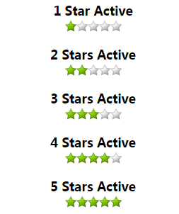
部分效果截图:
HTML代码(index.html):
<!DOCTYPE html>
<html>
<head>
<meta http-equiv="Content-Type" content="text/html; charset=utf-8" />
<title>纯css实现的星级评分系统</title>
<style type="text/css">
/* star rating code - use lists because its more semantic */
/* No javascript required */
/* all the stars are contained in one matrix to solve rollover problems with delay */
/* the background position is just shifted to reveal the correct image. */
/* the images are 16px by 16px and the background position will be shifted in negative 16px increments */
/*  key:  B=Blank : O=Orange : G = Green * /
/*..... The Matrix ....... */
/* colours ....Background position */
/* B B B B B - (0 0)*/
/* G B B B B - (0 -16px)*/
/* G G B B B - (0 -32px)*/
/* G G G B B - (0 -48px)*/
/* G G G G B - (0 -64px)*/
/* G G G G G - (0 -80px)*/
/* O B B B B - (0 -96px)*/
/* O O B B B - (0 -112px)*/
/* O O O B B - (0 -128px)*/
/* O O O O B - (0 -144px)*/
/* O O O O O - (0 -160px)*/


/* the default rating is placed as a background image in the ul */
/* use the background position according to the table above to display the required images*/
.rating{
	width:80px;
	height:16px;
	margin:0 0 20px 0;
	padding:0;
	list-style:none;
	clear:both;
	position:relative;
	background: url(images/star-matrix.gif) no-repeat 0 0;
}
/* add these classes to the ul to effect the change to the correct number of stars */
.nostar {background-position:0 0}
.onestar {background-position:0 -16px}
.twostar {background-position:0 -32px}
.threestar {background-position:0 -48px}
.fourstar {background-position:0 -64px}
.fivestar {background-position:0 -80px}
ul.rating li {
	cursor: pointer;
 /*ie5 mac doesn't like it if the list is floated\*/
	float:left;
	/* end hide*/
	text-indent:-999em;
}
ul.rating li a {
	position:absolute;
	left:0;
	top:0;
	width:16px;
	height:16px;
	text-decoration:none;
	z-index: 200;
}
ul.rating li.one a {left:0}
ul.rating li.two a {left:16px;}
ul.rating li.three a {left:32px;}
ul.rating li.four a {left:48px;}
ul.rating li.five a {left:64px;}
ul.rating li a:hover {
	z-index:2;
	width:80px;
	height:16px;
	overflow:hidden;
	left:0;
	background: url(images/star-matrix.gif) no-repeat 0 0
}
ul.rating li.one a:hover {background-position:0 -96px;}
ul.rating li.two a:hover {background-position:0 -112px;}
ul.rating li.three a:hover {background-position:0 -128px}
ul.rating li.four a:hover {background-position:0 -144px}
ul.rating li.five a:hover {background-position:0 -160px}
/* end rating code */
h3{margin:0 0 2px 0;font-size:110%}

</style>
</head>
<body>
<center>
<h1>纯css实现的星级评分系统</h1>
<h3>无需任何JS代码</h3>
<br>
<ul class="rating nostar">
	<li class="one"><a href="#" title="1 Star">1</a></li>
	<li class="two"><a href="#" title="2 Stars">2</a></li>
	<li class="three"><a href="#" title="3 Stars">3</a></li>
	<li class="four"><a href="#" title="4 Stars">4</a></li>
	<li class="five"><a href="#" title="5 Stars">5</a></li>
</ul>

<h3>1 Star Active</h3>
<ul class="rating onestar">
	<li class="one"><a href="#" title="1 Star">1</a></li>
	<li class="two"><a href="#" title="2 Stars">2</a></li>
	<li class="three"><a href="#" title="3 Stars">3</a></li>
	<li class="four"><a href="#" title="4 Stars">4</a></li>
	<li class="five"><a href="#" title="5 Stars">5</a></li>

</ul>
<h3>2 Stars Active</h3>
<ul class="rating twostar">
	<li class="one"><a href="#" title="1 Star">1</a></li>
	<li class="two"><a href="#" title="2 Stars">2</a></li>
	<li class="three"><a href="#" title="3 Stars">3</a></li>
	<li class="four"><a href="#" title="4 Stars">4</a></li>
	<li class="five"><a href="#" title="5 Stars">5</a></li>

</ul>
<h3>3 Stars Active</h3>
<ul class="rating threestar">
	<li class="one"><a href="#" title="1 Star">1</a></li>
	<li class="two"><a href="#" title="2 Stars">2</a></li>
	<li class="three"><a href="#" title="3 Stars">3</a></li>
	<li class="four"><a href="#" title="4 Stars">4</a></li>
	<li class="five"><a href="#" title="5 Stars">5</a></li>

</ul>
<h3>4 Stars Active</h3>
<ul class="rating fourstar">
	<li class="one"><a href="#" title="1 Star">1</a></li>
	<li class="two"><a href="#" title="2 Stars">2</a></li>
	<li class="three"><a href="#" title="3 Stars">3</a></li>
	<li class="four"><a href="#" title="4 Stars">4</a></li>
	<li class="five"><a href="#" title="5 Stars">5</a></li>

</ul>
<h3>5 Stars Active</h3>
<ul class="rating fivestar">
	<li class="one"><a href="#" title="1 Star">1</a></li>
	<li class="two"><a href="#" title="2 Stars">2</a></li>
	<li class="three"><a href="#" title="3 Stars">3</a></li>
	<li class="four"><a href="#" title="4 Stars">4</a></li>
	<li class="five"><a href="#" title="5 Stars">5</a></li>

</ul>
</center>
</body>
</html>


 分享到QQ
分享到QQ 分享到微博
分享到微博 微信扫一扫
微信扫一扫