以下是 手机端微信朋友圈微信分享代码 的示例演示效果:
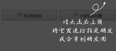
部分效果截图:
HTML代码(index.html):
<!DOCTYPE html PUBLIC "-//W3C//DTD XHTML 1.0 Transitional//EN" "http://www.w3.org/TR/xhtml1/DTD/xhtml1-transitional.dtd">
<html xmlns="http://www.w3.org/1999/xhtml"><head><meta http-equiv="Content-Type" content="text/html; charset=UTF-8">
<title>手机端微信朋友圈微信分享代码</title>
<meta name="viewport" content="width=device-width,height=device-height,inital-scale=1.0,maximum-scale=1.0,user-scalable=no;">
<meta name="format-detection" content="telephone=no">
<meta charset="utf-8">
</head>
<div class="list">
<div id="mess_share">
<div id="share_1">
<button class="button2" onclick="_system._guide(true)">
<img src="img/icon_msg.png"> 发送给朋友</button>
</div>
<div id="share_2">
<button class="button2" onclick="_system._guide(true)">
<img src="img/icon_timeline.png"> 分享到朋友圈</button>
</div>
<div class="clr"></div>
</div>
</div>
<style type="text/css">
button{width:100%;text-align:center;border-radius:3px;}
.button2{font-size:16px;padding:8px 0;border:1px solid #adadab;color:#000000;background-color: #e8e8e8;background-image:linear-gradient(to top, #dbdbdb, #f4f4f4);background-image:-webkit-gradient(linear, 0 100%, 0 0, from(#dbdbdb),to(#f4f4f4));box-shadow: 0 1px 1px rgba(0,0,0,0.45), inset 0 1px 1px #efefef; text-shadow: 0.5px 0.5px 1px #ffffff;}
.button2:active{background-color: #dedede;background-image: linear-gradient(to top, #cacaca, #e0e0e0);background-image:-webkit-gradient(linear, 0 100%, 0 0, from(#cacaca),to(#e0e0e0));}
#mess_share{margin:15px 0;}
#share_1{float:left;width:49%;}
#share_2{float:right;width:49%;}
#mess_share img{width:22px;height:22px;}
#cover{display:none;position:absolute;left:0;top:0;z-index:18888;background-color:#000000;opacity:0.7;}
#guide{display:none;position:absolute;right:18px;top:5px;z-index:19999;}
#guide img{width:260px;height:180px;}
</style>
<script type="text/javascript">
var _system={
$:function(id){return document.getElementById(id);},
_client:function(){
return {w:document.documentElement.scrollWidth,h:document.documentElement.scrollHeight,bw:document.documentElement.clientWidth,bh:document.documentElement.clientHeight};
},
_scroll:function(){
return {x:document.documentElement.scrollLeft?document.documentElement.scrollLeft:document.body.scrollLeft,y:document.documentElement.scrollTop?document.documentElement.scrollTop:document.body.scrollTop};
},
_cover:function(show){
if(show){
this.$("cover").style.display="block";
this.$("cover").style.width=(this._client().bw>this._client().w?this._client().bw:this._client().w)+"px";
this.$("cover").style.height=(this._client().bh>this._client().h?this._client().bh:this._client().h)+"px";
}else{
this.$("cover").style.display="none";
}
},
_guide:function(click){
this._cover(true);
this.$("guide").style.display="block";
this.$("guide").style.top=(_system._scroll().y+5)+"px";
window.onresize=function(){_system._cover(true);_system.$("guide").style.top=(_system._scroll().y+5)+"px";};
if(click){_system.$("cover").onclick=function(){
_system._cover();
_system.$("guide").style.display="none";
_system.$("cover").onclick=null;
window.onresize=null;
};}
},
_zero:function(n){
return n<0?0:n;
}
}
</script>
</div>
<div id="cover"></div>
<div id="guide"><img src="img/guide1.png"></div>
</body>
</html>


 分享到QQ
分享到QQ 分享到微博
分享到微博 微信扫一扫
微信扫一扫