以下是 Google粘土动画Doodle代码 的示例演示效果:
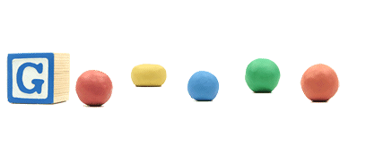
部分效果截图:
HTML代码(index.html):
<!DOCTYPE html PUBLIC "-//W3C//DTD XHTML 1.0 Transitional//EN" "http://www.w3.org/TR/xhtml1/DTD/xhtml1-transitional.dtd">
<html xmlns="http://www.w3.org/1999/xhtml">
<head>
<meta http-equiv="Content-Type" content="text/html; charset=gb2312" />
<title>Google粘土动画Doodle代码</title>
<script language="javascript" type="text/javascript" src="js/animation.js"></script>
<script language="javascript" type="text/javascript">
	window.onload = function () {
		new animation({ element: "Div1", url: 'images/15_gumby11-blockheads.jpg', hover: function () { this.element.style.backgroundPositionX = '-135px'; }, blur: function () { this.element.style.backgroundPositionX = '0'; } });
		new animation({ element: "Div2", url: 'images/16_gumby11-prickle.jpg', hover: function () { this.element.style.backgroundPositionX = '-335px'; }, blur: function () { this.element.style.backgroundPositionX = '-270px'; } });
		new animation({ element: "Div3", url: 'images/17_gumby11-goo.png', hover: function () { this.element.style.backgroundPositionX = '-467px'; }, blur: function () { this.element.style.backgroundPositionX = '-400px'; } });
		new animation({ element: "Div4", url: 'images/10_gumby11-gumby.jpg', hover: function () { this.element.style.backgroundPositionX = '-780px'; }, blur: function () { this.element.style.backgroundPositionX = '-682px'; } });
		new animation({ element: "Div5", url: 'images/18_gumby11-pokey.png', hover: function () { this.element.style.backgroundPositionX = '-609px'; }, blur: function () { this.element.style.backgroundPositionX = '-534px'; } });
	};
</script>
<style type="text/css">
	div{position:absolute;}
</style>
</head>
<body>
<!-- 代码 开始 -->
<div style="width:135px;height:156px;background:url(images/6_gumby11-initial-sprite.png) 0 0;" id="Div1"></div>
<div style="left:138px;top:40px;width:65px;height:102px;background:url(images/6_gumby11-initial-sprite.png) -270px 0;" id="Div2"></div>
<div style="left:196px;top:14px;width:67px;height:144px;background:url(images/6_gumby11-initial-sprite.png) -400px 0;z-index:90;" id="Div3"></div>
<div style="left:246px;top:-6px;width:98px;height:156px;background:url(images/6_gumby11-initial-sprite.png) -682px 0;" id="Div4"></div>
<div style="left:323px;top:50px;width:75px;height:108px;background:url(images/6_gumby11-initial-sprite.png) -534px 0;" id="Div5"></div>

</body>
</html>
JS代码(animation.js):
/*author:DKemail:derek.qin@yomeier.comdate:2011.10.12description:仿google首页动画*/
/*options参数说明:element:string,动画容器的idurl:string,用于播放动画的图片地址speed:int,每秒帧数hover:function,鼠标移动到element上时调用blur:function,鼠标离开element时调用*/
function animation(options){
	var defaultOptions ={
	element:"",url:"",speed:11,hover:function (){
}
,blur:function (){
}
}
;
	this.init(options,defaultOptions);
}
;
	animation.prototype ={
	init:function (o1,o2){
	var me = this;
	for (var p in o2){
	me[p] = o1[p] || o2[p];
}
me.element = document.getElementById(me.element);
	me.delay = 1000 / me.speed;
	me.step = 0;
	me.defaultBackground = me.element.style.background;
	me.defalutUrl = me.element.style.backgroundImage;
	me.url = me.url || me.defalutUrl;
	me.width = me.element.clientWidth;
	me.height = me.element.clientHeight;
	var img = new Image();
	img.onload = function (){
	me.cols = parseInt(img.width / me.width);
	me.rows = parseInt(img.height / me.height);
	me.frames = me.cols * me.rows;
	me.element.onclick = function (){
	me.play();
}
;
	me.element.onmouseover = function (){
	me.onhover();
}
;
	me.element.onmouseout = function (){
	me.onblur();
}
;
}
;
	img.src = me.url;
}
,play:function (){
	if (this.playing){
	return;
}
this.playing = true;
	this.next();
}
,onhover:function (){
	if (!this.playing){
	this.hover();
}
}
,onblur:function (){
	if (!this.playing){
	this.blur();
}
}
,next:function (){
	var me = this;
	me.step++;
	if (me.step > me.frames){
	me.stop();
	return;
}
var x = me.step % me.cols;
	var y = parseInt(me.step / me.rows);
	if (me.step % me.rows > 0){
	y++;
}
var position = "-" + (x - 1) * me.width + "px -" + (y - 1) * me.height + "px";
	me.element.style.background = "url(" + me.url + ") " + position;
	setTimeout(function (){
	me.next();
}
,me.delay);
}
,stop:function (){
	var me = this;
	me.step = 0;
	me.playing = false;
	me.element.style.background = me.defaultBackground;
}
}
;


 分享到QQ
分享到QQ 分享到微博
分享到微博 微信扫一扫
微信扫一扫