以下是 CSS3雷达波向外散发动画效果代码 的示例演示效果:
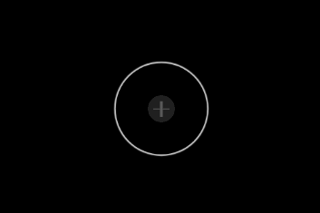
部分效果截图:
HTML代码(index.html):
<!DOCTYPE html PUBLIC "-//W3C//DTD XHTML 1.0 Transitional//EN" "http://www.w3.org/TR/xhtml1/DTD/xhtml1-transitional.dtd">
<html xmlns="http://www.w3.org/1999/xhtml">
<head>
<meta http-equiv="Content-Type" content="text/html; charset=utf-8" />
<title>CSS3雷达波向外散发动画效果</title>
<style>
body{ background:#000;}
.single em{width:90px;height:90px; margin:0 auto;background:url(images/icon.png) no-repeat center center;cursor:pointer;display:block;position:relative;}
.single em:after { content: ''; position: absolute; width: 120px; height: 120px; border-radius: 50%; box-shadow: 0 0 1px 2px rgba(255,255,255,0.8); top: 50%; left: 50%; margin-top: -60px; margin-left: -60px; z-index: 3; opacity: 0; -webkit-animation: halo 1s 0.5s infinite ease-out; -moz-animation: halo 1s 0.5s infinite ease-out; animation: halo 1s 0.5s infinite ease-out; }
@-webkit-keyframes halo { 0% { opacity: 0;-webkit-transform: scale(0.1); }
50% {opacity: 1; }
100%{opacity: 0;-webkit-transform: scale(1.2); } }
@-moz-keyframes halo {0% { opacity: 0; -moz-transform: scale(0.1); }
50% { opacity: 1; }
100%{ opacity: 0; -moz-transform: scale(1.2); } }
@-ms-keyframes halo {0% { opacity: 0; }
50% { opacity: 1; }
100%{opacity: 0; } }
@-o-keyframes halo {0% { opacity: 0; -o-transform: scale(0.1); }
50% {opacity: 1; }
100%{ opacity: 0;-o-transform: scale(1.2); } }
@keyframes halo {0% { opacity: 0; transform: scale(0.1); }
50% {opacity: 1; }
100%{opacity: 0;transform: scale(1.2); } }
</style>
</head>
<body>
<br><br><br><br><br>
<div class="single">
<em></em>
</div>
</body>
</html>


 分享到QQ
分享到QQ 分享到微博
分享到微博 微信扫一扫
微信扫一扫