以下是 CSS3实现动态天气小图标特效代码 的示例演示效果:
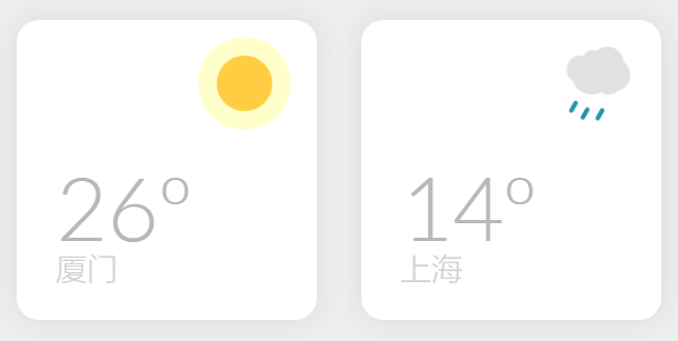
部分效果截图:
HTML代码(index.html):
<!DOCTYPE html PUBLIC "-//W3C//DTD XHTML 1.0 Transitional//EN" "http://www.w3.org/TR/xhtml1/DTD/xhtml1-transitional.dtd">
<html xmlns="http://www.w3.org/1999/xhtml">
<head>
<meta http-equiv="Content-Type" content="text/html; charset=utf-8" />
<title>CSS3实现动态天气小图标特效</title>
<link href="css/chinaz.css" rel="stylesheet" type="text/css">
</head>
<body>
<div class="weather-wrapper">
    <div class="weather-card madrid">
        <div class="weather-icon sun"></div>
        <h1>26º</h1>
        <p>厦门</p>
    </div>
    <div class="weather-card london">
        <div class="weather-icon cloud"></div>
        <h1>14º</h1>
        <p>上海</p>
    </div>
</div>
</body>
</html>
CSS代码(chinaz.css):
/*本作品由【站长素材】收集整理,转载请注明出处!*/
@import url(http://fonts.googleapis.com/css?family=Lato:100,300,400,700,900);body{background-color:#EEEEEE;}
*,*:before,*:after{box-sizing:border-box;}
.weather-wrapper{display:-webkit-box;display:-webkit-flex;display:-ms-flexbox;display:flex;-webkit-box-orient:horizontal;-webkit-box-direction:normal;-webkit-flex-direction:row;-ms-flex-direction:row;flex-direction:row;-webkit-flex-wrap:wrap;-ms-flex-wrap:wrap;flex-wrap:wrap;-webkit-box-pack:center;-webkit-justify-content:center;-ms-flex-pack:center;justify-content:center;}
.weather-card{margin:20px 20px;border-radius:20px;position:relative;overflow:hidden;width:270px;height:270px;background-color:white;box-shadow:0px 0px 25px 1px rgba(50,50,50,0.1);-webkit-animation:appear 500ms ease-out forwards;animation:appear 500ms ease-out forwards;}
.weather-card h1{position:absolute;font-family:'Lato',sans-serif;font-weight:300;font-size:80px;color:#B8B8B8;bottom:0;left:35px;opacity:0;-webkit-transform:translateX(150px);-ms-transform:translateX(150px);transform:translateX(150px);-webkit-animation:title-appear 500ms ease-out 500ms forwards;animation:title-appear 500ms ease-out 500ms forwards;}
.weather-card p{position:absolute;font-family:'Lato',sans-serif;font-weight:300;font-size:28px;color:#d2d2d2;bottom:0;left:35px;-webkit-animation:title-appear 1s ease-out 500ms forwards;animation:title-appear 1s ease-out 500ms forwards;}
.weather-icon{position:relative;width:50px;height:50px;top:0;float:right;margin:40px 40px 0 0;-webkit-animation:weather-icon-move 5s ease-in-out infinite;animation:weather-icon-move 5s ease-in-out infinite;}
.sun{background:#FFCD41;border-radius:50%;box-shadow:rgba(255,255,0,0.1) 0 0 0 4px;-webkit-animation:light 800ms ease-in-out infinite alternate,weather-icon-move 5s ease-in-out infinite;animation:light 800ms ease-in-out infinite alternate,weather-icon-move 5s ease-in-out infinite;}
@-webkit-keyframes light{from{box-shadow:rgba(255,255,0,0.2) 0 0 0 10px;}
to{box-shadow:rgba(255,255,0,0.2) 0 0 0 17px;}
}
@keyframes light{from{box-shadow:rgba(255,255,0,0.2) 0 0 0 10px;}
to{box-shadow:rgba(255,255,0,0.2) 0 0 0 17px;}
}
.cloud{margin-right:60px;background:#e1e1e1;border-radius:20px;width:25px;height:25px;box-shadow:#e1e1e1 24px -6px 0 2px,#e1e1e1 10px 5px 0 5px,#e1e1e1 30px 5px 0 2px,#e1e1e1 11px -8px 0 -3px,#e1e1e1 25px 11px 0 -1px;}
.cloud:after{content:"";position:absolute;border-radius:10px;background-color:transparent;width:4px;height:12px;left:0;top:31px;-webkit-transform:rotate(30deg);-ms-transform:rotate(30deg);transform:rotate(30deg);-webkit-animation:rain 800ms ease-in-out infinite alternate;animation:rain 800ms ease-in-out infinite alternate;}
@-webkit-keyframes rain{from{box-shadow:#2092A9 8px 0px,#2092A9 32px -6px,#2092A9 20px 0px;}
to{box-shadow:#2092A9 8px 6px,#2092A9 32px 0px,#2092A9 20px 6px;}
}
@keyframes rain{from{box-shadow:#2092A9 8px 0px,#2092A9 32px -6px,#2092A9 20px 0px;}
to{box-shadow:#2092A9 8px 6px,#2092A9 32px 0px,#2092A9 20px 6px;}
}
@-webkit-keyframes weather-icon-move{50%{-webkit-transform:translateY(-8px);transform:translateY(-8px);}
}
@keyframes weather-icon-move{50%{-webkit-transform:translateY(-8px);transform:translateY(-8px);}
}
.inspiration{color:#aeaeae;font-family:'Lato',sans-serif;font-weight:300;font-size:24px;text-align:center;}
.inspiration a{color:#FA565F;font-weight:400;-webkit-animation:all 300ms ease-in-out;animation:all 300ms ease-in-out;}
@-webkit-keyframes appear{0%{-webkit-transform:scale(0);transform:scale(0);}
50%{-webkit-transform:scale(1.05);transform:scale(1.05);}
75%{-webkit-transform:scale(0.95);transform:scale(0.95);}
100%{-webkit-transform:scale(1);transform:scale(1);}
}
@keyframes appear{0%{-webkit-transform:scale(0);transform:scale(0);}
50%{-webkit-transform:scale(1.05);transform:scale(1.05);}
75%{-webkit-transform:scale(0.95);transform:scale(0.95);}
100%{-webkit-transform:scale(1);transform:scale(1);}
}
@-webkit-keyframes title-appear{from{opacity:0;-webkit-transform:translateX(150px);transform:translateX(150px);}
to{opacity:1;-webkit-transform:translateX(0px);transform:translateX(0px);}
}
@keyframes title-appear{from{opacity:0;-webkit-transform:translateX(150px);transform:translateX(150px);}
to{opacity:1;-webkit-transform:translateX(0px);transform:translateX(0px);}
}


 分享到QQ
分享到QQ 分享到微博
分享到微博 微信扫一扫
微信扫一扫