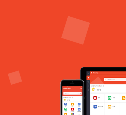
以下是 CSS3实现透明白块漂浮动画特效代码 的示例演示效果:
部分效果截图:
HTML代码(index.html):
<!DOCTYPE html>
<html>
<head>
<META charset="utf-8">
<title>CSS3实现透明白块漂浮动画特效</title>
<meta name="viewport" content="width=device-width, initial-scale=1.0, maximum-scale=1.0, user-scalable=0">
<link rel="stylesheet" type="text/css" href="css/style.css">
</head>
<body>
<div class="banner enterplorer-banner">
  <div class="am-container">
	  <h2><span>Enterplorer</span><span>为移动办公而生</span></h2>
	  <h4>安全、可控、跨平台的统一移动办公门户</h4>
	  <img src="images/enterplorer_banner.png">
  </div>
  <!-- 背景square -->
  <ul class="bg-bubbles">
	<li></li>
	<li></li>
	<li></li>
	<li></li>
	<li></li>
	<li></li>
	<li></li>
	<li></li>
	<li></li>
	<li></li>
</ul>
</div>
</body>
</html>
CSS代码(style.css):
body{padding:0;margin:0;overflow-x:hidden;}
h1,h2,h3,h4,h5,h6{font-weight:lighter;}
.banner{width:100%;height:400px;}
.enterplorer-banner{position:relative;height:550px;margin-bottom:80px;padding-top:40px;background:#ef4628;}
.am-container{max-width:1180px;width:100%;margin:0 auto;}
.enterplorer-banner h2{font-size:32px;margin-bottom:0;}
.enterplorer-banner h2,.enterplorer-banner h4{text-align:center;color:#fff;}
.enterplorer-banner h4{margin-top:0;font-size:20px;}
.bg-bubbles{position:absolute;top:0;left:0;width:100%;height:100%;z-index:1;}
ul,li{margin:0;padding:0;}
.bg-bubbles li{position:absolute;list-style:none;display:block;width:40px;height:40px;background-color:rgba(255,255,255,.15);bottom:-160px;-webkit-animation:square 25s infinite;animation:square 25s infinite;-webkit-transition-timing-function:linear;transition-timing-function:linear;}
.bg-bubbles li:nth-child(1){left:10%}
.bg-bubbles li:nth-child(2){left:20%;width:80px;height:80px;-webkit-animation-delay:200ms;animation-delay:200ms;-webkit-animation-duration:17s;animation-duration:17s}
.bg-bubbles li:nth-child(3){left:25%;-webkit-animation-delay:400ms;animation-delay:400ms}
.bg-bubbles li:nth-child(4){left:40%;width:60px;height:60px;-webkit-animation-duration:10s;animation-duration:10s;background-color:rgba(255,255,255,.25)}
.bg-bubbles li:nth-child(5){left:70%}
.bg-bubbles li:nth-child(6){left:80%;width:120px;height:120px;-webkit-animation-delay:3s;animation-delay:3s;background-color:rgba(255,255,255,.2)}
.bg-bubbles li:nth-child(7){left:32%;width:100px;height:100px;-webkit-animation-delay:7s;animation-delay:7s}
.bg-bubbles li:nth-child(8){left:55%;width:20px;height:20px;-webkit-animation-delay:15s;animation-delay:15s;-webkit-animation-duration:40s;animation-duration:40s}
.bg-bubbles li:nth-child(9){left:25%;width:10px;height:10px;-webkit-animation-delay:2s;animation-delay:2s;-webkit-animation-duration:40s;animation-duration:40s;background-color:rgba(255,255,255,.3)}
.bg-bubbles li:nth-child(10){left:90%;width:120px;height:120px;-webkit-animation-delay:11s;animation-delay:11s}
@-webkit-keyframes square{0%{-webkit-transform:translateY(0);transform:translateY(0)}
100%{-webkit-transform:translateY(-700px) rotate(600deg);transform:translateY(-700px) rotate(600deg)}
}
@keyframes square{0%{-webkit-transform:translateY(0);transform:translateY(0)}
100%{-webkit-transform:translateY(-700px) rotate(600deg);transform:translateY(-700px) rotate(600deg)}
}


 分享到QQ
分享到QQ 分享到微博
分享到微博 微信扫一扫
微信扫一扫