以下是 css3空中飘浮的气球动画特效代码 的示例演示效果:
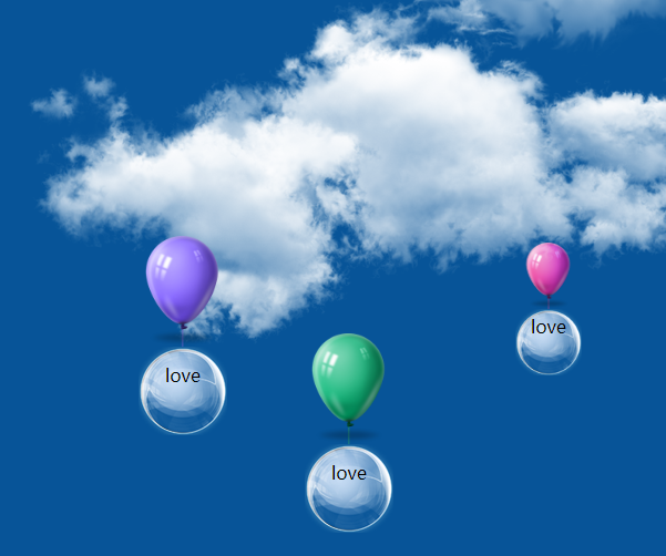
部分效果截图:
HTML代码(index.html):
<!DOCTYPE HTML>
<html>
<head>
<meta http-equiv="Content-Type" content="text/html; charset=utf-8">
<title>css3空中飘浮的气球动画特效</title>
<link href="css/index.css" rel="stylesheet" type="text/css"/>
</head>

<body>

	<div class="qiqiu1 qiqiu">
    	<img src="images/201101asdsaf22135412367.png"/>
        <div class="text">love</div>
    </div>
    	<div class="qiqiu2 qiqiu">
    	<img src="images/201101ddd22135412367.png"/>
        <div class="text">love</div>
    </div>
    	<div class="qiqiu3 qiqiu">
    	<img src="images/20110122135aaaaa412367.png"/>
        <div class="text">love</div>
    </div>
    	<div class="qiqiu4 qiqiu">
    	<img src="images/20110122135s412367.png"/>
        <div class="text">love</div>
    </div>
    	<div class="qiqiu5 qiqiu">
    	<img src="images/20110122135412367.png"/>
        <div class="text">love</div>
    </div>

	<div class="yun1 yun"> </div>
	<div class="yun2 yun"> </div>
	<div class="yun3 yun"> </div>
	<div class="yun4 yun"> </div>
</body>
</html>
CSS代码(index.css):
@charset "utf-8";/* CSS Document */
html{height:100%}
body{background:url(../images/bg.jpg) no-repeat center top;background-size:100% 100%}
.qiqiu{position:fixed;width:100px;height:200px;}
.qiqiu div{width:70px;height:65px;background:url(../images/730e0cf3d7ca7bcbbc1b79c0bf096b63f724a8f9.png) no-repeat center center;padding:15px 5px 0;text-align:center;margin:0 auto;background-size:100% auto;}
.qiqiu img{width:100%;height:auto;display:block;}
.qiqiu1{bottom:-200px;left:400px;animation:myfirst 20s linear infinite;z-index:2222;animation-delay:0s;-webkit-animation:myfirst 20s linear infinite;z-index:2222;-webkit-animation-delay:0s;}
.qiqiu2{bottom:-200px;left:650px;animation:myfirst2 22s 1s linear infinite;animation-delay:2s;width:70px;-webkit-animation:myfirst2 22s 1s linear infinite;-webkit-animation-delay:2s;}
.qiqiu3{bottom:-200px;left:900px;animation:myfirst3 22.2s linear infinite;z-index:2222;animation-delay:3s;-webkit-animation:myfirst3 22.2s linear infinite;-webkit-animation-delay:3s;}
.qiqiu4{bottom:-200px;left:1050px;animation:myfirst4 21s 0.2s linear infinite;z-index:2222;animation-delay:5s;-webkit-animation:myfirst4 21s 0.2s linear infinite;-webkit-animation-delay:5s;}
.qiqiu5 div{width:50px;height:55px;padding:5px 5px 0;margin:0 auto}
.qiqiu2 div{width:60px;height:65px;padding:5px 5px 0;margin:0 auto}
.qiqiu5{bottom:-200px;left:1250px;animation:myfirst5 19.5s 1.2s linear infinite;animation-delay:4s;width:60px;}
.yun{position:fixed;}
.yun1{width:567px;height:185px;background:url(../images/yun1.png) no-repeat center center;left:1060px;top:318px;animation:myfirst6 50s linear infinite;-webkit-animation:myfirst6 50s linear infinite;}
.yun2{width:605px;height:253px;background:url(../images/yun2.png) no-repeat center center;left:180px;top:249px;animation:myfirst7 50s linear infinite;-webkit-animation:myfirst7 50s linear infinite;}
.yun3{width:348px;height:226px;background:url(../images/yun3.png) no-repeat center center;left:50px;top:500px;animation:myfirst8 50s linear infinite;-webkit-animation:myfirst8 50s linear infinite;}
.yun4{width:786px;height:362px;background:url(../images/yun4.png) no-repeat center center;left:762px;top:433px;animation:myfirst9 50s linear infinite;-webkit-animation:myfirst9 50s linear infinite;}
@keyframes myfirst{from{bottom:-200px;}
to{bottom:800px;}
}
@keyframes myfirst2{from{bottom:-200px;}
to{bottom:850px;}
}
@keyframes myfirst3{from{bottom:-200px;}
to{bottom:820px;}
}
@keyframes myfirst4{from{bottom:-200px;}
to{bottom:780px;}
}
@keyframes myfirst5{from{bottom:-200px;}
to{bottom:830px;}
}
@keyframes myfirst6{from{left:1060px;}
to{left:1250px;}
}
@keyframes myfirst7{from{left:180px;}
to{left:400px;}
}
@keyframes myfirst8{from{left:50px;}
to{left:350px;}
}
@keyframes myfirst9{from{left:762px;}
to{left:1000px;}
}
@-webkit-keyframes myfirst{from{bottom:-200px;}
to{bottom:800px;}
}
@-webkit-keyframes myfirst2{from{bottom:-200px;}
to{bottom:850px;}
}
@-webkit-keyframes myfirst3{from{bottom:-200px;}
to{bottom:820px;}
}
@-webkit-keyframes myfirst4{from{bottom:-200px;}
to{bottom:780px;}
}
@-webkit-keyframes myfirst5{from{bottom:-200px;}
to{bottom:830px;}
}
@-webkit-keyframes myfirst6{from{left:1060px;}
to{left:1250px;}
}
@-webkit-keyframes myfirst7{from{left:180px;}
to{left:400px;}
}
@-webkit-keyframes myfirst8{from{left:50px;}
to{left:350px;}
}
@-webkit-keyframes myfirst9{from{left:762px;}
to{left:1000px;}
}


 分享到QQ
分享到QQ 分享到微博
分享到微博 微信扫一扫
微信扫一扫