以下是 CSS3实现圣诞雪人动画特效代码 的示例演示效果:
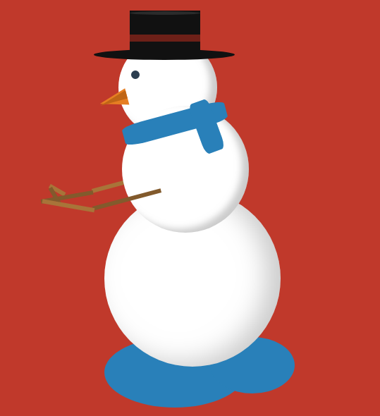
部分效果截图:
HTML代码(index.html):
<!DOCTYPE html>
<html class=''>
<head>
    <title>CSS3实现圣诞雪人动画特效代码</title>
    <script src='prefixfree.min.js'></script>
    <style class="cp-pen-styles">body {
  background: #c0392b;
}
.body {
  width: 250px;
  height: 250px;
  background: #ffffff;
  border-radius: 50%;
  box-shadow: inset -20px -5px 35px rgba(0, 0, 0, 0.2);
  position: absolute;
  right: 0;
  left: 0;
  margin: 300px auto;
  animation: jump 1s infinite;
}
.body:before {
  z-index: 2;
  content: "";
  width: 180px;
  height: 180px;
  background: #ffffff;
  border-radius: 50%;
  box-shadow: inset -10px -5px 10px rgba(0, 0, 0, 0.2);
  position: relative;
  display: inline-block;
  top: -120px;
  left: 25px;
}
.body:after {
  content: "";
  width: 140px;
  height: 140px;
  background: #ffffff;
  border-radius: 50%;
  box-shadow: inset -10px -5px 10px rgba(0, 0, 0, 0.2);
  position: relative;
  display: inline-block;
  top: -400px;
  left: 20px;
}
.body > .hat {
  width: 200px;
  height: 15px;
  border-radius: 50%;
  background-color: #111111;
  position: absolute;
  z-index: 4;
  top: -200px;
  left: -15px;
}
.body > .hat:before {
  content: "";
  width: 100px;
  height: 65px;
  background-color: #111111;
  display: inline-block;
  position: relative;
  top: -55px;
  left: 51px;
}
.body > .hat:after {
  z-index: 5;
  content: "";
  display: inline-block;
  position: relative;
  top: -145px;
  left: 51px;
  width: 100px;
  height: 5px;
  border-radius: 50%;
  background-color: #2b2b2b;
}
.body > .hat > .ribbon {
  height: 10px;
  width: 100px;
  background-color: #6d2018;
  position: relative;
  top: -90px;
  left: 51px;
  z-index: 6;
}
.body > .face {
  z-index: 3;
  width: 12px;
  height: 12px;
  background-color: #2c3e50;
  border-radius: 50%;
  position: absolute;
  top: -170px;
  left: 38px;
}
.body > .face:before {
  content: "";
  background-color: transparent;
  display: inline-block;
  position: relative;
  top: 30px;
  left: -45px;
  transform: rotate(-15deg);
  border-top: 12px solid transparent;
  border-bottom: 12px solid transparent;
  border-right: 40px solid #e67e22;
}
.body > .face:after {
  content: "";
  background-color: transparent;
  display: inline-block;
  position: relative;
  top: 0;
  left: -46px;
  transform: rotate(-15deg);
  border-top: 12px solid transparent;
  border-right: 40px solid #bf6516;
}
.body > .scarf {
  z-index: 3;
  width: 150px;
  height: 30px;
  background-color: #2980b9;
  position: absolute;
  top: -110px;
  left: 25px;
  transform: rotate(-15deg);
  border-radius: 20%;
}
.body > .scarf:after {
  content: "";
  width: 75px;
  height: 30px;
  background-color: #2980b9;
  display: inline-block;
  position: relative;
  top: 16px;
  left: 80px;
  transform: rotate(85deg);
  border-radius: 20%;
}
.body > .left-arm,
.body .right-arm {
  z-index: 7;
  width: 100px;
  height: 6px;
  background-color: #825a2c;
  position: absolute;
  top: 10px;
  left: -20px;
  transform: rotate(-15deg);
  animation: rub-right 0.5s infinite;
}
.body > .left-arm > .hand,
.body .right-arm > .hand {
  width: 25px;
  height: 6px;
  background-color: #825a2c;
  position: absolute;
  top: -32px;
  left: -60px;
  transform: rotate(75deg);
}
.body > .left-arm:after,
.body .right-arm:after {
  content: "";
  width: 75px;
  height: 6px;
  background-color: #a87439;
  display: inline-block;
  position: relative;
  top: -24px;
  left: -70px;
  transform: rotate(25deg);
}
.body > .left-arm.left-arm,
.body .right-arm.left-arm {
  background-color: #a87439;
  animation: rub-left 0.5s infinite;
  top: -15px;
  z-index: 1;
}
.body > .left-arm.left-arm > .hand,
.body .right-arm.left-arm > .hand {
  background-color: #a87439;
  top: -14px;
  transform: rotate(45deg);
}
.body > .left-arm.left-arm:after,
.body .right-arm.left-arm:after {
  background-color: #825a2c;
  transform: rotate(5deg);
  top: -12px;
  left: -74px;
}
.puddle {
  z-index: -1;
  width: 200px;
  height: 100px;
  background: #2980b9;
  border-radius: 50%;
  position: absolute;
  right: 0;
  left: -50px;
  margin: 500px auto;
}
.puddle:after {
  content: "";
  width: 120px;
  height: 80px;
  display: inline-block;
  border-radius: 50%;
  left: 150px;
  position: relative;
  background-color: #2980b9;
}
.text {
  text-align: center;
  font-family: 'Lobster', cursive;
  font-size: 74px;
  display: inline-block;
  transform: rotate(-15deg);
  position: absolute;
  margin: 50px 30px;
  color: #ffffff;
  text-shadow: 3px 3px 2px rgba(0, 0, 0, 0.5);
}
.text > small {
  font-size: 20px;
  display: block;
}
@keyframes rub-left {
  0% {
    margin-left: 0px;
    margin-top: 0;
  }
  50% {
    margin-left: 5px;
    margin-top: 1px;
  }
  100% {
    margin-left: 0px;
    margin-top: 0;
  }
}
@keyframes rub-right {
  0% {
    margin-left: 4px;
  }
  50% {
    margin-left: 0px;
  }
  100% {
    margin-left: 4px;
  }
}
@keyframes jump {
  0% {
    margin: 300px auto;
  }
  40% {
    margin: 250px auto;
  }
  80% {
    margin: 300px auto;
  }
}
</style>
</head>
<body>
    <div class="body">
        <div class="hat">
            <div class="ribbon">
            </div>
        </div>
        <div class="face">
        </div>
        <div class="scarf">
        </div>
        <div class="right-arm">
            <div class="hand">
            </div>
        </div>
        <div class="left-arm">
            <div class="hand">
            </div>
        </div>
    </div>
    <div class="puddle">
    </div>
</body>
</html>
JS代码(prefixfree.min.js):
!function (){
	function e(e,r){
	return [].slice.call((r || document).querySelectorAll(e))}
if (window.addEventListener){
	var r = window.StyleFix ={
	link:function (e){
	try{
	if ("stylesheet" !== e.rel || e.hasAttribute("data-noprefix")) return}
catch (t){
	return}
var n,i = e.href || e.getAttribute("data-href"),a = i.replace(/[^\/]+$/,""),o = (/^[a-z]{
	3,10}
:/.exec(a) || [""])[0],s = (/^[a-z]{
	3,10}
:\/\/[^\/]+/.exec(a) || [""])[0],l = /^([^?]*)\??/.exec(i)[1],u = e.parentNode,p = new XMLHttpRequest;
	p.onreadystatechange = function (){
	4 === p.readyState && n()}
,n = function (){
	var t = p.responseText;
	if (t && e.parentNode && (!p.status || p.status < 400 || p.status > 600)){
	if (t = r.fix(t,!0,e),a){
	t = t.replace(/url\(\s*?((?:"|')?)(.+?)\1\s*?\)/gi,function (e,r,t){
	return /^([a-z]{
	3,10}
:|#)/i.test(t) ? e:/^\/\//.test(t) ? 'url("' + o + t + '")':/^\//.test(t) ? 'url("' + s + t + '")':/^\?/.test(t) ? 'url("' + l + t + '")':'url("' + a + t + '")'}
);
	var n = a.replace(/([\\\^\$*+[\]?{
}
.=!:(|)])/g,"\\$1");
	t = t.replace(RegExp("\\b(behavior:\\s*?url\\('?\"?)" + n,"gi"),"$1")}
var i = document.createElement("style");
	i.textContent = t,i.media = e.media,i.disabled = e.disabled,i.setAttribute("data-href",e.getAttribute("href")),u.insertBefore(i,e),u.removeChild(e),i.media = e.media}
}
;
	try{
	p.open("GET",i),p.send(null)}
catch (t){
	"undefined" != typeof XDomainRequest && (p = new XDomainRequest,p.onerror = p.onprogress = function (){
}
,p.onload = n,p.open("GET",i),p.send(null))}
e.setAttribute("data-inprogress","")}
,styleElement:function (e){
	if (!e.hasAttribute("data-noprefix")){
	var t = e.disabled;
	e.textContent = r.fix(e.textContent,!0,e),e.disabled = t}
}
,styleAttribute:function (e){
	var t = e.getAttribute("style");
	t = r.fix(t,!1,e),e.setAttribute("style",t)}
,process:function (){
	e("style").forEach(StyleFix.styleElement),e("[style]").forEach(StyleFix.styleAttribute)}
,register:function (e,t){
	(r.fixers = r.fixers || []).splice(void 0 === t ? r.fixers.length:t,0,e)}
,fix:function (e,t,n){
	for (var i = 0;
	i < r.fixers.length;
	i++) e = r.fixers[i](e,t,n) || e;
	return e}
,camelCase:function (e){
	return e.replace(/-([a-z])/g,function (e,r){
	return r.toUpperCase()}
).replace("-","")}
,deCamelCase:function (e){
	return e.replace(/[A-Z]/g,function (e){
	return "-" + e.toLowerCase()}
)}
}
;
	!function (){
	setTimeout(function (){
}
,10),document.addEventListener("DOMContentLoaded",StyleFix.process,!1)}
()}
}
(),function (e){
	function r(e,r,n,i,a){
	if (e = t[e],e.length){
	var o = RegExp(r + "(" + e.join("|") + ")" + n,"gi");
	a = a.replace(o,i)}
return a}
if (window.StyleFix && window.getComputedStyle){
	var t = window.PrefixFree ={
	prefixCSS:function (e,n){
	var i = t.prefix;
	if (t.functions.indexOf("linear-gradient") > -1 && (e = e.replace(/(\s|:|,)(repeating-)?linear-gradient\(\s*(-?\d*\.?\d*)deg/gi,function (e,r,t,n){
	return r + (t || "") + "linear-gradient(" + (90 - n) + "deg"}
)),e = r("functions","(\\s|:|,)","\\s*\\(","$1" + i + "$2(",e),e = r("keywords","(\\s|:)","(\\s|;
	|\\}
|$)","$1" + i + "$2$3",e),e = r("properties","(^|\\{
	|\\s|;
	)","\\s*:","$1" + i + "$2:",e),t.properties.length){
	var a = RegExp("\\b(" + t.properties.join("|") + ")(?!:)","gi");
	e = r("valueProperties","\\b",":(.+?);
	",function (e){
	return e.replace(a,i + "$1")}
,e)}
return n && (e = r("selectors","","\\b",t.prefixSelector,e),e = r("atrules","@","\\b","@" + i + "$1",e)),e = e.replace(RegExp("-" + i,"g"),"-"),e = e.replace(/-\*-(?=[a-z]+)/gi,t.prefix)}
,property:function (e){
	return (t.properties.indexOf(e) ? t.prefix:"") + e}
,value:function (e){
	return e = r("functions","(^|\\s|,)","\\s*\\(","$1" + t.prefix + "$2(",e),e = r("keywords","(^|\\s)","(\\s|$)","$1" + t.prefix + "$2$3",e)}
,prefixSelector:function (e){
	return e.replace(/^:{
	1,2}
/,function (e){
	return e + t.prefix}
)}
,prefixProperty:function (e,r){
	var n = t.prefix + e;
	return r ? StyleFix.camelCase(n):n}
}
;
	!function (){
	var e ={
}
,r = [],n = getComputedStyle(document.documentElement,null),i = document.createElement("div").style,a = function (t){
	if ("-" === t.charAt(0)){
	r.push(t);
	var n = t.split("-"),i = n[1];
	for (e[i] = ++e[i] || 1;
	n.length > 3;
	){
	n.pop();
	var a = n.join("-");
	o(a) && -1 === r.indexOf(a) && r.push(a)}
}
}
,o = function (e){
	return StyleFix.camelCase(e) in i}
;
	if (n.length > 0) for (var s = 0;
	s < n.length;
	s++) a(n[s]);
	else for (var l in n) a(StyleFix.deCamelCase(l));
	var u ={
	uses:0}
;
	for (var p in e){
	var f = e[p];
	u.uses < f && (u ={
	prefix:p,uses:f}
)}
t.prefix = "-" + u.prefix + "-",t.Prefix = StyleFix.camelCase(t.prefix),t.properties = [];
	for (var s = 0;
	s < r.length;
	s++){
	var l = r[s];
	if (0 === l.indexOf(t.prefix)){
	var c = l.slice(t.prefix.length);
	o(c) || t.properties.push(c)}
}
"Ms" != t.Prefix || "transform" in i || "MsTransform" in i || !("msTransform" in i) || t.properties.push("transform","transform-origin"),t.properties.sort()}
(),function (){
	function e(e,r){
	return i[r] = "",i[r] = e,!!i[r]}
var r ={
	"linear-gradient":{
	property:"backgroundImage",params:"red,teal"}
,calc:{
	property:"width",params:"1px + 5%"}
,element:{
	property:"backgroundImage",params:"#foo"}
,"cross-fade":{
	property:"backgroundImage",params:"url(a.png),url(b.png),50%"}
}
;
	r["repeating-linear-gradient"] = r["repeating-radial-gradient"] = r["radial-gradient"] = r["linear-gradient"];
	var n ={
	initial:"color","zoom-in":"cursor","zoom-out":"cursor",box:"display",flexbox:"display","inline-flexbox":"display",flex:"display","inline-flex":"display",grid:"display","inline-grid":"display","min-content":"width"}
;
	t.functions = [],t.keywords = [];
	var i = document.createElement("div").style;
	for (var a in r){
	var o = r[a],s = o.property,l = a + "(" + o.params + ")";
	!e(l,s) && e(t.prefix + l,s) && t.functions.push(a)}
for (var u in n){
	var s = n[u];
	!e(u,s) && e(t.prefix + u,s) && t.keywords.push(u)}
}
(),function (){
	function r(e){
	return a.textContent = e + "{
}
",!!a.sheet.cssRules.length}
var n ={
	":read-only":null,":read-write":null,":any-link":null,"::selection":null}
,i ={
	keyframes:"name",viewport:null,document:'regexp(".")'}
;
	t.selectors = [],t.atrules = [];
	var a = e.appendChild(document.createElement("style"));
	for (var o in n){
	var s = o + (n[o] ? "(" + n[o] + ")":"");
	!r(s) && r(t.prefixSelector(s)) && t.selectors.push(o)}
for (var l in i){
	var s = l + " " + (i[l] || "");
	!r("@" + s) && r("@" + t.prefix + s) && t.atrules.push(l)}
e.removeChild(a)}
(),t.valueProperties = ["transition","transition-property"],e.className += " " + t.prefix,StyleFix.register(t.prefixCSS)}
}
(document.documentElement);


 分享到QQ
分享到QQ 分享到微博
分享到微博 微信扫一扫
微信扫一扫